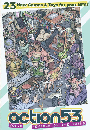
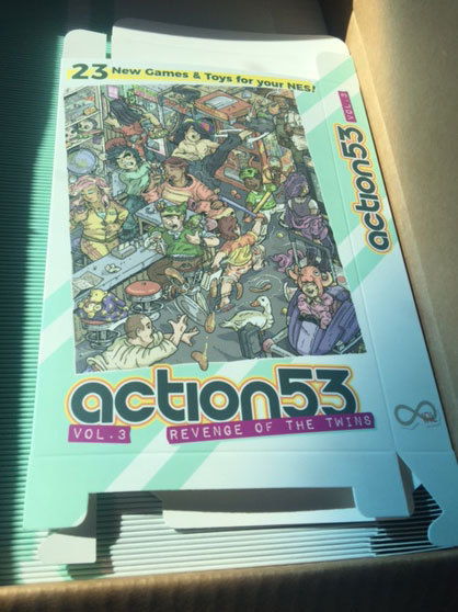
Early last month, I had a brief discussion with infiniteneslives, NEShomebrew, tepples, and na_th_an in which I expressed interest in illustrating and designing the new Action 53 box art. Not to misquote anyone, but the general consensus of the discussion was approving, pending the other contributors' input.
What I have planned…Currently, there seems to be discussion about whether v. 3 should cumulatively include games from v. 1 and 2.
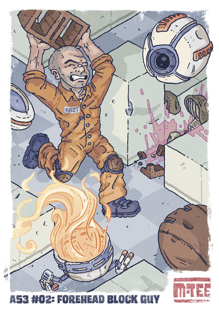
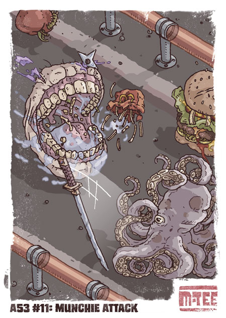
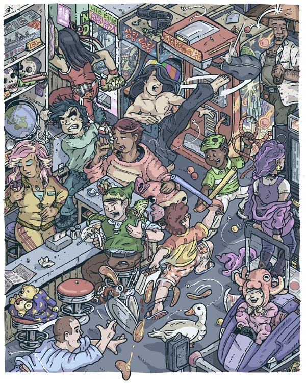
If v. 3 only includes new games, I will likely have a single illustration on the cover that is representative of every game included. If the new volume includes old games as well, I may do a wraparound cover. Regardless, it is my intention to have every game included on the cart represented in the box art. The illustration will also likely utilize the isometric perspective shown in the two illustrations below and in all of the Cowlitz Gamers artwork linked further below.
To give an idea of how I would represent some of these games, I've put together two postcard-sized illustrations of past Action 53 games:

 What Else I've done…
Some of the NES-related stuff I've done includes the following:
Swords and Runes packaging & illustrationCowlitz Gamers Adventure cover artCowlitz Gamers Adventure packagingCowlitz Gamers Adventure manualCowlitz Gamers' 2nd Adventure spot illustrationsPyronaut promotional illustrationWhen I can do it…I will spend the next two weeks or so finishing up the packaging for CGA-2. Afterward, I'll be available to start once the final game list is made available. Depending on the number of games included, it will take me a few weekends to finish it up.
Why I'm the artist for it…I've been following the progress of the competition throughout the year, and am both familiar with and passionate about these games. I'm excited about representing the characters of this year's games–and by the creative challenge of representing the characterless games as well.
Moreover, the particular art style that I've been working in lately is heavily influenced by the DIY, indie scifi / fantasy comics of the 80s– which I feel appropriately compliments the homebrew aspect of the project.
So, please use this thread for questions, comments, feedback, suggestions, etc.
I love your art and style and I think the multicart will benefit from your skills. I hope you are given the position.
Wow, that's great news, I really like your work !
Your art style is gorgeous and you should definitely go for it!
Is the t-shirt going to happen? If your illustration follows your examples it would be an awesome design for it. I'd even buy a full size poster with the cover art, that's how well I think of your art.
I'm glad that responses have ranged from no interest/no comment to avid approval.

I'm finishing up the Cowlitz packaging art at the moment and have begun loose sketches and ideas for this cover art. If there is any additional backstory, character representation preference, or anything from any of the contributors, please post here or PM me.
Otherwise, I look forward to the fun of interpreting these games and their characters.
M_Tee wrote:
I'm glad that responses have ranged from no interest/no comment to avid approval.

Please interpret my previous lack of response as avid approval. Your work looks great, and I'm excited to see how you'll represent everything!
I didn't say anything before because I didn't participate in the competition at all, but I really like this art style! I think it fits the spirit perfectly!
I feel like we are getting close to having a Release Candidate ROM soon, So I've been thinking about the theme topic lately. There has been mentions about deciding on a themed volume title, but I never saw a clear consensus yet.
Suggestions I found so far:
Action 53 Function Ceiling ⅓ (Action 53/3 for short)
[…54/3 = 18 = round(53/3)= ceil(53/3)]
Action 53…3…3…3…3…3…3…
Action 53 3: Too Hot For the Kitchen
JAN CTION PON 53
I personally like the first suggestion here but here's one of my own.
Action 53 Episode 3: Revenge of the Twins
This was thought up due to the compo winner, the 4 mojon twins games, and referencing a popular lackluster movie.
I tried title screen concepts for "twins", but the
Gemini symbol ♊ looks like the Roman numeral "II", which was the previous volume.
JRoatch wrote:
I feel like we are getting close to having a Release Candidate ROM soon, So I've been thinking about the theme topic lately. There has been mentions about deciding on a themed volume title, but I never saw a clear consensus yet.
Suggestions I found so far:
Action 53 Function Ceiling ⅓ (Action 53/3 for short)
[…54/3 = 18 = round(53/3)= ceil(53/3)]
Action 53…3…3…3…3…3…3…
Action 53 3: Too Hot For the Kitchen
JAN CTION PON 53
I personally like the first suggestion here but here's one of my own.
Action 53 Episode 3: Revenge of the Twins
This was thought up due to the compo winner, the 4 mojon twins games, and referencing a popular lackluster movie.
more properly, ⎡Action 53/3⎤ for short.
Love your art as always, M_Tee.

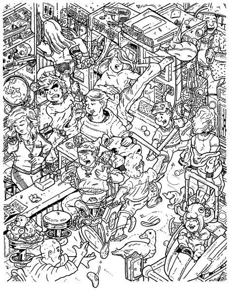
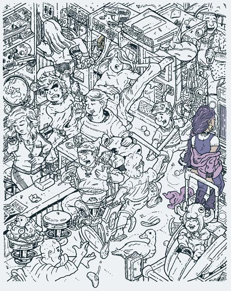
Inks are finally finished. Once I scan and clean them up, I'll post them.
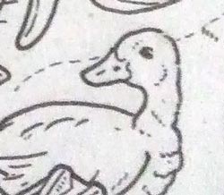
In the meantime, here's Waddles. It's a shame
Quack: A Duck Simulator and
The Legend of Quackin' Jack's Gold weren't finished for the cart. Would have been nice to have a full trio of ducks on the cover.

Awesome !
Can't wait to see this !
Now I'm imagining a t-shirt with three ducks quacking at the moon...
Nice duck! Can't wait to see the rest!

Thanks... my linework is generally a dense mess until I color it, but I'll be using color holds (converting parts of the inks to color) and balancing colors carefully, so it should (in theory) read surprisingly clearly despite the density of the lineart.

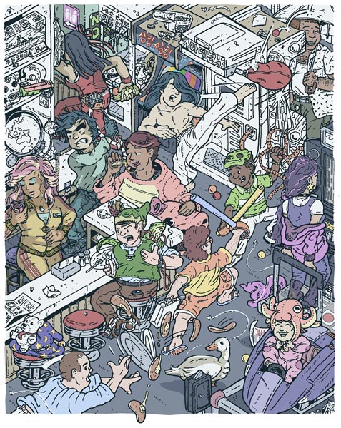
Every game and toy is represented, as of the latest build, and many games have a major -and minor- reference.
This looks great! I can't wait to see it colored as well.
I've identified some:
Attachment:
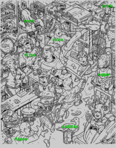 identified.png [ 38.97 KiB | Viewed 8338 times ]
Coloring will probably make the rest easier to identify.
I love how chaotic it is!
Glad y'all dig it. I only get short bursts to work until the weekends, but I'll keep posting progress as it comes along.
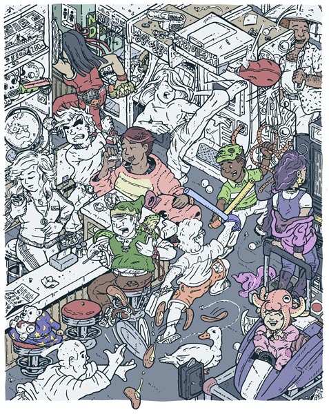
Cleaned up some more lineart, starting the flats step of coloring (assigning local, unshaded colors).

Man, I'm so glad you are in charge of the cover art. It looks gorgeous.

Thanks, man. I really enjoyed interpreting your characters into the modern arcade / realistic setting chosen for the illustration.
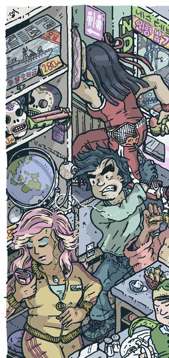
Lala, for example, shows references to her cutscene sprite through a dark sleeveless top, tall dark boots and long, purple, curly hair -- and her in-game cutscene with the magenta drawstring hoodie (for her robe) and witch's hat (on the floor). The star earring is a reference to her magic wand, and the rest (baby tee, hand-stitched black jeans, scruncie, choker, and highlights) were all added to strengthen the mall-teen aesthetic for the type of girl that'd wear a witch's hat in public.

In fact, I recognized her in the B/W preview picture because of the ear rings, nice touch! Congrats

So cool

Thanks, man. Not being able to draw some detailed twin dragons was my biggest sacrifice in choosing the arcade setting. A
Barney-esque arcade mascot was the next best thing...

Anyway, hope ya'll don't mind the daily updates. Haven't finished flats, but have started some shading (Cheril and a bit elsewhere) to get a feel for the final light / dark balance.
glutock wrote:
So cool

Nothing to add but superlatives!
Oh, and keep the daily updates, I am thrilling for it

This is wonderful! I love how waddles is just there like "how did I get here? What's going on?"
...it's kinda an accurate metaphor for the game/development too ;)
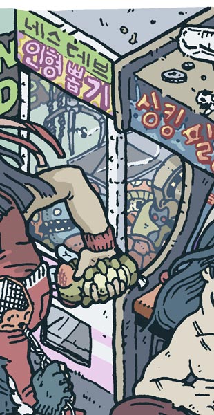
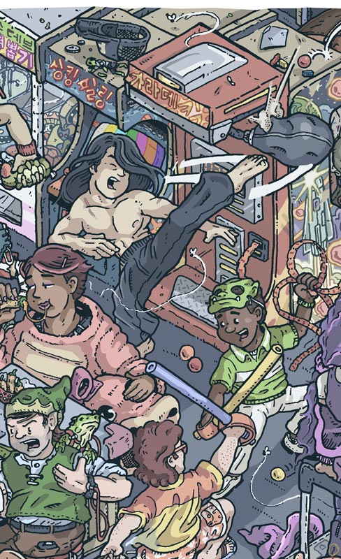
I had trouble finding 240p Test Suite in the first version. But now after looking up the hangul on the marquees, I realized 240p Test Suite is plugged into the Sinking Feeling machine's JAMMA slot as a diagnostic.
Speaking of "Sinking Feel-Ling" (싱킹필링) on the marquee: I'm not familiar with the conventions for hangulization of English, but I do know hangul for Korean tries to be morphophonemic in that a suffix beginning with a vowel is often moved to its own cluster beginning with a syllable break (ᄋ). Is there a reason the ᆯ (L) is doubled?
There are two lines of hangul on the marquee of what appears to be a claw machine (nearest the restroom). The top line says NESdev, but
English Wikipedia's article about claw machines doesn't appear to link to a Korean article about the same thing.
Another question I have relates to how this illustration is supposed to fit on the packaging and cartridge label with the title and stuff. I ask because that might affect whether there'd be a place for a "B-side" where Gus from 240p Test Suite is repairing a game after hours.
Sorry for the late reply. Wanted to finish coloring the crane game to post with it:

You're right: "네스데브" is NesDev
Below it is "
인형뽑기", which is what claw games are most commonly referred to as (loosely translates to doll pull or doll pulling machine). Here's a
blogpost with an image of a shop that uses it in their signpost for reference.
The double rieul (ㄹ) in 싱킹필링 is there because it's common practice when writing out foreign words in Korean to double that character for an "l" sound in the middle of word, when a single instance would be used for an "r". (This is not entirely consistent, but is a solid guideline. Spelling of foreign words into Korean can vary quite a bit as well.) Spelling out English titles for media instead of translating them is the most common approach, at least since the 90s. I had initially considered translating the title, but in doing so, it could mistakenly bring up connotations with a high profile ferry sinking incident from a few years back.
Anyway, glad to explain anything asked. Hope the Korean isn't an issue. I felt it'd add a little visual interest to the setting while also removing any unwanted emphasis put on titles whose marquees would be visible. Especially with the coloring, for the average consumer, the in-illustration text should merely add to the background, not stand out from it at all.
It's late now, I have the layout for box and label, including logo and title pretty concrete in sketch form. I'd rather just wait until they're done to post them, but I'm pushing back another project already to make time to finish this, so definitely no time for "B-sides" versions of the illustrations. Sorry.

I love it!
I'm in love with the blueish colouring you gave to Cheril's eyelids, she's a true queen of the mall!

Was out of town for a little over a week. Here's the prize shelf.
@na_th_an
Thanks. Many of the sprites had a lot of character and were really fun to interpret. Mall queen who's too bored to be at work seemed like the perfect representation of a goddess.

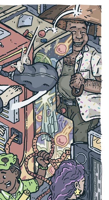
Early pencil work had a Calavera reference in the top right with an El Diablo from Suicide Squad-type character playing a (shotgun) light gun game... until I realized that I hadn't included a Brick Breaker reference. Luckily, I hadn't inked that portion and was able to relegate Calavera to the prize shelf.

A little more coloring out of the way. Hoping to finish up the illustration this weekend if time permits and then logo, label, and other layout afterward.
This cover art is gorgeous. The cart is going to look awesome
The cover's looking fantastic. This will be a great cartridge!
Thanks. Still taking longer than I thought, but here's a section that's finished up:


Now to work on the logo and lettering.
Excellent work. Looks awesome.
My only gripe is that a logo will cover some of your great art

Thanks, working on the packaging at the moment. This in-progress preview of the front should give a pretty good idea of the feel I'm going for with it:

Looking very good, as usual.
(Image Clipped)
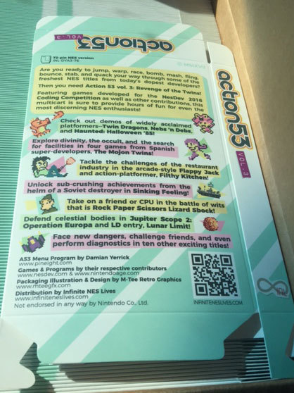
Please proofread this box back and let me know of any errors.
I also updated the artwork (not shown) to correctly reflect the palette of the Flappy Jack waiter.
I don't see any typos.
It looks like there's two spaces after "stab," compared to the other spaces on that line.
Keen eye, thanks. Fixed it.
It looks gorgeous. Can't wait to have this in my hands!
My name is Damian Yerrick. Damien with an E is the antichrist child from The Omen and an episode of South Park. (Rectus... dominus...)
"Ltd" needs a period "Ltd."
I'd say change the dash between
www.nesdev.com and
www.nintendoage.com into an ampersand (&) instead, but it's not a mistake, afaik.
Didn't want any images with the misspelled name floating around, so I removed the link to that image.
Anyway, corrected spelling, added all of Myask's corrections / suggestions. (much appreciated)
Unless there are any objections, the following is a preview of what's going to the printer:
Linked for WidthDespite the blurriness in that preview, it should print very crisply:
- All sprites have been vectorized using this method.
- The source image for the cover art is well over 600dpi at that scale.
- All text uses fonts with appropriate permissions and will be converted to outlines prior to print.
M_Tee wrote:
Didn't want any images with the misspelled name floating around, so I removed the link to that image.
We already have
Damian Yeppick floating around anyway.
Are we directly printing a vector file again? What's being done differently to make sure it turns out differently from Volume 2's somewhat blurry box?
We're using a printer I've worked with before (for Cowlitz 1) and the file is structured in the same way as the file I sent for that. The Cowlitz 1 boxes printed with crisp, clean art and text.
I haven't seen the A53 v. 2 boxes though.
Quote:
I haven't seen the A53 v. 2 boxes though.
Yeah last time we sent vectorized art to the print shop which they said was fine. Result was not ideal... AFAIK, it has to be converted to .bmp at some point in the process of getting to the printer, decision is whether you want to have control over that conversion or not.
Really the best insurance is to require proofs be delivered prior to full printing.
infiniteneslives wrote:
AFAIK, it has to be converted to .bmp at some point in the process of getting to the printer
What the hell?! What kind of print shop uses .bmp, a format that doesn't even support CMYK? AFAIK, the most common format for printing is PDF, which can contain bitmaps and vectors (whatever works best for each element) in CMYK.
The last time I used a large format printer, you had to rasterize it yourself (i.e. tiff, bmp, whatever) or else it would screw up fonts.
I wouldn't be surprised if the same was true for a box printer....
Colorspace conversions are comparatively hard to screw up, in comparison to postscript or its subset in PDF.
I've dealt with printers that preferred raster files and ones that prefer vector. With the latter, it's good to convert fonts to outlines first.
But I've no problem rasterizing the file first if needed.

Sorry I'm far from an expert on any of this. I was thinking "bitmapped" aka rasterized file, not necessarily .bmp format.
I just know we've been stung sending (vectored) files to the a print shop before without fully proofing. So regardless of what file gets sent to the print shop I'll be getting a proof prior to printing volume.
Problem with V2 is that it was rasterized in low resolution. As long as the vector art is rasterized to 600dpi (for example), it should look good in print.
Just saw the full box; it looks awesome!
Can't wait to get my hands on a copy
I have no words... Well done, this is amazing, thank you very much for giving part of your time to do the cover art.

I'm glad it's being received well. Sent it to the printer last week. I've been laying out the text for the contributor poster as of late. Should have a preview of it ready for proofreading soon.


I love
Wafflefoot's boxes. For anyone who plans on publishing their homebrew, I can't suggest him enough.
Cool! That looks great! Congratulations on the awesome work!
This looks great! Can't wait for the cartridges.
Small update here things are continuing to move along. We're getting close to the end now as M-Tee has completed all the 72pin NES artwork and expecting 60pin FC artwork to be wrapped up soon as well.
I approved the poster proofs yesterday, made payment, and am expecting to pick them up next week. I've attached a photos.
I have the first batch of boards already assembled. So just need to print off the labels and get everything put together, once the posters are done there won't be anything out of my hands needed for the contributor carts and NES release.
I received the batch of sega/famicom bitboxes last week, and I also ordered precut famicom sheet labels so all the materials are in hand. M-Tee is planning to wrap up the famicom labels and bitbox inserts over the next couple weeks while I'm assembling the NES carts. So we're getting very close to release time! My goal is to ship contributor carts and release sales by the end of November so everything is up in time for holiday release.
My plan was to keep with the long standing tradition of clear NES cases for the contributor & limited edition copies. Contibutors can select 60pin option if they would prefer, but unfortunately I don't have much of a way to make it 'special' in physical form as I don't have clear famicom shells. I only have yellow, orange, and red famicom shells currently.
I figured we would continue with traditional grey NES cases for the regular edition release unless there's enough of an out cry for some other color let me know. Plan is to go with yellow for 60pin/famicom carts it's more of a bright yellow, than the golden 'FDS' yellow unfortunately.
