I have a project that will be long running with multiple free ROM releases as time affords. It's all a bunch of text, and each page of text will have text stacked on top of each other (as in, a line, then the very next line, no empty in-between lines). Seeing as it will be free releases and such, what is the best font you have seen that has both upper and lower case, and will not clash with having stacked lines? (i.e. lower-case y's or q's or j's smashing into uppercase letters on a line that is below them, and other considerations such as that).
Instead of searching the ROM community for fonts, I usually pick a bitmap font from my system. X11 comes with quite a lot of them, they have all chars, with many sizes, and all quite readable as they were used in the old workstations.
All also free and legal to use.
EDIT: though for lots of text, I might recommend a monospace TTF font instead, so you can use three colors.
All also free and legal to use.
EDIT: though for lots of text, I might recommend a monospace TTF font instead, so you can use three colors.
May be of help/use: https://forums.nesdev.com/viewtopic.php?p=115203
Now I feel bad for not placing my characters in ASCII order. 
Roth wrote:
(i.e. lower-case y's or q's or j's smashing into uppercase letters on a line that is below them, and other considerations such as that).
so, not the CGA font.
… so wait, books on cartridge?
If you require positive leading (ascenders cannot touch previous line's descenders), and you use CHR RAM, you could do a lot worse than this 7-pixel-tall proportional font, which I used in RHDE, robotfindskitten, the Action 53 menu, and the NES port of 240p Test Suite.

Sample of translated Lorem ipsum text

Sample of translated Lorem ipsum text
I personally find that font a little thin, and don't like that the 'h' looks a bit like an 'n'. Hope I don't sound too critical... overall it looks nice, but...
For NES, I think all caps is acceptable for text, it's letters are more distinctive.
For NES, I think all caps is acceptable for text, it's letters are more distinctive.
dougeff wrote:
I personally find that font a little thin
If you're referring to the 1-pixel-wide vertical strokes, they look fine on a white, light gray, or pale yellow background. Because of interactions between gamma curves and low-pass filters, a dark vertical line on a light background appears slightly wider than a light vertical line on a dark background. That makes the strokes look a little thicker on an SDTV than on a modern LCD PC monitor.
Or by "thin" did you mean the overall glyphs are narrow, with most of lowercase having a width of 4 pixels and advance of 5 compared to an advance of 8 in a monospace font?
Quote:
and don't like that the 'h' looks a bit like an 'n'.
That's the only flaw that I don't know how to address without compromising either the 5-pixel x-height, the positive leading, or the 8-pixel overall line height, other than by avoiding words where context doesn't easily distinguish the h/n minimal pair. Drawing text with a line height that isn't a multiple of 8 is doable but needs somewhat more complicated code.
Now I realize that Roth might get a better answer by providing more information:
- Antialiased or 1-bit glyphs
- 8, 10, 12, or 16 pixel line height
- 1-pixel, 2-pixel, or 1.5-pixel vertical stroke width? (1.5-pixel needs antialiased glyphs.)
- Monospace or proportional width
I meant the 1-pixel wide vertical lines...but I suppose I haven't viewed in on an NES, maybe it thickens up as you stated (with black letters on a white BGD).
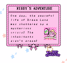
Did you play Kirby's Adventure? That game has 1 pixel wide font for story text and the menus and is *slightly* antialiased.

It's quite readable.

It's quite readable.
I have to agree with Jarhmander. It's easy to look at, and it doesn't feel tedious to read when there's less text on the screen at one time.
If one were to type out the Kirby story, it'd probably be TLDR material. In fact....
Okay, maybe not.
If one were to type out the Kirby story, it'd probably be TLDR material. In fact....
Quote:
One day, the peaceful life of Dream Land was shattered by a mysterious crisis! The inhabitants didn't dream! On the edge of Dream Land, dreams and hope once gushed from the Dream Spring, fueled by the Star Rod. Investigating the Dream Spring, Kirby found naughty King Dedede swimming in his magical waters! Dedede has broken the Star Rod and given the pieces to his friends, who are now hiding in Dream Land! To bring back the lost dreams, Kirby sought the Star Rod!
Okay, maybe not.