Here are some ideas about how the graphics will work on the NES.
jungle level:
bg palette 0:
black, dark brown, medium brown, yellow (for ground)
bg palette 1:
black, dark green, medium green, light green (for tree tiles not overlapping sky)
bg palette 2:
black, dark green, medium green, sky blue (for tree tiles overlapping sky)
bg palette 3:
black, dark red, dark pink, light pink (for flowers)
sprite palette 0:
black, brown, yellow (Kongs, bananas, barrels, bees)
sprite palette 1:
black, red, white (DK's tie and Diddy's shirt, 1up balloons, red bees)
sprite palette 2:
dark green, medium green, light green (kremlins, 2up balloons)
sprite palette 3:
black, dark grey, light grey (bouncing tires)
There are a couple of chinese DKC games for the NES.
Here's one of them.

Here is an NES sprite I made.
Looks good, but with up to 5 sprites in some scanlines the flickering will be intense! I usually allow myself to use up to 4 sprites horizontally per character/object, so that I can show at least 2 of them in the same scanlines without flickering. I do make exceptions for a couple of animation frames here and there, but only when extremely necessary.
The game I linked to looks pretty decent, and the sprites are a bit more cartoony (with outlines and flat colored areas), which might look better than pre-rendered 3D on the NES.
Your style is interesting though, I wonder what a full screen mock-up would look like.
It should be noted that DKC was released on Game Boy Color in 2000-ish. Since the NES and GBC have similar-looking graphics, I think an NES DKC would look just like the GBC version.
"How a game would look" depends on a lot more than just the platform. You also have to consider the year of the conversion, the company who's doing it, the deadline, and so on.
The GBC has considerably more colors and more palettes than the NES, so it definitely has the potential for better looking ports. However, many GBC developers didn't make good use of the resources, for whatever reason.
DKC on GBC is a really lazy port that obviously recycled the DKL engine with new elements that don't work. For example, the DKL games didn't have you jumping onto moving ropes, but DKC-GBC does, and if you try to roll jump onto a moving rope that is moving away from you, the character rolls through it!
Not to mention the control just feels loose in general. You're barely able to ride a rolling metal keg which was
easy enough on the SNES.
strat wrote:
Not to mention the control just feels loose in general. You're barely able to ride a rolling metal keg which was
easy enough on the SNES.
WTH is that web site?

YTMND is a web site where people can upload a still image (or animated GIF) and an accompanying audio file to make a simple web page. (See
Wikipedia's article about YTMND.)
As for this page: In DKC, the player can toss barrels and they roll. Metal kegs are like barrels that bounce off walls, and the player can toss one and jump on it to ride it. The image is a demonstration of riding a keg, combined with a
meme from Star Fox 64.
zz
tokumaru wrote:
There are a couple of chinese DKC games for the NES.
Here's one of them.
Is Hummer Team (the ones who developed that port) a Chinese company?
Bootleg Games Wikia's page on Hummer Team states that Hummer Team is based in Taiwan, "the other China".
Where your question obviously was "how would DKC look downported to the NES," and that question's already been answered with evidence of the Hong Kong versions, I couldn't help but think "how would DKC look if it had been originally developed for the NES.
My guess is that it would have looked very similar to
Mindscape's Conan, with monochromatic sprites, much smaller than the SNES sprites, but with fluid animation with a large number of frames per animation, but a much more limited possible number of animations.
EDIT: Sorry for the necropost as my first post. Hadn't expected a first page topic to be a year old.

M_Tee wrote:
Wow, that game is hideous! It's weird how they used wide pixels (like the pixels on the Commodore 64) for the background... maybe this was a cheap way to compress tiles to half their size, since it uses CHR-RAM (a quick look in a tile editor reveals some uncompressed low-resolution tiles though, so I'm not sure about this).
IMO, you should consider the developer of the game. Since the SNES DKC games were made by Rare, it's reasonable to assume that the NES version would also be made by them. One of their most famous games on the NES is Battletoads, which has detailed backgrounds and large, colorful sprites. They even overlaid sprites in order to make them look more colorful and give them more volume. They also went out of their way to implement all sorts of background effects, such as animation and parallax scrolling.
So, considering the history of the company developing the game, I imagine that a Donkey Kong Country developed by Rare for the NES would look nothing like this ugly Conan game, which has dull backgrounds and flat monochrome sprites. Tho only good thing about it are the smooth animations, but DKC doesn't need them THAT smooth.
tokumaru wrote:
M_Tee wrote:
Wow, that game is hideous! It's weird how they used wide pixels (like the pixels on the Commodore 64) for the background... maybe this was a cheap way to compress tiles to half their size, since it uses CHR-RAM (a quick look in a tile editor reveals some uncompressed low-resolution tiles though, so I'm not sure about this).
The graphics are straight out of this C64 game:
http://youtu.be/Ede0NkkMXH0
They look at lot better in that C64 version.
Perhaps that's because the graphics are actually a lot narrower on the C64.
With few exceptions, home computers and game consoles from the 240p era use dot clock rates that are simple fractions of the NTSC color subcarrier frequency of is f = 315/88 = 3.58 MHz. Different platforms used
different fractions, most of which produced noticeably non-square pixels. Apart from the Neo Geo and Nintendo 64, few 240p platforms attempted to closely approximate the frequency that produces square pixels, which Rec. 601 defines as 12/7 color burst, or 6.14 MHz. (The closest are Neo Geo and Nintendo 64.) So horizontal lines of the same pixel count will have different physical lengths on different platforms, and horizontal lines of the same physical length will have different pixel counts.
The C64 dot clock is 16/7 of NTSC color burst (8.18 MHz), while the NES dot clock is 3/2 of NTSC color burst (5.37 MHz). This slower clock makes NES pixels 52% wider: a horizontal line that's 32 pixels long on the C64 is as long as one that's 21 pixels wide on the NES. The Capcom CPS-1 and CPS-2 use a dot clock very close to that of the C64, which is why graphics in Street Fighter II games had to be redrawn narrower for the Super NES.
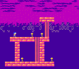
I imagine that using a single palette for the entire map certainly didn't help (seriously, look: blue, green, brownish yellow and gray).
It looked like a poorly colorized Game Boy Color game at first. Before seeing that I didn't know a NES game could even look so awful.
Sik wrote:
I imagine that using a single palette for the entire map certainly didn't help (seriously, look: blue, green, brownish yellow and gray).
It sometimes work ok though, like in The Immortal, and Solstice.
This game reeks of being a trashy port though, so I'm not surprised it looks like ass.

Everything except stonework (the house fronts, chimneys, well, and bridge) in
this sketch is one palette, and it appears to work:

It's not how many palettes you have; it's how you use 'em.
Drag wrote:
Sik wrote:
I imagine that using a single palette for the entire map certainly didn't help (seriously, look: blue, green, brownish yellow and gray).
It sometimes work ok though, like in The Immortal, and Solstice.
Oh damn, I never realized those games have 4 color backgrounds. Ironsword is another game that pulls it off, IMO. In all 3 games the high contrast between the single hue background and the colorful sprites looks really nice.
Not to toot my own horn or anything, but I did it too:

So it's not
impossible to use only 4 colors and still have a nice looking background. Hell, it's not even that
hard, that Conan game was just really bad at it.

The isometric games (Solstice and The Immortal) have a good reason to use a single palette: attribute block boundaries are completely misaligned with the level geometry.
Another understandable use for simplified attributes is when there are moving objects rendered as background tiles (i.e. software sprites), because there's a lot of tile animation involved and keeping the attribute data consistent might not be trivial.
Other than those 2 reasons, I can't think of a reason to be so cheap with background palettes. An unskilled programmer avoiding messing with the complexity of attribute tables? I could buy that, but attribute tables aren't THAT complicated, specially if there's no scrolling involved.
Could be the other extreme, an artist skilled enough that can get away making the entire environment with such a small set of colors. Depends on the scenery, but yeah (for example, if you're making a cave chances are you can get away with a few shades of brown for everything, since the entire cave could be pretty much rocks).
This, though...
This is where RGB makes things look far worse. The chroma blurring of composite helps a lot with a limited palette.
I'm pretty sure Wizards & Warriors I and II went the "single palette" way to make their levels. I don't know why they did that but they did.
Duplicate the same palette 4 times is the only way to meaningfully use the attribute table bytes as name table.

