While I'm tearing the sub forum up with posts, I thought I'd ask everyone a couple of questions.
You don't have to answer all of them, but any answers you can provide will help me!
What are you favorite NES games graphically? Ugliest Games? Any particular thing you dislike?
For example, I hate dithering. I think it usually looks like crap. I also tend to like cartoon looking games the best.
Ian A wrote:
While I'm tearing the sub forum up with posts, I thought I'd ask everyone a couple of questions.
You don't have to answer all of them, but any answers you can provide will help me!
What are you favorite NES games graphically? Ugliest Games? Any particular thing you dislike?
For example, I hate dithering. I think it usually looks like crap. I also tend to like cartoon looking games the best.
Try looking at Sunsoft's amazing graphics blending in Ufouria/Hebereke, and also look at how Dahrkdaiz's hacks pack a graphical punch, The NES may be lo-res, but shading via blending is best
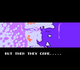
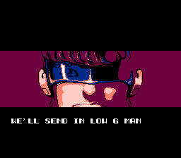
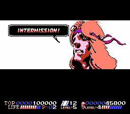
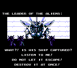
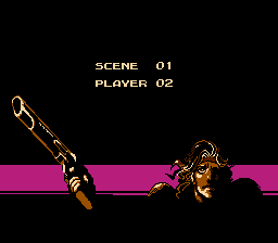
It is difficult to list all the favorite graphics, there are many games with good graphics to my taste, but without thinking too much I could name Batman and Solbrain/Shatterhand. Although these are japanese-made, and japanese artists usually avoids dithering, it used there a bit, in a good way.
Here are some games with graphics I really like:
Batman: Return of the Joker
Little Samson
Willow
I like these mostly because of their good use of color, which makes it look like the NES has more colors than it actually does. I like dithering when it's used well (i.e. no large areas of the same pattern repeated over and over).
I also like cartoony graphics a lot, but that's more common on the NES so I don't feel like listing anything in that category.
Graphics in NES games which I appreciate (read: the style and implementation works very well for the kind of game it is and/or impress me in general):
Batman: Return of the Joker
Battle of Olympus[1]
Blaster Master
Contra
Fester's Quest[7]
Fire 'n Ice
Gyruss
Magician
Megaman 1-3
Ninja Gaiden series
R.C. Pro Am
River City Ransom[2]
RoboWarrior
Shatterhand[3]
Solstice
Strider[4]
Super C
Super Dodge Ball[2]
Trojan[5]
Willow
Xexyz[6]
I almost added Power Blade 2 to the list, but the colour choice is fairly uniform, so I kept it off.
[1]: Sprites tend to blend in with the background, which is a downside, but the overall quality is NES-ish without being "old" (classic).
[2]: I love the "stubby" SD look, and the choice of matte ("flat") colours on sprites makes for an enjoyable, humorous overtone, and the contrast vs. the background really makes things stand out. Comparatively, I cannot stand the version of this game on the SFC; the graphics look horrible/stupid and remind me too much of Renegade (which I hate).
[3]: This one rates extremely high in my book. I can't really describe it; they're just really amazing graphics to me, everything looks great.
[4]: Graphics glitches aside (and there are many), the actual quality of the art fits the style of game very well.
[5]: Hard to explain. The backgrounds are nicely done (in my opinion), and the sprites are kept to matte colours to make them easily stand out from the background. So, similar to [2] but not quite.
[6]: Very uppity and cartoon-ish, kinda like Darius Twin.
[7]: Almost didn't put this on the list; had to think about it for a while, and figure it's worth mentioning. A lot of people hate this game and its graphics alike, however. What always amused me is how the title game implies it's going to be some silly comical game with simple graphics yet it's an adventure game with really rocking music.
Did someone remove my post? I realize it wasn't strictly about my favorite NES graphics, but I put some effort into it (graphic editing) and it's frustrating to see it taken down for being slightly off topic.

Which one? The interesting one about all kind of graphics about castlevania and other games? I would be surprised that your post would be removed. This would be quite unusual for nesdev since it was nes related.
Banshaku wrote:
Which one? The interesting one about all kind of graphics about castlevania and other games? I would be surprised that your post would be removed. This would be quite unusual for nesdev since it was nes related.
No, it was a reply to the OP about dithering. I explained that it's pretty ubiquitous and often useful, and linked some pictures from Little Samson to help illustrate, including this one that I edited to show how dithering adds texture. (Original game graphics on the right, they used dithering pretty effectively.)

I suppose maybe I never correctly submitted the post or it got eaten by the forum, but I was pretty sure I posted it.
Okay, I'll concede that dithering can look good. Maybe the only time I consciously notice it is when it's badly done, and everything has that grainy sand like textures.
@UncleSporky - You should post more in your 'graphic design of NES games' thread!
@Tokumaru - Good call on Willow. It has a pretty unique style.
@koitsu - Solid list! The annotations are really helpful. Most of those games have really good music as well. Coincidence?
Okay, time to study some videos.

The thing that looks bad to me is when the two colors being dithered are too different like #2. Trying to get too much out of three colors looks bad to me. I'd rather see a game that uses more of the palette (#1), or even use a hue that doesn't make sense (#3) over the sort of dithering in #2.
Though, this is all personal opinion

yeah, that makes sense, artists trying to get away with a little too much color blending.
Actually that's a very nice tree. Is it yours? I like how it doesn't use dithering on top, but the lower part does, showing the difference between direct sunlight and shadows under leaves.
Quote:
The thing that looks bad to me is when the two colors being dithered are too different like #2. Trying to get too out of three colors looks bad to me. I'd rather see a game that uses more of the palette (#1), or even use a hue that doesn't make sense (#3) over the sort of dithering in #2.
I'd say all 3 are fine as long as there is no block solid color, such as seen in many early NES games.
Here 1 is obviously the best, then comes 2 and 3 ex - eacho. If the three is in the BG, then 3 would probably work well, nobody will notice the "hue that doesn't make sense".
UncleSporky wrote:
Actually that's a very nice tree. Is it yours?
Thanks

Yep, I made it just for this example lol.
Bregalad wrote:
I'd say all 3 are fine as long as there is no block solid color, such as seen in many early NES games..
Yes, I suppose that's true

Don't forget Kirby's Adventure! Lots of gradients made from billowy cloudy material.
Batman and Strider both have great graphical choices, looking flat and shiny when needed, and rusty/stony when needed. NTSC artifacts help with the blending. Bionic Commando and Code Name: Viper also have great gritty stages and share cool character designs at the moment when enemies are killed.
Mario Bros., Clu Clu Land, Donkey Kong Jr.: Flat graphics but exceptional clarity. Primary colours and great-looking shiny "pipe" designs.
Mega Man 2: Much less blocky chaos than MM1; Much less blocky predictability than MM4-6. Crash Man's stage is cartoony but with a great beveled feeling of depth.
Shadow of the Ninja has fantastic shading and interesting light-sourcing in many stages.
This might turn into an endless list if I keep thinking about it...
My personal favorites:
Zelda II - Except for the castle bricks using the same patter for foreground and background, the backgrounds are varried and interesting. I also like the contrast between the more realistic looking backgrounds and the cartoony, flat-shadded sprites.
Metroid - Everything is dark, grimmey and foreboding. The palettes used have great varriet and contrast.
Crystalis - I love the consistentelly cartoony style, and how everything in tuat game, even the thouguest of dungeons, looks bright, happy and inviting. That said I think the color choices could have used a little more contrast, and the endless repetition of backgrounds gets tiresome.
It might not be a coincidence that I just ned the last three games I played through in order

I might be a little biased here.
Am I the only one that thinks the colors in Willow are a washed out nightmare? I mean seriously, there is hardly any contast at all.
qbradq wrote:
Am I the only one that thinks the colors in Willow are a washed out nightmare? I mean seriously, there is hardly any contast at all.
I'm inclined to agree somewhat. A game should still look playable if all hues of $x1-$xC are transformed to $x7, or if the TV's "color" knob (saturation) is dialed down to zero.
$01-$0C: halfway between $0F (black) and $00 (dark gray)
$11-$1C: very close to $00
$21-$2C: very close to $10 (light gray)
$31-$3C: halfway between $10 and $30 (white)
Man, I've checked out pretty much every game you guys listed and my head is starting to hurt. But I'm now more certain than ever if you gave me a screen shot of an NES game I could guess the year.
UncleSporky wrote:
...Actually that's a very nice tree...
You got me going on this one... So I did some more pixel art.
If I were to make an adventure game for the NES this is what it would probably look like:

cartlemmy wrote:
UncleSporky wrote:
...Actually that's a very nice tree...
You got me going on this one... So I did some more pixel art.
If I were to make an adventure game for the NES this is what it would probably look like:
wow! you're really talented, that looks great.
Dang cartlemmy! That's awesome! Now someone just needs to lick 8-way scrolling and bribe you

Would you take a little criticism? Or basically just some suggestions. I know you just did it for fun but hey why not.

There's nothing particularly wrong with the trees, I think they look great, but I wish the smaller trees matched the big one a bit better. It gets really dark near the bottom but the other trees stay light. It doesn't have dithering on top and has it at the bottom, but the small trees are kind of the opposite of that.
I think the green bush thing is a little too chaotic to be easily recognizable. Looks a bit like some kind of tiny alien creature to me, leading the advance of a horde of other tiny alien creatures. Sometimes round Zelda style bushes are ok, I think they would fit fine with your style.
I love the effect of using bigger pixel chunks to stipple the edges of grass and dirt, but I don't know if there's enough of it going on. The diagonals are a bit too regular for me (though I know you might do it that way to save on tiles).
And I think the water effect is a little too regular and square in places, looks a bit odd. Almost like it was larger and you squished it down by resizing it with a selector tool.
I made this to illustrate.

There are two slightly unique 16x16 tiles that will still tile next to each other perfectly on all four sides, just to break up the visible grid a bit. I just tiled them like a checkerboard.
UncleSporky wrote:
Would you take a little criticism...
Good eye UncleSporky

I actually took the bushes and the water from another project of mine (non-NES) where they were 20x20 tiles, and resized them to 16x16 without cleaning them up at all.
What you did with them looks great.
Ever tried
Rotsprite? It's really good at resizing and rotating sprites, it uses algorithms optimized for pixel art.
Dwedit wrote:
Ever tried
Rotsprite? It's a really good at resizing and rotating sprites, it uses algorithms optimized for pixel art.
I normally just nearest neighbor resize it (like above); then manually adjust it until it looks the way I like it (like I hadn't done above yet). But if there's an easier way it sounds good to me. Thanks.
EDIT: I just checked it out. The results are really impressive.
SECOND EDIT:
I went ahead and made some changes based on your recommendations (and actual modifications):

I have to agree with you it looks better this way.
This thread delivers!
@cartlemmey Damn! That looks awesome! (especially with UncleSporky's touch up!)
EDIT: Even better!
@BMF54123 I had never even heard of any of those games before. Kick master looks pretty awesome, though!
I have to admit this looks very good. Congratulations for your great work !
Dwedit wrote:
Ever tried
Rotsprite? It's really good at resizing and rotating sprites, it uses algorithms optimized for pixel art.
The connection has timed out
I tried the Wayback Machine, and "We were unable to get the robots.txt document to display this page."
I seem to remember reading before that it appears to be something like
Scale4x followed by nearest neighbor resampling. Is source code available, or does it work in Wine?
The link worked today, don't working right now.
RotSprite is closed-source and Windows-only. I'm working on rewriting it in Python based on
the algorithm's description.
I'm surprised no one mentioned the graphics from battletoads & Double Dragon The Ultimate Team.
that game has amazing graphics and coloring in various parts of the game. not to mention some of the best portraits for the end of level screens.
moon crystal looks fantastic too.
my all time favorite game graphically is the guardian legend for the fact that the backgrounds are not boring and the sprites are well done as well as least amount of flicker.
my two cents
TMNT 2+3 have some great graphics, how did I forget about that one I don't know...
Wizards & Warriors
Super Pitfall
Zelda II
All had unique art styles especially Wizards & Warriors. Super Pitfall is accused of being a Mario clone but it was actually staying true to the Tandy Coco3 and, for the most part, PC88 versions. Zelda II just seemed right. Less cartoony than its first outing.
One thing I wonder about later NES games is that they still didn't vary palettes between tiles in the large sprites they used. With stuff like MMC5 chips you think player sprites would be more colorful.


