I thought I would make a thread where I can look at different games and examine their graphics in some detail, maybe see what makes them tick, and why they might be appealing or not. I don't know how often I'll be doing this, or whether I'll be doing it more than once, but I thought it might be interesting/helpful.
Tonight I am going to look at Castlevania 3, because I found a page full of handy screenshots, and while they may not be pixel/color perfect they highlight the game's graphic design very well.
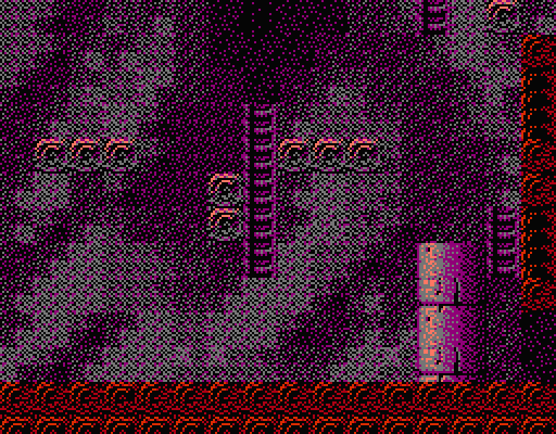
I always thought that Castlevania as a series on the NES looked very "busy," graphically crowded. They tried to cram in as much detail as possible with very limited graphical capabilities, and didn't always succeed.
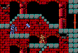
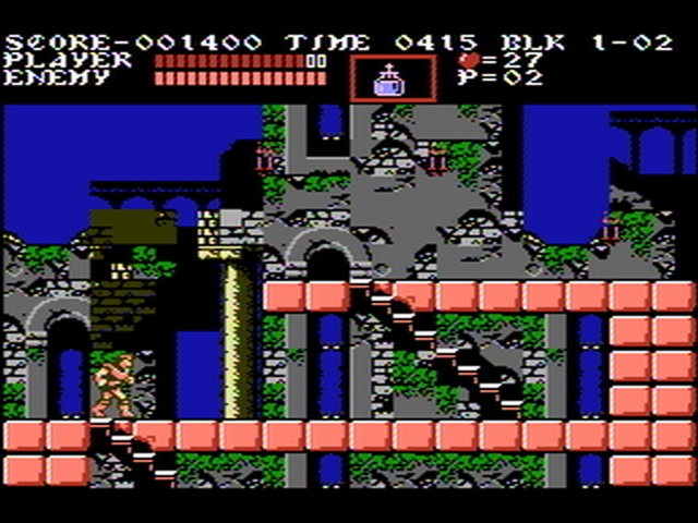
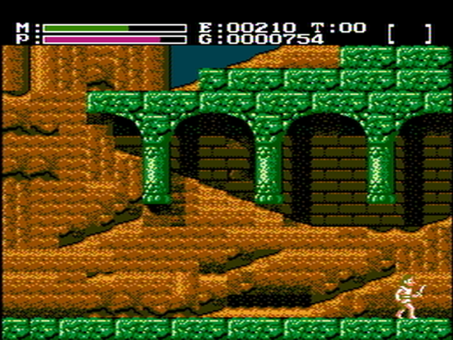
In the above screenshot you can quickly see some of their methods: for one, they generally highlighted walkable areas using blocks with a lot of contrast to everything else. This way they could fill in the rest of the background with whatever detail they wanted, in contrast to many platformers, where the walkable area connects to the ground and extends downwards. Castlevania's blocks are technically hovering in the air, but the background can show them as part of anything they want. It's as if there are foreground and background layers of architecture, as desired by the artist.
They also had no qualms about using tiles in the "wrong" way - that is, using an incomplete part of a graphic in order to give an overall affect they desired. Notice in the screen above that the left part of the arch only fully completes right behind Trevor (and in one other spot). Everywhere else, the arch just sort of ends next to the wall. This sort of thing always looked sloppy to me, but it is effective in making smaller arches and/or simplifying the necessary metagraphics.
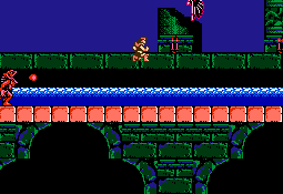
Similarly, notice how the higher bridge arches just end and don't look braced up too well, but it provides a great negative shape overall. Again, the bright salmon blocks clash with the rest of the scene, but give players necessary information about what is solid.
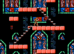
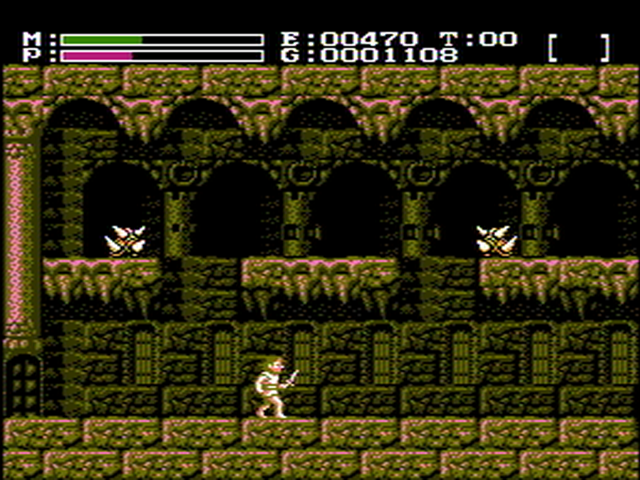
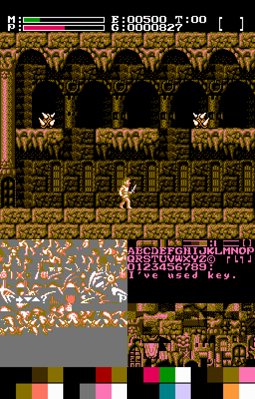
The stained glass windows are pretty nice, although the top half looks rather messy. The tiny stained glass windows however are really ugly (in my opinion). They're just small parts of the larger ones, which is logical for saving space but they have clearly been chopped up.
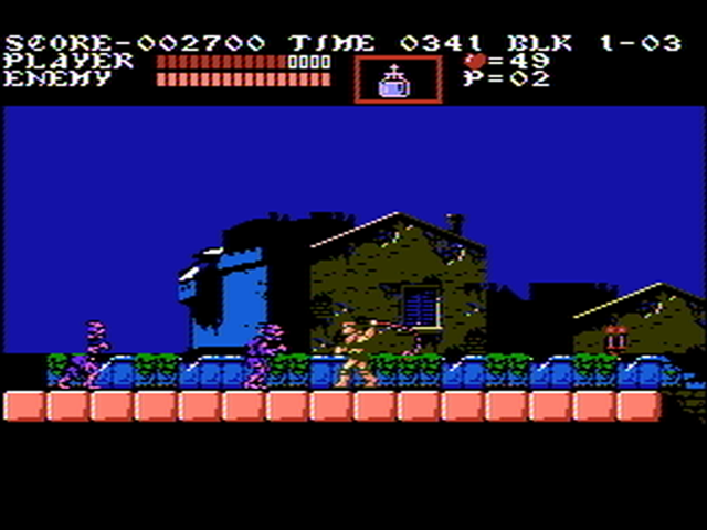
You will also notice the theme of using a black background color, which of course many NES games use for outlines and shadow. It may seem an obvious choice, but it's important to keep in mind other options - this is just one way to do it.
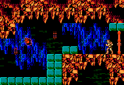
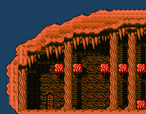
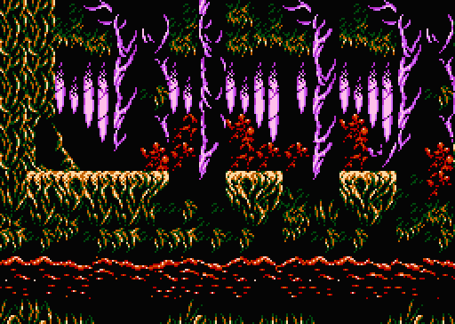
Hm, I guess they didn't always use blocks to show ground. Anyway, I really dislike this rocky wall/stalagtites. While it portrays a natural sort of chaos you might expect in a cavern, it's obviously made up of many small blocks with straight edges. Castlevania attempts too much realism without the capability to do it effectively.
Though to be honest, I don't notice a lot of this while playing. It's recognizable as what they intended it to be, and only really hard to look at on close examination.
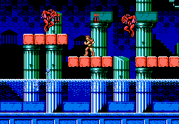
Speaking of close examination, this is the sort of scene I don't fully appreciate unless I'm looking at it like this. The pillars are quite striking and nicely aged, and the colors are well-chosen. I really like the water. I don't think I ever noticed the temples in the background before, they're easy to miss when it doesn't scroll on an independent layer and monsters are attacking you.
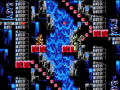
It's interesting how different NES games do the "waterfall in the background" graphic. Notice how they used a light blue in one of the background palettes to make the water appear to reflect off the pillars.
And look at how the pillars fade out under the platforms to show a deep shadow. It's not hard to use a technique like this in your own graphics to save on detailed tiles and give a scene more depth.
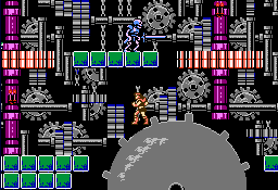
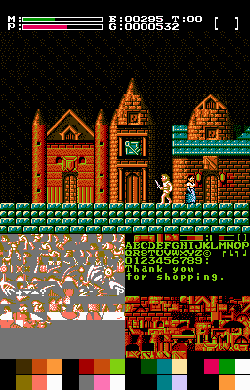
This scene is very busy (and a little too complicated for a clock tower) but it looks very impressive animated in the game. It's well worth seeing how it's put together by watching the PPU data. It's the second level, top path, I believe.
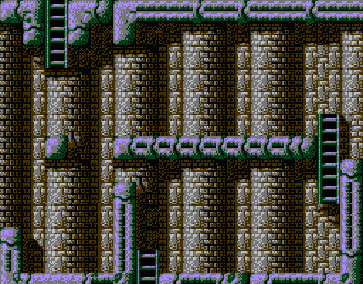
Also notice how the large gear is highlighted using a lot of smaller bits, that even make it seem to have a gritty metal texture.
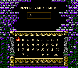
I always liked the design on the name entry screen. Good choice of colors, nice effect with the partly ruined brick wall and the vines. And it doesn't look too badly chopped up due to the tiles, either.
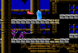
The haunted ship is nicely aged, though not too colorful. I was never a big fan of this part.
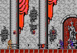
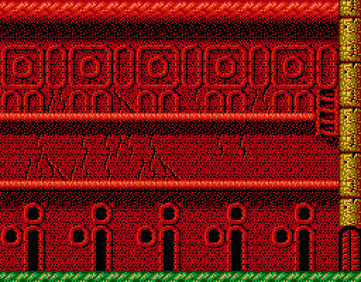
The remake of CV1's first level. Look at that first curtain - they just repeated the top part twice! And yet somehow, it doesn't look that terrible, if I squint I can buy that as folds in cloth...sort of. And the area of missing paint is repeated in the same way. It breaks the monotony of seeming the same pattern every time, but still sticks out to me as repeated data.
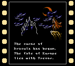
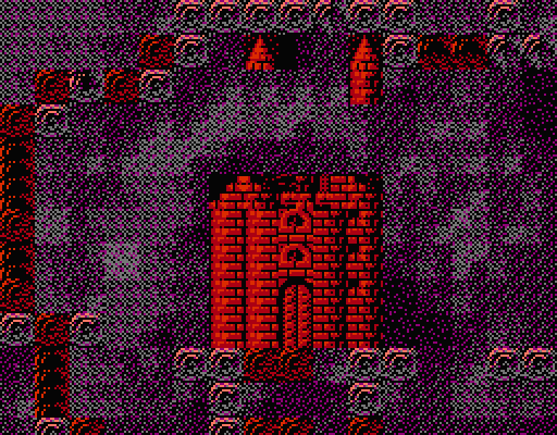
The intro has some nice use of graphics. You can see repeated data but none of it breaks against other graphics, everything fits. The highlighted castle looks especially cool, reminds me of a comic book.
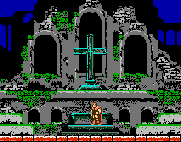
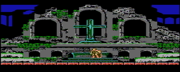
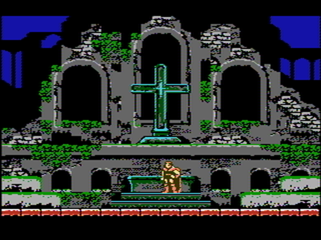
One of the first things you see when starting a game. I still think this is one of the better images you will see in a NES game. Composed like a work of art, balanced, and well-colored. From the shadows of the ruins, to the cross, to the moss and vines, it's a striking scene. If you look at it closely you can see how it was crafted carefully to also use repetition to save space as well. I don't know if I could do something like this, I would sooner go the easy stylized route of something like Mario 3 than attempt this.
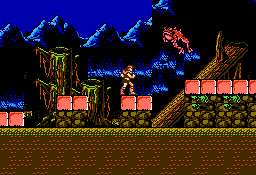
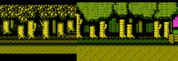
The moss is a bit too glowy but I like the dead tree graphics a lot. The mud doesn't fit well though, it reminds me of earlier generation games. The mountains look good until that strange split point where again we see graphics have been chopped.
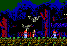
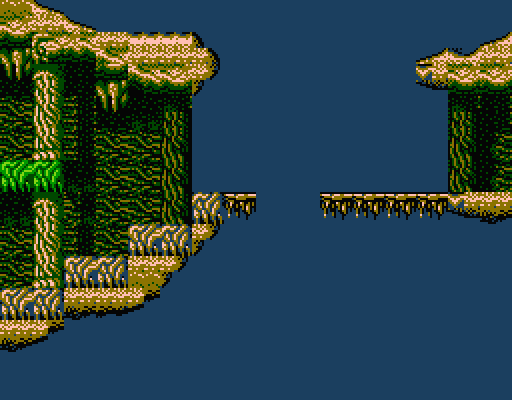
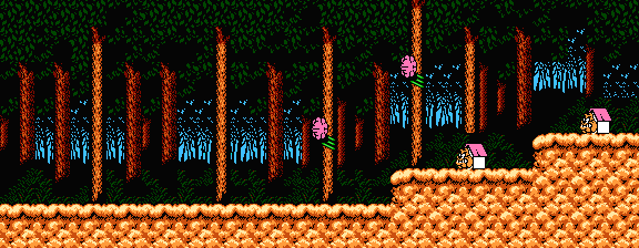
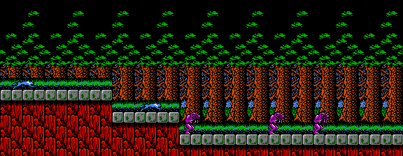
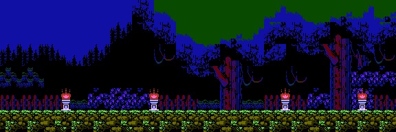
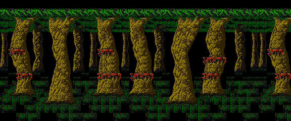
I always liked the look of the woods. I haven't said anything about the character/enemy graphics, but those owls are really well designed. The blue and red go together well to show both wood and darkness lit by the moon. Shadows are put to good use on the vines that just fade into darkness. The ground is a nice change from bright cubes. But again we see some straight edges up in the branches, and the green at the top sticks out a bit too much for me.
Well that was really long, I don't expect a detailed reply or anything, I just felt like looking over CV3 for fun. I think it would be quite difficult to design a game with graphics like this. It uses a complicated mapper and a lot of ROM to store all this data, and even then they had to cut a lot of corners. As I said, they decided to give us more of an overall impression of objects, even if it meant some graphics tiled strangely at times. Lots of dark images, lots of scratches and crumbling stone and aging. Hard to pull off on the NES, but they mostly succeeded.
Tonight I am going to look at Castlevania 3, because I found a page full of handy screenshots, and while they may not be pixel/color perfect they highlight the game's graphic design very well.
I always thought that Castlevania as a series on the NES looked very "busy," graphically crowded. They tried to cram in as much detail as possible with very limited graphical capabilities, and didn't always succeed.

In the above screenshot you can quickly see some of their methods: for one, they generally highlighted walkable areas using blocks with a lot of contrast to everything else. This way they could fill in the rest of the background with whatever detail they wanted, in contrast to many platformers, where the walkable area connects to the ground and extends downwards. Castlevania's blocks are technically hovering in the air, but the background can show them as part of anything they want. It's as if there are foreground and background layers of architecture, as desired by the artist.
They also had no qualms about using tiles in the "wrong" way - that is, using an incomplete part of a graphic in order to give an overall affect they desired. Notice in the screen above that the left part of the arch only fully completes right behind Trevor (and in one other spot). Everywhere else, the arch just sort of ends next to the wall. This sort of thing always looked sloppy to me, but it is effective in making smaller arches and/or simplifying the necessary metagraphics.

Similarly, notice how the higher bridge arches just end and don't look braced up too well, but it provides a great negative shape overall. Again, the bright salmon blocks clash with the rest of the scene, but give players necessary information about what is solid.

The stained glass windows are pretty nice, although the top half looks rather messy. The tiny stained glass windows however are really ugly (in my opinion). They're just small parts of the larger ones, which is logical for saving space but they have clearly been chopped up.
You will also notice the theme of using a black background color, which of course many NES games use for outlines and shadow. It may seem an obvious choice, but it's important to keep in mind other options - this is just one way to do it.

Hm, I guess they didn't always use blocks to show ground. Anyway, I really dislike this rocky wall/stalagtites. While it portrays a natural sort of chaos you might expect in a cavern, it's obviously made up of many small blocks with straight edges. Castlevania attempts too much realism without the capability to do it effectively.
Though to be honest, I don't notice a lot of this while playing. It's recognizable as what they intended it to be, and only really hard to look at on close examination.

Speaking of close examination, this is the sort of scene I don't fully appreciate unless I'm looking at it like this. The pillars are quite striking and nicely aged, and the colors are well-chosen. I really like the water. I don't think I ever noticed the temples in the background before, they're easy to miss when it doesn't scroll on an independent layer and monsters are attacking you.

It's interesting how different NES games do the "waterfall in the background" graphic. Notice how they used a light blue in one of the background palettes to make the water appear to reflect off the pillars.
And look at how the pillars fade out under the platforms to show a deep shadow. It's not hard to use a technique like this in your own graphics to save on detailed tiles and give a scene more depth.

This scene is very busy (and a little too complicated for a clock tower) but it looks very impressive animated in the game. It's well worth seeing how it's put together by watching the PPU data. It's the second level, top path, I believe.
Also notice how the large gear is highlighted using a lot of smaller bits, that even make it seem to have a gritty metal texture.

I always liked the design on the name entry screen. Good choice of colors, nice effect with the partly ruined brick wall and the vines. And it doesn't look too badly chopped up due to the tiles, either.

The haunted ship is nicely aged, though not too colorful. I was never a big fan of this part.

The remake of CV1's first level. Look at that first curtain - they just repeated the top part twice! And yet somehow, it doesn't look that terrible, if I squint I can buy that as folds in cloth...sort of. And the area of missing paint is repeated in the same way. It breaks the monotony of seeming the same pattern every time, but still sticks out to me as repeated data.

The intro has some nice use of graphics. You can see repeated data but none of it breaks against other graphics, everything fits. The highlighted castle looks especially cool, reminds me of a comic book.

One of the first things you see when starting a game. I still think this is one of the better images you will see in a NES game. Composed like a work of art, balanced, and well-colored. From the shadows of the ruins, to the cross, to the moss and vines, it's a striking scene. If you look at it closely you can see how it was crafted carefully to also use repetition to save space as well. I don't know if I could do something like this, I would sooner go the easy stylized route of something like Mario 3 than attempt this.

The moss is a bit too glowy but I like the dead tree graphics a lot. The mud doesn't fit well though, it reminds me of earlier generation games. The mountains look good until that strange split point where again we see graphics have been chopped.

I always liked the look of the woods. I haven't said anything about the character/enemy graphics, but those owls are really well designed. The blue and red go together well to show both wood and darkness lit by the moon. Shadows are put to good use on the vines that just fade into darkness. The ground is a nice change from bright cubes. But again we see some straight edges up in the branches, and the green at the top sticks out a bit too much for me.
Well that was really long, I don't expect a detailed reply or anything, I just felt like looking over CV3 for fun. I think it would be quite difficult to design a game with graphics like this. It uses a complicated mapper and a lot of ROM to store all this data, and even then they had to cut a lot of corners. As I said, they decided to give us more of an overall impression of objects, even if it meant some graphics tiled strangely at times. Lots of dark images, lots of scratches and crumbling stone and aging. Hard to pull off on the NES, but they mostly succeeded.
