Just looking for some opinions on the graphics I've been working on.
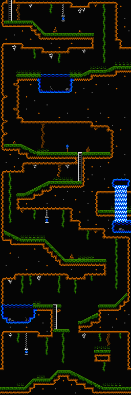
I'm not too happy with the rock columns in the cave tileset or the areas that are supposed to be solid dirt (the gray and brown rocks).
Jungle / Cave:Attachment:
 map02.png [ 20.38 KiB | Viewed 10625 times ]
Attachment:
 palj.PNG [ 2.04 KiB | Viewed 10625 times ]
Color 3 of sub-palettes 0,1, and 3 are unused.
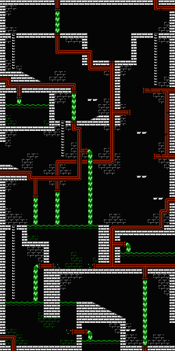
Sewer:Attachment:
 map0A.png [ 14.15 KiB | Viewed 10625 times ]
Attachment:
 pals.PNG [ 2.03 KiB | Viewed 10625 times ]
Color 3 of sub-palette 0 and all of sub-palette 3 is unused.
Colors 2D and 3D aren't present on all PPU revisions. They're on the composite (NTSC and PAL) PPUs but not the RGB PPU in the Famicom Titler, Famicom TV, and PlayChoice. In addition, a naive fade routine tends to turn these colors into color 0D, which causes some TVs' horizontal sync circuits to misbehave. Colors 00 and 10 should be more broadly compatible.
Thanks, I'll have to change those.
I think the dirt looks just fine, and the overall feel is fluid and organic.
With the solid rocks, the grey ones stand out quite a lot from the background and this telegraphs information, whether desired or not, to the player. I would expect them to perhaps shake loose and fall down as I approached. Either they should act as sprites, or the coloring should blend more with the background. With the brown rocks, they just look too much like the dirt and it breaks suspension of disbelief (why are their big boulders made of dirt), so here they should blend a bit more towards stone colors of grey.
The bricks in the second shot are maybe a bit too uniform. Maybe break a few of them, add vines occasionally or something, or if possible, use more than one tile to add even more variation like this. But here it depends on what feel you are going for, of course.
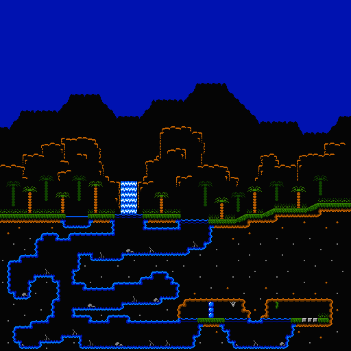
I've been trying to improve the background and sky line. This is a surface area of the cave tileset.
Attachment:
 map00.png [ 15.45 KiB | Viewed 2573 times ]

