The "Modern game logos are rubbish" thread inspired me to demake the DOOM logo for the NES. I'm always trying to remember to document things i draw, so i can learn from them at some later point or solidify the experience. But i stayed up all night so i kind of lost track in the end, so the snapshots got sparse in the late end. Anyway, this is a record of the progress i'm making. This OP will be updated in at least three parts. I'll probably do a more full writeup too, here or on the blog.
Goals:
-Make a BIG, screen filling DOOM logo
-also make it as detailed as possible
-which hopefully doesn't eat up all of char space halfway in the process
-and beats the modern iteration.
-keep it personal, just not a pixel for pixel true copy of the original.
-but stay true to the aesthetic
-Draw to find out if all this works
Progress:
Session one: Get things going - DONE
Session two: 'finish' the background layer. - DONE
Session three: Add coverup sprites, adjust bg layer to match. -DONE
Left to do:
Session four: software/hardware test, final touches. - NEXT
Post Session: Reflection and full writeup.
SESSION 1:
I started out with the premise that:
-To be able to conserve maximum amount of tiles, and be able to foresee possible reuse of tiles, Photoshop is out of the question. It can probably be done, but not by me. Drawing in NESST is optimal for this purpose, even if 'seeing the big picture' is a bit harder.
-When i draw a new tile, test where it can do double duty or more. I can add more detail later if there's space still available.
-That at least the 'holes' in D, O and O should be attribute aligned, and hopefully much else too, so that i could reuse patterns, and as a bonus make more out of the full palette.
Coming up with a bunch of ersatz tiles like this helps planning out the layout. I didn't bother with getting the angles right for the mid leg of the M, etc - it serves as a representation. This layout would work from an attribute grid perspective.
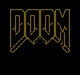
Adding the 3d angle made me aware that i had pinched the M by far too much in my objective to fit evything into the grid and at the same time keep it centered
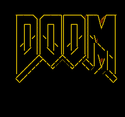
This remedied the pinching, at the cost of being off center. No problem, i'll just scroll it 8px left in code, eventually. This seems to be something i run into sometimes. The 'wrecking balls' logo had to be adjusted like this, too. The bottom of the M looks a little troublesome, but it's still using rough tiles, so i want do do something fun now.
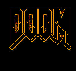
Adding a texture to the insides of D and reusing most of it for the first O. The intuitive way here is to draw in diagonal lines (like i first did the the '3d' effect on the upper right part of M), but i stopped myself there. I wanted to add something of a rough texture, which is hard to apply on top of lines. I can always add directional lines later if i want to; that's easy.

Beginning to fill in the letters was easier than i had anticipated. It required less tiles than i first thought, to name a thing. It felt a bit like drawing blocks for a level, so i leaned on that prior experience.
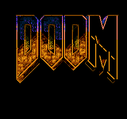
More fill work and a splash of colour. Attributes are beginning to show, especially on those attribute cells cut in half diagonally. This is where i'll put sprites to work, eventually. I will get away with precisely 8 sprites per scanline where needed.
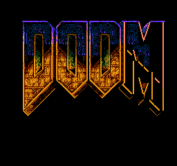
Filling in much of the blue. A bit too much, so it feels extremely noisy. Noise is okay, but this is too saturated with it. My plan from here is to roll back and have a little border/drop shadow effect to let it 'breathe'.
It is currently using $8C / #140 tiles, so it looks promising. It looks like i'll have plenty of room to fix the troublesome bottom part of M and will still have a handful of spares for nice touches
That's it for 'today'. I sat up all night in a manic rush.
===============================
Session 2:
===============================
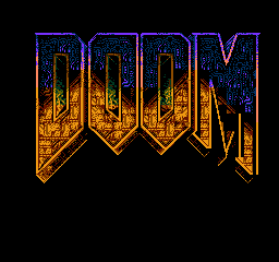
Getting diagonals right that aren't 45 degrees proved to be a pain in NESST. The mid leg got all wrong here. It was also around this time that i noticed that the v cut in the M was way too shallow. That could've been avoided if i was done withe the layout before starting on the actual graphics. This is where it's good to break out photoshop (after all!) and do a few angle measurements with the line tool.
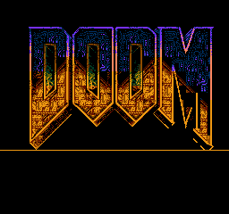
Speaking of 45 degree slopes. It proved geometrically impossible to get an even bottom line on the M without its right leg getting way under the base line. of the D. This is because is way broader than the other letters. Two things are different from the original logotype. Measuring it, it appears that all bottom slopes are approximately 37 degrees. The width of the letters are made to fit this number. I can't do that since i have the tile and attribute grid to mind, but i *could* convert all bases to 37 to get it more original like.
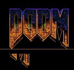
Skipping snapshot #11 as it is nearly identical to 12. I started to try on angling it differently. Ugh. It would of course look better if i rebased all of the letters and looked at it then, but 37 just isn't raster friendly. The pattern goes something like this: first pixel. diagonal pixel. on-level pixel. two more diagonal pixels. one more on-level pixel. And so on. It can of course be anti-aliased. But there's also the problem that non-diagonal tiles take more RAM space since there's need of more unique tiles. And i'm still not getting a smooth base line for the M, so no thanks. Moving on...

That's more like it. Given the limits, i think this is acceptable for the background layer. There's #$44 / #68 tiles to spare. That's more than enough for, say, a numeroalphabet and some luxury tiles to brush things up when it's time to do the final touches.
That's enough for the second session. Next things to do: aligning the picture and covering up attribute clashes with sprites.
===============================
Session 3:
===============================
At first, i was going to paint the sprites in NESST aswell and then manually fit them into place using .db statements, then adjust back in NESST, rinse and repeat. But it only took me a few minutes before i realized how slow (and worse - impacting on the end result) that would be. Besides, what's the point? I have 64 sprites at to my disposal*, and up to 256 patterns to use.
*well, one could multiplex their positions while rendering and get 128 or even up to 240 (still 8 per row) sprites on screen since the cpu isn't doing much else anyway... i got greedy and started opting for this.
So, time for photoshop. What i did was i ping-ponged between PS and NESST. Drawing some sprites, oh - the background should look this way instead to help - over to nesst. export. import in ps. back and forth. It'd be a bit convoluted and and probably wearing to include all the iterations. They don't tell me that much in hindsight anyway. Here's a distillate:
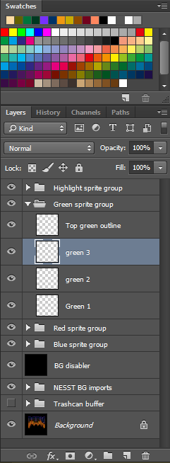
This is hopefully a good overview. Keeping sprite tiles in separate layers is good not just for toggling on/off and moving them without using Marquee, but especially for controlling how how they are cut into 8x8 entities when converted to a pattern binary (i use NESST for this). I didn't need to keep literally every sprite in a separate layer, though - only keep them separate enough to for the optimization to work. All that are aligned to grid are in one layer. All that can count as one sprite if cut off-grid gets its own layer for separate export. Some others still get layers so they can be toggled. Besides, i have the terrible habit to forget which layer i'm working in all the time. Keeping the count less meticulous means less mistakes that needs to be corrected.
Another method for making 8x8 tiles out of a canvas is the good old slice tool, but partial exports to NESST supercedes it because it can also generate metasprite data for me if i need to.
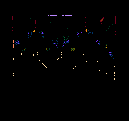
Here's all sprites in place.
The grid feature is super handy for this. Toggling visibility back and forth via ctrl+' is a breeze. For toggling between 16 and 8px grid, it's ctrl+k, grid tab, subdivide by 2. After a while, I hotkeyed opening the grid tab to ctrl+<.
Almost all sprites are aligned to the 8px grid for convenience, except a few where i could get more coverage per scanline otherwise. For placing them in code, that means i all i need to know is which grid position the sprite has (a quick look suffices) and then muliply that by 8.

Here's the composited result. It took a lot of bouncing between PS and NESST (editing the background when sprite drawing made me aware of things i wanted to change).
There's still 60 or 3C unused bg tiles in there.
1 sprite colour is left unused, too; in the 'highlight' subpalette.
I am way overtracing the 64 sprite limit which means the sprites HAVE to be multiplexed (if that's the correct term).
What's still left:
-Adding sprites in software (this is all photoshop and nesst so far)
-Hardware test
-The very final touches, if needed
-Figuring out if it's done or if there's some use for it
-Write some final thoughts
Goals:
-Make a BIG, screen filling DOOM logo
-also make it as detailed as possible
-which hopefully doesn't eat up all of char space halfway in the process
-and beats the modern iteration.
-keep it personal, just not a pixel for pixel true copy of the original.
-but stay true to the aesthetic
-Draw to find out if all this works
Progress:
Session one: Get things going - DONE
Session two: 'finish' the background layer. - DONE
Session three: Add coverup sprites, adjust bg layer to match. -DONE
Left to do:
Session four: software/hardware test, final touches. - NEXT
Post Session: Reflection and full writeup.
SESSION 1:
I started out with the premise that:
-To be able to conserve maximum amount of tiles, and be able to foresee possible reuse of tiles, Photoshop is out of the question. It can probably be done, but not by me. Drawing in NESST is optimal for this purpose, even if 'seeing the big picture' is a bit harder.
-When i draw a new tile, test where it can do double duty or more. I can add more detail later if there's space still available.
-That at least the 'holes' in D, O and O should be attribute aligned, and hopefully much else too, so that i could reuse patterns, and as a bonus make more out of the full palette.

Coming up with a bunch of ersatz tiles like this helps planning out the layout. I didn't bother with getting the angles right for the mid leg of the M, etc - it serves as a representation. This layout would work from an attribute grid perspective.

Adding the 3d angle made me aware that i had pinched the M by far too much in my objective to fit evything into the grid and at the same time keep it centered

This remedied the pinching, at the cost of being off center. No problem, i'll just scroll it 8px left in code, eventually. This seems to be something i run into sometimes. The 'wrecking balls' logo had to be adjusted like this, too. The bottom of the M looks a little troublesome, but it's still using rough tiles, so i want do do something fun now.

Adding a texture to the insides of D and reusing most of it for the first O. The intuitive way here is to draw in diagonal lines (like i first did the the '3d' effect on the upper right part of M), but i stopped myself there. I wanted to add something of a rough texture, which is hard to apply on top of lines. I can always add directional lines later if i want to; that's easy.

Beginning to fill in the letters was easier than i had anticipated. It required less tiles than i first thought, to name a thing. It felt a bit like drawing blocks for a level, so i leaned on that prior experience.

More fill work and a splash of colour. Attributes are beginning to show, especially on those attribute cells cut in half diagonally. This is where i'll put sprites to work, eventually. I will get away with precisely 8 sprites per scanline where needed.

Filling in much of the blue. A bit too much, so it feels extremely noisy. Noise is okay, but this is too saturated with it. My plan from here is to roll back and have a little border/drop shadow effect to let it 'breathe'.
It is currently using $8C / #140 tiles, so it looks promising. It looks like i'll have plenty of room to fix the troublesome bottom part of M and will still have a handful of spares for nice touches
That's it for 'today'. I sat up all night in a manic rush.
===============================
Session 2:
===============================

Getting diagonals right that aren't 45 degrees proved to be a pain in NESST. The mid leg got all wrong here. It was also around this time that i noticed that the v cut in the M was way too shallow. That could've been avoided if i was done withe the layout before starting on the actual graphics. This is where it's good to break out photoshop (after all!) and do a few angle measurements with the line tool.

Speaking of 45 degree slopes. It proved geometrically impossible to get an even bottom line on the M without its right leg getting way under the base line. of the D. This is because is way broader than the other letters. Two things are different from the original logotype. Measuring it, it appears that all bottom slopes are approximately 37 degrees. The width of the letters are made to fit this number. I can't do that since i have the tile and attribute grid to mind, but i *could* convert all bases to 37 to get it more original like.

Skipping snapshot #11 as it is nearly identical to 12. I started to try on angling it differently. Ugh. It would of course look better if i rebased all of the letters and looked at it then, but 37 just isn't raster friendly. The pattern goes something like this: first pixel. diagonal pixel. on-level pixel. two more diagonal pixels. one more on-level pixel. And so on. It can of course be anti-aliased. But there's also the problem that non-diagonal tiles take more RAM space since there's need of more unique tiles. And i'm still not getting a smooth base line for the M, so no thanks. Moving on...

That's more like it. Given the limits, i think this is acceptable for the background layer. There's #$44 / #68 tiles to spare. That's more than enough for, say, a numeroalphabet and some luxury tiles to brush things up when it's time to do the final touches.
That's enough for the second session. Next things to do: aligning the picture and covering up attribute clashes with sprites.
===============================
Session 3:
===============================
At first, i was going to paint the sprites in NESST aswell and then manually fit them into place using .db statements, then adjust back in NESST, rinse and repeat. But it only took me a few minutes before i realized how slow (and worse - impacting on the end result) that would be. Besides, what's the point? I have 64 sprites at to my disposal*, and up to 256 patterns to use.
*well, one could multiplex their positions while rendering and get 128 or even up to 240 (still 8 per row) sprites on screen since the cpu isn't doing much else anyway... i got greedy and started opting for this.
So, time for photoshop. What i did was i ping-ponged between PS and NESST. Drawing some sprites, oh - the background should look this way instead to help - over to nesst. export. import in ps. back and forth. It'd be a bit convoluted and and probably wearing to include all the iterations. They don't tell me that much in hindsight anyway. Here's a distillate:

This is hopefully a good overview. Keeping sprite tiles in separate layers is good not just for toggling on/off and moving them without using Marquee, but especially for controlling how how they are cut into 8x8 entities when converted to a pattern binary (i use NESST for this). I didn't need to keep literally every sprite in a separate layer, though - only keep them separate enough to for the optimization to work. All that are aligned to grid are in one layer. All that can count as one sprite if cut off-grid gets its own layer for separate export. Some others still get layers so they can be toggled. Besides, i have the terrible habit to forget which layer i'm working in all the time. Keeping the count less meticulous means less mistakes that needs to be corrected.
Another method for making 8x8 tiles out of a canvas is the good old slice tool, but partial exports to NESST supercedes it because it can also generate metasprite data for me if i need to.
Here's all sprites in place.
The grid feature is super handy for this. Toggling visibility back and forth via ctrl+' is a breeze. For toggling between 16 and 8px grid, it's ctrl+k, grid tab, subdivide by 2. After a while, I hotkeyed opening the grid tab to ctrl+<.
Almost all sprites are aligned to the 8px grid for convenience, except a few where i could get more coverage per scanline otherwise. For placing them in code, that means i all i need to know is which grid position the sprite has (a quick look suffices) and then muliply that by 8.

Here's the composited result. It took a lot of bouncing between PS and NESST (editing the background when sprite drawing made me aware of things i wanted to change).
There's still 60 or 3C unused bg tiles in there.
1 sprite colour is left unused, too; in the 'highlight' subpalette.
I am way overtracing the 64 sprite limit which means the sprites HAVE to be multiplexed (if that's the correct term).
What's still left:
-Adding sprites in software (this is all photoshop and nesst so far)
-Hardware test
-The very final touches, if needed
-Figuring out if it's done or if there's some use for it
-Write some final thoughts