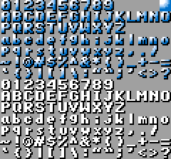
I was bored and thought I'd draw something, but it ended up being a major pain in the ass. The way I made it is I made the font on the bottom, deleted the white in it, and then put it over the pattern in the top right. I'm not completely satisfied, but I think it looks good enough. I don't think I've actually seen any game have a gradient like that on the text, the closest I can think of is SF2 that has the gradient going diagonal. I could have made the gradient go out in a better circle, but it looked really awkward in spots. I didn't actually modify anything after laying it.
Attachment:
 Text.png [ 2.41 KiB | Viewed 4943 times ]
Man, if every aspect of what I'm trying to make has as much effort put into something as unimportant as the font, I'll end up making the best game ever.

How do you intend to display this in game? Using sprite overlays won't work very well if you have more than 8 characters on a line unfortunately :/.
Espozo does SNES dev, not NES dev.
Yeah, I had been told to put art related stuff here, even if it is for the SNES. Really, this (as well as just about anything else) is for any system that's capable enough to reasonably display it.
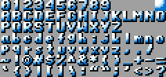
I think I found out why I didn't really like what I had done: The color ramp is too long. I got rid of the second closest color to white and replaced it with white, and then I adjusted the middle color to where it is a little closer to the color above it than below it in terms of brightness. I think this is much better:
Attachment:
 Better Text.png [ 1.45 KiB | Viewed 4799 times ]
ObNES: Two 2bpp versions. What do they lose?
Espozo wrote:
I was bored and thought I'd draw something, but it ended up being a major pain in the ass. The way I made it is I made the font on the bottom, deleted the white in it, and then put it over the pattern in the top right. I'm not completely satisfied, but I think it looks good enough.
It does look pretty good (and yeah, making effects like this is a pain in the ass).
Espozo wrote:
I don't think I've actually seen any game have a gradient like that on the text
I had remembered seeing some sort of comment about this style used in a game on
NFG's Arcade Font Tool; turns out it was DoDonPachi that had the comment about this style. Battle Bakraid seems to have a similar style as well.
tepples wrote:
ObNES: Two 2bpp versions. What do they lose?
Not a whole lot. They seem to adapt well to your changes.
On the SNES it sounds very wastefully to not use a 2BP layer for the font. I guess it depends on which more you are, but assuming you're using mode 1, you really want to put your font on the last BG in order to reduce VRAM usage. Well some games like DQ6 actually uses the high color layers for the font even though it's monochrome, so maybe this somehow made sense for them ?
I'm really not a fan of using up a whole BG for a few characters. Because I predominately want to use 16x16 and 32x32 sized sprites, I've thought of a system where instead of changing sprite tile numbers, you just update the tile data itself. Most games even have information stacked on top of itself, so if you had a score bar with 8 digits, that's 4 sprites, and you still got the 8 8x8 tiles on top. This system takes up both less sprites and almost always less tiles. The only disadvantage is using VBlank time to update the tile data, but this is hardly anything, as you only need to update what has changed from the previous frame.
Even if I were using BG 3 for the score board, I'd use HDMA to make a vertical gradient. I showed how you can pretty much recreate the Metal Slug scoreboard.
Espozo wrote:
I'm really not a fan of using up a whole BG for a few characters. Because I predominately want to use 16x16 and 32x32 sized sprites, I've thought of a system where instead of changing sprite tile numbers, you just update the tile data itself.
That also gives you a chance to use a variable-width font. Some test patterns in the NES version of the 240p Test Suite use proportional text in a sprite status bar.
Quote:
Most games even have information stacked on top of itself, so if you had a score bar with 8 digits, that's 4 sprites, and you still got the 8 8x8 tiles on top. This system takes up both less sprites and almost always less tiles. The only disadvantage is using VBlank time to update the tile data, but this is hardly anything, as you only need to update what has changed from the previous frame.
That and it takes up some of the 16K dedicated to sprites, whereas the tiles for a BG3 scoreboard can be placed outside that area.
There's the option of using BG3 as a far background, but with the HUD placed in the sky area. You can also put clouds on BG2, and any part of BG2 sticking out over the clouds can use sprites.
Espozo wrote:
I'm really not a fan of using up a whole BG for a few characters.
Neither am I, but this is just the typical SNES way to do things. You don't have to do that if you don't like it.
Quote:
Even if I were using BG 3 for the score board, I'd use HDMA to make a vertical gradient. I showed how you can pretty much recreate the Metal Slug scoreboard.
Sounds like a good idea to me as well. Using sprites is a good idea to, but then what do you use the BG3 for ? Very unimportant background, or special lighting effects ? Also, keep in mind the SNES can only output 32 8x8 sprites per line and that all bigger sprites are internally converted to 8x8 sprites. This is a pretty serious limitation if you want a HUD with sprites and it takes the whole screen horizontally, a couple of any additional sprites and they'll already start to disappear. If only part of the screen is used for a HUD then it's fine.
Bregalad wrote:
what do you use the BG3 for ? Very unimportant background
BG3 definitely isn't BG1 or 2, but it can still look very good in the right hands. Just look at Donkey Kong Country:


Bregalad wrote:
If only part of the screen is used for a HUD then it's fine.
I mean, this is mainly how it goes. I actually just created a mockup HUD for the heck of it. (There'd be more information in a real game like lives, but I'd have them on top of that stuff.) I always think it's funny how vertical shooters almost always put the HUD on the top of the screen, when the majority of the action is on the top of the screen but there's almost always nothing on the bottom. The HUD takes up 24 of 34 tiles horizontally, which isn't bad because if I were to use it for a vertical shooter, 90% of enemies never even reach this far down the screen because they're either dead or have turned around. It's pretty unlikely you'll be that far down the screen either, and you could even make it to where you can't be.
Attachment:
 Scoreboard.png [ 796 Bytes | Viewed 4661 times ]
I took the edit that tepples made and resized it to 8x8. I think it looks good, but now the rest of the scene needs some work.
Well, that is a heavily shaded font on top of mostly flat graphics, the styles do clash quite a bit. The large trees are the biggest offenders when it comes to lack of shading, considering that even the small trees have highlights at the top.
Against a black background the darker parts of the shading are a little hard to read.
Also, characters with descenders ('p', 'g') look really weird and unbalanced here (see: "happen", "night") because they're too tall. Those are notoriously hard to get right but I think you could improve them here.
If you're using both shadows and descenders, you may want to make the capitals 6 pixels tall.
Top left: underlying black-and-white image
Top right: 3bpp
Bottom left: 2bpp without shadow
Bottom right: 2bpp with shadow
I've reordered the encoding to ASCII, and in each, rows 7 and 8 are the lowercase with some glyphs slightly enlarged for readability.
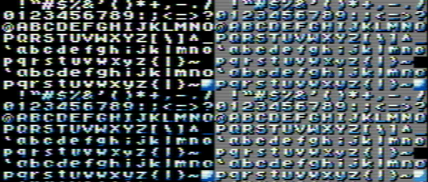
I always think it's important to consider the corruption of a font under the system's signal generation. It can make a big difference in legibility. Here's
Blargg's NTSC filter applied to tepples' example.
Attachment:
 shaded_font_ntsc_filter.png [ 145.81 KiB | Viewed 1363 times ]
