Character appearance in Tennis, Soccer, and Kung Fu

This is an archive of a topic from NESdev BBS, taken in mid-October 2019 before a server upgrade.
View original topic
Character appearance in Tennis, Soccer, and Kung Fu
by on (#178409)
Here's my attempt to recap only the productive parts of a previous topic that got unfortunately polluted with dramatic garbage.

Observations

DRW observed that the player characters in NES launch titles Tennis and Soccer share a distinctive art style. I can try to characterize it as dark-medium-skin palette, no outlines, more or less realistic ratios among head, torso, and limbs, a 1-pixel eye, a 1-pixel nose, and no mouth. In particular, they're a lot less stubby than the smaller characters in games like Donkey Kong, Ice Climber, and Balloon Fight. Nor do other early games, such as Urban Champion and Super Mario Bros., share this exact style, though they share some elements of it. And by Pro Wrestling, outlines had started to become common. (See comparison screenshots in post 178325, as well as homebrew characters in a similar style such as Daffle and Amy.)

But the appearance of Thomas in Kung Fu resembles a redrawn version of the Tennis and Soccer characters more than that of the arcade game Kung Fu Master from which it was ported, itself a video game adaptation of the film Wheels on Meals starring Jackie Chan.

Outlines became more common later. Compare Super Mario Bros. to Super Mario Bros. 3 or Donkey Kong for NES to its 1994 expanded remake for Game Boy.

And to make it clear, I'm not referring to box art.

Questions

Why do Soccer, Tennis, Baseball, and Kung Fu share an art style that other NES launch games don't? Did they share artists?

Why weren't outlines used early on?

Are there other aspects not yet mentioned that distinguish the art style in these games in particular from that in other games?

Why was Thomas in Kung Fu changed so much?

Have any of the people who worked on these games mentioned the rationale behind this art style? Whom would it be most productive to contact, and how could we phrase such an inquiry most effectively?

Speculation

Perhaps Nintendo wanted to distance the NES launch lineup from what was seen on pre-Crash consoles by not using the 1-pixel-wide limbs common in Atari 2600 and Intellivision games. So it used the stubby style similar to that of Mario in Donkey Kong for Villager in Balloon Fight and Popo in Ice Climber, whose heights are close to Mario's. But because the characters in Tennis and Soccer are taller than all three and Mario and wearing less bulky clothes than Popo, there's more room for realistically proportioned limbs.

Early games may not have used outlines because artists were still adapting to three colors, up from one or two on second-gen platforms, and non-black backgrounds.

Perhaps Kung Fu looks like Tennis because IREM didn't want to have to pay for Chan's personality rights on the console version.

Now might be the best time to ask Nintendo about this, just before the release of the forthcoming NES mini and before the artists pass away. The Japanese headquarters might have better answers than Nintendo of America, so we might need to get a Japanese speaker involved. A couple of koitsu's Twitter friends might know whom to ask.


EDIT: Corrected actor name
Re: Character appearance in Tennis, Soccer, and Kung Fu
by on (#178412)
As far as common features of early NES games goes, here are two that I noticed years ago:

This font:
Attachment:
arcade_font.png
arcade_font.png [ 1.31 KiB | Viewed 4793 times ]


This walk cycle:
Attachment:
walkcycles.png
walkcycles.png [ 5.66 KiB | Viewed 4793 times ]


The most mundane (and therefore most likely) explanation is that various artists saw early examples of what "good graphics" looked like on the NES, as far as clarity and functionality were concerned, and just copied from those examples. That would probably explain the art styles in Kung-fu, Tennis, Soccer, etc. I'm personally a fan of the no-outlines art style of early NES games, but I also like painterly art. :)

Edit: For information purposes, that arcade font seems to originate from Atari, and the 0 originally had a slash through it. A 6-frame version of the walk cycle can be found in the arcade version of Mario Bros, though I'm sure there's earlier examples of it floating around somewhere.
Re: Character appearance in Tennis, Soccer, and Kung Fu
by on (#178416)
tepples wrote:
itself a video game adaptation of the film Wheels on Meals starring Bruce Lee.

It's Jacky Chan though. As far as I know Irem only secured the right to the film in Japan, thus it was called Spartan X after the name of the film in Japan, and renamed Kung Fu Master in overseas versions.
The Famicom version was still called Spartan X though, so the theory that they redesigned the character to remove connection to the movie didn't seem legit. As to why they dropped the 'Master' in the title in the overseas carts, then it beats me. Maybe they thought Thomas in the home version was not 'Master' enough? :roll: Or, more likely, it was easier to hackconvert the original title Spartan X to the shorter title because of name table/space constraints.
Re: Character appearance in Tennis, Soccer, and Kung Fu
by on (#178417)
Purely speculation here (I've wondered this myself) but here's my two cents:

Early on, I don't think artists had access to the same tools we have today. Sprites were often drawn on grid paper and then transposed into data pixel-by-pixel by a programmer. When drawing sprites like this, it's much easier to create a design using big, blocky chunks instead of filling in outlines. Look at Mario's face in that image I showed. Once you start adding in lots of pixel-level details things start getting pretty cluttered.

Another theory: Early pixel artists prioritized the number of colors in a sprite more than graphical detail. It's easier to create a clear design when you have 3 colors to work with. Contrast Donkey Kong Mario and SMB3 Mario. The former has 3 colors to clearly separate his skin, overalls and shirt. The latter design has outlines, but had to sacrifice the blue overalls as a result.

Also, it goes without saying, outlineless sprites work best when you can predict the color of the background. For most games, this was black. For sports games, it was usually green. This is fine and dandy for single-screen games like Kung Fu and Tennis, but you start to introduce problems once game worlds become bigger. An outlined character like Megaman can have virtually any palette and be put in front of any colored background. In contrast, SMB1 Mario could not be put against dark green, orange, red or white without bleeding into the background. But not a problem, since the scope of the game was more limited.

Finally, I'm not an authority on this, but I imagine the quality of televisions got better near the end of the NES's lifespan. Bold, outline-less sprites don't look too great, but they hold up a lot better once you start throwing in NTSC artifacts.
Re: Character appearance in Tennis, Soccer, and Kung Fu
by on (#178420)
@Gilbert
:oops: Thank you for the correction.

I guess by the time of Jackie Chan's Action Kung Fu, console game budgets had risen to where Hudson Soft could afford Mr. Chan.

@DragonDePlatino
I guess that's what the programmer was going on about with "tracing holes" (ana wo nazoru) in the rant hidden in the PRG ROM of Pachi Com.
Re: Character appearance in Tennis, Soccer, and Kung Fu
by on (#178421)
That's only assuming that the sprite palettes are static and cannot change, and while that might be true for certain arcade machines, the NES lets you redefine the palette at runtime. Basically, if you know the background palette of one scene is going to conflict with the sprites, you have two options: 1) cleverly craft the scene so the player is always in front of non-conflicting background elements, 2) have that scene use a slightly tweaked sprite palette. For example, SMB3 gives the player a blue outline in dark/cave stages.

This doesn't apply as much, but SML2 goes through the trouble of using an entirely different sprite sheet for dark stages.

Either way, it's just pros and cons, and this particular art style might not even have that much reasoning behind it; What if it's only by chance that the artist happened to design the graphics this way, and everyone thought it looked good and copied the style? It's funny to think that we may be trying to extrapolate meaning behind design choices, when there wasn't actually any meaning to begin with. :P
Re: Character appearance in Tennis, Soccer, and Kung Fu
by on (#178425)
Drag wrote:
This font:
arcade_font.png
Image

Unlike human heads, 8x8 1-bit text fonts have a lot of non-arbitrary constraints. If you start with particular goals there really are very few ways to draw a lot of characters. A lot of the features are just dictated by your goals. Example goals for this font might be:
  • Vertical strokes are 2 pixels wide (for better legibility on NTSC + CRT perhaps?)
  • Horizontal strokes in the middle of letters are consistent (i.e. height of line in A, B, E, F, G, H, match)
  • Horizontally symmetrical characters with a centre stroke need to be offset with one blank column of pixels (I, Y, T)
  • Capital letters only

When you get down to it, most of the characters are going to come out the same or almost the same no matter who is drawing them, or whether they used another font as a reference or not. This is not like drawing a human figure where you can arbitrarily change body proportion, omit eyes or nose if you like, etc. In a font you must have spaces in certain places and you must have lines in certain places or the character will not be recognizable or legible; with only 8 lines there's only so many places you can put them.

This particular one only has a few characters that I think are distinctive:
  • S - shortened upper portion
  • R - strange unbalanced shape of the hole
  • 0 - diagonal hole
  • 8 - thick stroke crossing over top of a thinned stroke
  • J - unusually low height of the hook
  • X - "fat" lines

The rest of the characters look like more common choices to me, for a font under these constraints. When you add up all the distinctive characters, eventually a font becomes distinctive, but a lot of the individual ones end up being fairly common. Lowercase characters tend to have a lot more variation than the capitals as well, but so many of these fonts are capitals only.
Re: Character appearance in Tennis, Soccer, and Kung Fu
by on (#178427)
rainwarrior wrote:
Unlike human heads, 8x8 1-bit text fonts have a lot of non-arbitrary constraints. If you start with particular goals there really are very few ways to draw a lot of characters.

I thought you or someone else claimed this before, which inspired me to start my collection.

Quote:
A lot of the features are just dictated by your goals. Example goals for this font might be

Susan Kare of Apple took similar goals and came up with a very different design called Chicago. My 8x8 rendition of Chicago is shown in the collection, under the title "Who's Cuter". So did whoever at Commodore came up with the font included in the C64 KERNAL.
Re: Character appearance in Tennis, Soccer, and Kung Fu
by on (#178434)
Correct me if I'm wrong, but didn't Nintendo have a really primitive hardware rig set up for their early games? I seem to recall seeing old photos of this setup floating around, a while back.

Keeping things simple would have been advantageous, in this case.
Re: Character appearance in Tennis, Soccer, and Kung Fu
by on (#178441)
Alp wrote:
Correct me if I'm wrong, but didn't Nintendo have a really primitive hardware rig set up for their early games? I seem to recall seeing old photos of this setup floating around, a while back.

Yeah, they did. Such pictures I believe are in issues of Nintendo Power. I'll dig through mine (yes I have 'em!) and see if I can find them + scan/provide pictures.

It's a system that visually looked very similar to Sega's "Digitizer" System.

Edit: Never mind: I remembered ccovell's Stars of Famicom Games page, which covers it. (Note there are two pages; don't miss the link at the top)
Re: Character appearance in Tennis, Soccer, and Kung Fu
by on (#178458)
No, even earlier than using computers, Masayuki Uemura, the Famicom's designer (I think it was him, at least) said in a presentation that the first hand-drawn graphics were input into the dev system by means of an 8x8 grid of lights and photoreceptors (built by Uemura). Basically, binary graphics were scanned in one character at a time. That could go a long way in explaining the primitive graphics of a lot of early Fami games.

Oh, and other companies at that time brazenly disassembled Nintendo's Famicom games to figure out how the hardware worked. I would not be surprised if they also copied the CHR graphics wholesale until it became necessary to change them before their own products' release.
Re: Character appearance in Tennis, Soccer, and Kung Fu
by on (#178459)
ccovell wrote:
No, even earlier than using computers, Masayuki Uemura, the Famicom's designer (I think it was him, at least) said in a presentation that the first hand-drawn graphics were input into the dev system by means of an 8x8 grid of lights and photoreceptors (built by Uemura). Basically, binary graphics were scanned in one character at a time. That could go a long way in explaining the primitive graphics of a lot of early Fami games.

Oh, and other companies at that time brazenly disassembled Nintendo's Famicom games to figure out how the hardware worked. I would not be surprised if they also copied the CHR graphics wholesale until it became necessary to change them before their own products' release.

Yes! This is precisely what I was talking about! There's an old photo floating around, of this set-up.
It was possibly posted somewhere on Twitter? I have no idea where to look for it, though.
Re: Character appearance in Tennis, Soccer, and Kung Fu
by on (#178468)
ccovell wrote:
No, even earlier than using computers, Masayuki Uemura, the Famicom's designer (I think it was him, at least) said in a presentation that the first hand-drawn graphics were input into the dev system by means of an 8x8 grid of lights and photoreceptors (built by Uemura). Basically, binary graphics were scanned in one character at a time. That could go a long way in explaining the primitive graphics of a lot of early Fami games.

Oh, and other companies at that time brazenly disassembled Nintendo's Famicom games to figure out how the hardware worked. I would not be surprised if they also copied the CHR graphics wholesale until it became necessary to change them before their own products' release.


I think the same , the companies only copied the graphics style
Re: Character appearance in Tennis, Soccer, and Kung Fu
by on (#178470)
Yeah, it's entirely possible we're reading too much into this and it was just the regional style of the time. Another very distinct example are the British platformers of the early 90s:

Image

Lots of bright, chrome-shaded characters with cartoony proportions and no outlines. The Atari ST had fewer restrictions than the NES, but it saw the same amount of stylistic consistency between different artists. Simply put, without modern references like VG-Resource, all these artists could do is look to their contemporaries to learn how to translate designs into pixel art.
Re: Character appearance in Tennis, Soccer, and Kung Fu
by on (#178626)
The dreaded Pillow Shading!
Re: Character appearance in Tennis, Soccer, and Kung Fu
by on (#178645)
It's not quite pillow shading, since the light does follow a 3d figure in each of those sprites. Instead, it's polished-chrome-on-a-sunny-day shading. :P
Re: Character appearance in Tennis, Soccer, and Kung Fu
by on (#178647)
Heh. That's a good way to put it.

Image
No shading, cell shading, pillow shading, polished-chrome-on-a-sunny-day shading

A bit off-topic, but I actually really like the lattermost kind of shading. I used to do cell shading but the polished chrome has a nice retro look without feeling like a cop-out. Using a 9-bit RGB palette like the Atari ST helps complete the look by forcing your highlights to be super-bright and oversaturated. :D
Re: Character appearance in Tennis, Soccer, and Kung Fu
by on (#178707)
DragonDePlatino wrote:
Heh. That's a good way to put it.

Image
No shading, cell shading, pillow shading, polished-chrome-on-a-sunny-day shading

A bit off-topic, but I actually really like the lattermost kind of shading. I used to do cell shading but the polished chrome has a nice retro look without feeling like a cop-out. Using a 9-bit RGB palette like the Atari ST helps complete the look by forcing your highlights to be super-bright and oversaturated. :D

To a pixel-art veteran, even that sphere is considered "moderately pillow-shaded". :P

If you want a good example of low-color shading, go check out some pixel works from the Bitmap Brothers. They have some of the best use of colors, I've ever seen!
Re: Character appearance in Tennis, Soccer, and Kung Fu
by on (#178714)
That's debatable...

But yes, the Bitmap Brothers were great. I loved their work in Chaos Engine. It feels very ahead of its time for a 1993 game. Almost like a mockup you'd see today on PixelJoint.
Re: Character appearance in Tennis, Soccer, and Kung Fu
by on (#178716)
Drag wrote:
Instead, it's polished-chrome-on-a-sunny-day shading. :P

Several colleagues and myself refer to this as "Amiga syndrome", or if we're not sure, bare minimum, "the game was certainly made by Europeans". For whatever reason, excessive gradients and that shiny, "chrome" look are extremely prevalent in lots of European games during the 16-bit era. It was just an art style that was "in" at the time.
Re: Character appearance in Tennis, Soccer, and Kung Fu
by on (#178798)
DragonDePlatino wrote:
That's debatable...

The effect I was thinking of, is apparently called "color banding" by the pixel art communities. It's another lesser-form of pillow shading.
Re: Character appearance in Tennis, Soccer, and Kung Fu
by on (#178820)
Ah. I see what you mean in that case, Alp. The issue is that each layer of shading is exactly 2 pixels thick. I'll keep that mind in the future.
Re: Character appearance in Tennis, Soccer, and Kung Fu
by on (#178821)
Arne has a page that addresses it well: https://androidarts.com/pixtut/pixelart.htm
Re: Character appearance in Tennis, Soccer, and Kung Fu
by on (#178835)
M_Tee wrote:
Arne has a page that addresses it well: https://androidarts.com/pixtut/pixelart.htm

Call me an asshole, but I don't really like any of that. The after looks better though, of course. I can't quite put my finger on it, but I've seen 100x worse.

Anyway, I thought I'd try and make my own sphere that is high color, but doesn't use "color banding" or whatever. I hate full black outlines, so I changed that, but that's a personal thing.

Attachment:
Spheres.png
Spheres.png [ 351 Bytes | Viewed 4293 times ]

(I probably could have made mine look better, like if I darkened the darkest color to separate it, but I decided I'd keep all the same colors. Trying to make the middle color fit right was a pain.)

If you ask me, European pixel art looks like you had pillow shading to where every color is the darker one in a smaller size, but instead of being dead center in the middle of the object, it's just been translated across the x and y axis slightly. it's like they have to have it where the side of everything is just about the full gradient, in that you'll never see white paired next to black unless the object was a Zebra. If you ask me, it's like the old sphere where just about every shade is a perfect circle, (the same as the whole thing except smaller) when I don't think it makes sense to be that way. That was actually an excellent demonstration, DragonDePlatino.

And about the lighting being directional in the previous pictures, it is, but only to a certain extent (there emphasize displaying every color in the gradient more, like I said earlier) and the lighting doesn't even make sense it terms of what direction it's coming from. (The second picture can't seem to make up its mind whether the light is coming from the left or right.)

And no, I'm not a perfect pixel artist. :roll:
Re: Character appearance in Tennis, Soccer, and Kung Fu
by on (#178862)
I agree that if the color count starts getting high then varying outline colors can be helpful as well. Rust Bucket from nitrome is a good, clear example of this:
Image

The shading is clear, and clearly represents the form. In the Arne example, despite the personal appeal of its style, the final solution undeniably most clearly represents the form, by giving clear details without distractions:
Image

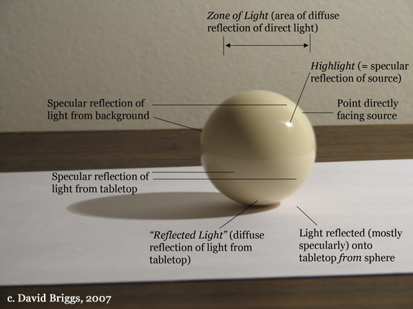
...but that form's not a sphere, so what's a better way to shade a sphere? One of the things I've noticed from all of the spheres posted here (and is also evident in the Euro 'toon characters posted) is the lack of reflected light:
Image

From your post history, Espozo, it seems that the Metal Slug style may be your most preferred style? If so, I wouldn't blame you, it's very well done. So, let's look at how those artists handled a sphere:
Image
Source

7 colors + 1 transparent, What makes it successful:
* Bands vary in thickness in relation to each other
* Bands vary in thickness in relation to themselves (tapered)
* Reflected light on opposite side from light source
* Highlight is very minimal (a single pixel)
* Saturation and value contrast are tightly keyed, and clearly represent the reflectiveness of the material of the orb.

All in all, the two things that make the Metal Slug style so effective are:

1) complete control over saturation, which is typically the number one giveaway of programmers' art on systems with palettes high enough that saturation differences are an actual option. You can tell someone there had formal training. (This is also the most evident on the low-quality Metal Slug "knockoffs" that occasionally flood the android market)
2) shading that clearly conveys the textures and details of what's being represented

Anyway, the specific topic of discussion from the title seems to have run its course, it may be beneficial to rename the thread to broaden its topic of discussion to pixel art styles in games. There are a lot of interesting points to discuss on the evolution of styles across each system's history, regional differences, etc.
Re: Character appearance in Tennis, Soccer, and Kung Fu
by on (#178868)
Stylistically speaking, I like the window-shaped shine better than the simple point shine. :P
Re: Character appearance in Tennis, Soccer, and Kung Fu
by on (#178930)
That's really well done, actually. The window highlight is cute, gives information about the environment. The rim lighting on the right implies a secondary light source, likely internal lighting. Moreover, the exact shape of the darker shade gives very specific info about the shape of the vase. I frequently use a similar method for leaves as well.
Re: Character appearance in Tennis, Soccer, and Kung Fu
by on (#179425)
tepples wrote:
I thought you or someone else claimed this before, which inspired me to start my collection.

Have you seen the Ultimate Oldschool PC Font Pack? There's a number of interesting 8x8 fonts in there.
Re: Character appearance in Tennis, Soccer, and Kung Fu
by on (#180837)
tepples wrote:
Why do Soccer, Tennis, Baseball, and Kung Fu share an art style that other NES launch games don't? Did they share artists?


This might be old-hat by now, but something recently came up that may explain this phenomenon.

Quote:
Donkey Kong was released for the arcade in 1981, but came out on the Famicom, the Japanese version of the NES, in 1983. Miyamoto had nothing to do with this version, he said. “The porting of arcade games to Famicom, we left in the hands of a different team. In order to get the Famicom off to a good start, I was working on the rest of the software lineup.

While only three games were available for Famicom on its launch day, Miyamoto says the team hoped to have about 7 games available in short order. “I personally really wanted there to be a Baseball game, and so I was working on that, as well as games like Tennis and Golf.” These simple sports games aren’t listed in any of Miyamoto’s official “gameographies,” but he says he was all in on their creation: “I was directly in charge of the character design and the game design.

In fact, any game on the Famicom is designed around Miyamoto’s low-level specs: The 8-bit systems could only pull from a palette of 64 possible colors, and Miyamoto helped to hand-pick which colors it would support, he said.
(Emphasis mine)

Most of the games in question had Miyamoto's direction with the gameplay and the character design. That's why they all have similar looking character sprites. It would not be surprising if other developers at the time were consulting him, whether directly or through inspiration or through some kind of documentation he wrote.