I've got a little problem with the colors in my game.
Level 1, 2 and 4 already look quite nice:

Level 1, 2, 4.png [ 9.59 KiB | Viewed 5502 times ]
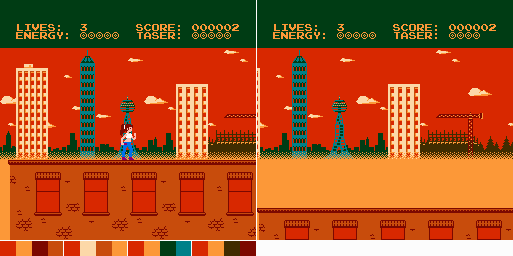
But I don't know what to do with level 3:

Level 3.png [ 5.98 KiB | Viewed 5498 times ]
I have a feeling that the red background looks too bold on a TV screen. Also, the yellowish fog might be too bright.
And the colors clash too much with the cyan skyscraper and tower.
Do you have any idea how I could change this to make it better?
Also, please note that whatever color the fog has will also be the color of the font. Unless the palette of the status bar has some other bright color that I could use.
I did this in level 4: The fog is dark gray, but I still have light gray, so I was able to use this for the font.
I could have done it in level 1 and 2 as well, making the font white. But this would have meant that the background color of the status bar would have been gray. And I didn't want that.
Likewise, in level 3, I don't want the status bar background to be too similar to the sky. Green is best here. That really dark brown would work as well.
But I wouldn't want the reddish brown for the status bar if the sky is already some kind of red. Therefore, the fact that the second palette has another whitish color doesn't help me with the font since I don't want to use the reddish brown of that palette for the status bar background.
So, what's the best way to improve the colors of level 3?
And do you know of any examples from actual NES games with an evening sky? I know "Rygar" did the plain red for their sky as well, but I don't know if that's really so good.
Oh, by the way: Setting any of the intensity bits in the PPU for the whole background is out of the question. This game shall look like one of the first generation games, so I will use only the standard colors.
Level 1, 2 and 4 already look quite nice:
Attachment:
Level 1, 2, 4.png [ 9.59 KiB | Viewed 5502 times ]
But I don't know what to do with level 3:
Attachment:
Level 3.png [ 5.98 KiB | Viewed 5498 times ]
I have a feeling that the red background looks too bold on a TV screen. Also, the yellowish fog might be too bright.
And the colors clash too much with the cyan skyscraper and tower.
Do you have any idea how I could change this to make it better?
Also, please note that whatever color the fog has will also be the color of the font. Unless the palette of the status bar has some other bright color that I could use.
I did this in level 4: The fog is dark gray, but I still have light gray, so I was able to use this for the font.
I could have done it in level 1 and 2 as well, making the font white. But this would have meant that the background color of the status bar would have been gray. And I didn't want that.
Likewise, in level 3, I don't want the status bar background to be too similar to the sky. Green is best here. That really dark brown would work as well.
But I wouldn't want the reddish brown for the status bar if the sky is already some kind of red. Therefore, the fact that the second palette has another whitish color doesn't help me with the font since I don't want to use the reddish brown of that palette for the status bar background.
So, what's the best way to improve the colors of level 3?
And do you know of any examples from actual NES games with an evening sky? I know "Rygar" did the plain red for their sky as well, but I don't know if that's really so good.
Oh, by the way: Setting any of the intensity bits in the PPU for the whole background is out of the question. This game shall look like one of the first generation games, so I will use only the standard colors.
