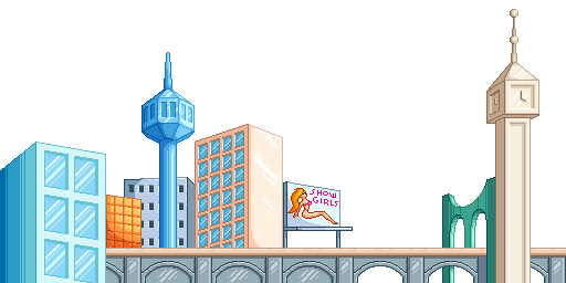
I'm making a background for my SNES game. I haven't analyzed colors yet, but I want to keep it within 4 palettes and 512 tiles, just to leave room for the other 2 layers. Anybody have some constructive criticism? There are parts that I like, such as the bridge, the Jetsons-like building, the billboard, the clock tower, but some I feel need improvement like brown building, the grey building and the orange building. I also feel like there's too much empty space, even though that probably won't be a problem with the far background behind it.
Attachment:
 city background.png [ 10.28 KiB | Viewed 6697 times ]
Perspective is off.
http://www.drawinghowtodraw.com/drawing ... ctive.htmlThe only thing that is really proper perspective is that 'show girls' sign, and maybe the building in the back.
Also, size of buildings. If a window is reasonably up to 10 feet wide, then that building to the left of the 'show girls' sign looks like its about 30 feet by 30 feet, tops. Actual buildings are usually over 100 feet, maybe even 300+ feet long.
I think it's good you leave uneven space for the second layer to show through. The yellow-light brown building is the one that stands out as aesthetically different, if that is enough confirmation on what you already wrote in the OP. The scene reminds me of the mixed architecture at current time alexanderplatz, though seen through a sci fi cartoon shimmer.
I tthought the warped perspective was intended? Whether or not, if anyone's interested, Martin Jay's article on
scopic regimes is relevant and a good short read for any artist working with scenes or generally interested in the craft of projecting a state of perception unto the viewer.
WheelInventor wrote:
I think it's good you leave uneven space for the second layer to show through. The yellow-light brown building is the one that stands out as aesthetically different, if that is enough confirmation on what you already wrote in the OP. The scene reminds me of the mixed architecture at current time alexanderplatz, though seen through a sci fi cartoon shimmer.
I think the perspective is intended? Whether or not, if anyone's interested, Martin Jay's article on
scopic regimes is relevant and a good short read for any artist working with scenes or generally interested in the craft of projecting a state of perception unto the viewer.
Which one do you mean by yellow-light brown? The one next to the bill board?
dougeff wrote:
Perspective is off.
That's common in 2D games. Or are you going to tell me that the perspective in the Donkey Kong Country series makes any sense? There's no need to draw realistic background for games with stylized characters.
No, i thought about the more vivid one, over to the left. My first thought was that it stood out, not only in colours but also in style. Whether this is good or bad is up to you.
Maybe, the one next to the billboard ought perhaps to be edited, realigned, or placed on the layer behind, or something. Personally, i like the warped perspectives, but this one stands out as a little more warped than the others, maybe because it is in so close proximity to the billboard.
EDIT: OR, you could place the billboard slightly in front of the building and see what effect that would have.
Maybe you could do a more minimalist city-scape...
I have no idea what this is from, Google found it for me...
One of those buildings looks like corn to me.
Other than that, I think it looks pretty good.
Smaller detail, it may come across as a bit unfinished where there are no windows where the bridge is in front of the beige building.
I think the light brown building next to the billboard should be more peach, with a lighter shadow, and maybe it should be placed in front of the bridge. Also, I think part of the bridge can be filled up to avoid wasting too many tiles and having attribute problems.
Quote:
Donkey Kong Country
There's not alot of buildings in this game, but you're right, the perspective is all over the place in this factory...
https://youtu.be/whp2Y_MjTXs#t=67m24s
I like this color scheme a little bit better, but I think the blue windows look a little too strong now.
Attachment:
 city background.png [ 10.28 KiB | Viewed 6626 times ]
Final Fight has some good buildings...
https://youtu.be/2qCN-YOi14o#t=41m0sIn this video, I like how the building side is either perpendicular to you or angled toward the right. And the windows seem the right size.
Regarding colour schemes, i think you could work with warmth/cold to convey the sense of depth you might be looking for. You could try to use cold, green, blue, teal and gray for objects you wish to be percieved as more distant than the others, and orange, peach, gold, tan, old computer beige, brown etc for objects closer to the player's point of view (the house in front of the bridge, for example).
That'd also work well with your new windows, ie, closer buildings will have sharply defined windows due to the warm/cold contrast, and more distant buildings will feel less distinct since the blue for the window panes is already cold.
The perspective is poor if you're going for realism, buildings normally align with each other (think of the streets between them), etc...
However I think it all fits with the style of your character art. I said before that your main character kinda reminds me of a plastic toy doll. This stuff fits with that, the jumble of buildings with irregular alignment again feels like plastic toys. Maybe part of it is the white sky suggesting this story takes place on a model table in a photographic studio.
The blue building on the left has weird lighting. The flat face of a building should have a mostly flat shade, not a gradient like that. The tan building in the middle does this better, there are textural accents and shaded corners, but each face is a flat shade. The angle of its top-left edge is very steep, which makes its perspective strange as well.
The green arches have a similar problem. The dark area next to the clock-tower could be justified as a shadow but the dark area on the far side might not make sense unless connected to something else, though it doesn't stand out as a problem as much to me. The middle pillar on the arch, though, seems to cut off abruptly, maybe could use a tiny bit of shading to indicate it terminates at the tan bridge.
The orange building stands out too much (very bright), and the extra shading in the corner really makes the shape look warped. It looks like it's being squished, and I think what you were looking for is just a shiny flat glass face. Maybe try not to shade every cell like a bubble; keep the grid frame but give the glass panels a flat shading and draw a highlight across it as if they were one big flat piece of glass. Don't try to treat each one individually like this.
Casting shadows between adjacent buildings might contribute more sense of depth.
Walls on the clock tower, the non-window part of the control tower, and the brown building in the middle probably aren't going to be as shiny as your illustration's specular shading makes them out to be. They'll probably be somewhat flatter.
Attachment:
 city background.png [ 10.89 KiB | Viewed 2391 times ]
I changed the "corn" building, and also made the light brown building's windows smaller.
It looks better, but I don't understand the curved shading you're applying to flat walls. The sun is not a spotlight; its light should hit flat sides uniformly.
pubby wrote:
It looks better, but I don't understand the curved shading you're applying to flat walls. The sun is not a spotlight; its light should hit flat sides uniformly.
Now that you say that, I think this shading is a lot of the reason for the "corny" appearance of Maize Tower. The "dekerneling" of the windows helped some, but it's still shaded as if it should be round.
Corn or no corn, I'd suggest a palette change for that building. It's color makes it the most dominant part of the image, and it doesn't merit that. The more interesting buildings would be the "space needle" or "big ben". However, you also have the billboard, which also uses reds and oranges, and I think that this is a good place to subtly use your most dominant colors. I'd prefer to see the orange building a more muted color like the rest of the skyline.
Edit:
Also, looking at the the picture a little more, I started to really wonder about the arch. First I thought, its color is a little strong, if you muted Maize Tower then this would be the strongest, and really, for the buildings, I think that should probably be the Space Needle. However, what really perplexes me about the arch is why, or, what is it? Is there intended to be something above it which is being supported? It's perpendicular to the bridge and doesn't support it. Why are there two archways and only one is passed under? It looks like a lot of work was put into it, especially when you consider that the foundation of the arch is likely underwater. This had to require the coordinated effort of a lot of people and the use of a lot of resources. I probably wouldn't think twice about it if it scrolled by in the background of a video game, but since I'm looking at it, it is an enigma.
I'm finally getting around to adding this into my game. However I don't know why I chose to do it using 8x8 when I could've done it the easy way by using 16x16 tiles.
