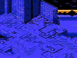
I think this is getting critique ready:


This time, i tried to convey light/shadow effects with just one single palette for the playfield, in order to have more to spare. The other palettes used for backdrop and the placeholder status bar don't do much here and could easily be used for other stuff.
It started out as an investigation on how diablo might look like if it were to be demade, but it quickly evolved into something else (but a bit similar looking). I made a bunch of notes too on how this may actually play if anyone's interested, but i'd like to hear what you think of it first.

How you managed to shoehorn that into NES restrictions, I have no idea. How many tiles in that screen?
If I had to nitpick, it's a little monochromatic. But attribute boundaries are pretty limiting for unaligned graphics.
Thanks! I counted to 143 or $8f unique tiles in use. Some could possibly be replaced by lookalikes.
Regarding monochromatism, i want to do something about it, but first i wanted to be sure i could do something that looks convincing with just one. Changing the common colour from black to middle blue should open up some possibilities, but generally speaking/in many cases, two colours need to be common for a transparent effect. Other than that, i guess a game engine could alternate between attribute tables to increase the granularity but i don't know if that is practical or feasible.
Another note on the same is that it probably shows of that i'm much more used to scribbling with black on white than with colour pencils.
Two-player co-op? I'm curious to see your character designs for Will and Faith.
2 player co-op is the aim! I'd like to have players choose from four characters (much like Gauntlet which is a prime reference), and one of the characters would be a thief boy named Wart, in reference to *some* character in Diablo 1. Haven't thought much about their looks yet, though.
EDIT: Will and Faith was actually just attributes, but i think they are perfect as character flavour. Mind if i use it as such?
To try and make it look less monochrome, what I'd do is I'd make the whole building thing a different color than blue while keeping the ocean that, and at the boundaries of where the building and the ocean meet, use another palette that's kind of intermediate. You could make the edge of the building appear more roughed up to work better with BG attributes.
I quite love it. If you ever want to pick my ear by PM for more specific feedback, feel free to do so.
Otherwise, I'll keep an eye out for what you have in progress.
Thanks! Something like
so?
(edit: old pic moved to link - *new* pic inserted for new details and cliffside)

Yeah, except I'm not sure how you're going to explain what that black mass to the side is. I'd also try and go for more varied colors still, which would make you need to fix the bottom part with the dirt of it'd look really messed up. I actually notice that you're using a gold and a gray palette, which could be a bit of a problem.
Probably the biggest change would be making the walls have another color (right now they look the same as the floor, even contrast-wise, not just hue). This would also be the most likely thing to cause trouble with color clash. Would be worth trying to figure out though.
that black mass (mess?) was me throwing something cheapo there made from recycled cloud and mountain tiles before dinner just to have something that could serve as separation. It's replaced with dedicated ruin/cliffside tiles now, in the same post.
@M_tee: Thanks! I like your style, it is very clear. That's something i can take lessons from.

@sik: food for thought. It could be easier to implement in the dungeons where no palette is bound to the lake/ocean.
Well, my biggest worry would be more the boundaries where walls and floor meet, since that diagonal would make it some serious hell to cleanly avoid an attribute clash.
Yeah, personally, I don't think the walls need to be a different color than the floors. Anyway, One thing I did do is I made the sunset a bit taller changed the color of the clouds, because I don't know why they'd be blue in this case. I actually tried to make the ocean less blue and more of that golden color, but I couldn't get it to work. I'm not to sure what's up with your ocean, as it goes from dark, to light, to medium, and then to dark again. I'd have thought it'd be a steady gradient from dark on the bottom to light on the top.
And yeah, the wall is 16 pixels taller.
Attachment:
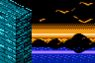 New Sunset.png [ 973 Bytes | Viewed 4834 times ]
WheelInventor wrote:
one of the characters would be a thief boy named Wart, in reference to *some* character in Diablo 1.
But could
Wart beat up
Wart?
Quote:
EDIT: Will and Faith was actually just attributes, but i think they are perfect as character flavour. Mind if i use it as such?
Go ahead.
Anyway, the walls facing the light source do kind of blend into the floor. You might want to draw a line between them. It doesn't have to be a cartoonish outline, just something to suggest the
ambient occlusion of a concave
dihedral. (In plain English: It's harder for light to get into a corner.)
Quote:
Anyway, the walls facing the light source do kind of blend into the floor. You might want to draw a line between them. It doesn't have to be a cartoonish outline, just something to suggest the
ambient occlusion of a concave
dihedral. (In plain English: It's harder for light to get into a corner.)
Is this enough of a line? Also added the opposite for the stairwell edge, and there's an attempt at fixing the ocean:

My thoughts are: what is intractable and collidable?
Certainly I can see a back wall that I expect to be solid, and there is a ledge I can see as well.
But the main floor looks like it is just design, and I ought to be able to walk everywhere. But can I? Or am I supposed to interact with some of those more complex-looking regions somehow?
And I stared at image for a minute before I realized there was a staircase there in the ground.
Artistically, it looks good. But for a game, I would want the edges to be better defined. I don't want to have to guess about where I can walk.
Also, you might try shifting the hues a bit. The highlights or the shadows or both; try shifting the hues. It usually looks really good, and you can sometimes use that other hue to add extra detail and definition if you put it in the right spot.
It looks wonderful as it is, but imagine the background tiles being bankswitched as you move to give a faux parallax scrolling effect... that would be costly (eight 1k banks), but even more spectacular looking!
Got a night's sleep in and have a little more time to comment now. First, I would totally play this. Makes me think of the GBA Baldur's Gate, which I played a lot of.
I see no problem with using the same palette for walls and ground. I would say, though, don't be afraid to let shadows be shadows and resist putting highlights in them.
Here is a quick paintover I did to illustrate this:

I simply removed the highlights from the southeast walls and darkened some of the immediate areas behind walls that jutted out to define them a bit more.
The other thing that stands out to me are the black lines on the ground. Assuming the light is coming from screen west (from the direction of most of your highlights), shadows should be cast on the southeast and north east sides. but some of your ground panels have shadows on all three sides, causing a bit of confusion.
I didn't touch the ground in my paintover, but I would likely include (dark, not black) shadows cast from the walls, and greatly reduce the amount of black in the ground, using it sparingly to imply crevasses or shadows cast from uneven panels.
As for marscaleb's comments:

This is how I read the walking plane. It seems pretty clear to me, but if what I highlighted isn't what's intended, then I would say it could use more clarity.
Also, he has a good point on hue shifts. You seem to already be doing so for your highlight. I don't know how many screenshots of his work are still up, but alp is really good at using three different hues within the same palette and getting a lot of variation out of them. It'd be worth searching to see what he has posted.
Looking forward to seeing more.
Looks good. It's true the walk-plane doesn't pop distinctively, but it is still obvious where it is.
Just don't make it so that the mid-right bit crumbles off to death.
All of the pics looks amazing!!
I do not think the walls needs to be a different colour than the floor. Because of how isometric graphics works, that basically means you could not use the whole palette for either, and that's a problem. However they definitely need to be a different shade of the same colour, and I think WheelInventer did that wonderfully.
What is however important is that the background is not the same colour as the wall of floors. In the very first pic this was a problem but then it has been fixed and looks wonderful.
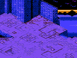
I tried to tone down the thicker lines in the walk plane as to not cause too much confusion and to be more clear on what it is supposed to convey. Regarding shadows and skyline, i took the advices about halfway for now. I really liked what it did. Also most noticable, i tried a main palette outside my comfort zone.


Regarding the floor plane: The intention here is *almost* purely aesthetic. This is the intro scene, but also camp/hub you'd come back to a few times, so it needs to avoid sameness. Dungeons may be a bit more sparingly/functionally decorated to give a fair chance to spot traps etc. No real dangers ever occur in this scene so you're free to explore the limited premises without hazard.
Hidden doors to shortcuts will appear after you'd defeat one of the three planned major bosses (well, after the third you'd beat the game, but i'd like to drop the player back into a hard mode with all shortcuts open). Palettes for sunset and castle would also change at these triggers. I have to admit that it is kind of weird that the sunset is back there and that the light source in the forground is the direction it is. But let's just assume that this castle foundation is built on bald mountain and unholy things are commonplace. Oh by the way, the baddies are no others than
Ferenc the black knight,
Erzsébet the blood countess, and if rumours are true, the dark lord they serve - rid the world of them, preferably before they engage in an unholy trinital wedlock. Of course, that's package fluff and historically incorrect. It takes a bit of influence from a certain
E A Poe screen adaption.
Here's my notes on how i would like the on-screen interaction:
Walk into/press against something - close combat animation ensues or open chest/door if you have the key.
B (or A) - character's signature action. In the case of wart, that is putting a trap on the floor or, if standing on an untriggered dungeon trap, disarm it. Faith (possibly a paladin or an unresting spirit in search of redemption) gets a cursor to aim a smiting lightning strike from above or a heal a friend at the cost of a slight self sacrifice depending on target. Will can hold for a defensive stance or hold and release while d-pad is pressed for a bash/tackle. I'm not sure about the fourth class, but an idea is to have *Unnamed ranger* quick tap repeatedly for a couple of shots in the facing direction, or hold to get a crosshair and a stronger shot, a bit like the Faith. Or come up with some mid-range attackey character concept. Too bad there's already a whip-wielding hero on a holy mission.

A (or B) - use consumable item.
*if* i would incude a height variable walking plane (graphically doable with current tileset), you'd need to walk a stair step up on the platform as there's no planned jump.
All characters are planned to have a passive trait that makes them stand out slightly. Wart, for example, is planeed to trigger dungeon traps with a slight delay and a warning click, giving the player a split second more to counteract. Will is simply landing slightly harder hits in close combat. All of this will be tedious to balance, but worth it. Different 1 player choices or different 2 player combinations may warrant some replay value if the rest doesn't turn out crappy.
Should this thread move to the homebrew section? Or should i do a new post there in case this takes off and keep this for graphics discussion? I have a far, far way to go when it comes to 6502 programming, but i strongly feel something like this would complement the nes library. I just need to take it in slow increments.
Definitely your best yet. (I like the purple color.) The compromise with the clouds is really good, as it makes sense they wouldn't be that color latter on because of the size of the sunset.
It looks MUCH better with those shadows, and using the dark blue with the purple really works out well! (Though honestly I think the purple overall isn't as good as the blue; lavender bricks seem a little unusual. I think the 1C looked best, but that would be hard to get a color that works as well for the shadows as you have with the purple and blue. I guess there's no perfect solution.)
I also notice you increased some highlights around the edges, and they pop a lot more making the edges much more defined. Great work!
That being said, my eye is still being drawn to that spot in the lower-left corner. (This spot has always stood out the most to me.) If I were playing, I would want to walk over to it to see if there is something special about it, because it is noticeably darker that the rest of the floor. It looks like there a shallow hole there, and I would want to investigate it. Even with the other edges better-defined, I would still wonder if I can walk on it or not, because it might be a hole, or it might be a dark spot. Unless you plan to actually have something special there, I would suggest you alter that so it just looks like the other floor patterns.
If it is actually a hole and the player can't walk on it, i would add more highlights on the bottom edges. If it is supposed to be flat and the player can walk on it, I would add some dithering in the dark spot, or remove the dark spot completely. If you deliberately want the player to investigate the spot (like maybe there is a key hidden there or a touchplate the player triggers by walking on or something) then i wouldn't change a thing.
Thanks! I'm also leaning, if only by a little, towards 1c in terms of palette choices. Though, if i stick to the idea of having the castle/sunset palette shift from dusk to after dark throughout the game progression, i can eat the cake and have it too, and get a nice feature out of it. ^^
It's good you mention the bottom left structure. It's a slight design choice problem i have right there, and you taking notice of it is a sure sign that i need to think it over properly. It is indeed intented to be a hidden stash, though you would need to break/move a stone slab (animation issue) to uncover it. I'm probably not going to have a 'secret' stash in this scene, but there it is just to have it laid out and tested.
The stone slab with an O-ring attached to it was my first design on such a lid. But i also want _that particular lid_ in this scene to be a hidden stairway passage to lower levels, which would open only after you've defeated a certain boss or pulled a lever in the room after the boss, or whatever the mechanic i come up with. But i feel sloppy for using the same graphics for two quite different functions. Why would you be able to open/break the ones in the dungeon below, but not this one in the camp scene? Or if i can't interact with the camp scene slab, why would i try later on?
Since i don't plan for enemy sprites in this scene, though, i can use sprites more liberally. I'm thinking of vines/bugleweed/poison ivy or something right now to cover it, and it could add a nice colour splash... back to the drawing board!
@za909, that'd be nice indeed, but as you said, costy. I haven't figured the whole scope out yet, in regards to resources, but i'm suspecting i will be wasting bytes on LUTs quite a bit, and some more on countless rookie mistakes.

Well I guess you already thought of it, but as I was reading you talking about having the pull-ring, my first thought was that it would probably be best drawn as a sprite. That way you could use a slightly different color for it. Help it stick out a bit so the player knows to investigate it.

As a big fan of 60s and 70s era animation, that cartoon hits home pretty hard. haha
As for palette transitions for time of day, don't forget that emphasis bits can be toggled for more subtle transitions or effects.

Very illustrative!
Not only _does_ something stand out, you'd also know from experience with games and cartoons, if somehow not from your guts. Much better. A sprite would be convenient in several ways. I'm also having at least one background palette to spare in dungeons, if using sprites for nonmoving objects turns out to be limiting.
It's just beginning to dawn on me how much effort will go into animating enemies, and how much ROM it will eat up - at least for humanoids.
@M_Tee Good reminder! It's easy to forget about. Am i correct to say the emphasis bits can be switched at any time, not just vblanks?
Yup, emphasis (like CHR banking) is an anytime thing (within the precision you can get the CPU to play along.)
Not iso, but a thematically concistent excercise in ending/credits/intro screens. Redrawn work layered over a dithered bw photo in photoshop. Had an extra layer highlighting the first pixel in every 8x8 which helped a lot when deciding how to redraw and what to remove, shift around, and simplify. Then removed the original dither layer and imported in nesst for attributing and tile reuse where needed. The source photo is over 100 years old. It took a few passes before i got it distinct without loosing the horror / old school black metal album cover feel. I thought i might aswell share it and see what you think of it. It is using up a full $FF bytes but could be simplified if needed.
that last one have the castlevania's ending feel all over. i am all impressed that the nes can actually handle those beautiful pixel-detailed backgrounds, your art is actually the best one i have ever saw on the system; you are really talented!
I am looking forward to this game so hard, i really congratulate you for what you have done so far, i really appreciate your art.
Feels like a late-EGA title screen. Not in the bad way. I like it.
And if you parallax that into the background of a level/segment, it'd be lovely. But you're not likely to have a side-scrolling bit where parallax is easy...unless you allow "diagonal" movement w/r/t the grid.
Reminds me of the two controlstyles of SR'n'R...
Personally I don't like the dithering all over the place. It looks like an automated conversion. I've nothing against limited use of dithering, by the way, but that's too much.
Bregalad wrote:
Personally I don't like the dithering all over the place. It looks like an automated conversion. I've nothing against limited use of dithering, by the way, but that's too much.
I have to concur. I really like your work, but that style of NES graphics doesn't look good to me.
I'd prefer to see it primarily in solid shading with some dithering details.
I actually agree with all these points, for the same reasons and some more.
It is very EGA like, and it is not often i liked that style myself. I was aiming for something that was reminiscent of the low budget covers of early black metal albums, but in a video game context, that translates into something else.
Another bad thing with overdithering like this is that it consumes a *lot* of tiles. I used a full $FF of tiles and still felt i had to compromise for the sake of keeping the dithering style concistent (the larger clouds, especially). It was made to be decoration for a club/vernissage evening together with some other stuff displayed on one tv sreen each. But if i'd reuse it for a game, i think it needs to be more clear-cut, both in terms of style and memory usage. That way it would also look more elaborate and perhaps rewarding for the player.


