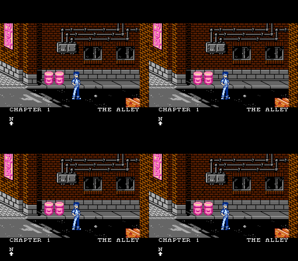
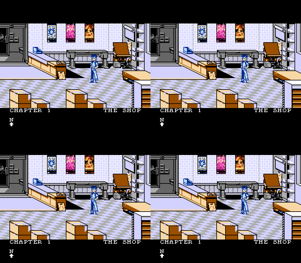
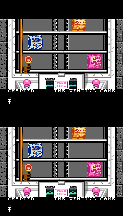
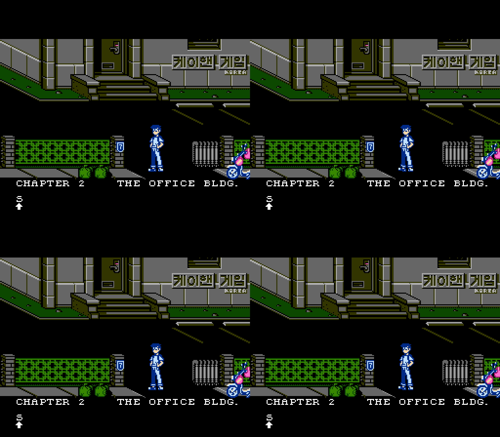
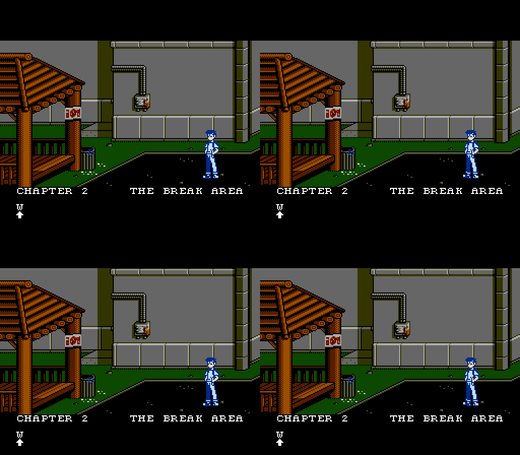
Figured I'd post some of the stuff I've been doing here periodically.

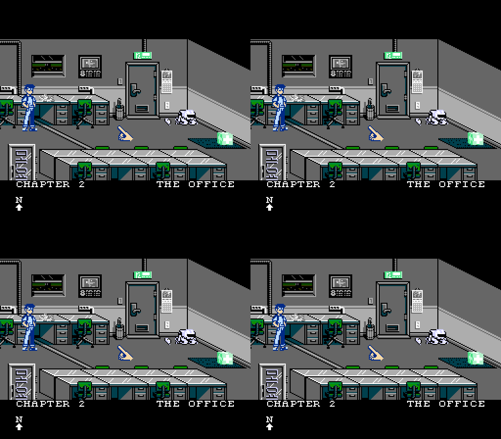
This is from Isolation, a homebrew NES point-and-click adventure that I'm working on with KHAN Games. (Short in-progress video of gameplay
here.
In it, the player guides Taewon, a South Korean teenager who awakens to his city mysteriously abandoned.
I'll post some more work here as time goes by, including, hopefully, some Pyronaut updates soon.
In the meantime, you can check some of my other graphics work at:
http://www.mteegfx.com/tagged/graphics
Will the point-and-click adventure feature SNES mouse support?
Dunno, mate. Not my call. I'll chime in if I hear one way or another.
@dougeff
Thanks. Put a lot of work into establishing the exact style and layout for the graphics.
As for process, I start on custom-designed graph paper, build in Photoshop, import to NES Screen Tool to generate nametables and attribute tables (used to do it by hand using Photoshop actions, this program saves so much of that work) l use yy-chr to manage my CHR files, and use Photoshop actions to build sprite charts that are passed along for coding.
darryl.revok wrote:
Will the point-and-click adventure feature SNES mouse support?
I'm always surprised how often people bring up SNES mouse support for NES games. How many people actually have these, and why? Has anyone besides tepples ever written NES software that can use it? Does a commercially available SNES to NES adapter even exist?
SNES mouse came with Mario Paint. One website says a million copies of Mario Paint were sold. There are a million mouses [mice ?] out there. I have one.
SNES to NES adapter? I don't know.
rainwarrior wrote:
I'm always surprised how often people bring up SNES mouse support for NES games. How many people actually have these, and why? Has anyone besides tepples ever written NES software that can use it?
Sliding Blaster by NovaSquirrel, but that might not count because we're cousins.
Quote:
Does a commercially available SNES to NES adapter even exist?
The adapter I received from Paul at Infinite NES Lives was a one-off. But the
FC Twin famiclone can use the mouse.
dougeff wrote:
SNES mouse came with Mario Paint. One website says a million copies of Mario Paint were sold. There are a million mouses [mice ?] out there. I have one.
Yet I see copies of
Mario Paint at pawn shops and other classic game shops with no mouse.
tpw_rules was working on an adapter to translate PS/2 mouse protocol to Super NES Mouse protocol, allowing use of the PS/2 mice that are plentiful in Goodwill and Salvation Army stores. But he got sidetracked by other features to be added (especially PS/2 keyboard support) plus a killer app for that feature (a Z-machine interpreter) plus real life (college).
My brother and I got Mario Paint back when it came out. It was a lot of fun. In the US, Macintoshes and Amigas were not common in homes at the time, so the most complex graphic program I'd used before Mario Paint was Paintbrush on Windows 3.1. Mario Paint mixed in animation and music and had preset stamps for all kinds of Nintendo characters.
There's probably not much reason to go back and play it now, but at the time it was great.
I'd say there have got to be more copies of Mario Paint that have survived than the mice. You see a copy of Mario Paint thrown in with every lot of cheap games almost. Without the mouse, you pretty much have to give the game away to get rid of it.
I just hear point-and-click and a mouse obviously comes to mind. I think it's a cool feature that could work well with a lot of games. More games supporting it would make it more likely that emulator authors would support it which would mean more games supporting it in the future.
Mario Paint was a popular game. I had it too. I sold it a long time ago, with mouse.
darryl.revok wrote:
More games supporting it would make it more likely that emulator authors would support it which would mean more games supporting it in the future.
FCEUX, Nestopia and Nintendulator all have "mouse" input options, though I've never experimented with what they do. Is this SNES mouse support, or some other kind of mouse?
Edit: Tried all three with Thwaite:
1. FCEUX "mouse" isn't detected by Thwaite.
2. Nestopia's "mouse" isn't detected by Thwaite.
3. Nintendulator: works.
Quote:
I'm always surprised how often people bring up SNES mouse support for NES games. How many people actually have these, and why? Has anyone besides tepples ever written NES software that can use it? Does a commercially available SNES to NES adapter even exist?
I have one because I was making a strategy game that supports it. It's a secondary project, so only a basic engine has been completed and nothing has been publicly released.
I also use it when I play Thwaite.
Other kinds of
pointing device for NES:
- Oeka Kids tablet, DA15, supported by two games
- Hori Track trackball, supported by four Famicom games. NES version was defined (and supported in Operation Wolf) but canceled.
- Subor Mouse, supported only by a pseudo-Windows 95 cartridge for an "educational" famiclone
- Power Glove, properly supported only by Super Glove Ball
I'd bet the "mouse" option in some of these emulators emulates the Subor Mouse. Had the Hori Track been released stateside, I probably would have supported it in
Thwaite instead of the Super NES Mouse.
I've
requested Super NES Mouse support in FCEUX;
Zero Mouse has yet to reply after having
added Super NES Controller support. (Which reminds me: I need to check for a new SVN build to close that bug.)
rainwarrior wrote:
FCEUX, Nestopia and Nintendulator all have "mouse" input options, though I've never experimented with what they do. Is this SNES mouse support, or some other kind of mouse?
Two years ago today, I wrote about
attempting to use FCEUX's mouse with Theremin:
Bavi_H wrote:
When I tried to use FCEUX's mouse option with Theremin, it also crashed for me.
I looked at FCEUX's
mouse.cpp. I didn't understand it very deeply, but it I think it's using the Subor mouse "single-byte packet".
Subor mouse protocol from Nocash NES Specs (scroll down a little to get to the Subor mouse)
SNES mouse protocol from Nesdev Wiki
Subor mouse, eh? Hmm. The "mouse.cpp" code in FCEUX is from before 2006. I looked into its implementation, it wasn't even hooked up correctly (probably hasn't worked in years). Can't tell if it agrees with that "single byte packet" version of the subor mouse in that documentation. It might.
I
fixed it while I was in there, but does anyone know where to find a subor mouse test ROM?
Maybe while I'm looking at this I'll see how easy it is to add SNES Mouse.

Cursor movement feels great on the test ROM I was sent. It accelerates and decelerates smoothly, allowing both quick access to the opposite side of the screen as well as precise movement in a small area.
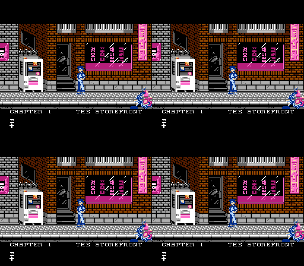
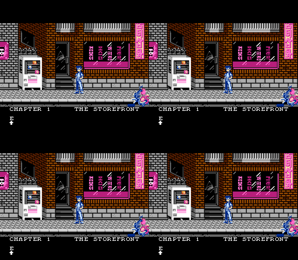
Anyway, here's the next screen with a scooter-in-parts on the side of the road:

tepples wrote:
I made an attempt to add support for it with
r3215.
Seems to work fine with Thwaite, though moving the mouse off the window presents a little bit of a problem. FCEUX has no mouse-capture interface at the moment.
I noticed that Thwaite does not seem to cycle the sensitivity settings like the wiki suggests to do?
rainwarrior wrote:
I noticed that Thwaite does not seem to cycle the sensitivity settings like the wiki suggests to do?
You mean the suggestion in
this edit from 2014? I finished
Thwaite in 2011, before I noticed that part in any documentation. Though
Fullsnes suggests that the mouse might start with the acceleration parameters unspecified, my own mouse appears to boot up functional in slow mode.
Paul from INL is sending me a SNES mouse with a NES adapter, so I will be looking to implement mouse support, yes.
Huh, the Subor mouse does acceleration based exclusively on the new mickeys, without taking into account any previous motion. How well does that work in practice?
M_Tee wrote:
Anyway, here's the next screen with a scooter-in-parts on the side of the road:

Okay, first off your graphics look stellar. Some of the best I've seen around.
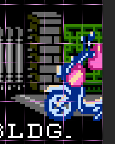
The bike though, does not look right to me. If I look at it closely for a while, I can kind of see that it's a bike. However, at first glance, it doesn't look like a bike, even if I go back to it and look at it now.
Honestly, when I look at the bike, the first thing that comes to mind is NES tile glitching. Every time I look at the bike, it looks like random mismatched tiles. Does anyone else see this? I don't feel that it holds up to the rest of the art which is wonderful.
I got the same idea about the bike. Needed some time figuring it out, which might not be a desireable effect. I get the feeling it looks a bit disjointed? I know it is supposed to be in parts, but still. The wheel feels kind of abstract compared to the overall style. The helmet may help to confuse as it is right now too even if i like the model, but i'm not sure.
Other than that, i like the clear, sharp and bold style of it a lot! Very distinct, and nice. It is also kind of the opposite to what i am comfortable doing.

Very neat detail with the printshop sign being visible from around the corner so the player can orient her/himself without effort

Great stuff!
I have the same opinion about the bike, it looks kinda like a glitch. Another thing that bothers me a bit is the extremely busy sidewalk pattern, which clashes with the character's feet. It would probably look much better if it was made of bigger tiles (i.e. less detail) and didn't have all those white highlights (more inconspicuous).
If the shoes were outlined, they'd look better, although I'm not sure how possible that is given how small they are.
Thanks, all. I'm glad to be showing some of this work now. It's been in progress for about a year.
tokumaru wrote:
I have the same opinion about the bike, it looks kinda like a glitch. Another thing that bothers me a bit is the extremely busy sidewalk pattern, which clashes with the character's feet. It would probably look much better if it was made of bigger tiles (i.e. less detail) and didn't have all those white highlights (more inconspicuous).
Yeah, I had versions with and without the highlighting on the sidewalk. Once I test it on real hardware on my CRT, I'll make the final call on it, but I do agree that its busy.
As for the bike, it's disjointed and is something I struggled with for quite a bit. Moreover, it's likely to be cropped even more by overscan on a CRT, which isn't going to help it. But luckily, when you hover your cursor over it, the text box up top tells what it is.

Kidding aside, there's an animation for the player lifting that tire and putting it back on which will make it pretty clear, along with putting the front cover back on and wearing that helmet.
Here's a shot of it once put together against another background screen:

And here's the next screen, the inside of the print shop.

Incidentally, i happened to refresh my browser on your site just as you've posted the indoors scene. Again, i really like how it shows where to go to go back. And the box tape is really clever, i think.
I'm assuming the cursor changes when it hovers over something interactable? Or is there another form of highlighting?
The cursor by default is a pointing finger and changes for two reasons: the first is when it hovers over an exit, at which time it changes to one of four exit arrows depending on direction. The other is when the player selects an item to use from the inventory, the cursor is replaced with that item's icon. Otherwise, the player recieves a text display identifying something that can be interacted with or observed when hovering over it. Note in the video how the text displays "coin" when the cursor passes over the coin. Upon clicking, the player either takes, uses, or makes a further observation of the object in question.
And yeah, the box tape's definitely there to try to hide attribute borders since the pale blue is the shared color between the two palettes.


This is the last screen shown in the video. It's a push-rod vending game, a typical variation of a crane game. Knew I was working with the right programmer when the script given to me said "retrieves chips from vending machine" to which I reply, "Can we do a version of this game from my neighborhood? This is how I think it could be done." and he's all, "totally."
Also, for a separate project, it was time for me to tackle the slime/goo/goop trope of an enemy:

The hop would be used for movement, so it wouldn't look so stiff.
Looks really great (both things). I like your choice of palettes very much.
Thanks. Color theory has long been a passion of mine, but there are
only so many choices on the NES. So, for someone to specifically compliment my color choices is reassuring.

I try to take inspiration in what others are doing as well. For example, Alp has some of the absolute best backround palettes I've seen people use on the NES, and the work ptoing has been posting here lately has been fantastic. In terms of animation,
nicolas betoux (who recently joined morphcat games) is probably doing the best work for the NES at the moment (I can't wait to see footage of
the 4-player game they recently premiered). In fact, his goo's splash effect is what made me want to include something similar in mine.
Chosing the best colours in the NES is always the most difficult part of creating graphics. Going the easy route often produces rather monochromatic stuff. The lack of (real) dark tones is also a problem. I'm always strugling to get the right choice in my own work. Your graphics look pretty well balanced in regards of shadows and highlights, plus they look colourful. That's why I think your palette choices are excellent!
Actually, my main issue with NES palettes is the remarkably high level of saturation most emulator palettes have. I used to worry about designing for compatability with as many palettes as possible. Now I just use NEStopia's for all of my screenshots. Its darks are darker than I think they should be, but its colors are generally more reasonably saturated. Other than that, I check when I can on my AV famicom on an NTSC CRT, where the saturation is far more subtle.
Anyway, here's another screen. There's one in between, but I think we're gonna wait a while to reveal it.

Edit: Permanent Link updated for old version of image.
Looks good as always.
I'd imagine this chapter has the player entering a rougher part of town. I get that impression from the palette shift and the fact that the sidewalk doesn't seem to be particularly well maintained.
Thanks, it could be seen as such. This particular area is modeled after a non-residential area, such as an industrial park, in contrast to the prior chapter, which depicts a common type of working class neighborhood that would have residences above 1st floor businesses open for foot traffic. In fact, nearly everything in the first chapter is from a hodgepodge of references from my actual neighborhood. As for the palette shift, it also indicates an afternoon-to-night transition, which is shown in the chapter interlude screen.
At some point in time, I will probably do some write ups on the details of the backgrounds. Some of them flesh out the script and puzzles. Many of them just add character to the setting.
Great work, as always. I love the colour scheme. That door looks gorgeous. The only problem I have has to do with the complex patterned fence. It seems like the perspective is off. The darker green shade should be top-left, not bottom right. Or maybe I'm "mentally rendering" it in the wrong way.
Actually, you're right. The posts immediately adjacent to the fence clearly show a visible top, left, and front plane, and my fence was showing front, right, and bottom. Fixed it. Thanks a ton, wouldn't have noticed it otherwise!

Here's the next background, by the way:

The blank space next to the compass is for inventory, by the way. I've been cropping out the items so as not to reveal too much about the puzzles of the game. (I also may selectively not post some backgrounds if I feel they be too revealing.)
"Backpack Contents" will likely be the way that the bottom portion of the screen will be referred to in the manual. When it came to character design, giving the player some type of bag was a priority, as I wanted to avoid the magic pocket inventory concept. (Even though, at times, an item may be larger than the backpack, nothing so far couldn't hypothetically be carried in it, sticking out--although we don't depict it as such.)
Backpack was chosen as the type of bag to reinforce the character's age (high school). If he were an older character, I may have gone with a satchel, or a duffel bag for a more athletic character.
These little details are big for me. When I joined Pyronaut, even, I replaced various sized hearts and shield icons with various sizes of first aid gear (all clearly shown with a first-aid cross) and actual armor (along with a small line intended for the manual about the planet's creatures having raided the ship's crash site like raccoons, explaining why they would drop human supplies when defeated). In fact, the other day, I was playing The Legend of Zelda (for the first time, surprisingly), and my wife asked me "did you kill the dragon yet?" To which I replied, "Yeah, then I ate its heart. Now, I'm stronger." Although that interpretation was likely not intended, I much prefer games like Survival Kids (and I think, Morrowind, IIRC), where the items dropped by an enemy (meat), could make sense story-wise.
M_Tee wrote:
These little details are big for me. When I joined Pyronaut, even, I replaced various sized hearts and shield icons with various sizes of first aid gear (all clearly shown with a first-aid cross)
So, you violated the Geneva Conventions? Or are they blue? (I didn't know it was quite
that protected.)
Interesting read, but orange, actually.

EDIT: ... not that I'd be opposed to a red and white depiction being used to denote medical supplies in a work of fiction, but orange is the one steady palette throughout the game.
Orange is still close enough to red that it could probably violate the convention. (I guess the white cross may have it safer though - EDIT:
no it's not, and in hindsight I'm wondering if any cross is safe even if blatantly not red since precisely that any cross does the job means it's probably enough to be muddling the trademark)
M_Tee wrote:
There's a missing tile in that bump in the parking slot (or whatever it's supposed to be called).
Keen eyes, looks like a tile did get pasted over. Thanks for pointing it out. Updated the file. Apparently they're called
parking blocks, by the way. I had no idea.
Oh, and further reading actually shows that using the red cross in video games for medkits has been an issue (despite it being pretty standard since at least Doom 1). That's interesting. May or may not affect our designs (currently designed in orange, but in-game, they flash through all four sprite palettes, which usually feels predominantly purple.) Anyway, not looking to spend time on Pyronaut now. Will keep it in mind though. Definitely not going back to floating hearts though.

That seems weird. I've seen a lot of actual first aid kids with a red cross on them.
In the United States, Johnson & Johnson owns the
+ trademark for first aid products, and the American Red Cross owns it for all other purposes.
The standard symbol for a first aid kit is a
white cross on a green field. It looks like $20 on $1B, with 8x8 pixels, the cross occupying the center 6x6 with 2-pixel-wide strokes. Another symbol that may fit in better with video game aesthetics is a red heart on a white background.
tepples wrote:
In the United States, Johnson & Johnson owns the
+ trademark for first aid products, and the American Red Cross owns it for all other purposes.
The standard symbol for a first aid kit is a
white cross on a green field. It looks like $20 on $1B, with 8x8 pixels, the cross occupying the center 6x6 with 2-pixel-wide strokes. Another symbol that may fit in better with video game aesthetics is a red heart on a white background.
Yeah. They've been cracking down on that, lately. The Steam versions of Doom 1+2 are both "censored", for example. Which is stupid. Luckily, I have my original DOS disks.
I don't understand their logic here, to be honest:
"Let's make a universal symbol for medical help, and let
nobody use it!"
Their logic was to make a logo for
their organization. Likewise, the Olympic rings are a logo for the International Olympic Committee, and the Golden Arches are a logo for McDonald's Corporation.

Consider if all of a sudden people started using the classic Konami logo to represent "video games no matter the publisher". If you ran Konami, wouldn't you be upset?
except the konami logo is a lot more elaborate. Imagine if someone own the rights to a red colon - i think that translates into how owning a + with a colour that has a practical function sounds to me. I get they have the rights, though. If it's rational, is debatable.
Does anybody own the traffic cone? I know someone invented it. Should they in that case crack down on Kraftwerk for doing an aesthethical rendition?
WheelInventor wrote:
except the konami logo is a lot more elaborate.
I chose it because it's also a cross. It's just slanted with the center cut out, the left and top sections joined, and the bottom and right sections joined. I agree that these changes make it more inherently distinctive.
But marks become distinctive through use. Most trademarks are limited to one field of use. Others are so famous that they qualify for
dilution protection; try making a "Coca-Cola" computer mouse and see how far you get. The legal status of Red Cross and Olympic marks is similar to that of famous trademarks.
WheelInventor wrote:
Imagine if someone own the rights to a red colon
"Red colon"? Must...resist...goat...
WheelInventor wrote:
i think that translates into how owning a + with a colour that has a practical function sounds to me.
The + used for adding is rarely red. UPS owns the color brown for delivery trucks.
WheelInventor wrote:
Does anybody own the traffic cone? I know someone invented it. Should they in that case crack down on Kraftwerk for doing an aesthethical rendition?
Kraftwerk might have a case against VideoLAN, the organization behind VLC media player. But then it might not, as Kraftwerk arguably abandoned the traffic cone logo after its third album
Ralf and Florian. None of the albums in
The Catalogue have the cone on the front. Trademarks live only as long as they remain in use.
tepples wrote:
I chose it because it's also a cross. It's just slanted with the center cut out, the left and top sections joined, and the bottom and right sections joined. I agree that these changes make it more inherently distinctive.
I never realized until you posted it that it is indeed a cross.

Quote:
"Red colon"? Must...resist...goat...
And i must become better at remembering some words bear double common meanings in english

Quote:
WheelInventor wrote:
i think that translates into how owning a + with a colour that has a practical function sounds to me.
The + used for adding is rarely red. UPS owns the color brown for delivery trucks.
Sorry, i could've been more clear. I didn't mean + as a literal plus, but as a common variation of the symbol for christian religion (or, within christian symbolism, salvation).
Quote:
WheelInventor wrote:
Does anybody own the traffic cone? I know someone invented it. Should they in that case crack down on Kraftwerk for doing an aesthethical rendition?
Kraftwerk might have a case against VideoLAN, the organization behind VLC media player. But then it might not, as Kraftwerk arguably abandoned the traffic cone logo after its third album
Ralf and Florian. None of the albums in
The Catalogue have the cone on the front. Trademarks live only as long as they remain in use.
I've thought about that, too. Striking similarity.
Well, how about the white flag? (Flag of peace/surrender). Some private body could theoretically own the rights to that, but it holds a function more important than the function of private or national property, so it wouldn't be rational. I think the red cross could be argued being such a case, too, as it helps save lives. A red cross on a white background is a lot more functioning as a signal than pretty much any other colour on white.
The advice to avoid rights conflicts by using red on white is very sound, nontheless. Just like avoiding doing tetris variations, for the time being.
Alp wrote:
I don't understand their logic here, to be honest:
"Let's make a universal symbol for medical help, and let nobody use it!"
Because of fear that people may not take it seriously enough when it's really needed. Remember, it's not just intended for medical aid, it's for aid
in severe circumstances such as a war. That's where you definitely don't want to risk any sort of dillution or even confusion as to what's official. (in fact,
you can't just use it for medical aid either)
Sik's answer is convincing. But should that apply to works of fiction?
case 1: band of brothers/the pacific: the red cross is accurately represented as an organization providing aid.
case 2: doom: first aid kits may be a discoursive slip, but then it's also hell on mars.
maybe worse that doom in terms of representation: sexy nurse halloween costumes?
For the record, I imagine case 1 could be given a pass since it doesn't misrepresent the trademark. I wonder what a lawyer thinks about this.
The problem is that for starters it doesn't mean medical aid, it means protection during a war, i.e. people and things that would be a war crime to attack. And as you can imagine trying to identify as being something with such protection when you aren't is also a war crime. If there is so much stuff around using the red cross with another meaning, well it loses significance and can't be used to indicate what's under protection when it's really needed.
A medikit with the red cross in a game is obviously not under protection (it isn't even a real thing), but it does help with the confusion that leads people to misuse it and hence why the symbol is trademarked, to help reduce that problem.
To sum up, unless you're referring to the Red Cross organization:
I just happened to sit beside this symbol. It could possibly be trademarked by some other organization, but it is a clean way to circumvene the problem while retaining the signal of the red and white:
Yeah, light on dark will likely be my approach (considering that the icons always flash through four palettes: orange, violet, and two others, not too worried about the color.) Might try to keep the round field throught the sizes as well. Appreciate all the input on it.
Palette question:
Are there any differences, benefits, or best practices when selecting #20 or #30 for white?
#$20 and #$30 are the exact same voltage, and so are fully identical whites.
I personally like using #$20 just because it's a smaller number.
The difference between $20 and $30 can be seen mostly during a fade out using the common "subtract $10 each step and crush negatives to $0F" method. $20 fades with the rest of the colors; $30 stays bright longer.
Ah, so in that situation, #30 would go from #30 (white) to #20 (still white) before going to #10 (light grey) and #00 (dark grey)?
Yes. That allows for interesting effects. If you, for example, dim the palette on PAUSE, you can have the $30 values go to $20 (no change) and have that for importat stuff such as stats or something you want to emphasize.
That's looks pretty cool, M-Tee. I really dig it.

The next screen:

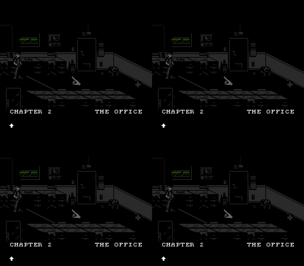
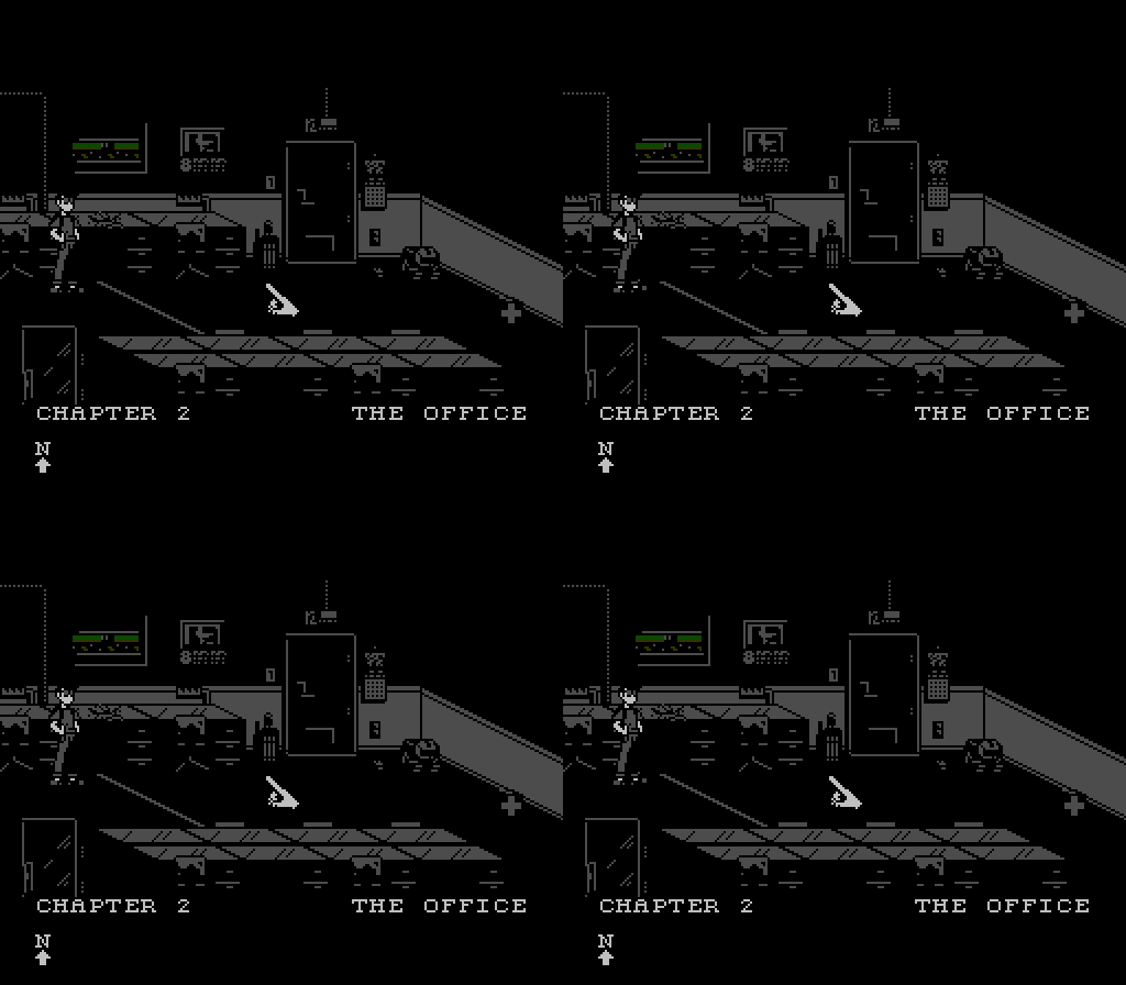
This one involves lights being turned on and off, so I chose to use #0D to give a nice lights-out effect:

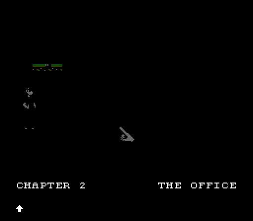
Still playable, if on a system with an emulated palette. It'd just look like so:

(being able to see anything other than the cursor and the window isn't necessary for play while the lights are off)
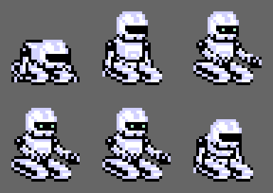
...and here's the animation for the robot booting up.

na_th_an wrote:
Yes. That allows for interesting effects. If you, for example, dim the palette on PAUSE, you can have the $30 values go to $20 (no change) and have that for importat stuff such as stats or something you want to emphasize.
Thanks, I love the palette darkening of the pause screen in Yun, by the way. It's a nice bit of polish.
@GoogieToons
Glad you dig.
Oh, and on Instagram, another video of mouse support:
https://www.instagram.com/p/BFPogternm8/And, a short preview of a parallax-scrolling transition scene:
https://www.instagram.com/p/BIs7_fTgLHv/(Am insanely satisfied with it...)
M_Tee wrote:
And, a short preview of a parallax-scrolling transition scene:
https://www.instagram.com/p/BIs7_fTgLHv/(Am insanely satisfied with it...)
You should be!
M_Tee wrote:
This one involves lights being turned on and off, so I chose to use #0D to give a nice lights-out effect:
Should not be using that color. (Search the wiki/forum.)
thefox wrote:
M_Tee wrote:
This one involves lights being turned on and off, so I chose to use #0D to give a nice lights-out effect:
Should not be using that color. (Search the wiki/forum.)
Yeah, some emulator palettes will have an extra dark colour for $0D, or rather all the other blacks are raised. A few people like this because their TVs also do something that looks similar.
Unfortunately, on a lot of TVs (both new and old) it will fuck up the blanking signals and cause the picture to wobble, or completely disappear. Even if the TV can handle it, on many it won't actually be darker.
There's a bunch of possible different behaviours for $0D, really, and a lot of them will make the game unplayable for the user. It really isn't a good idea. (This is why my
palette test ROM doesn't show $0D by default.)
There's also the two "extra" greys in the $XD column, if you need a few extra levels of grey. These do have slightly different values than the greys in the $X0 column, but some emulator palettes seem to make them identical, which is a little bit sad. Most games seem to just avoid that column anyway, maybe because it becomes an annoying special case for fades.
That's a bummer. I was under the impression that since it was used in a number of commercially released games that the compatability issues would have been a non-issue. Will keep that in mind.
Did you really mean $0D (the invalid black), though, and not $2D (the dark gray)? I don't really see how $0D would help your dark scene.
$2D is fine to use, although it will be black in the official Nintendo RGB PPUs (not widely used) and maybe some emulators(?). One more option is to set all emphasis bits to darken the screen further (this, also, will not work on Nintendo's RGB PPU).
0D is actually darker than 0F (apparently not on all TVs, though?). I'm aware that it was suggested against due to some form of issue. But, with The Immortal and some other games using it, I figured it wouldn't be game-breaking or a big deal.
If it can be gamebreaking for anyone, I guess better to avoid it.
M_Tee wrote:
And, a short preview of a parallax-scrolling transition scene:
https://www.instagram.com/p/BIs7_fTgLHv/(Am insanely satisfied with it...)
Good, because it's insanely cool.
M_Tee wrote:
If it can be gamebreaking for anyone, I guess better to avoid it.
Some TVs really don't like it.
Thanks for the link, the explanation, and for bringing it to my attention, all. That's a shame. I was really looking forward to it, too.
Rahsennor wrote:
Good, because it's insanely cool.
If I were to try and improve it, I'd make the side of the bridge thicker (it doesn't make sense how it's as thick as the back because of perspective and that you should be seeing the side of the road, not just the guardrail) and I'd make the skyline palette and the gradient different. Other than that, it looks great.
Do you have an image of it on your computer though, like a screenshot from an emulator? I want to mess with it to see what you think.
I see what you mean about the outer height of the guardrail. I do believe that I have some space to alter that without having to change one of the heights of the scroll breaks. I might go back and do that. As for the gradient, what's shown is somewhere in the middle of a series of palette & emphasis transitions for sunset, and the colors are heavily washed out on that video. I'm satisfied with that aspect as it is.
Edit: as for the screenshot, am on my phone and don't have one immediately available. But I get the gist of what you're saying. Thanks for the offer, though.
thefox wrote:
$2D is fine to use, although it will be black in the official Nintendo RGB PPUs (not widely used) and maybe some emulators(?). One more option is to set all emphasis bits to darken the screen further (this, also, will not work on Nintendo's RGB PPU).
I'm aware that #2D is roughly all over the place between emulator palettes, but it's a bit darker than #00 through my NTSC CRT on a Famicom, so I decided to go with #2D for my darkest grey and use all three emphasis bits. I was worried that it wouldn't be dark enough for the intended effect, but I think it'll do fine:

If anyone else can chime in as to whether #2D is darker or lighter on their setups than #00, that'd be helpful.
M_Tee wrote:
If anyone else can chime in as to whether #2D is darker or lighter on their setups than #00, that'd be helpful.
It's darker. There's a video capture from my NES in my
palette test thread, if you want an example.
On FCEUX's default palette it's the same, though, which sucks.
A while back I had lidnariq
measure the output levels so I could fix the IRE brightness test in 240p test suite.
To oversimplify: 1D 2D 00 10 20 = 0.0 0.3 0.4 0.7 1.0
A color ($x1-$xC) would presumably be the same luma as the average between $x0 and $xD. The difference between $1D and $0F is that $1D is affected by emphasis, while
$0F is not.
Thanks so much for the palette feedback. We're trying to decide whether it'll be better to black out everything but the cursor, or to use #1D with all the emphasis bits to get that darkened room effect.
In the meantime, I've put together a splash screen for the game.

It was really interesting to do this because the KHAN Games logo contains a lot of colors:

(I know splash screens are a divisive subject. Personally, I love them, and enjoy making them, so any "I don't think games should have splash screens." posts will be fruitless.

)
It looks nice.
It's not splash screens I hate so much as a "minimum hold time" for them.
Sometimes a licensor demands a minimum hold time as a condition of allowing the game to be published at all. Nintendo's Tetris for NES, for example, shows the "Copyright Elorg" screen for a minimum 256 frames, then 256 more frames or when Start is pressed, whichever comes first. (GB version uses 250 + 250 according to NieDzejkob.)
And in games on disc-based platforms or games for cartridge platforms using CPU-bound decompression, the minimum hold time covers loading. I've read Super Mario World does a bunch of decompression while "Nintendo Presents" is showing. And behind "MARIO START!" in both SMW and the Super Mario Bros. 3 port in Super Mario All-Stars is a bunch of SPC loading.
Many splash screens are used to cover loading, but you might be surprised how often splash screens in games are literally doing nothing but waiting. They're often very hastily implemented (i.e. cheaply, and using the programmer with the least experience), added quickly and with displeasure for everyone involved, only because the publisher demanded it or had some other contract requirement to do so.
A lot of "splash" screen style stuff is streaming video these days, too, which kinda works against the idea of using it to cover loading. ;P On one project a major publisher insisted that showing their video logo be the very first thing we implemented, and that is must appear in any build that was delivered to them (e.g. QA builds). I disabled it in my own build 'cause I'm a programmer, but most couldn't or didn't, and I thought it was utterly stupid how many collective man-hours were being lost on that project because of others waiting for this useless video to play on every restart.
rainwarrior wrote:
On one project a major publisher insisted that showing their video logo be the very first thing we implemented, and that is must appear in any build that was delivered to them (e.g. QA builds). I disabled it in my own build 'cause I'm a programmer, but most couldn't or didn't, and I thought it was utterly stupid how many collective man-hours were being lost on that project because of others waiting for this useless video to play on every restart.
Did you estimate and report to the publisher how many man-hours of work were related to that requirement?
I complained to my superiors about it in a meeting. They told me to drop it, so I did.
If you're asking me for an estimate in hindsight, I'd ballpark that with the size of the team we were wasting about 1 man-day per day waiting for this video to play.
Thanks again, the help here is priceless.
I'm looking for a basic ROM that simply displays a full, uncompressed nametable, attribute table, and background palette. I vaguely recall seeing something that might have done that a while back on the forums, but I'm failing to find anything in my searches.
All I'm looking for is something that I can very quickly paste a nametable and attribute table into and change the palette entries, through a hex editor, for doing quick hardware tests of screens that I'm designing.
If anyone can point me in the right direction, I'd greatly appreciate it.
M_Tee wrote:
Thanks again, the help here is priceless.
I'm looking for a basic ROM that simply displays a full, uncompressed nametable, attribute table, and background palette. I vaguely recall seeing something that might have done that a while back on the forums, but I'm failing to find anything in my searches.
All I'm looking for is something that I can very quickly paste a nametable and attribute table into and change the palette entries, through a hex editor, for doing quick hardware tests of screens that I'm designing.
If anyone can point me in the right direction, I'd greatly appreciate it.
I made something for that purpose a little while back, although I didn't post it here. It includes the nametable/CHR/palette data from files, but if you prefer modifying them in the .asm file, simply find the relevant
.incbins and replace with
.byte.
(Needs asm6, included in the package. Artwork by ptoing.)
That's awesome. I'll do exactly that. Thanks a ton!
M_Tee wrote:
I'm looking for a basic ROM that simply displays a full, uncompressed nametable, attribute table, and background palette. I vaguely recall seeing something that might have done that a while back on the forums, but I'm failing to find anything in my searches.
All I'm looking for is something that I can very quickly paste a nametable and attribute table into and change the palette entries, through a hex editor, for doing quick hardware tests of screens that I'm designing.
My
NES background graphics editor can do that. It reads the pattern table, nametable, and palette from a
.sav file that you can build using the included
savtool.py written in Python, or if you don't have Python installed, you can build the
.sav file yourself:
- at $6000-$6FFF (.sav file offset $0000-$0FFF)
- Nametable at $7800-$7BFF (.sav file offset $1080-$1BFF)
- Palette at $7F00 (.sav file offset $1F00-$1F0F)
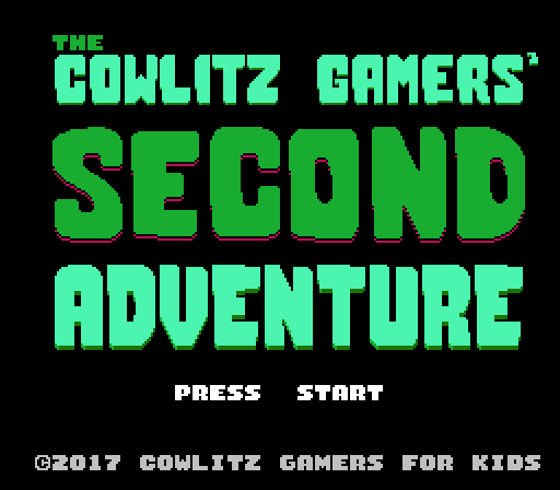
I thank both of ya'll for your offers. Spent the last few months working on the Cowlitz Gamers Adventure sequel. Really excited about it as I pitched a sequel with a new artstyle and mock-up and it seemed to have been well-received by the programmer, so we're working on it together. Finished all the stage layouts and art assets about a month or so ago. Don't want to show much yet in case some parts end up getting cut from the game, but here's the title screen (for which I used thefox's tool to do palette and layout tests):

The lettering style is based off of the hand lettering that I did for the first game's
box art.
Here are a few things from Isolation as well:
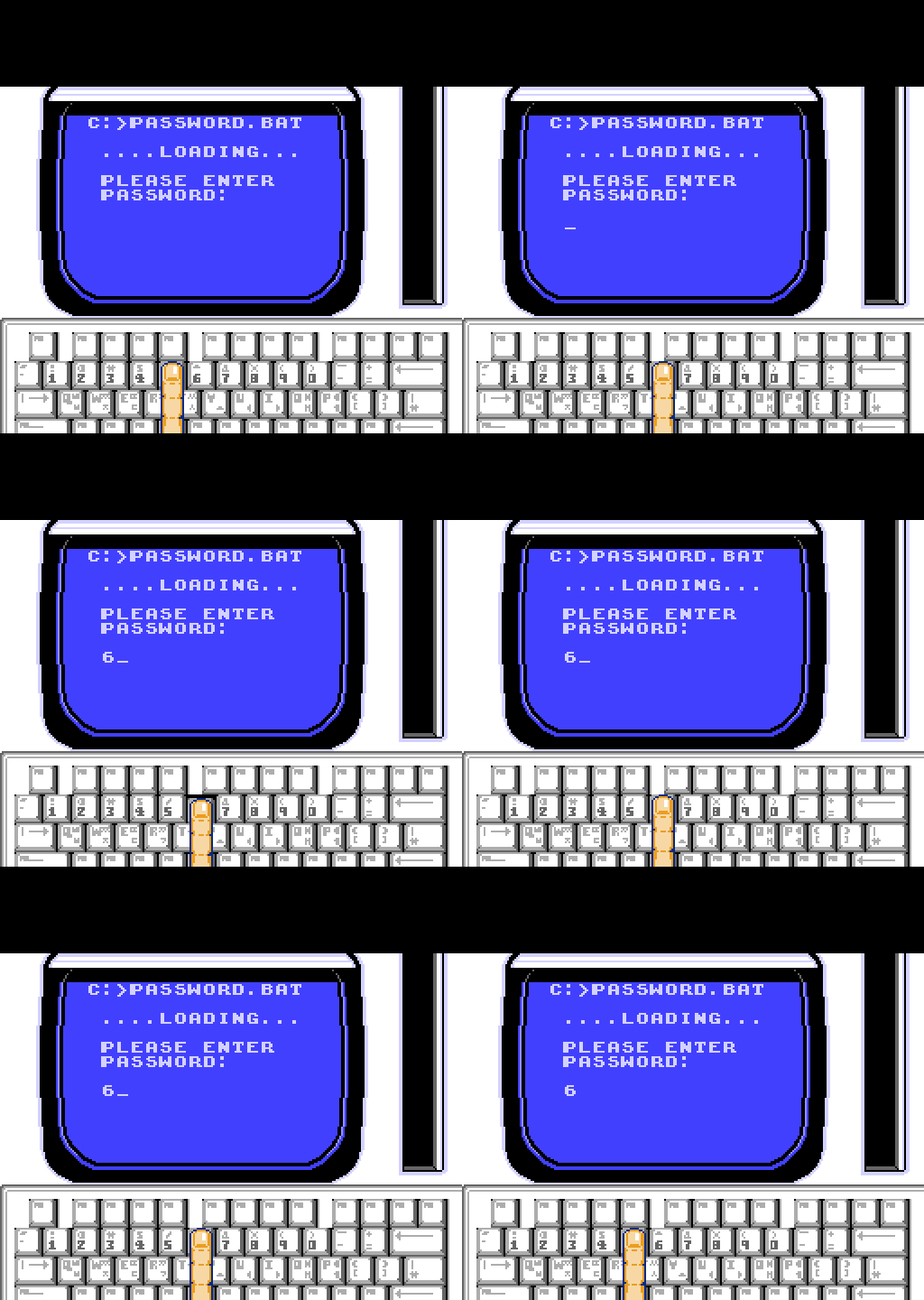
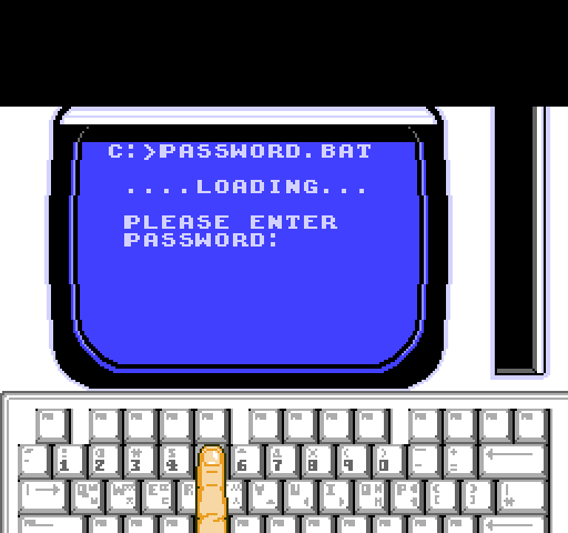
A computer terminal in a wall panel, player can move finger cursor along number keys only:

A ladder-climbing cycle:

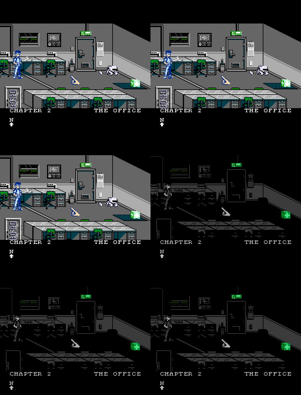
And, I decided to go with #2D with emphasis bits set for the lights-out office screen I had previously posted about:

The power-off sequence feels good! Is it supposed to be a grid blackout or the like, or just a local circuit? I think emergency exit signs ought to be powered through separate lines and should be lit.
The lone finger feels a little E.T. all on its own, but it is clear what it does.
I just saw your bike trip animation, that was extremely good.

Top tier good use of the resources available. Have you studied classic film animation?
It looks good (especially the blackout, like what WheelInventor said) but there's always one thing in whatever you draw that aggravates me. The lone finger is a little odd (you could have possibly drawn the tips of knuckles) but the problem to me was how flat the finger looks across the keyboard when there is no way for that to be possible without the other fingers to be showing, unless they were cut off. I tried to fix that and make the finger look more natural overall, not being perfectly straight and reducing the size of the fingernail among other things. I don't know if you like it more, but my OCD was killing me.

Attachment:
 New Finger.png [ 2.23 KiB | Viewed 5011 times ]
In regards to the finger cursor, I haven't been completely satisfied with it, but the bottom 8 pixels will be cropped by most players anyway (That's the full, 240 px height shown there). So, I don't think adding some sprite tiles for the other knuckles would be worthwhile. However, you're right, the main reason the finger looks weird is that it is shown flat--not angled down toward the keyboard . I'll definitely re-approach that. Thanks for pointing it out.
(The keyboard, by the way, is being held in the air by the character's other hand, as the keyboard is shown previously being stored in the vertical slot to the right of the monitor)
@WI
Thanks. I took an animation elective in undergrad but didn't major in it and I'm not comfortable with it (frequently having to check resources like Preston Blair books or google walk/flight cycles as reference, etc.
As for the exit sign, my early drafts had it on, but it shares palette with the green cube, and I'm worried that it might draw too much attention as neither are gameplay-relevant when the lights are off. May reconsider it though.


Quick double post here. If I go with the visible exit sign, it'd look like the above. I think it's a bit too distracting, but I've yet to make up my mind on it.
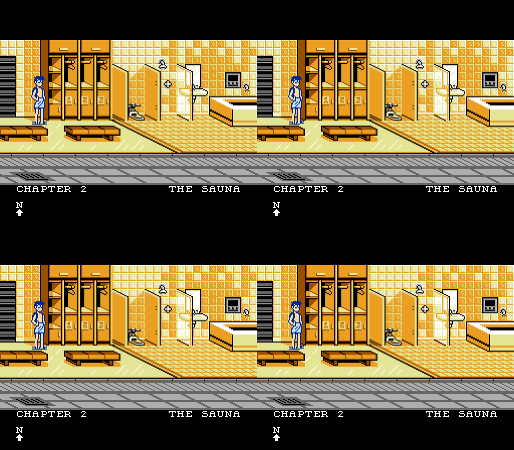
Also, here's a sauna.
Heh. I like how he's still wearing the backpack even after undressing.

Maybe trying to explain why you can still access the inventory items there?
Wait, there's a terribly easy fix to the light problem. When the lights go out, just switch the cube's palette to that of the robot thing, because it's completely black.
One nitpick is that glasses/eyeballs in dark rooms usually, in cartoony settings, remain full-white.
I think the exit sign's fine, especially if that's how you exit. Is that
Otherwise? Everything is amazingly recognizable even built with an economy of pixels. Lovely as usual.
I don't know if you want to hide the first aid block when it is dark, but using the robot's wholly black palette like Espozo said does not only help hiding it, but would probably also help make the exit sign more believable once the unreal light of the box is gone.
Also loving the backpack keeping in the sauna. And, well done on the glass wall. It stood out to me as really good looking.

Sharing a technique: It is a common practice in film animation to let components of a unit lag one up to several frames behind each other, anywhere one component is the force that pushes the other into action.
Two examples:
1)When the main character is riding the bike, the vibration of the vehicle would (in the real world or in a cartoon) make the character bump - not in unison, but in cascade. This would've been easy to implement on a system with less sprite restrictions, of course. Attempting this on large nes sprite groups might need to involve tile-level animation.
2)When the finger is pushing the button, there is a span of travel for the finger to do before the actual pushing takes place. This may be simulated with a similar cascaded lag.
The sense of pre-signaling movement prepares the audience to both focus on and accept the action about to come. In the examples above, the actions are pretty self-explanatory, though, so it's mostly for appearance; to heighten the naturality or hide the animator's hand.
That's really useful. I do struggle with the animations, especially for such a large character.
I've got a bit of that delayed movement going on with the scooter in terms of the chassis bumping a frame later than the wheels to try to show some shocks. In early drafts of the scooter animation I had the character bumping a frame later than the chassis and it looked good, but either way I was trying it, it was eating up my tile or scanline restrictions. It wasn't a conscious decision though and having you explain the reasoning behind it will help me keep it in mind for future animations.
On that note, to save space, we're using a combination of showing the player performing an action and just showing the result of the player's action (for example, we may show him open a door, but later just show a drawer open in front of him). Basically, each screen is getting 1-2 major animations even though it may have 4-5 interactions.
There are actually quite a few animations I'd like some feedback on that I don't want to post publicly. (Considering how niche the player base will be, we'd like to keep some surprises in the game). I'll send you a PM if you've got the time.
As for the glass partition, I actually had all three as glass in my first draft of the screen, but later realized how silly it was having translucent partitions around a toilet.

M_Tee wrote:
I actually had all three as glass in my first draft of the screen, but later realized how silly it was having translucent partitions around a toilet.
Well, at SFA (a college where my mother works), in the men's restroom next to the indoor swimming pool, there are no stall walls around the toilets.


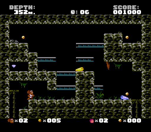
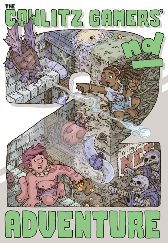
Progress on this has come along enough that I think it's okay to show some off. This is from The Cowlitz Gamers' 2
nd Adventure.
After finishing the illustration and packaging for Lukasz Kur's original last year, I put together a mockup for a sequel with larger sprites and more detailed graphics, (based off of the illustrations which were based off of the 8x8 sprites of the original game.)
Luckily, the programmer not only liked the mock-up, but was willing to code a sequel based off of it. Here's a screenshot of it at its current state.
Possibly not the best thread for it, I may take all of the Cowlitz posts to their own thread in Homebrew Projects when I get the time to type up a proper OP.
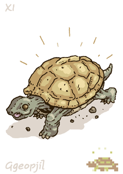
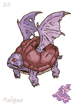
In the meantime, here are some manual illustrations for the game:


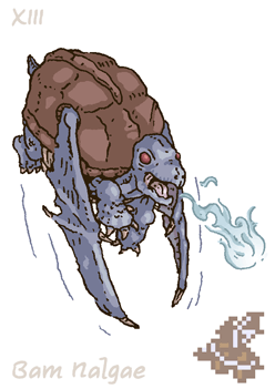
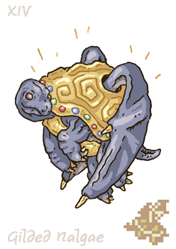
These are all four turtle-type enemies, of the sixteen or so total enemies in the game.
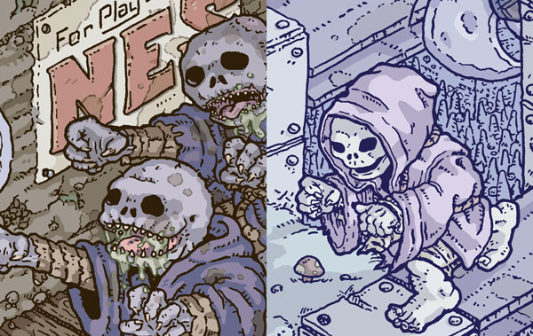
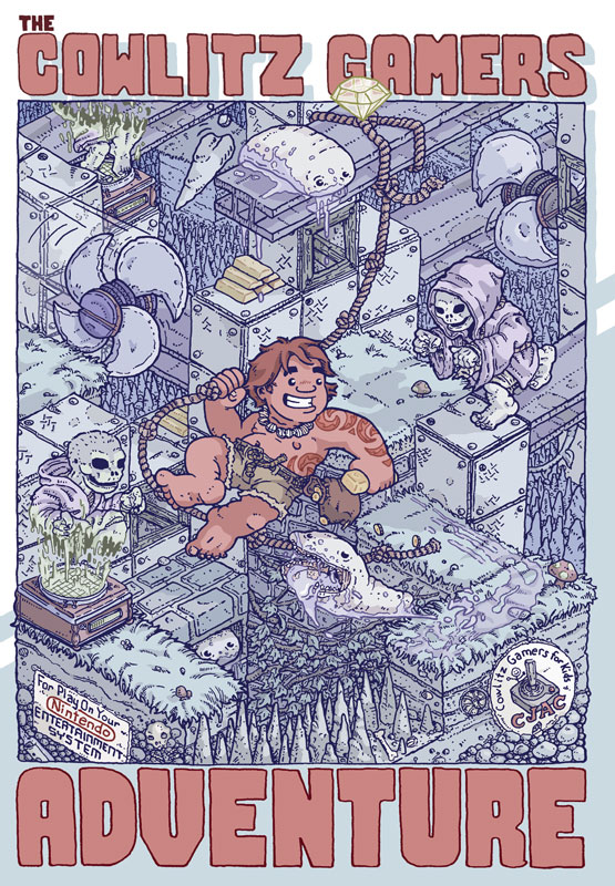
I'm currently coloring the CG2 cover art and thought I'd post this comparison with last year's cover art here:

The rightmost illustration was based off of the original (8x8) graphics of the first game:

The enemy sprite for the second game was based off of the first game's illustrative representation:

…and the leftmost illustration above is based off of the enemy sprites for the second game.
This creative path was similar for the characters, enemies and items present in the first game, although a few of the characters (such as the new lead and some enemies) were created originally for the second game.
Looks neat! …though, except for that first cover-image, the restless dead have unusually good posture.
However, this sort of artwork path has Telephone-lke risks. (See the strategy-guide image here:
http://zelda.gamepedia.com/Fokkeru , which hardly resembles a bird at all!)
Well damn... (I could never draw that...

) What program do you use? Adobe illustrator? Like all Adobe products though,
pirating paying for it is the problem.
@Myask
Thanks.
Is "telephone" a reference I'm missing? Anyway, the lillustrative liberties taken with retro game art is something I'm actually a huge fan of and choose to embrace in my own work instead of avoid. My favorite MegaMan covers are PAL MM 1, followed by US MM 2. (Followed by Rockman 1~3 on Famicom, though)
That Zelda example is pretty extreme, but it's definitely an interesting interpretation of the sprite. I'm glad you showed it to me. I'd love to track down a scan of the other illustrations.
@Espozo
I draw and ink by hand, color in Photoshop, and use Illustrator for layout. Sometimes (like here), I letter by hand as well, and may vectorize the lettering in Illustrator.
Telephone is a game, it is also called chinese whispers.
https://en.m.wikipedia.org/wiki/Chinese_whispersIn the game telephone the original message typically no longer resembles the last message, due to multiple minor changes. Myask example is how this occured with Fokkeru via sprite reinterpretation.
Myask wrote:
However, this sort of artwork path has Telephone-lke risks. (See the strategy-guide image here:
http://zelda.gamepedia.com/Fokkeru , which hardly resembles a bird at all!)
For modern examples of telephone, see Drawception. Sometimes
a theme is kept, but more often
not. (
snort)
Ah, yes. I'm familiar with the classroom game, but hadn't made the connection when reading it.

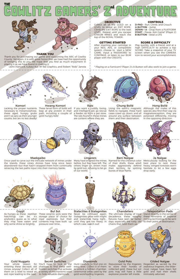
First draft of our foldout manual for Cowlitz. Dashed lines indicate folds, won't actually be printed. Some of enemy names have been revised.
Please post any errors that you notice. I'm pretty bad at proofreading my own writing.
This looks really good! I really dig the coloring style.
Very good job, congratulations

M_Tee wrote:
Please post any errors that you notice. I'm pretty bad at proofreading my own writing.
Error under Gold Pots: "hordes" should be "hoards"
Error under Gilded Nalgae: "zealotous" should be "zealous"
May be error (redundancy): under Gold Pots, "bul sot pot"…if bul sot means pot.
Not errors, but I'd suggest changing these to flow better.
under Hwang Komori, "These larval form of bollé" to "These bollé larvae"
under Maekgaibo "the last paths input into their memory banks." to "their last-programmed paths." or "the last paths put into their memory banks."
under Gold Nuggets, "an exit rope leading to an exit." to "a rope leading out."
Art is lovely.
Lingerer description is perfect.
Curious what all those words and names mean outside of this context, as I'm not familiar with their language[s] of origin:
[hwang] komori
[chung/hong] bollé
maekgaibo
[bam/ja] nalgae
gopjil
bul sot
I see "nalgae" and immediately think of "nalgas", meaning "buttocks" in Spanish.
Thanks a ton, Myask. That's exactly the kind of proofreading I need. I'll implement all of those changes.
As for etymology, it's Korean (and errs toward the side of sino-Korean, or Korean with Chinese origins, especially in regards to color). I try implement it into my work whenever I can, and I'm also a big fan of enemy names using foreign languages to generate fantasy naming conventions (apparently
Koopa originates from gukbap, a Korean broth served with rice, I could only speculate from the similarity between the bowl and the shell.) But plenty of enemy and item nameswere simply not localized, just transliterated in game manuals, and I really dig that.
Anyway, the word origins are as follows:
(Standard romanization given when different. For example, the eo in Korean romanization is intended to be pronounced like the short o in dog. Also, I freely chose between older and newer romanization in regards to consonants (such as j and ch or g and k)
Nalgae (날개) - Wing
Gopjil (껍질, ggeopjil) - Shell
Bam (밤) - Chestnut (frequently used as a color reference for a particular shade of brown)
Ja (자) - Purple (most commonly used to refer to the slightly reddish purple a specific breed of sweet potatoes have)
Chung (청, cheong) - Blue
Hong (홍) - Red
Bollé (벌레, beolle) - Bug, (but frequently used interchangeably for beetle, such as a stag beetle being a saseum beolle, or deer bug)
Komori (거머리, geomeori) - Leech
The last is my absolute favorite, and no one ever asked from
last year's manual, so I haven't shared it yet:
Swiss Army knives in Korean are literally called
McGuyver knives (맥가이버칼 or maekgaibeo kal).
So, the name for the spinning blades, Maekgaibo, comes from (맥가이버, maekgaibeo), what I believe to be the raddest instance of Korean appropriation of English.
However, in development, we just refer to them as blue slugs, yellow blades, etc. though.

Anyway, will update the image when I get a chance to do so. Thanks again for taking a look at it.
EDIT: Forgot bul sot (불) - fire, (솥) - pot (cauldron, etc.). Specifically chosen in reference to large ceramic pots used for cooking.
M_Tee wrote:
I'm also a big fan of enemy names using foreign languages to generate fantasy naming conventions
Ask the Maori how they felt about
LEGO Company's appropriation of their culture in Bionicle.
Luckily, I'm not an intern Googling exotic phrases (intentionally hyperbolic exaggeration of whatever situation led to Lego's situation). I'm an immigrant with long and deep roots in the culture who also does my research when needs be. I choose to incorporate Korean culture and linguistics into my work because it is a deep part of who I am and so that one day, my children may see it and feel a connection to it. Would rather not soapbox, though. Enjoy the art.

M_Tee wrote:
Thanks a ton, Myask. That's exactly the kind of proofreading I need. I'll implement all of those changes.
[…]Korean.
You're welcome and Thanks!
Quote:
Swiss Army knives in Korean are literally called
McGuyver knives (맥가이버칼 or maekgaibeo kal).
So, the name for the spinning blades, Maekgaibo, comes from (맥가이버, maekgaibeo), what I believe to be the raddest instance of Korean appropriation of English.
McGyver Knife is indeed rad.
My favorite Japanese compound (though I'm American) is 魔法瓶, mahōbin: mahō (magic) bin (bottle) = Thermos bottle (vacuum flask) …or, if you break up by kanji, demon technique bottle.
Japanese has interesting wasei eigo"made in Japan English" words where they appropriate a word and it doesn't really mean what it does in English, like handoru (from handle) for "steering wheel".
Quote:
EDIT: Forgot bul sot (불) - fire, (솥) - pot (cauldron, etc.). Specifically chosen in reference to large ceramic pots used for cooking.
That means bul sot pot in the gold pot description is technically redundant…but only people who're bilingual/looking "bul sot" up will ever notice. And that's not many people.
@Myask: Yeah, Korean has a number of loanwords and phrases from English that are used differently, commonly an adjective may be used in place of a noun, or syllables will be broken up, dropped, and reused. For example, sandwich is frequently just sand. So, you can see things marketed as Cheese Sand. I'm pretty sure it's common in all languages (English's introduction of other languages' words being no exception) but it doesn't make it any less amusing.

Also, I apparently have never once spelled MacGyver correctly.
@Tepples
I read the source link for the Maori controversy, and it's an interesting read. I certainly didn't mean to imply that appropriate research and consideration shouldn't be made, (though I could see due to my phrasing that it could have been read that way).
@Myask
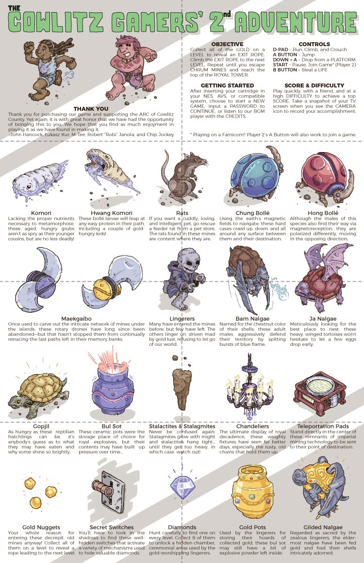
I've updated the manual with your corrections and suggestions (and to add an additional credit).
For word spacing, I've rephrased a few of the entries:

Again, if anyone else notices errors, please let me know. Still a few weeks away from having these printed.
under Gold Pots:
"gold. these bul sot" is that a comma? It should be, and I think it already is, but this is a little too low-res to tell.
under Bul Sot:
is the punctuation after "explosives" a comma? It should be, and I think it already is, but this is a little too low-res to tell.
Otherwise, looks good to me (though I invite others to look, generally any editor is significantly worse on their second pass through something, being familiar, their memories autofilling what they read…)
FWIW, I read through all of it and didn't spot any mistakes.
So, I'm vectorizing a few assets for the A53 packaging, and I found out that the
Create Object Mosaic feature in Illustrator is a pretty efficient way of doing so. Previously, I had been using an embarrassingly tedious method from a Youtube video that involved filling in a grid cell-by-cell with the Live Paint tool.
I posted
detailed instructions (assuming no or basic previous experience with Illustrator) on my blog in case anyone else could benefit from it.
A little early preview video (from a week or more ago) of a title Lukasz Kur and I are working on. Trying to wrap it up, from start-to-finish, in just a little over a month (coming up on that deadline very soon.)
https://youtu.be/_PmGaukgM-k
Looks really nice! I remember playing the pegasus - my cousins in poland had it, of course

