First time ever trying to do graphics on the NES

This is an archive of a topic from NESdev BBS, taken in mid-October 2019 before a server upgrade.
View original topic
First time ever trying to do graphics on the NES
by on (#165653)
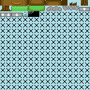
So this is the first time I've ever actually put any form of effort into making graphics. All I really have that's presentable right now are some maps, and I think they're pretty good, but it seems like a lot more is expected in terms of graphics since the NES's commercial era, so I'd like to hear opinions from someone who isn't myself, and if I should just scrap the whole thing while it's still young.
Attachment:
testscreen1.png
testscreen1.png [ 18.89 KiB | Viewed 7412 times ]
Attachment:
testscreen2.png
testscreen2.png [ 18.1 KiB | Viewed 7412 times ]
Attachment:
tiles.png
tiles.png [ 1.7 KiB | Viewed 7412 times ]

What I have in mind is a bit of a cartoony look to the graphics, but not in too forced of a way; but I'm interested in thoughts, input, changes, and criticisms. Think of the actual level design as a bit of a lorem ipsum, it's mainly just barebones of what I have in mind and is of course still subject to change.
Re: First time ever trying to do graphics on the NES
by on (#165654)
My 2 Cents...

Certain corners could be improved... for example, underground, where you see 1 pixel of blue at each corner. You seem to have plenty of tiles left...should be easy to fix.

The clouds aren't great.
Re: First time ever trying to do graphics on the NES
by on (#165661)
Try doing some simpler white clouds. You could even try something like Megaman 2's Airman stage, and have large cloudy shapes coming in from the top of the screen.

There's no getting around it, the rounded corners are going to need to take into account what they're "touching". You'll need multiple copies of each corner, or else you'll wind up with the issue where the sky shows through in inappropriate spaces. Try having "square" versions of each corner in addition to the rounded ones, and use each where it looks appropriate. Plug those holes, basically. :P

The lines in the ground look a little odd, you'd almost be better off just leaving the ground as a solid color. To keep it from being boring, you can add large shaded rectangles into the ground, like if regions were popping out towards the screen. You can also paint the entire cliffside with polkadots or a checkerboard or something, that'd look pretty toony too.

Overall, this is pretty good for your first try. :D
Re: First time ever trying to do graphics on the NES
by on (#165699)
A path down next to a bottomless pit?
Re: First time ever trying to do graphics on the NES
by on (#165721)
Oh hush, like Mega Man never put down-ladders next to bottomless pits that would've led to safety anyway. :P
Re: First time ever trying to do graphics on the NES
by on (#165726)
It wasn't good when Mega Man did it.
Re: First time ever trying to do graphics on the NES
by on (#165753)
I'm more concerned right now with how the actual tiles/color choices look, than how the level is put together. The levels are really just mockups, but if level design is really that integral to critique on the tileset, I'll make a new map.
Re: First time ever trying to do graphics on the NES
by on (#165763)
The best way to check if your color-reduction looks good is to try your existing maps but with the color-reduced tiles. That way, you can spot compositional problems that you wouldn't know about by just looking at individual tiles and blocks by themselves.
Re: First time ever trying to do graphics on the NES
by on (#165871)
Been working on the clouds a little more.
Attachment:
newclouds.png
newclouds.png [ 2.72 KiB | Viewed 7121 times ]

I think they have a little more depth now and look puffier, but they still seem kinda stiff. Any suggestions?
I guess too if they're at the top of the screen, the top half won't even be visible, I may keep tweaking them a bit.

I also fixed the blue pixels in underground corners, and it does look a lot better.
Attachment:
fixedcorners.png
fixedcorners.png [ 5.24 KiB | Viewed 7121 times ]
Re: First time ever trying to do graphics on the NES
by on (#165882)
The stiffness comes from how it's just one straight, flat, solid cloud log. It's fine for if those clouds are going to be platforms later, but if they're just background decorations, try giving them a little more variation, like in size and position.
Re: First time ever trying to do graphics on the NES
by on (#165903)
Part of it is, I want the player to be able to exit the room vertically, but only at certain spots. Rather than having vertical exits have a specific address of where to go like the pipes in SMB (I already have an idea with something like this anyway, only with teleportation platforms. Some are 1-way, others are 2-way. I think it'd make an interesting game mechanic. But I digress, ) I was planning on having the clouds be solid, and then in places where the player is allowed to leave the room by exiting up, there'll be a break in the clouds.
Re: First time ever trying to do graphics on the NES
by on (#165928)
Alrighty, then you might want to try making the clouds a bit taller, maybe like the ground where there's a top part, middle part, and bottom part. Also be aware that the top and bottom rows of tiles may be offscreen. For example, my television cuts almost two rows off the top and one row off the bottom. Other TVs may be better or may be worse.
Re: First time ever trying to do graphics on the NES
by on (#191766)
Different game now :roll:

I'd like to get some feedback on the graphics I've done so far the island adventure game I'm making
Attachment:
player_facings.png
player_facings.png [ 610 Bytes | Viewed 5760 times ]

Attachment:
walking_up.gif
walking_up.gif [ 469 Bytes | Viewed 5760 times ]

Attachment:
walking_down.gif
walking_down.gif [ 489 Bytes | Viewed 5760 times ]

Attachment:
walking_right.gif
walking_right.gif [ 496 Bytes | Viewed 5760 times ]

(Right and left are mirrors of each other btw)
Re: First time ever trying to do graphics on the NES
by on (#191767)
Sorry, lots of gifs...

Attachment:
attacking_up.gif
attacking_up.gif [ 306 Bytes | Viewed 5760 times ]

Attachment:
attacking_down.gif
attacking_down.gif [ 303 Bytes | Viewed 5760 times ]

Attachment:
attacking_right.gif
attacking_right.gif [ 336 Bytes | Viewed 5760 times ]

And here are a few screens from the overworld:
Attachment:
somescreens.png
somescreens.png [ 20.73 KiB | Viewed 5760 times ]

The shitty-looking forest trees are still a work in progress, and I'd love any suggestions as to how I could make them better.
Also, the water is animated in the game
Attachment:
waves.gif
waves.gif [ 340 Bytes | Viewed 5760 times ]
Re: First time ever trying to do graphics on the NES
by on (#191769)
Quote:
feedback on the graphics


My main issue, with the sprites, is, they aren't very colorful.

Quote:
forest trees


I'm more concerned with the shape of the water. Entirely square edges. Try to have at least 1 shared color between different palettes...like the universal background color (3f00), and use that to round the corners a bit.

There is a joke in the Discworld 2 game, where he makes fun of a movie set backdrop that was "apparently painted without reference material". Look at real trees. Research how other games handled trees. (Not Zelda 2...its trees are terrible).
Re: First time ever trying to do graphics on the NES
by on (#191771)
dougeff wrote:
Quote:
feedback on the graphics


My main issue, with the sprites, is, they aren't very colorful.

Yeah, the main character does only use one palette (black outline, caucasian skin, and brown for the hair and pants), but the third palette is currently being used for powerups, weapons, things being dropped by the enemy, etc. And I want to be able to have the other 2 palettes reserved mainly for enemies so that there can be some variety of things to kill on the screen. Although the player's skin and the color of the sand are tbe same ($37), I feel like the outline does a pretty good job of making him stand out.

Quote:
Quote:
forest trees

I'm more concerned with the shape of the water. Entirely square edges. Try to have at least 1 shared color between different palettes...like the universal background color (3f00), and use that to round the corners a bit.

There is a joke in the Discworld 2 game, where he makes fun of a movie set backdrop that was "apparently painted without reference material". Look at real trees. Research how other games handled trees. (Not Zelda 2...its trees are terrible).

The universal background color for the beach is $37, so there can be 3 different colors of sand to give it a more grainy look. In the forest/jungle it's $17 (ignore the sand tiles at the bottom of the second screen, they should be dirt.) Changing the UBC to blue I feel I could work around it and still make the sand (and the trunks of the palm trees, which share the same palette) look good, but for the palms (which has the palette $37,$1A,$29,$17), this wouldn't work because all three of the colors are already used (plus the background color to make it look like it's on sand.)
Re: First time ever trying to do graphics on the NES
by on (#191773)
dougeff wrote:
There is a joke in the Discworld 2 game, where he makes fun of a movie set backdrop that was "apparently painted without reference material". Look at real trees. Research how other games handled trees.

This is good advice. Even if you're doing heavily stylized graphics, looking at good reference pictures will help you choose what to emphasize/distort/replace/maintain.

Sogona wrote:
Yeah, the main character does only use one palette (black outline, caucasian skin, and brown for the hair and pants)

I can think of very few cases where NES sprites turned out good when using black outlines and a single palette, and if you think about it, wasting 33% of the colors just on outlines doesn't sound very sensible.

I personally don't like sprite outlines, but if you really must have them, maybe it would be better to use a dark shade of an actual color that you can reuse. You could easily use the same dark brown for outlines, pants and hair, freeing one slot for a more interesting color. You can highlight the brown areas using a light shade so that they don't look flat. Just an idea.

There's something weird about the animation too, because the guy projects his body forward when attacking down but not when attacking right or up. These are supposed to be different views of the same movement, so they should match.

This is actually another good opportunity to use reference material. Watch videos/animations of sword fights, or even try to do these movements yourself. When people make a stabbing movement, they usually put one foot forward, for balance. Your character is currently bending his knees or doing nothing with his legs (depending from where you're looking), so that's definitely something that can be improved.
Re: First time ever trying to do graphics on the NES
by on (#191775)
If this wasn't mentioned already, one thing that bothered me much is the inconsistency on the size of his arms in the side views.
It's most noticeable in the walking animation, that his arm alters between really thick and really thin. Also, in the attack animation the arm changes from a muscular one to a thin one when it is stretched out.
I know it may be difficult to work with the low resolution, but it's just too noticeable to me, so I'd recommend some tweaking.

Considering that pixels are a bit 'fat' when the Famicom screen is viewed on a authentic NTSC screen (pixel aspect ratio is 8:7, according to the wiki), it could look even worse on a real 4:3 TV (and horrible if someone just stretched the display on a 16:9 wide screen monitor).

Awwwwww! The forums said I was logged out nearly every time I tried to submit the reply, and I had to repeatly re-login until it worked.
Re: First time ever trying to do graphics on the NES
by on (#191776)
Gilbert wrote:
(pixel aspect ratio is 8:3, according to the wiki)

You mean 8:7, right?
Re: First time ever trying to do graphics on the NES
by on (#191777)
It's actually fixed when you're reading my post. :roll:
Re: First time ever trying to do graphics on the NES
by on (#191787)
This is the scene in Discworld 2, if anyone is terribly curious....

https://youtu.be/ighVB4DBqy0

At exactly 3:38:28 is when he looks at the 'set' and comments about 'painted without reference material'
Re: First time ever trying to do graphics on the NES
by on (#191789)
Color contrast is important when designing a character and the stages. Right now, your character is pale yellow and medium brown... Of the three colors shown in your backgrounds, which the player will constantly be in front of, one is primarily pale yellow. The other is primarily light brown. Ever wonder why "soldiers" dressed in bright blues and reds in overhead shooters like Ikari Warriors (instead of the greens and browns actual soldiers wear for camouflage)?

As for the sprite: consistency between angles, consistency between frames, and appropriate, realistic movement for actions such as walking, attacking, etc. all need to be focused on.
Re: First time ever trying to do graphics on the NES
by on (#199016)
Sorry for taking so long to get back with this.

I finally decided that there was no way to have the player's animation look good when attacking downward and still have the weapon spawned below the hitbox, so I decided to make the hitbox only 15x15 pixels when the player is in that respective state and direction. This does present the issue of the weapon being hard to see, since now there's sprite flicker. I guess I could tweak the engine slightly to draw object 1 (hard-coded to be the player's weapon) first, and then objects 0 and 2-15. Or, since I'm using CHR-RAM, I could dynamically load the sprite of the player's leg drawn around the weapon depending on the weapon being used. I'll see.

I've done numerous small tweaks to the graphics and frames of animation. The frames for when he's standing are different, so that when he attacks it looks more like he's lunging. I'm still not fully satisfied when he's attacking up and down, as the legs still look kinda weird and ambiguous for what he's supposed to be doing. But here's how everything looks right now:
Attachment:
facings_updated.png
facings_updated.png [ 544 Bytes | Viewed 3476 times ]

Attachment:
walkings_updated.gif
walkings_updated.gif [ 1.23 KiB | Viewed 3476 times ]

Attachment:
attackings_updated.gif
attackings_updated.gif [ 2.98 KiB | Viewed 3476 times ]


tokumaru wrote:
I can think of very few cases where NES sprites turned out good when using black outlines and a single palette, and if you think about it, wasting 33% of the colors just on outlines doesn't sound very sensible.

I personally don't like sprite outlines, but if you really must have them, maybe it would be better to use a dark shade of an actual color that you can reuse. You could easily use the same dark brown for outlines, pants and hair, freeing one slot for a more interesting color. You can highlight the brown areas using a light shade so that they don't look flat. Just an idea.

Something like this, perhaps?
Attachment:
new_palette.png
new_palette.png [ 308 Bytes | Viewed 3476 times ]


I more or less need to use an outline, since a fair part of what I plan to be the game will take place on an island with sand, which is the same color as the players skin, and they'll blend together and make it hard to tell what's going on.
Re: First time ever trying to do graphics on the NES
by on (#199261)
Don't make the sand the exact same color as the sprites if possible, otherwise it just looks like monochrome graphics on top of a single color.
Re: First time ever trying to do graphics on the NES
by on (#199265)
Dwedit wrote:
Don't make the sand the exact same color as the sprites if possible, otherwise it just looks like monochrome graphics on top of a single color.

I was afraid that $38 would look too green for sand, but I tried it out and it looks okay in FCEUX and Nestopia. My powerpak isn't working for some reason, though, so as of right now I can't test it on the real thing.

Having a UBC of $38 with colors $27, $17 and $30 give the sand a grainy look and help the player pop out better.
Attachment:
island-3.png
island-3.png [ 2.06 KiB | Viewed 3413 times ]
Re: First time ever trying to do graphics on the NES
by on (#199327)
It'll also double as a water tile with another palette, as Zelda II did.

might want to tuck his shirt in, it looks like his pants are instead chaps and don't cover his pelvis.