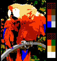
It irks me a little that the Wikipedia page on Game Palettes says (for NES and Sega Master System)...
Quote:
Because of the constraints mentioned above, there are no current simulated screen images available for the NES.
https://en.wikipedia.org/wiki/List_of_v ... e_palettesSo, I challenge any of you out there, CAN IT BE DONE? To render their little Parrot picture in NES (or SMS) graphics.
The Master System one is easier:
1- resize (smoothly) to 32x24;
2- convert to 2 colors to find out which tiles can be represented with the same palettes;
3- resize (nearest-neighbor) to 256x192;
4- separate the original image in 2 layers using the 2 areas created before as masks;
5- convert each layer to 16 colors (from the SMS master palette) separately;
On the NES, things can get complicated if you want to automatically select the best value for color 0, but if you assume it to be black, the same process works just fine:
1- resize (smoothly) to 16x15;
2- convert to 4 colors to find out which 16x16-pixel blocks can be represented with the same palettes;
3- resize (nearest-neighbor) to 256x240;
4- separate the original image in 4 layers using the 4 areas created before as masks;
5- convert each layer to 4 colors separately (from the NES master palette), forcing black as one of the colors;
In the past, I've written a PC program that takes an image and a 32-character palette string and produces a file containing CHR and NAM data. Perhaps someone should write a batch PC program that does that in real time, letting the user adjust each of the 13 relevant color values up or down.
- Wait for the user to adjust a color or change dithering mode
- Convert the image with each of the four subpalettes
- Find which subpalette's converted image best represents each 16x16 area
- Show the image, as well as which colors ended up being used seldom if at all
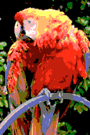
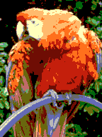
Well, I did some stuff in Photoshop, following tokumaru's advice and these are the results:
Sega Master System
Although doesn't the Sega Master System have one palette for sprites and palette for backgrounds, each with 16 colors.
Considering the 8 sprites per scanline limit, they can't really be used to fill up the picture like that. Or can the backgrounds use both palettes? I made a 16-color version of the picture, just in case.
 NES
NES
The NES version turned out way uglier, than I thought. I guess that's what happens, when you don't have choice over the colors in the palettes.
By the way, thanks, tokumaru for sharing this technique. I was wondering how you can do this sort of thing without editing individual tiles, even though it's not very recommended to use this, when making NES-style images.
That was fast. Is this what it looks like in Photoshop, or in an NES emulator?
Any chance you can share the nametable and palette data...if you layered sprites on top, it could be improved a bit.
Quote:
Because of the constraints mentioned above, there are no current simulated screen images available for the NES.
'twas I who added that, when some other random wikipedia editor didn't understand that the
quantized image didn't count.
tokumaru wrote:
1- resize (smoothly) to 16x15;
2- convert to 4 colors to find out which 16x16-pixel blocks can be represented with the same palettes;
That's going to produce highly-visible attribute clash, as visible in AlienX's results. It'd be better to use an algorithm like Khaz's
quantomatic.
AlienX wrote:
Although doesn't the Sega Master System have one palette for sprites and palette for backgrounds, each with 16 colors.
Considering the 8 sprites per scanline limit, they can't really be used to fill up the picture like that. Or can the backgrounds use both palettes?
Yes, each background tile can select which of the 2 palettes to use, and each palette has a unique color 0. Tile maps on the master system have 2 bytes per tile, so there are enough bits not only to index patterns (which takes 9 bits), but also to select a palette, flip the pattern vertically and horizontally and select a priority relative to the sprites.
Quote:
The NES version turned out way uglier, than I thought. I guess that's what happens, when you don't have choice over the colors in the palettes.
Yes, and it can only go downhill from their version that makes unrestricted use of the NES master palette. Their decision of not using any dithering at all also makes things way worse.
Quote:
By the way, thanks, tokumaru for sharing this technique. I was wondering how you can do this sort of thing without editing individual tiles, even though it's not very recommended to use this, when making NES-style images.
Yeah, I guess automatically converted images will never look as good as those created with actual artistic interference. The PPU sucks for straightforward display of photographic images anyway, so I can't help feeling like trying to improve this kind of conversion is a waste of time.
To be fair, the NES pic would look a lot better if some tiles were changed to use the red palette (I see brown where it doesn't make sense at all, e.g. the shadow of the wing at the left)
dougeff wrote:
That was fast. Is this what it looks like in Photoshop, or in an NES emulator?
Any chance you can share the nametable and palette data...if you layered sprites on top, it could be improved a bit.
This is how it looks like in Photoshop. Converting the graphics into a .chr file, making nametables and palette data, and putting all of that in an engine, that would display it all will take too much time and is pointless.
Also, while sprites could help, you'd have to know where to put them, keeping to the 8 sprites per scanline limitation. And besides, I wouldn't try adding sprites to a picture, that's meant to show what the NES's background graphics could do.
I guess I could make a new version of the NES image, where I'd select which tiles to use which palettes and maybe also select the colors. That will make it look much better.
By the way, how would you go about uploading this to Wikipedia? Do you just edit the article or is permission from the original author required.
I'd personally really want a better-looking version first, although obviously I won't stop you.
For anything that isn't protected or semi-protected, you just edit it. Usually I make the link while I'm editing the page, upload the images via that UI, and then save the edits to the page.
Well, I guess you could 'add sprites' in Photoshop. Thus covering up the harsh attribute table edges.
I don't think its unreasonable to use sprites as BG. Lot's of games have Sprites as various BG elements.
Adding sprites would give an excuse for somebody to remove it.
And again, you could probably fix most of it by just changing some of the tiles to the red palette. I mean, one thing is unavoidable attribute clash (like the one next to the forehead), but those are absurdly obviously meant to be mostly red (those that are nearly entirely covering feathers, really).
dougeff wrote:
I don't think its unreasonable to use sprites as BG. Lot's of games have Sprites as various BG elements.
The point of the images is not to show the best possible pictures these systems can produce, they're just meant to show the basic use of the systems' palettes. That's probably why dithering, raster effects, overlays, or any other kind of graphical tricks are not used in any of the images.
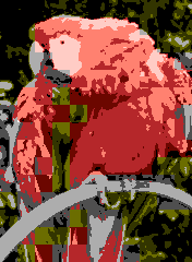
I tried making another version for NES. This time I selected the areas myself and picked most of the colors. (Note, the previous image used a more washed out color palette, while this one uses the palette shown in the article)

There's still a lot of attribute clash, but what can you do? Like tokumaru said, the system is not good at displaying photographic imagery. And I don't think tampering with the image itself to improve quality will be the right thing to do in this case.
At this point the clash is no more noticeable than it'd be in a Spectrum title screen.
Yep, this is probably good enough. It looks better than I thought it could get o.o
tepples wrote:
At this point the clash is no more noticeable than it'd be in a Spectrum title screen.
Well, I'm not really sure how to make it better, without actually editing the picture (this includes something as simple as removing those red leaves to the left. Adding common colors between all of the palettes (like red for instance) makes the image look flatter, because of the lack of colors. If anyone has any suggestions on how to make it look better, please share them.
Which colors did you pick, so I can complete the file description page for the "all limitations" version? And do you likewise release your retouched version to the public domain?
Once I have this info, I'll post both a regulation conversion (no dithering) for Wikipedia and an optimized conversion (sharpened and dithered) for NESdev Wiki as an example of how a photo ought to be processed for NES display.
tepples wrote:
And do you likewise release your retouched version to the public domain?
Sure.

Anyway, I've added the palettes to the picture, so that it resembles the ones for the Gameboy and Gamboy Color:

The colors in the palettes are the following:
0F, 06, 16, 02
0F, 16, 38, 30
0F, 08, 00, 10
0F, 0A, 18, 30
I hope this helps.
Why did you resize the image to 240 pixels high? None of the others on the wikipedia page are taller, and in practice the US NES won't show that full height anyway.
Besides, the ground rules for that article imply that the image size shouldn't be changed from 150x200 unless a particular platform can't display the whole picture:
These simulations are always up to the maximum vertical resolution of the given graphic mode or up to 200 scan lines, if vertical resolution is greater.
But thanks for the palette. I'll see what I can do with
savtool.py --palette 0F1602060F1638200F0800100F0A1820 tonight.
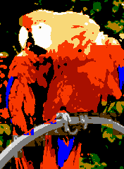
At 1:1 size, I had to make a few changes to the palette because different colors were getting put together. Here's what I came up with:
0F 16 06 08 / 0F 16 27 20 / 0F 09 00 10 / 0F 0A 19 10
One is converted per Wikipedia regulation, the other sharpened and dithered for showing what's possible.
It might be useful to note that the original image is not a multiple of 16x16 pixels, so it feels like it should be ok to move the edges of the 16x16 attribute grid internally, perhaps indicated by explicitly adding padding?
Now that I finally have some free time, I tried my hand at it...
Palettes...
0f 07 16 26
0f 08 18 16
0f 18 21 16
0f 26 27 38
(with lots of dithering)
tepples wrote:
At 1:1 size, I had to make a few changes to the palette because different colors were getting put together. Here's what I came up with:
0F 16 06 08 / 0F 16 27 20 / 0F 09 00 10 / 0F 0A 19 10
One is converted per Wikipedia regulation, the other sharpened and dithered for showing what's possible.
I think replacing the grey with purple will make the attribute clash a little less noticeable, but other than that, it's the best one in this thread so far.
The same picture, undithered.
And (to disagree with psycopathicteen) Tepples should replace the dark gray($00) with $16.
How about replacing the photo with an amazing pixel art parrot?

Seriously, am I the only one who thinks all of these images suck? I know this was proposed as a challenge, but isn't that whole Wikipedia page nonsense anyway? 90% of the consoles listed there don't come close to properly displaying the picture, a photograph that has no business being in a video game console to begin with.
Isn't the whole point of that page precisely to show how much older hardware sucked for the kind of images you'd expect today? (hence using it to explain why the hardware changed like that over time)
tokumaru wrote:
How about replacing the photo with an amazing pixel art parrot?

Seriously, am I the only one who thinks all of these images suck?
No, I tought the same. (hence why I didn't contribute to this topic before right now).
Quote:
I know this was proposed as a challenge, but isn't that whole Wikipedia page nonsense anyway? 90% of the consoles listed there don't come close to properly displaying the picture, a photograph that has no business being in a video game console to begin with.
Exatly, just like a large part of WP, it is pure nonsense.
OK, I have to admit, the teppels and dougeff's conversions are much better than mine. Although I don't like how the blue color in tepples's version is lost. After all, the image is supposed to show off the color capabilities of the system. I guess dougeff made up for that in his version, but some shades are missing.
tokumaru wrote:
90% of the consoles listed there don't come close to properly displaying the picture, a photograph that has no business being in a video game console to begin with.
True. It'd be a better idea to show some pixel art, considering the limitations of the systems. Although converting images and figuring out how to make them look good is kinda fun.

Bregalad wrote:
Quote:
I know this was proposed as a challenge, but isn't that whole Wikipedia page nonsense anyway? 90% of the consoles listed there don't come close to properly displaying the picture
Exatly, just like a large part of WP, it is pure nonsense.
A lot of the nonsense that people see on Wikipedia is the result of trying to uphold its
verifiability policy. If the best published sources say X, but even better nonpublic sources say Y, then Y isn't verifiable, and Wikipedia will say X. Wikipedia also tries to
eliminate what it calls "original research", which would at first glance appear to rule out posting your original pixel art on Wikipedia. (Those, together with "neutral point of view", are its core content policies.) But because Wikipedia knows that it's in the minority with respect to copyright licensing policies, it welcomes original illustrations "so long as they do not illustrate or introduce unpublished ideas or arguments." You might be able to justify posting an original pixel art trace of the same parrot that way.
Bregalad wrote:
a photograph that has no business being in a video game console to begin with.
The conception that photos don't belong in a game console is the problem. A few weeks ago, Holt mentioned an
interview with David Crane of
Pitfall! and
A Boy and His Blob. Crane was looking for less tile repetition and more photorealism in consoles and was disappointed to see
Super Mario Bros. embrace tile repetition as its aesthetic. See in particular the trees in the screenshot of
A Boy and His Blob that rainwarrior posted.
tepples, was black the best background color for this image? What if you used red or orange instead? It looks like you re-used a color between the first two palettes - what if that were the background instead?
Attachment:
 startropics_peter_parrot.png [ 5.16 KiB | Viewed 1680 times ]
