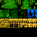
I've been putting together this tileset and I'd like to get some feedback. Please be honest; it's better to face the harsh criticism early than before I'm committed.
The sample scene shown here is for a Castlevania-inspired game.
I'm anticipating the game to use CHR-ROM, so I am trying to fit all the relevant tiles into groups of 64 tiles. (What is the official term for those groups? I've been calling them "pages.")
This tileset currently has a whole unused page that could be used for any other elements I want to add to the level, including ones specific to just one area. Likewise I also have a whole palette that is unused that can be used by any special tiles in the last page. I kept the sky using just one color as I might want to add some water, and it could use the same palette.


This sample image also shows two different variations for how I could set up the stairs. I may just be nit-picking but I'd appreciate any honest feedback about which looks better. (Edit: The stairs themselves are exactly the same, but where they connect to the ground is different. One is 8 pixels back.)
The trees look great, except their trunks are slightly dark.
Ground, good.
Stairs, I would redo them. Why not use the brown from the tree trunks, and make wooden steps?
I really like the majority of it, especially the green trees. Those look really good, I think.
The one part that i don't like are the black trees in the background. I just feel that the pattern is overly repetitious. Not as good as the rest.
Rocks are pretty good, but look a little too repetitious also. Try drawing over some of the grid lines. See if you can hide the grid, at least somewhat.
For the stair variations, I'm not sure exactly what you mean. They look almost exactly the same except for the top tile. I have no preference, if I'm looking at it properly.
Have you thought about using one of those CHR "pages" for animated tiles? Water or something of that nature? A lot of games did that.
Noted, noted, noted, and noted. Keep 'em coming! And feel free to bring up things others have mentioned; otherwise I just think one person thought that.
darryl.revok wrote:
Rocks are pretty good, but look a little too repetitious also. Try drawing over some of the grid lines. See if you can hide the grid, at least somewhat.
I intentionally made them look blocky. I know it's not conventional, but does it actually look bad? Innapropriate? (whatever)?
darryl.revok wrote:
For the stair variations, I'm not sure exactly what you mean. They look almost exactly the same except for the top tile.
Oh right, only the top/alignment is different. I've edited my first post to mention this.
darryl.revok wrote:
Have you thought about using one of those CHR "pages" for animated tiles? Water or something of that nature? A lot of games did that.
I have, actually! Animated water, maybe a rainy area... But right now I'm working out the base tiles.
Quote:
I know it's not conventional
I personally wouldn't call it unconventional. With the hardware, it's tough to do anything else. Most game will show a lot of repetition in the rocks, but i think the big issue with yours, for me, is that the actual tile borders are defined in your rocks, for most of the edges.
Quote:
Animated water, maybe a rainy area...
If you do this, you'll have to swap out a section of at least 1KB to animate the water, so consider filling the rest of the blocks with other tiles that could animate with the same number of frames. SMB2 is a good example of this.
The art looks good, but I can't help thinking that you dedicated waaay too many tiles to trees. Almost half of the tile budget is spent on trees, a repetitive background element that the player doesn't even interact with. As for the things that the player does interact with, you only have the ground (which is substantially less detailed than the trees, since the rocks don't ever cross the metatile boundaries), the stairs, and a few floating platforms. You only have one page/bank left to draw everything else that could make the map more interesting, like mountains, clouds, bridges, waterfalls, water, hazards (spikes, fire, etc.)... not to mention items that the player can destroy/collect.
Since these trees are cones, you could probably reuse the sides of the lower sections in the upper sections, as they get progressively closer. Some of the center could certainly repeat vertically as well. Sure they would look less detailed, but they're trees, so they already look repetitive by default. Better save the tiles for foreground stuff that's likely to draw more attention from the player.
Looking at the screenshot a third time, the trees way in the back (top) look really silly for some reason.
I'd say it looks awesome. I'm no specialist though.
The problem with the trees at the top is that their silhouette makes it look like small things on top of some solid block. Having their bottoms blend better together so it looks like they're actually part of it would help solve the issue.
As for stairs: I'd say, take the top variant, then make the tile to the right (i.e. the first one immediately above the stairs) thin. That way you're marking more clearly which part you can go through.
The rocks could be a little more detailed. You could probably replace the darkest shade of brown with black, and add a light brown highlight for the rocks. You can add some dithering to the rocks too.
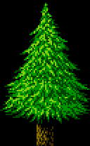
I thought I'd try and improve the tree:
Attachment:
 Tree.png [ 1.49 KiB | Viewed 5067 times ]
Espozo wrote:
I thought I'd try and improve the tree:
Attachment:
Tree.png
Dang. You, sir*, are very talented.
If I had money, I would strongly consider hiring you to help me with my art.
*Or madam, I don't know you.
I think the grid-like ground rock tiles look fine. It's an aesthetic, it's not necessarily right or wrong, but it definitely doesn't look bad to me. The floating platforms, I think you should darken the bottom halves (the stalactite-like part) to better match what the ground tiles look like.
As for the background, I wish I had the example still with me, but you can draw the negative space between trees and use that to decorate the black part, as though the trees were all black and you were drawing the ambient lighting that comes from behind the trees. I just drew a quick sketch of what I mean; with a layer of shading, this can look really good, and those blue vertical lines can be repeated a bunch to look like a bunch of tree trunks with spaces between them, even if the rest of the tree is just a solid black.
Edit: I'm not saying to ditch the trees you have, I'm just offering an alternative thing you can try if you want to jazz the BG up a little more.
Here's my attempt at taking Espozo's tree and reducing the number of tiles as tokumaru suggested, and a PyxelEdit file for said tree.


Edit: Made a couple edits and uploaded file. I wanted to play with this tileset in the new NiGo-CHR but I was having trouble getting it imported.
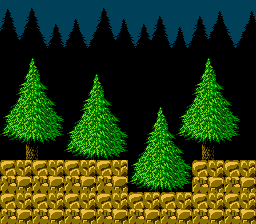
I was bored again, so I made the tops of the trees in the background different:
Attachment:
 Forest.png [ 2.89 KiB | Viewed 4908 times ]
I don't think I used too many tiles either. I think it was about 16. I actually made it to where it never dipped below the trees, because I thought it would be cool to use parallax scrolling there.
I have a second tileset I would appreciate feedback on.
I have a few details I haven't wrapped up, but it's late and I wanted to get this posted before I went to bed. So right now I only have like four squares of the ground finished, so I haven't bothered packing into the PPU space. (I guess it's better to get some feedback on the base design before I push in all the details anyway.)
Also I tried two different designs for the top layer of the ground; one with little rocks in in and one without. IMO one looks much better than the other, but I decided I'd like to get some feedback before I send one to the chopping block.
Beyond that it's the same ideas as the first set; same game and such.


I'm going to try some revisions to my first tileset and hopefully get that posted in the next couple days.
Marscaleb wrote:
Also I tried two different designs for the top layer of the ground; one with little rocks in in and one without. IMO one looks much better than the other, but I decided I'd like to get some feedback before I send one to the chopping block.
Two look better than one if you can fit them. Have the simple design without the pebbles, and then place the pebbles tile on top of it at various places.
I'll probably do some stuff for the hell of it, but I'll give you some advice on this one first:
First, Why are the trees in the background wavy, but not the ones in the foreground? Second, what in the world is going on with the trees in the background? They're outlined in red. Third, the leaves on the trees should be much less repetitive, and finally, I imagine a tree with a canopy that large would have a thicker trunk. You could make it take up four tiles as the base, but make it get a bit skinnier as it goes up, like the trees in the background.
Oh, and just to let you know, I'm a guy. Out of the hundred or so people I know on this website, I've never come across a single girl. Kind of weird, but I guess this stuff just isn't as popular with them.
Quote:
I have a second tileset I would appreciate feedback on.
My opinion : The trees looks great, the underground looks ok, but the ground looks awful. Either with or without the small stones on it. Also, the edges of the ground tiles looks particularly awful, those edges should definitely be smoothed, using the repeating pattern tile on a border is often a bad idea.
I could be wrong, but looking at the tileset, I only see left-facing leaves... If this is indeed the case, and you're counting on flipping tiles, you'll have to reconsider this, since the NES can't flip background tiles, only sprites (the exact opposite of the Master System/Game Gear, which flips backgrounds but not sprites).
Well, I don't want to sound overly critical, but I would redo everything.
Ground - my issue with it is, when (in real life) would you see rocks stacked like this? Take a look at real forests and you see grass, weeds, leaves, etc. But never piles of round rocks.
Tree trunks - the background trunks look weird, their shapes are too squished.
Tree leaves - a bit repetitive. I feel like there should be some negative space (holes) or branches. Or maybe go the other direction, and do a more minimalist thing (flatter and less detailed) would hide the repetitiveness.
dougeff wrote:
when (in real life) would you see rocks stacked like this? Take a look at real forests and you see grass, weeds, leaves, etc. But never piles of round rocks.
To be fair, platformers are represented in a perspective we never see in real life, and since you have to draw a part of the ground that's not ordinarily visible, there's no problem with being a bit "creative".
Video games (especially 8-bit ones!) aren't supposed to be realistic.
Pinobee for Game Boy Advance approached this compromise in an unusual manner: solid areas were solid black beyond a border of surface.
tokumaru wrote:
To be fair, platformers are represented in a perspective we never see in real life, and since you have to draw a part of the ground that's not ordinarily visible, there's no problem with being a bit "creative".
the DKC games just kind of have it look like the whole level is kind of on a cliff so the camera isn't seeing through the floor. Anyway though, I thought that the ground (if it isn't like the side of a cliff) is supposed to look like if you split the ground in half right there and you're looking inside, so in this case, there wouldn't be weird carrot rocks.
I thought the trees in the background looked odd, as the game is supposed to be directly 2D where everything is perfectly facing the camera, but the trees in the background start above the grass by a good amount, so I made my own grass that actually meets up with the start of the trees:
Attachment:
![Sample2x002[1].png](./download/file.php?id=4881) Sample2x002[1].png [ 4.96 KiB | Viewed 4072 times ]
Sample2x002[1].png [ 4.96 KiB | Viewed 4072 times ]
Unfortunately, it kind of looks like a freshly cut lawn.

tepples wrote:
Pinobee for Game Boy Advance approached this compromise in an unusual manner: solid areas were solid black beyond a border of surface.
And I don't think that turned out so well. Unless the level is very dark, those huge black areas stand out a lot, and areas where absolutely no action takes place shouldn't be distracting the player. It also looks cheap... it's just a bunch of "nothing", wasting screen space.
Espozo wrote:
I thought that the ground (if it isn't like the side of a cliff) is supposed to look like if you split the ground in half right there and you're looking inside, so in this case, there wouldn't be weird carrot rocks.
Indeed, that's not the kind of soil you'd find in a forest. I guess it should be mostly dirt with rocks scattered around?
tokumaru wrote:
And I don't think that turned out so well. Unless the level is very dark, those huge black areas stand out a lot, and areas where absolutely no action takes place shouldn't be distracting the player. It also looks cheap... it's just a bunch of "nothing", wasting screen space.
That game looks very mediocre in about every department, not just graphics. The music is clearly only being generated by the GBZ80, and Gameboy Advance game or not, it isn't good, but it especially isn't good when it's not paired with older looking graphics.
tokumaru wrote:
Indeed, that's not the kind of soil you'd find in a forest. I guess it should be mostly dirt with rocks scattered around?
I'd think so. More of a dark brown, like chocolate, than the orange color being used, and only pebbles and small rocks, not boulders.
Really quick edit on the ground.
That's better, but now, the rocks are in really odd shapes, as they should be more circular and not fit perfectly together like a puzzle. There should be more soil between them, and none of that should be that orange color, more like dark brown and potentially gray for the rocks. (Like I said, small rocks.) I know you said it was a quick edit though, and it does already look better.
Actually, now, it kind of looks like Captain Crunch.


Espozo wrote:
Second, what in the world is going on with the trees in the background? They're outlined in red.
Ain't exactly a lot of brown on the NES, you know.

But in all seriousness, if you could suggest a better palette, please do. But I personally am really trying to avoid using the same palette for a background object as I am for any block the player can actually collide with. Games play better when there just isn't guesswork about what is solid and what is not.
Espozo wrote:
Oh, and just to let you know, I'm a guy. Out of the hundred or so people I know on this website, I've never come across a single girl. Kind of weird, but I guess this stuff just isn't as popular with them.
I figured that was more statistically likely. But I don't really like how condescending it sounds to just flat-out assume that.
Bregalad wrote:
Also, the edges of the ground tiles looks particularly awful, those edges should definitely be smoothed, using the repeating pattern tile on a border is often a bad idea.
Of course. I hadn't done any of the edges yet, other than the top edge. I really wanted to stop and re-evaluate before I proceeded. It wasn't working right.
darryl.revok wrote:
I see carrots.
Oh good it's not just me.
tokumaru wrote:
I could be wrong, but looking at the tileset, I only see left-facing leaves... If this is indeed the case, and you're counting on flipping tiles, you'll have to reconsider this, since the NES can't flip background tiles, only sprites (the exact opposite of the Master System/Game Gear, which flips backgrounds but not sprites).
Waitwaitwaitwait WHAT?! Aw, f*** me sideways, I had no idea!
Well, it wasn't working right anyway. Guess I'll have to start over from scratch.
Also I did some flipping with the trunks.
Espozo wrote:
I'd think so. More of a dark brown, like chocolate, than the orange color being used, and only pebbles and small rocks, not boulders.
Yeah, the rock tile has been bothering me for the forest environment. It didn't seem so bad when it was blocky in the first tileset, but it wasn't right here. I will likely save it for a cave or something, but I'll have to make the forest have something that looks more dirt.
*******
So, what I was originally trying to do with the canopy was something like this:

But I simply failed to draw something that looked acceptable. I kept drawing again and again until I got the pattern seen above. And everyone keeps saying its repetitive, but I used four tiles plus an offset pattern. Is repetitive really the right word? I honestly do NOT see a repeating pattern in those leaves.
Before I wound up mirroring the leaves, the canopies weren't really supposed to identify a specific tree. I wanted something that just looked like a solid mess of canopy, like you see here:

...But with more detail; using more tiles and looking less blocky.
Thanks for the feedback, everyone. I'll try this again in a few days.
Wow, they were very harsh in their critiques, in my opinion. I do no see this red outline as any problem, if it is a single pixel wide it will be butchered by the NTSC encoding in a way that doesn't even create a clear colour, so I really wouldn't mind.
I guess it's pretty much standard to have a visible underground in 2D games, even if it is not realistic. Just look at Contra, or WoodMan's stage from Mega Man 2 for example. I don't see how haivng this "feature" can even be considered a flaw.
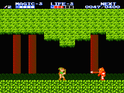
The forest from Zelda II is much, much worse than yours for example, the trunks looks simply horrible. Nintendo sucked at graphics before the release of SMB3, in my opinion, 3rd party games have overall better graphics.
Marscaleb wrote:
Guess I'll have to start over from scratch.
No don't scrap it! You've got some decent stuff to work with. We'll help you fix it.

Marscaleb wrote:
But I simply failed to draw something that looked acceptable. I kept drawing again and again until I got the pattern seen above. And everyone keeps saying its repetitive, but I used four tiles plus an offset pattern. Is repetitive really the right word? I honestly do NOT see a repeating pattern in those leaves.
It doesn't exactly look "repetitive" to me, but maybe "shapeless" is a better description. The detail is so uniform, that it's just a big flat wall of leaves. A tree's leaves are arranged in a large round volume, and the interaction of this volume with light gives it the appearance of shape.
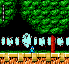
The Mega Man example is partially successful, using dark tiles for the edges, and then roughening up the shape of the filled leaf area with patches of light and dark. It's very coarse, which helps hide the "flat" feeling of the trees.
Attachment:
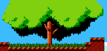
File comment: Gimmick! Level 3 tree.
 gimmick_tree.png [ 4.23 KiB | Viewed 4085 times ]
I like the trees in Gimmick! quite a lot. (See
Level 3 Map). There's no leaf texture on the main part of the tree, which is kind of the opposite approach to roughening; by being completely undefined the flatness of a single colour kinda gets ignored, with no points of detail it doesn't even register to me as flat. Similar to with the Mega Man example, a lot of love went into lighting on the edges, giving it the appearance of shape. That's the most important part here, shadow and detail on the edges. The black hanging background suggests shadow under the canopy of the tree, which helps too, while giving a nice contrast and differentiating the underside from the topside of the tree.
Like, if you look at it from a realism perspective, it fails in a number of ways, but I don't think realism is the best goal. It gives a great impression a tree, and works well to the imposed limitations, and that's what counts.
IMO, the trees in that Mega Man screenshot are the best looking trees I've ever seen on the NES. The ones you made turned out more like the ones is Mega Man 2, which aren't nearly as good. The problem, IMO, is not that they're repetitive, but that they lack volume. The canopy looks flat, like it's been cut the same way the ground was, and nothing extends towards the camera.
Marscaleb wrote:
http://eightballgaming.com/img/Sample2x002.png
I'll be blunt: I don't like those trees at all. Honestly they don't look like trees, and where they overlap it just looks like there's a sudden edge rather than actually overlapping. (for the record though, block-shaped trees do exist in real life, I've seen a few of those)
As for the ground, dunno I like the rocks =/ The only issue is the black outline being too strong. Since I doubt you can fix that (as that's the background color), maybe you should increase the contrast of the rock gradient instead so the darkest shade is closer to black. (or make the rocks darker, but probably increased contrast is better for visibility)
I decided to break from the environment tiles this week to work on some sprites.
I'm got three variations for a possible main character, and three enemies I cobbled up today. Also a coin and a sample HUD that I made a month ago.


None of the palettes are set in stone; I need to develop the rest of the game more firmly so that I know what colors will be needed at all times. But I definitely don't want black in the player's palette, or else he's melt away into most of my backgrounds.
Not bad, but the character's stance looks really weird and his left arm looks stubby.
I wanted to edit his stance and then I ended up doing a bunch of other stuff too. Please feel free to do with it what you like but let me know what you think.
Attachment:
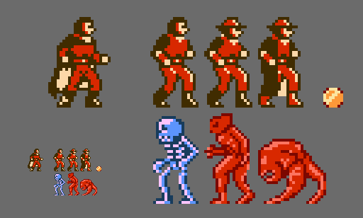 Sample003.png [ 6.36 KiB | Viewed 3955 times ]
All I wonder is... Why you no use new trees?

Do you use a tile mapping program? Something like Tiled perhaps?
Wow, you turned the trenchcoat into a cape!
It looks awesome, but I also keep thinking... I thought I was gonna
slay Dracula, not
become Dracula!

(Actually not developing the story yet, but Castlevania inspired and all, so final boss is likely to either be Dracula or some original demon lord.)
You think he looks better without the hat?
darryl.revok wrote:
All I wonder is... Why you no use new trees?
Well two things.
One, I just haven't touched up on those old tiles yet. I'm trying to get a sense of how quickly I can produce this pixel art, so right now I'm budgeting my time with just first attempts. (Because you can spend forever doing revisions and touch-ups.) And I wanted to pose the characters in a scene so I just grabbed the image I already have.
Two, if I go through with this project, it is my intent to actually sell the final game. As such, I'm really not sure about directly using the touch-ups you folks have provided. Using as a guide, sure, but using the exact pixels? Seems like I ought to negotiate some kind of reimbursement first.
darryl.revok wrote:
Do you use a tile mapping program? Something like Tiled perhaps?
For these mock-ups I'm just working strait inside GIMP. They're just mock-ups, and half the designs are more about using all the tile combinations I might need rather than something I would want in the final game.
For the actual game development I'd be working in Unity, and I do have a tile map extension that I bought to work with Unity. (Which can import maps from Tiled.) If I make this NES-styled game, I have a palette-swapping extension I've been looking at that I think will fulfill my needs.
The long story is:
I was working on a video game called Solius. I poured a lot of effort into it and tried to run a kickstarter campaign, but ultimately I didn't get any funding. After some thought, I decided to instead build a different game with a smaller scope using many of the assets I had produced for Solius. I've been working on this other game for a while now, but just at the end of last year I had another idea. What if I instead used the assets I've been building into an NES game? (The code assets, that is, obviously not the art assets.) In theory, I could produce the art assets much quicker as there would be fewer assets, nearly all of the core game mechanics are already built, and the final scope of the game is pretty much smaller-still than the game I have been working on. So I decided to spend a month conducting an experiment to see if it would really be worth it to switch to this NES game. I've laid out a schedule and some deadlines, and so now I'm just trying to find out if I could really do this well enough and fast enough for it to be worth it to switch projects.
The lack of black outline makes those sprites look a little weird when they're not on a solid black background. However, if they had a black outline then they'd look odd against a solid black background.
Personally I avoid using solid black background, but if you do use them, then I'd recommand outlining the sprites in a non-black dark colour, but not a colour of the same hue as the one you're using for the light palette.
For example if you have those red enemies, use a dark blue or brown outline for them, instead of a dark red outline.
The main character is obviously Castlevania-inspired. But I can't say I dislike that... With the hat it is less obvious. Don't forget that hands naturally comes down until the thighs when leaning downwards, if it stops before then you have to make them in a "v" shape, or else it'll look like this character has tiny arms (this is hard to do on 8-bit sprites, I agree).
I know a tree like this may not fit the style you're going for, but it may help with the composition. Instead of lots of tiny pixels that vary wildly in brightness, you've got larger areas of color where the change in brightness is a bit more gradual. It's still a detailed tree with the same colors (or close, heh), but the main character's fine details don't get lost in the tree's much more broad detailing.
It's a little on the short side, I know, my bad, I did this really quickly.

Marscaleb wrote:
I thought I was gonna
slay Dracula, not
become Dracula!

Haha good point. Really, the black on the upper portion of his arm kind of looked like some sort of cloak so I went with that. At first it was actually a Star Wars robe with a hood.
Quote:
You think he looks better without the hat?
Not necessarily. The hat makes me think of Indiana Jones and I like some Indiana Jones. I honestly picked the one that had the least on it to work with because I initially just planned to change the body and not his costume.
Quote:
Seems like I ought to negotiate some kind of reimbursement first.
I can't speak for Espozo, but as far as I'm concerned, if I take somebody else's character or tiles and edit them and post it, it's theirs. My characters for my game are pretty much the only ones that I wouldn't want somebody to use.
To pose a question for others, how do you guys feel about people using graphics you post for them?
But, of course it also probably goes without saying that you'll learn more from more practice.
Quote:
...experiment to see if it would really be worth it to switch to this NES game.
When you say switch to an NES game, do you mean an NES-inspired Unity game like you said, or an actual NES game for the console?
Marscaleb wrote:
I'm really not sure about directly using the touch-ups you folks have provided. Using as a guide, sure, but using the exact pixels? Seems like I ought to negotiate some kind of reimbursement first.
If I were worried, why would I have even uploaded the picture in the first place? I could care less. Not everything is about money.
Also, one of the monsters is a blatant Pinky Demon rip off.
Yeah, it does look better when I use the dark/outline color from a different hue. Thanks for that pointer!
I've tweaked the leg for the main character, plus the neck in Darryl's version. I also tried a different version wearing a trenchcoat that uses two palettes. And made some more monsters.

darryl.revok wrote:
When you say switch to an NES game, do you mean an NES-inspired Unity game like you said, or an actual NES game for the console?
Distributing an actual NES ROM would be hard. (Well, hard to make money off of.) Plus it would require knowing assembly and whatnot. So strictly speaking it is NES inspired and not a literal NES game, but since I'm trying to match the limitations 100%, it is all but literally an NES game.
Espozo wrote:
Also, one of the monsters is a blatant Pinky Demon rip off.
More of a cross between Pinky and those red things from Gauntlet.
Marscaleb wrote:
I also tried a different version wearing a trenchcoat that uses two palettes.
I don't think that there are two reds that close together on the NES.
Espozo wrote:
I don't think that there are two reds that close together on the NES.
It's 06 and 07.
And 05 and 06 look even more alike.
I spend some down time at work restarting the second forest tileset, and decided to spend my time today finishing it up.
I've also got another revision on the main character; I took the two palette trench coat version and turned it into a single palette version, and modified the design of the outfit. I like the design, but it extends out two pixels into a new tile, so it would require some extra tiles.

That is one of the nicest NES forest tilesets I've seen.
The old tree trunks look a bit flat next to the new tiles, though.
Looks great for me! It makes me wants to play the game.
The only small issure here I'd say the palette for the main character is too close from the palette from the BG, no major issue, considering it's probably just a tileset among others where this problem won't be apparent.
Now those are some nice trees.
Rahsennor wrote:
The old tree trunks look a bit flat next to the new tiles, though.
To be fair, the biggest issue is the top (i.e. where it meets the leaves) if those few pixels were edited to make it look more like it blends against the leaves (talking about black pixels here), it would probably look OK. As it is now, the tile boundaries at the top look way too blatant.
Looks great. Don't change a thing.
Sik wrote:
To be fair, the biggest issue is the top (i.e. where it meets the leaves) if those few pixels were edited to make it look more like it blends against the leaves (talking about black pixels here), it would probably look OK. As it is now, the tile boundaries at the top look way too blatant.
Yeah, it makes them look more like stumps in front of the canopy than trunks behind the canopy. But they only use two shades when everything else uses three, and there doesn't seem to be anything else tying up that extra palette entry anymore.
Then again, I'm no artist. Just because it's techically feasible doesn't make it a good idea.
Rahsennor wrote:
But they only use two shades when everything else uses three, and there doesn't seem to be anything else tying up that extra palette entry anymore.
I drew this leaving one whole palette unused (and at least 64 tiles unused) so I can add extra elements later. This is still just an early experiment, or a mock-up, and I don't know conclusively what I am going to want in each level. So if I need a level that is a forest with a cabin in it, I don't have to scrap out all of my forest tiles to fit in the cabin. Or a forest with a stream, or whatever. The point is, I have room to add more detail once I know exactly what I want.
That's not what I meant. Correct me if I'm wrong, but you're using one palette for the ground, one for the grass, leaves and silhouettes, and one for the tree trunks, yes? Only two colors are being used from the tree trunk palette. You could add a third shade like you did with the other two.
EDIT: my bad, I thought the highlights on the leaves were the same shade as the silhouettes in the background. Pay my poor eyesight no mind.
I was playing this game today, and thought...what a beautiful tree.
Moon Crystal (stage 1)


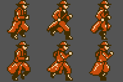
I decided to splurge and use six frames for the running animation. Using CHR-ROM I can easily swap out tiles for new animation frames, so I have some extra space for extra frames.
I'm not very experienced with pixel animation, so I'm not opposed to a more trained eye pointing out anything I have done wrong.
dougeff: It's one of many games I was using as inspiration for that tileset.
This is really coming together!
I think his head should move a little. In fact his body should bounce some. It seems strange that he's running without going up and down.
darryl.revok wrote:
This is really coming together!
I think his head should move a little. In fact his body should bounce some. It seems strange that he's running without going up and down.
I could do that.


Also, here's an alternate color. I would think this would show up better in more environments, plus the palette could be more useful for other sprites. But I'm not really sure if I like it.
EDIT:
Corrected a couple pixels, but it's late and I'm tired so I'm not fixing the animated gif.

I like this much better.
Now... your highlights are all over the place. Especially the one on his coat, but almost all of them.

Although, one thing I've been wondering myself, how do we explain light sourcing when our sprites rotate and one character has highlights on the side opposite from the other characters? I guess we just don't explain it and hope nobody asks.

Also, I'd make his knees kick up a little higher for a run.
And here's a sample tileset for a dungeon-like level.

I also have a couple different variations on the stairs included.
Plus, I have plenty of space left over for extra tiles, so maybe I'll add in some more variants or extra detail, but honestly there isn't much more that I can think of that is worth adding in. I got a couple ideas, but the dark theme I was exploring lends itself to having less.
And having finished this up, I need to make up my mind if I'm actually going to pursue this project. I'm leaning toward yes, but I have more to consider than just how good I can make the art. Nevertheless, I would appreciate some candidness in your comments. Please, be honest.
I'd change the brown color on the blocks to a dark blue, because I'm under the impression that the lighting in the room is more blue colored than it is brown because of the purple background.
Attachment:
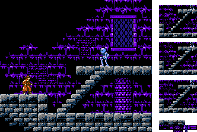 Recolored.png [ 28.17 KiB | Viewed 2914 times ]
Hey, actually, you'd also only be using two palettes instead of three. Have you thought of adding torches or something?
Espozo wrote:
I'd change the brown color on the blocks to a dark blue, because I'm under the impression that the lighting in the room is more blue colored than it is brown because of the purple background.
Hey, actually, you'd also only be using two palettes instead of three. Have you thought of adding torches or something?
I was thinking of using these textures in a couple different castle areas, so I would adjust the colors to make them look distinct from each other.
I was thinking of having the windows be a third palette and then having lightning strike randomly, and the windows flash when that happens. (Well, maybe just in one of the castles. But I guess the other ones could use the same palette as the foreground.)
Torches? Ooh, I like that idea.
Statues sounds good too; I was thinking about adding suits of armor. Also, crests, curtains, and some crossbars for the lower areas to make them look like a dungeon.
But of course, before I spend two weeks with all of the detail, I want to make sure the basic design looks good.
I was inspired by Batman's maps, how they look so dark and moody by having a lot of blank tiles, and the area that do have tiles fade to black.
Any thoughts about the stairs?
Marscaleb wrote:
I was thinking of using these textures in a couple different castle areas, so I would adjust the colors to make them look distinct from each other.
You could always use the brown somewhere else.
Marscaleb wrote:
Any thoughts about the stairs?
The original stairs are the best. I don't really get the back on them though, I'd just get rid of that part.
Espozo wrote:
I'd change the brown color on the blocks to a dark blue, because I'm under the impression that the lighting in the room is more blue colored than it is brown because of the purple background.
I wouldn't change it, as it is now, it has perfect warm/cold color contrast. Red/Blue.
Changing that to similar colors would just make it monochrome, which is less visually interesting.
In color theory, you generally want to grab colors from the opposite end of the color spectrum for contrast, or, at least something relatively close.
(Insert color wheel here)
Alp wrote:
I wouldn't change it, as it is now, it has perfect warm/cold color contrast. Red/Blue.Changing that to similar colors would just make it monochrome, which is less visually interesting.
You want it in reason though... Half of pictures I've seen in games, movies, etc. don't fully go from one side of the color wheel to the next, as it doesn't make any sense 90% of the time, and I feel that this falls within that percentage.
It's like this picture: (They're way to high resolution to show here)
http://img14.deviantart.net/518f/i/2006/118/6/9/ocean_sunset_by_ryafacan.jpgVersus this picture:
http://www.hdwallpapersnew.net/wp-content/uploads/2016/01/ocean-sunset-high-resolution-wallpaper-for-desktop-background-images.jpgThere's so much unnecessary contrast in the second picture that it almost looks unnatural.
Like I said though, he could insert torches. That would make more sense and look more visually appealing for contrast in my opinion, but I personally feel that it's pretty good as it is.
The BG here is purple, not blue, so having a brown/red foreground is fine. It's up to preference here, do you want purple to blue or purple to red?
Even if the bg were stark blue, Castlevania regularly put bright orange blocks over a blue background.
I know brown is a mixture of red and blue, but I don't think that this brown is as close to the purple as the blue is. It's preference, but I personally think it looks better. The brown with a more red background would probably look good, and you could use it as a palette swap.
Drag wrote:
Even if the bg were stark blue, Castlevania regularly put bright orange blocks over a blue background.
I always thought it looked awkward though, as if the level takes place in a bathroom at a Mexican restaurant.
Espozo wrote:
I always thought it looked awkward though, as if the level takes place in a bathroom at a Mexican restaurant.
Considering how many bricks people shit when they play it...

You know, if this were inverted, it really would look like Castlevania:
