http://www.dkc-atlas.com/maps/dkc/layer ... in/1-1.pngYou can zoom in on MSPaint and look at the actual pixels.
I've been trying different ways of "porting" DKC to NES and Genesis to see how it looks like on systems with a smaller color palette. When your looking directly at the tiles themselves, you can see a lot of attribute clash problems. Colors themselves look a little dull on emulators too.
I'm not exactly sure, but I think the later DKC games did a little better with color palette choices.
The most serious problem I see with DKC is that the anti-aliasing of the graphics doesn't go well with the hard transparency (no alpha). All edges end up looking very jaggy. Another issue I see is that some parts have very busy textures, that look like a mess of pixels when seen on anything other than a blurry CRT TV.
Other than that, I think the style is pretty consistent, and it works even though the hardware isn't the best to reproduce pre-rendered 3D graphics. Unfortunately, the Genesis is even less suited for that, and I don't even have to say anything about the NES.
On the Genesis, I think that the standard techniques would work fine: increase the contrast a bit, so the result doesn't look washed out, and reduce color usage with dithering. Make use of the higher horizontal resolution to make the dithering blend more, which means adjusting the graphics to a new aspect ratio.
On the NES you'd need a different approach if you expect it to not look like crap. The pre-rendered look won't work, the graphics have to be cartoonized a bit. Objects should still have volume (i.e. shadows and highlights whenever possible). Backgrounds could be more heavily dithered. A more washed out look will be unavoidable.
If you think that's bad, I suggest you look at this:
Attachment:
 DKC Atribute Klash.png [ 64.86 KiB | Viewed 4149 times ]
tokumaru wrote:
The most serious problem I see with DKC is that the anti-aliasing of the graphics doesn't go well with the hard transparency (no alpha).
I find the biggest problem to be the weird anti aliasing artifacts around some of the sprites, like edges on Diddy Kong's hat that turn gray
Attachment:
 Anti Aliasing.png [ 760 Bytes | Viewed 4149 times ]
tokumaru wrote:
On the Genesis, I think that the standard techniques would work fine: increase the contrast a bit, so the result doesn't look washed out, and reduce color usage with dithering. Make use of the higher horizontal resolution to make the dithering blend more, which means adjusting the graphics to a new aspect ratio.
Even though this is a pirate piece of garbage, the backgrounds don't look too bad as they look pretty colorful, but as a result, there's only enough colors for one type of object onscreen. Something better looking could have been made, (there's no excuse when it comes to animation) but it's still impossible to magically turn 64 into 256.
https://www.youtube.com/watch?v=gUz-Qc0c-9Qtokumaru wrote:
On the NES you'd need a different approach if you expect it to not look like crap. The pre-rendered look won't work, the graphics have to be cartoonized a bit. Objects should still have volume (i.e. shadows and highlights whenever possible). Backgrounds could be more heavily dithered. A more washed out look will be unavoidable.
Remember the picture I made?

Perhaps it does look bad close-up on crisp monitors- that's not what it was expected to run on, though.
Donkey Kong Land seems like a better target.
Donkey Kong Land looks bad even far away though.

I think the sprites need some help. I'd have probably sacrificed some of the sprite per scanline limit for more colorful sprites. Also, kind of random, but many of the backgrounds are oddly colored. Why is the factory background red? It really doesn't seem like all 16 color palettes for BGs or sprites are ever being used and there are some attribute problems, but that's to be expected with 2bpp graphics. (Certainty not all palettes are used for sprites, because on the SNES with 8 palettes, no more than 8 different types of objects are even onscreen, unless they do use the same color palette. They probably could have reserved 2 palettes per object instead of just 1.) Like I said though, flickering can be pretty bad, but only ever really around large amounts of bananas, which reasonable only need one palette anyway.
tepples wrote:
How does DKC (GBC) look?
Took a quick look at a longplay. The backgrounds are surprisingly good, but the sprites are, um... let's just say they leave a lot to be desired, and some palette choices are really questionable. No idea if this longplay is using color correction though (the LCD screen washed out the colors a lot so palettes were made to counter it - also this causes issues on the GBA that doesn't do this heavy washing making GBC games look darker than they should)
Which video did you see? I actually own the game (I own all 3 versions of DKC) so I can verify if it looks correct. A lot of the palette choices are just really odd though, and there really isn't much excuse considering both the GBC and the SNES run at the same color depth, although the GBC obviously uses 2bpp graphics.
Just because it's 5-bit doesn't mean that the intensities encoded by those bits are evenly distributed. To oversimplify things: GBC's gamma is kind of light, GBA's gamma is very dark, DS's gamma is less dark, DS Lite's gamma matches Game Boy Player and is very close to Super NES 5-bit.
I was under the impression that the GBA's darkness was more related to the complete lack of backlight (how does the GBA SP look, for comparison?). If the issue was gamma being so off I'd expect emulators accounting for it, since most games are overly bright to compensate for the darkness.
Espozo wrote:
Which video did you see? I actually own the game (I own all 3 versions of DKC) so I can verify if it looks correct. A lot of the palette choices are just really odd though, and there really isn't much excuse considering both the GBC and the SNES run at the same color depth, although the GBC obviously uses 2bpp graphics.
https://www.youtube.com/watch?v=_pHP3JNwkQ8
Sik wrote:
I was under the impression that the GBA's darkness was more related to the complete lack of backlight (how does the GBA SP look, for comparison?).
The GBA SP and New GBA SP have an internal light but kind of dark gamma for compatibility with GBA software designed to correct for the GBA's gamma. When GBA homebrew was first starting out, I made a demo that proved that the GBA's alpha was close to 4 when sRGB is closer to 2.2.
Quote:
If the issue was gamma being so off I'd expect emulators accounting for it
NO$GBA includes multiple gamma settings to simulate multiple screen types. The uncorrected "VGA" setting resembles what GBA games look like on a Game Boy Player and on my
white Lite.
Quote:
https://www.youtube.com/watch?v=_pHP3JNwkQ8
That made me want to vomit through my eyes. It's like the contrast or the color or something was turned up to infinity.
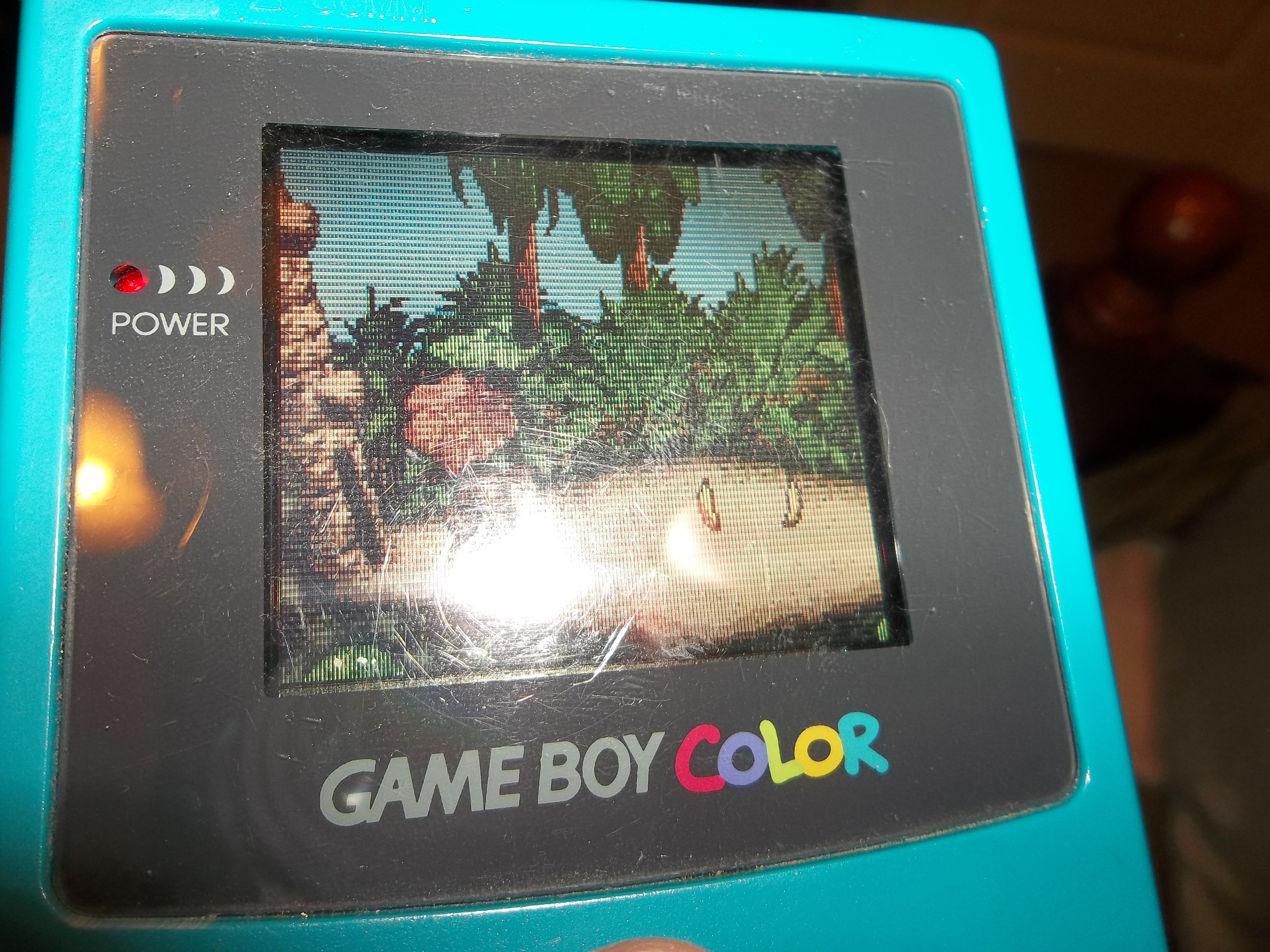
Well, Anyway, I tried my best to take a picture of the GBC game, (it's at an awkward angle because when I took it head on, all I saw was white from the flash, and if I disabled it, it was dark) which doesn't look even half as bad as what was shown in that video.
Attachment:
 DKC GBC.JPG [ 2.92 MiB | Viewed 3911 times ]
The main part with the odd color choices are just in some of the levels, the palette is incorrect, like in slip slide ride, the background (which was shown earlier) is purple for whatever reason. Oil Drum alley also has a dark red background instead of the dark gray, and I'm sure many of the caves are also off.
OK that sounds like color compensation wasn't turned on then... (doesn't explain the overly bright green/blue enemies, though)
Sik wrote:
doesn't explain the overly bright green/blue enemies, though
They don't look as awful either. (although still a little off.) Honestly, I've looked online for DKC GBC, and every picture I saw used the same color scheme as in the video. What's the most popular GBC emulator, because the colors must be way off.
This is kind of a random thing to say, but I'm surprised the sky on the jungle levels in DKC GBC aren't using a color gradient like in the SNES game. I assume it's relatively easy to change colors per scanline on the GBC, seeing how many games do it? I honestly always thought it kind of looked strange though on the GBC vs. how it looks on the SNES, because you have a "16 bit level" gradient with near NES graphics placed on top, if that even makes sense. You know, do any games actually change the tilemap color, as in not color 0 or whatever color is the sky? It would be like having an 1x8 palette area. I don't know how many colors you can change per scanline though.
Espozo wrote:
What's the most popular GBC emulator, because the colors must be way off.
It's probably still Visual Boy Advance I presume, but that one
does have the color correction I was talking about... I think it's disabled by default though, which probably explains it.
Espozo wrote:
You know, do any games actually change the tilemap color, as in not color 0 or whatever color is the sky? It would be like having an 1x8 palette area. I don't know how many colors you can change per scanline though.
Wacky Races does it on the track to create some variety (e.g. the rivers with the bridges, or the difference between dirty and rocky areas), take a look. Also apparently
it was attempted in Telefang, but no idea how reliable it is (unless that was removed just to work on a non-color Game Boy?).
No wonder why those weren't used. It looks almost as bad as a youtube video from 2005.
...but predates the Game Boy Advance. At the time those were some pretty good graphics for a handheld actually.
I honestly thought they looked perfectly fine. There's some weird attribute table problems and blurriness, but it still looks very impressive.
When it came out I thought it was the best looking SNES game.
If you're talking about DKC, I still think the series have the 3 best looking SNES games ever made. I don't care what anyone else says, but I find pre rendered sprites to have a bit of charm to them, but only when done correctly and when the thing that was pre rendered looked good in the first place, which, in my opinion, are both true in this case.
Prerendered sprites can look OK as long as 1) you take into account what palette are you going to use and 2) you put effort into the animations (a lot of early 3D had awful animations, and this was an artist issue, not a technological issue). The bad reputation from prerendered sprites comes from failing horribly at these two things (especially the latter). Something similar happens with digitized actors (which is why Mortal Kombat is like the only series that doesn't look awful with those), or anything not pixelart, really.
I guess
Mortal Kombat doesn't look awful for the same reason
Prince of Persia doesn't look awful: the massive amounts of cleanup done to the source footage.
Does
NBA Jam also look awful? It uses
digitized basketball players.
Just had to look up the arcade version. Honestly the console versions looked way more like pixelart. Good catch. To be fair though, it's Midway again, so if they could get it right in Mortal Kombat it's not surprising they could also get it right in other games.
tepples wrote:
I guess
Mortal Kombat doesn't look awful for the same reason
Prince of Persia doesn't look awful: the massive amounts of cleanup done to the source footage.
Does
NBA Jam also look awful? It uses
digitized basketball players.
I don't think Prince of Persia quite fits into this category. From what I recall PoP has rotoscoped animations, where the animations are more or less traced from videos of the game creator performing those actions in his house.