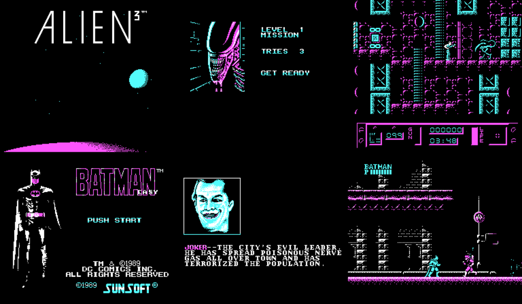
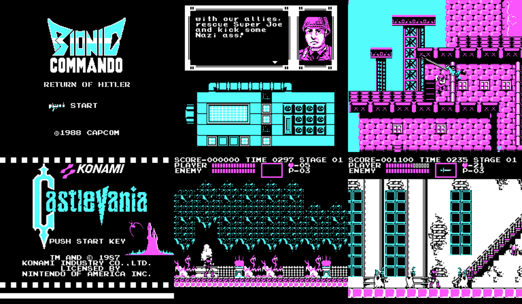
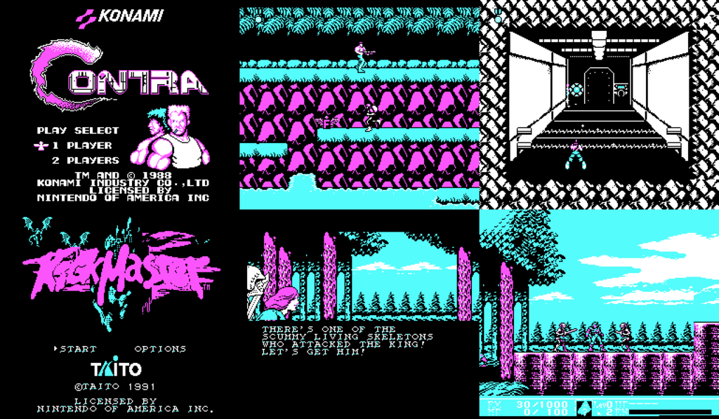
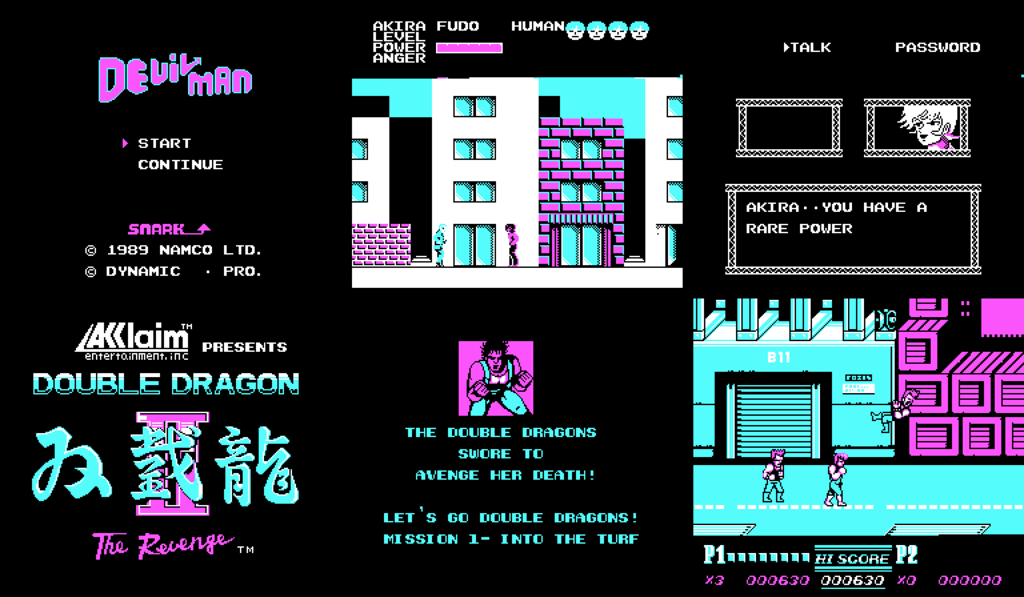
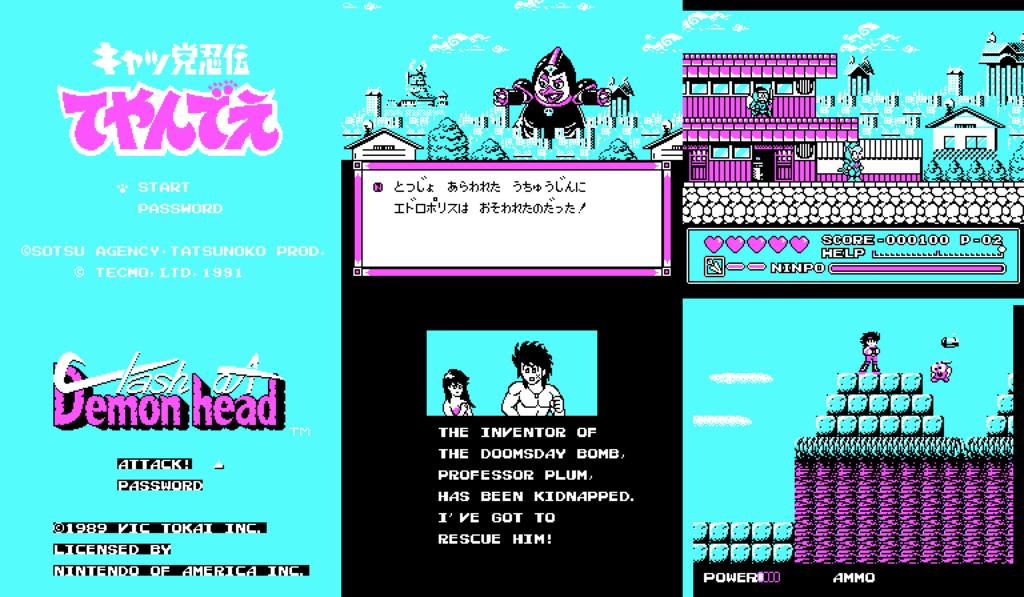
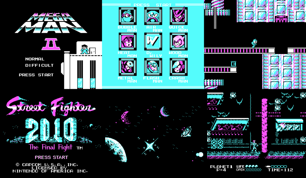
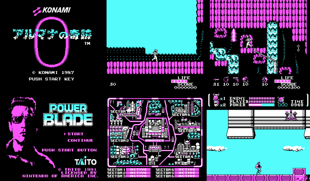
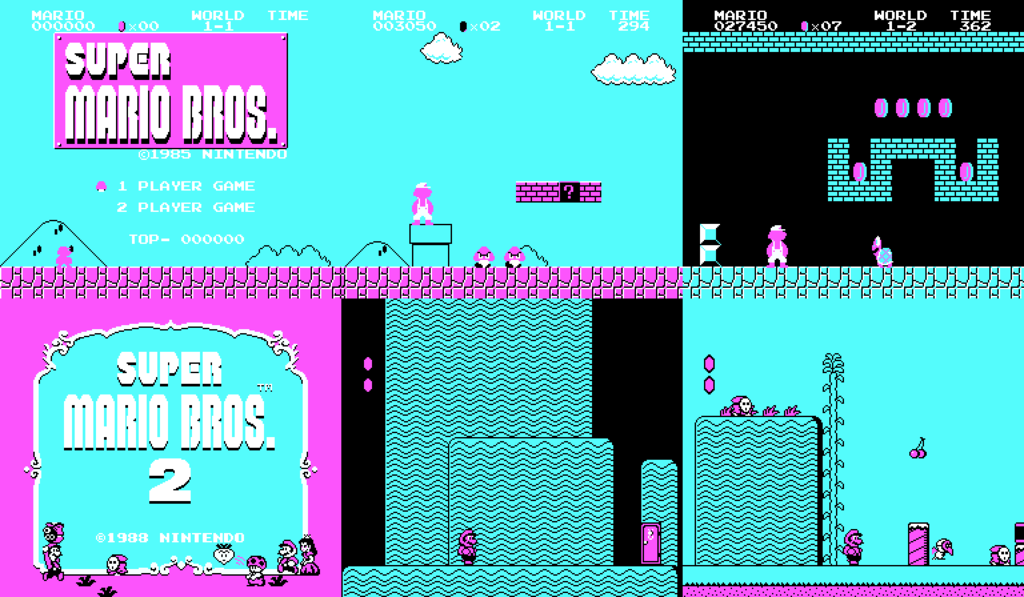
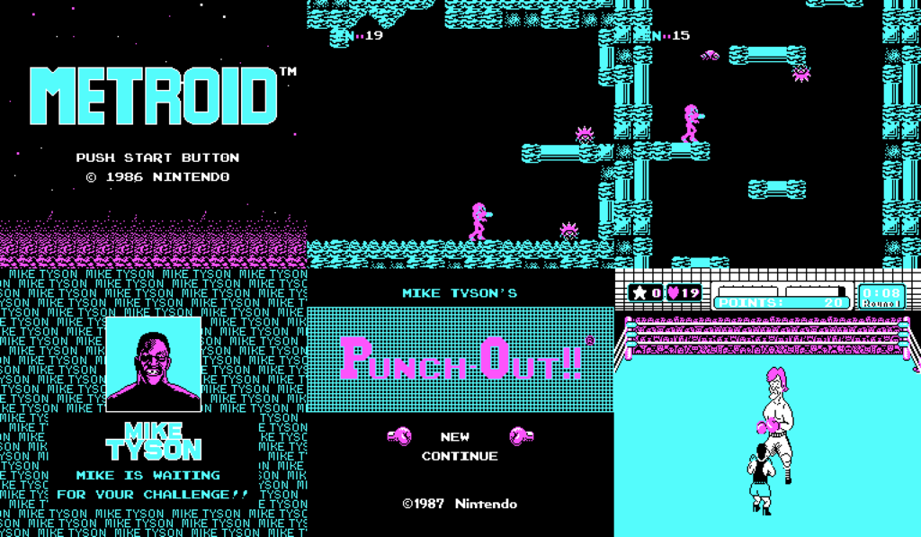
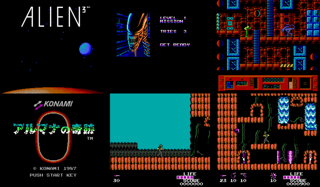
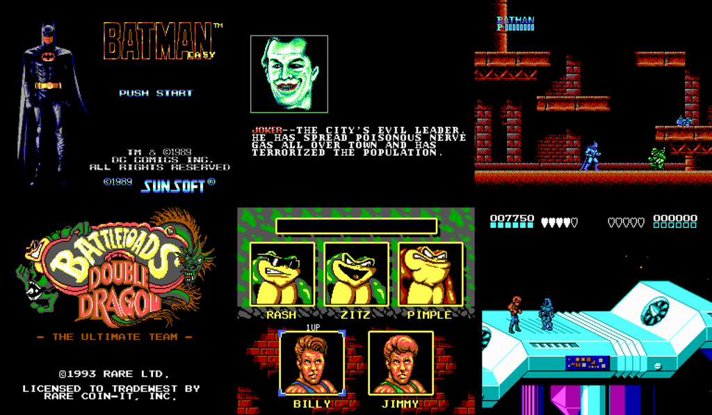
Time for some pointlessness! So, I was messing around with an NES emulator and some color palettes I have and then I thought: "How would NES games look like with the 16-color Commodore 64 color palette? Or the EGA palette? So, I decided to adapt these colors in these palettes to the NES ones, as best as I could and make .pal or .act files, which you can use in FCEUX or any other emulator, that supports external palettes.
First is the C64 palette. At first, I was gonna just do a quick copy-paste operation and just put whatever "new" colors are similar to the original ones. But then I decided to make color ramps for all the hues, so that the shades look good. I'm glad, I made that decision, because the results are much better.
Original NES Palette:

NES-C64 Palette:

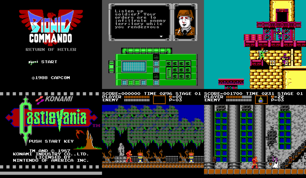
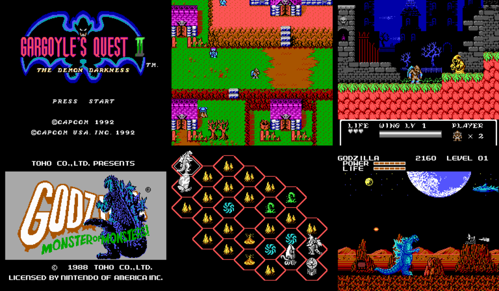
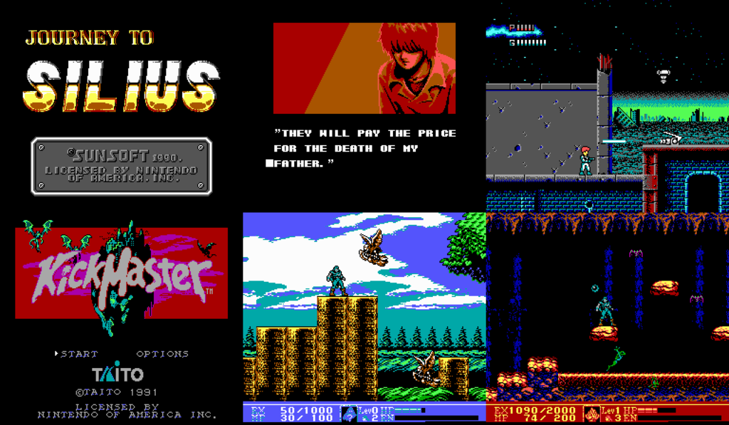
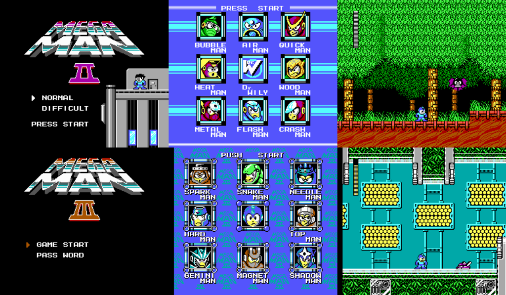
Speaking of the results, they are... interesting. Some games still look great, others don't. As you can see, C64 color palette uses very washed out colors and 3 shades of gray, and there are only 16 colors. This should create great limitations for the palette and it kinda does, but it also allows the user to easily create color ramps. So, even though it may not seem so, the graphics look quite similar to the original ones. Here are some screenshots of various games, so you can see what they look like.
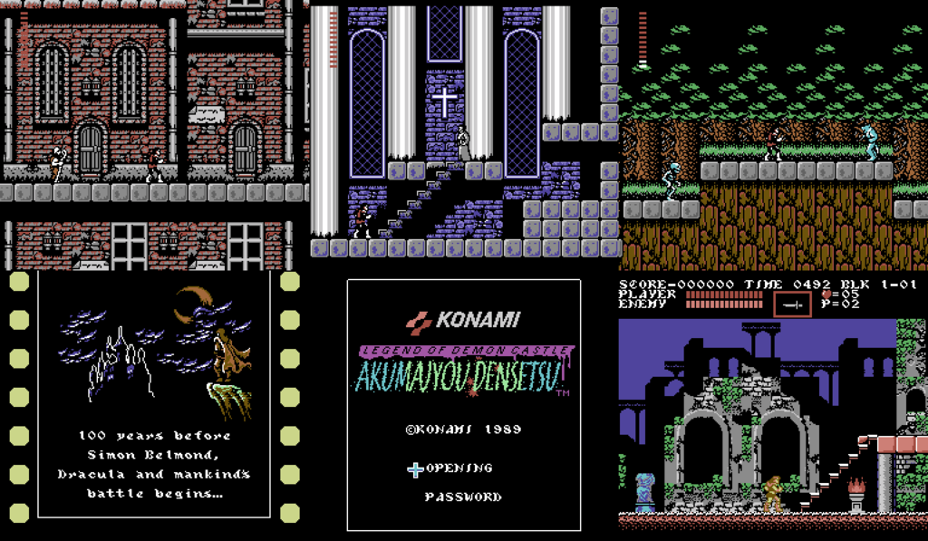
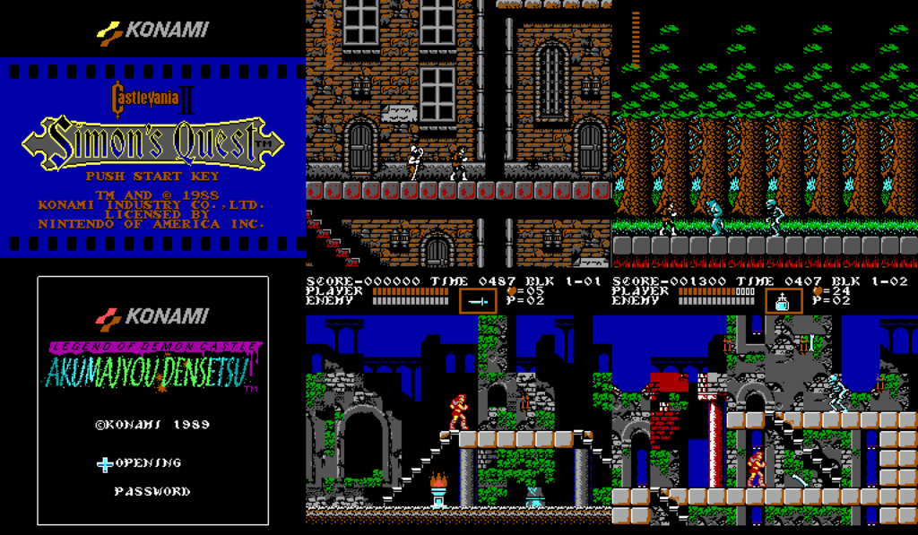
"Castlevania II: Simon's Quest" used a lot of grays to create a washed out color palette. Now, with the C64 palette, there are even more grays! "Akumajou Densetsu"(Castlevania III: Dracula's Curse), on the other hand looks rather nice.
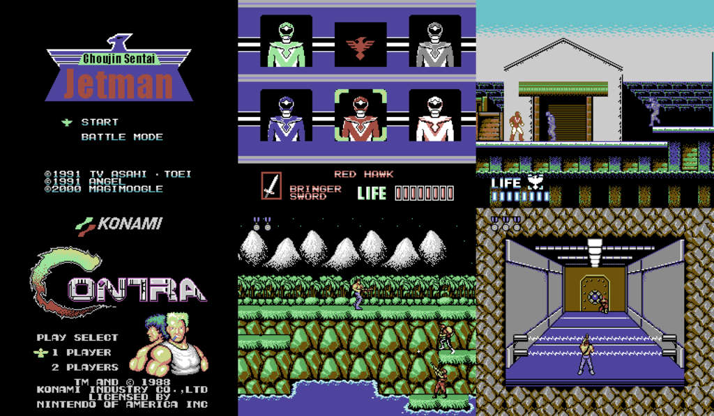
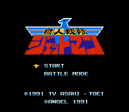
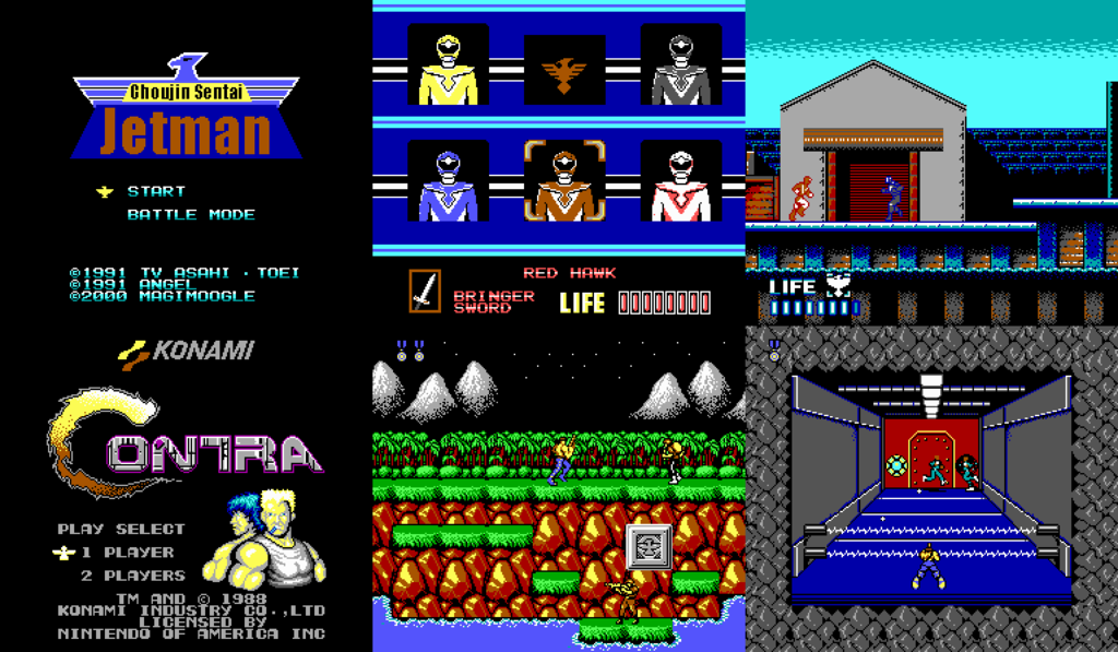
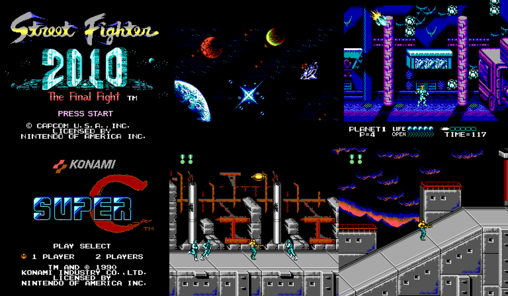
Some games kinda suffer from this new palette. The C64 palette has only one yellow color, so I had to put either light brown, light red or light green in a lot of places. Because of that, the yellow ranger in "Choujin Sentai Jetman" is now a green ranger.
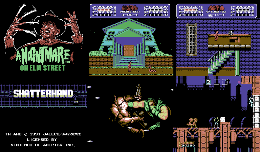
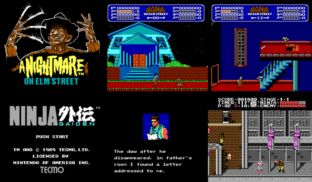
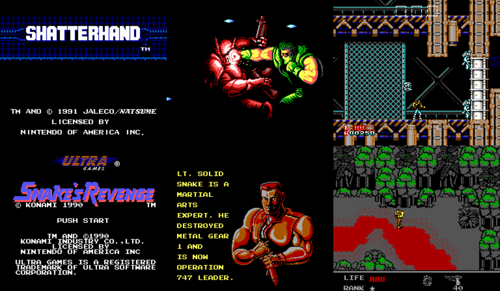
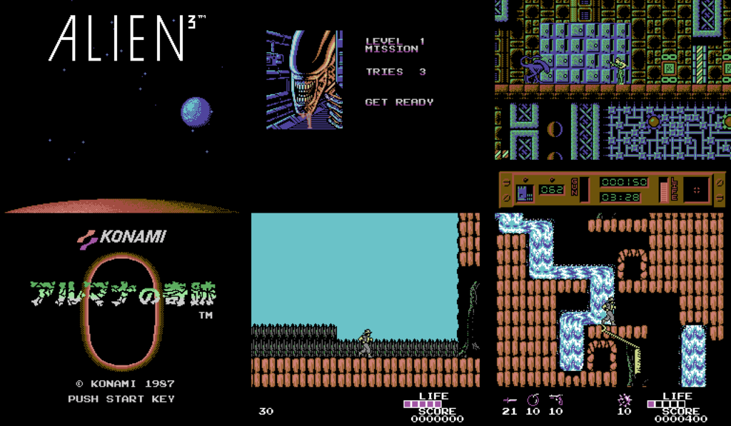
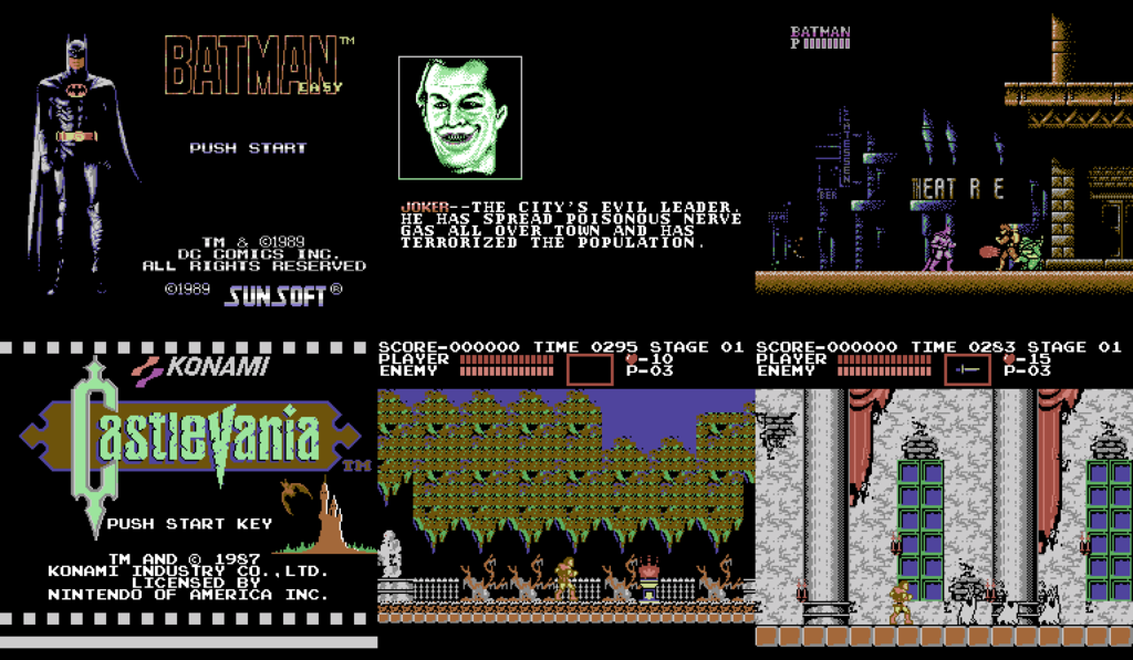
I have to admit, "A Nightmare on Elm Street" looks amazing with this palette. "Shatterhand" also looks great, but it's probably because it has some of the best graphics, the NES could offer, in my opinion.
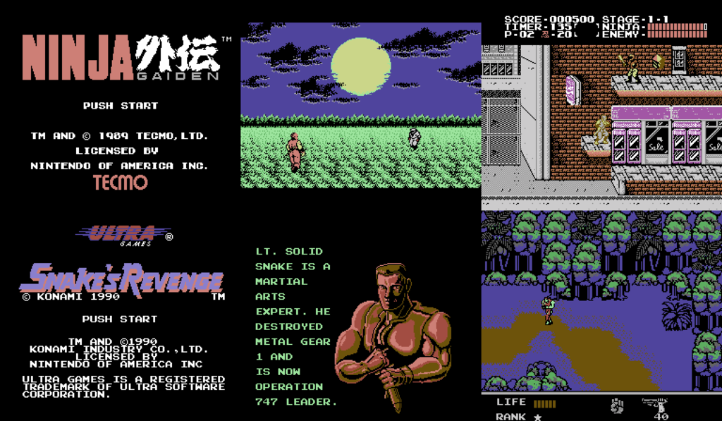
"Ninja Gaiden", on the other hand, wasn't converted well. We have a very grey-looking Ryu Hayabusa. Then again, he is a ninja, he is supposed to blend in with the environment.
 [/URL]
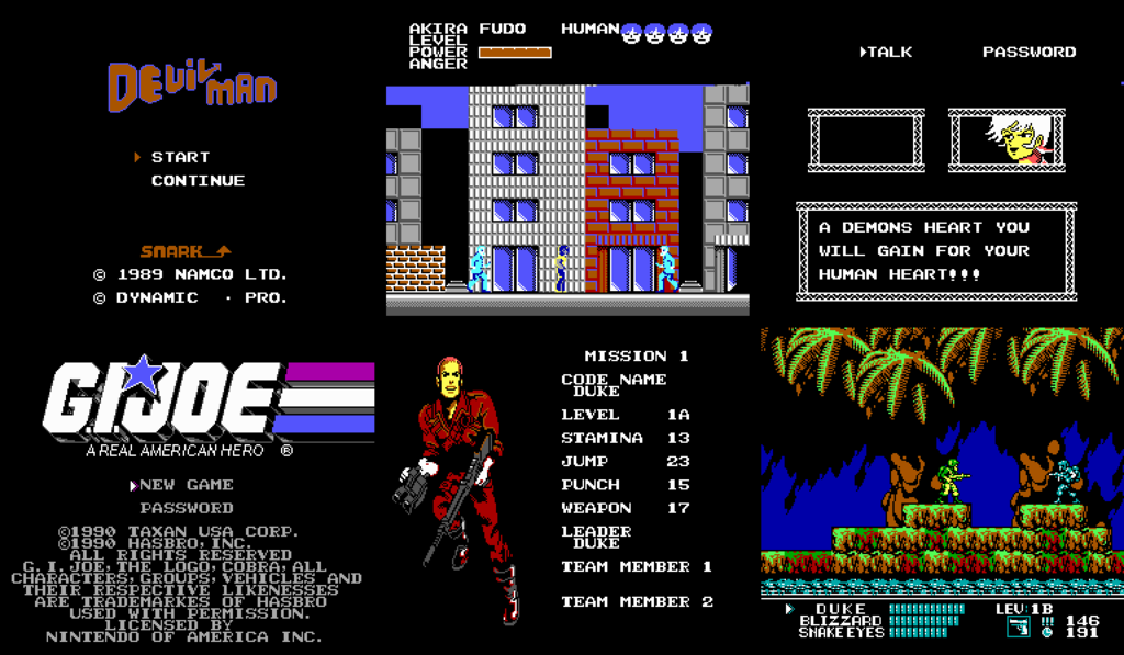
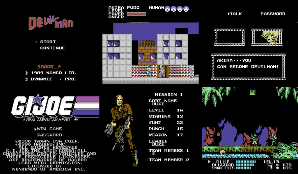
Some games really don't look good with this palette, though that may be, because of the graphics designers' color choices. "Devilman", for instance has incredibly bland graphics (especially considering it was made in 1989) and it suffers from the C64 color palette. It may not look so bad in the screenshots, but the enemies blend in with the background and it looks pretty bad. "G. I. Joe", on the other hand, looks pretty good.
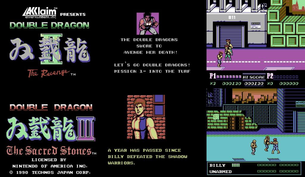
"Double Dragon II and III" look pretty great, though there is color loss.
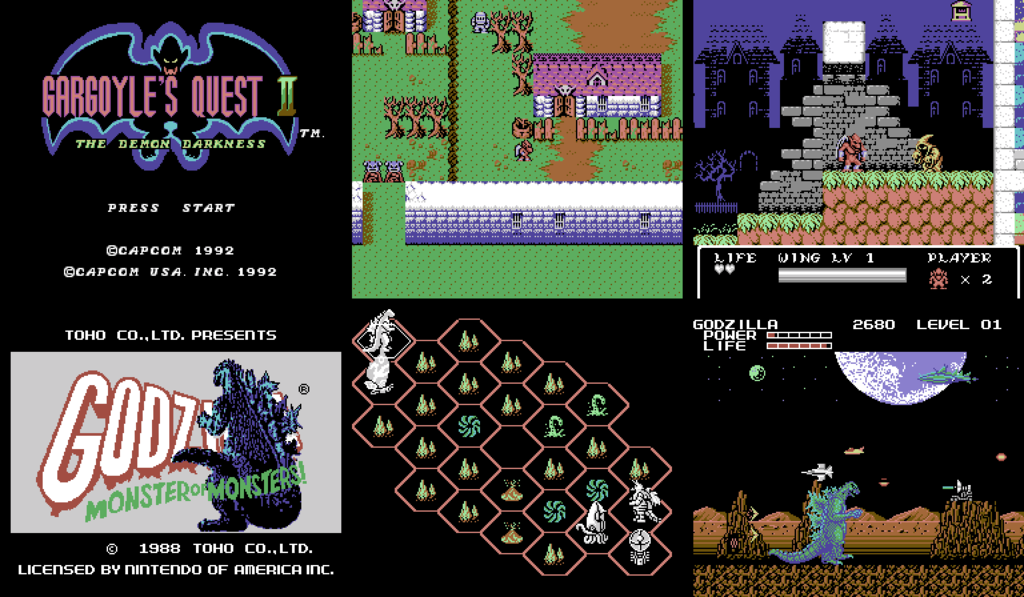
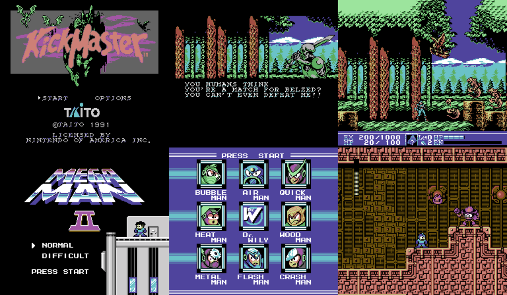
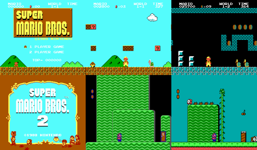
Now you may be wondering why I didn't show you the original "Super Mario Bros.", the game that started it all. Well... because it kinda looks like this:
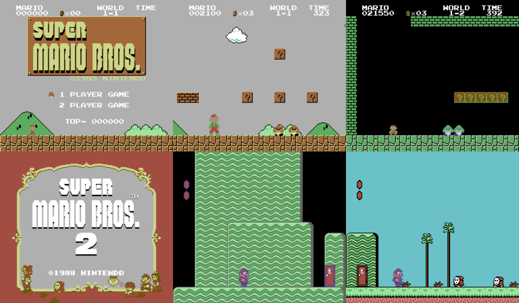
As you can see, we have a gray sky and the green in Mario's sprites looks very bright. This was the darkest green color in the C64 palette, so it ended up using that one. As for the sky, one of the brightest colors in this palette is, you guessed it, a light gray. When making the color ramps, I had to use it for the brightest shades, with the exception of the warmer colors, where I put yellow, because it's bright and I wanted to avoid gray skin colors. "Super Mario Bros. 2" looks a bit better, but not much.
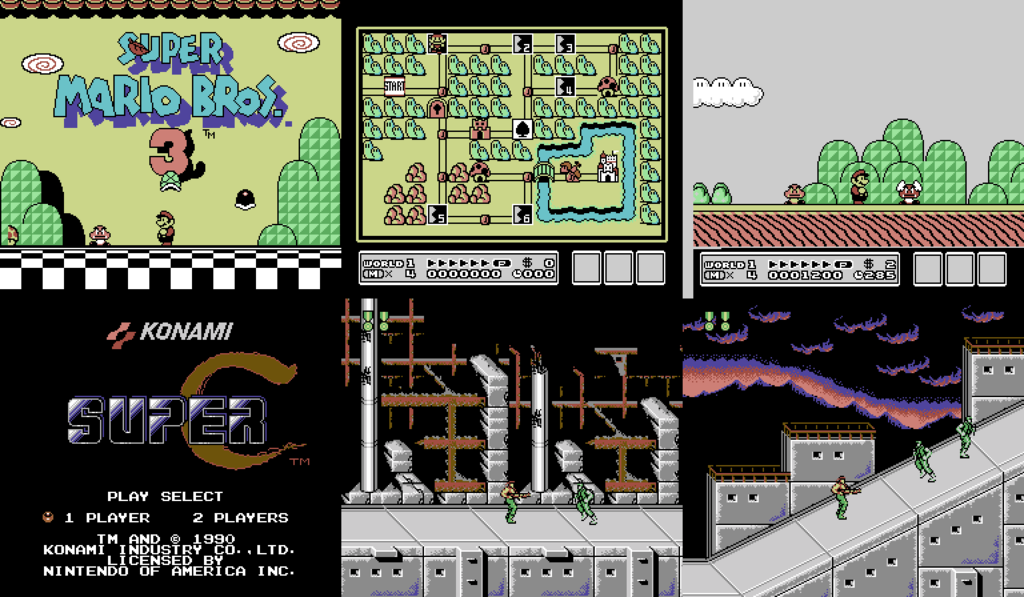
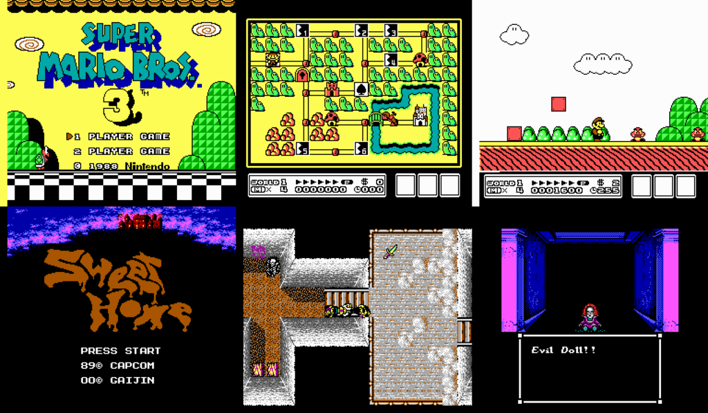
Finally, "Super Mario Bros. 3" looks really good, though, unfortunately, it still has gray skies.
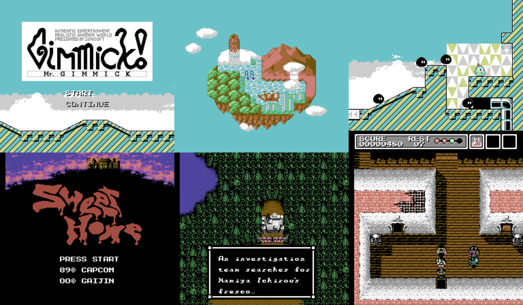
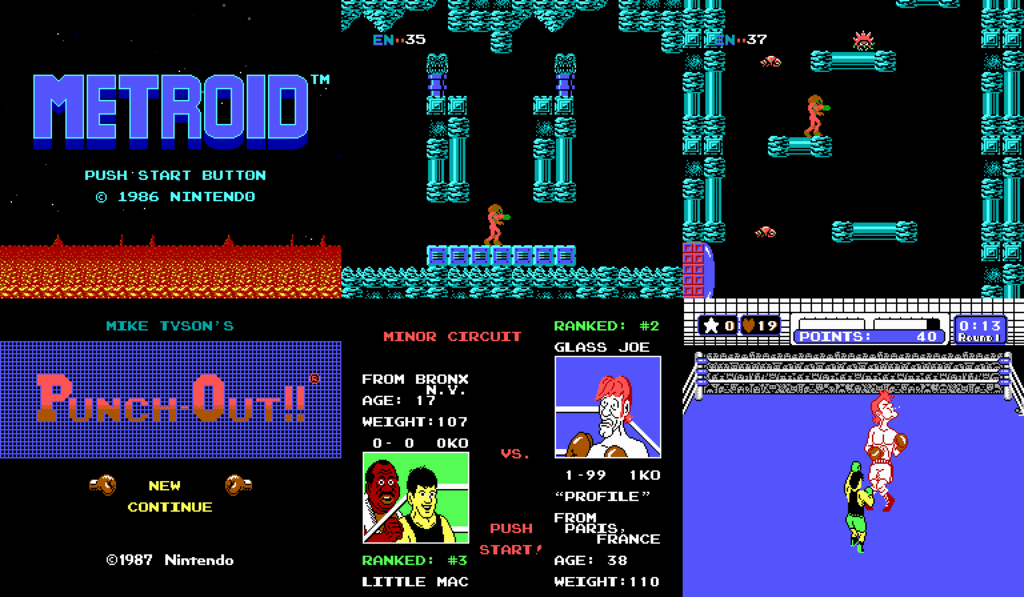
I'll finish this with two NES classics.
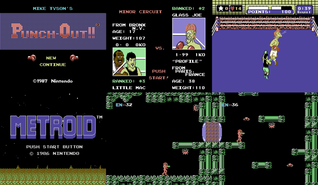
Interesting how "Metroid" ended up using a lot of greens.
Anyway, that's it for now. I'll post the palette as an attachment and test out your favorite games yourselves! I'll be posting screenshots of games, using the CGA, EGA and Amstrad-CPC palettes.
First is the C64 palette. At first, I was gonna just do a quick copy-paste operation and just put whatever "new" colors are similar to the original ones. But then I decided to make color ramps for all the hues, so that the shades look good. I'm glad, I made that decision, because the results are much better.
Original NES Palette:

NES-C64 Palette:

Speaking of the results, they are... interesting. Some games still look great, others don't. As you can see, C64 color palette uses very washed out colors and 3 shades of gray, and there are only 16 colors. This should create great limitations for the palette and it kinda does, but it also allows the user to easily create color ramps. So, even though it may not seem so, the graphics look quite similar to the original ones. Here are some screenshots of various games, so you can see what they look like.


"Castlevania II: Simon's Quest" used a lot of grays to create a washed out color palette. Now, with the C64 palette, there are even more grays! "Akumajou Densetsu"(Castlevania III: Dracula's Curse), on the other hand looks rather nice.

Some games kinda suffer from this new palette. The C64 palette has only one yellow color, so I had to put either light brown, light red or light green in a lot of places. Because of that, the yellow ranger in "Choujin Sentai Jetman" is now a green ranger.

I have to admit, "A Nightmare on Elm Street" looks amazing with this palette. "Shatterhand" also looks great, but it's probably because it has some of the best graphics, the NES could offer, in my opinion.

"Ninja Gaiden", on the other hand, wasn't converted well. We have a very grey-looking Ryu Hayabusa. Then again, he is a ninja, he is supposed to blend in with the environment.
 [/URL]
Some games really don't look good with this palette, though that may be, because of the graphics designers' color choices. "Devilman", for instance has incredibly bland graphics (especially considering it was made in 1989) and it suffers from the C64 color palette. It may not look so bad in the screenshots, but the enemies blend in with the background and it looks pretty bad. "G. I. Joe", on the other hand, looks pretty good.

"Double Dragon II and III" look pretty great, though there is color loss.


Now you may be wondering why I didn't show you the original "Super Mario Bros.", the game that started it all. Well... because it kinda looks like this:

As you can see, we have a gray sky and the green in Mario's sprites looks very bright. This was the darkest green color in the C64 palette, so it ended up using that one. As for the sky, one of the brightest colors in this palette is, you guessed it, a light gray. When making the color ramps, I had to use it for the brightest shades, with the exception of the warmer colors, where I put yellow, because it's bright and I wanted to avoid gray skin colors. "Super Mario Bros. 2" looks a bit better, but not much.

Finally, "Super Mario Bros. 3" looks really good, though, unfortunately, it still has gray skies.

I'll finish this with two NES classics.

Interesting how "Metroid" ended up using a lot of greens.
Anyway, that's it for now. I'll post the palette as an attachment and test out your favorite games yourselves! I'll be posting screenshots of games, using the CGA, EGA and Amstrad-CPC palettes.
