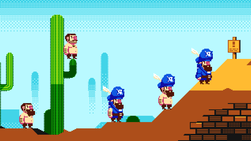
progress on this game is coming along nicely. Heres a recent shot, "NES" is widescreen and uses 8x8 palettes.

Looks pretty good, actually. However, I'm going to guess that the random skulls on the floor would be rendered as 'sprites' since there doesn't appear to be a background palette for those. Of course since this isn't designed to be made for the NES in the first place, it's not an issue, but a key reason why so many NES games looked liked the way they did was due to the dreaded sprite flicker (8 tiles per line may be drawn, anything over will either not be drawn/cause others to not be drawn or cause flicker, depending on the algorithm programmed), and given how detailed the pirate is (who likely has several sprites layered on him), this would cause extreme flicker. Again, this assuming this was an NES game (which it isn't), and this is a detail that many artists choose to ignore that has a huge impact on game aesthetics, or even level design.
That said, it looks highly plausible to be converted to the NES, albeit with a few changes. Good job!
Background looking better than ever, though I preferred bushy-bearded version of pirate. 16-px-wide feels mildly disappointing by comparison. (Or is this just "a different status level"?)
OneCrudeDude wrote:
However, I'm going to guess that the random skulls on the floor would be rendered as 'sprites' since there doesn't appear to be a background palette for those.
Considering the skeleton at the right (which has the same colors), I wouldn't be surprised if those skulls are just idling skeletons.
Thanks for the feedback guys, very much appreciated. Yes the skulls are sprites.
My NES restrictions don't include scanline sprite number, and 2x2 tile colour grouping (I'm shooting for per tile MMC5 color assignment)
Bit more work on some other locations, 18th century London work in progress:

Man, those are some sweet pixels! The bigger horizontal resolution really adds an incredible sense of scale to this. And your dither texturing? Pretty sweet! No real complaints here.
Yeah, that night scene is very snazzy, with very good usage of the 8x8 attributes.
Thanks for the feedback.
Thinking of some ways to do a multicoloured title screen using tiles and the same NES restrictions without too much colour bleeding...
1.

2.

3.

(press start would be sprites)
Maybe I'm just biased, but I would avoid any mentions of "retro" or "8 bits" in a game's title. My main reason for that is because it usually means "I'm an indie game with pixel stick figure syndrome and sfxr". I really like your title screen otherwise, this is just me being a retro-snob.

Drag wrote:
Maybe I'm just biased, but I would avoid any mentions of "retro" or "8 bits" in a game's title. My main reason for that is because it usually means "I'm an indie game with pixel stick figure syndrome and sfxr". I really like your title screen otherwise, this is just me being a retro-snob.

I feel the same way. I think pixel graphics and design styles can be enjoyed for what they are without being thrust in front.
Drag wrote:
Maybe I'm just biased, but I would avoid any mentions of "retro" or "8 bits" in a game's title. My main reason for that is because it usually means "I'm an indie game with pixel stick figure syndrome and sfxr". I really like your title screen otherwise, this is just me being a retro-snob.

Not just that, "Pixel Pirate" is basically implying that using pixelart is the main point of the game... which basically means the game has nothing interesting to go for it (especially given how overused pixelart is these days,
especially pixelart that tries to look NES-like).
I actually think "bits of eight" is a good pun.
Unless there's some in-game justification, such as being able to produce unauthorized copies of weapons. In-game, "pixels" are the distinctive appearance aspects of a weapon, and a "pirate" is someone who trades in counterfeit items. Thus a "pixel pirate" is a specific type of counterfeiter.
tepples wrote:
In-game, "pixels" are the distinctive appearance aspects of a weapon
What?
Sik wrote:
(especially given how overused pixelart is these days, especially pixelart that tries to look NES-like).
I think the main reason "NES style" pixel art is the most common is because it takes the least amount of effort to draw. Compared to SNES pixel art, there is much less to draw (smaller sprites, less animation for each sprite) and there are much less colors to use, both for each tile and total. After about making 3 frames of animation on an SNES sprite I'm making, I already want to pull my hair out.
I find 3-color sprites a lot more difficult and time consuming to draw, because of the hard choices it imposes.
I also think that "NES" style is not the most common pixel art by far. The vast majority is just unrestrained-RGB pixel art.
rainwarrior wrote:
I find 3-color sprites a lot more difficult and time consuming to draw, because of the hard choices it imposes.
I have to agree with Espozo on this one. With only 3 colors, the choices might even be hard, but there are only 4 possible outcomes for each pixel. Even if you start trying things at random in detailed areas you might end up with something you like (I distinctly remember doing this when drawing hands, trying to convey the idea of fingers). With 15 colors, making bad choices is easy, and there are so many more combinations to try. Even choosing an ideal 15-color palette is hard when the global palette has so many colors to pick from. Working in restricted environments reduces the possibilities, so you have less choices to make.
Would you say that Atari 2600 sprites are harder to draw than NES sprites because they're more limited? I think that there's only so much you can do with 8 pixels across and 1 color per line, so there's no way you'd spend more time filling that space than you would a 16-pixel wide 3-color sprite. NES vs. SNES sounds like a very similar case to me.
Quote:
I also think that "NES" style is not the most common pixel art by far. The vast majority is just unrestrained-RGB pixel art.
True. Most people using the terms "pixel art" or "8-bit" are just thinking of blocky graphics.
For me, the answer is yes, but I think the Atari 2600 comparison is a bit of a red herring, since the resolution is different. Not so for the NES vs SNES comparison.
With other things equal, though, I do consider 1bpp art more difficult to produce than 2bpp, and 4bpp or 24bpp is much easier. With more colours I can get the look I want without having to manage alternatives. With less colours I have to carefully choose between a pixel here and a pixel there, it is very time consuming for me. It takes me much longer to produce an effect that satisfies me. In particular, trying to express shape with lighting/shading without having a graduated palette to work with is something I find very difficult.
I've worked on pixel art at all of these colour depths, and I've often done so under tight time constraints (like one-hour compos, or game jam), and I can say without a doubt that I work faster with less restricted colour choices. I honestly find NES color restrictions extremely frustrating.
I wouldn't say the same about resolution. Higher resolution art takes me longer.
tokumaru wrote:
tepples wrote:
In-game, "pixels" are the distinctive appearance aspects of a weapon
What?
I was attempting to come up with a scenario that would justify the title "Pixel Pirate".
tepples wrote:
Unless there's some in-game justification, such as being able to produce unauthorized copies of weapons.
Dude, the character is literally a pirate, clothes and all, that alone justifies the "Pirate" part.
The only way your idea would make sense is if he was counterfeiting pixels, but I really doubt that's the case, unless we start claiming that pirates in real life are people who counterfeit atoms =P
rainwarrior wrote:
For me, the answer is yes, but I think the Atari 2600 comparison is a bit of a red herring, since the resolution is different. Not so for the NES vs SNES comparison.
I've read something about how sprites on the Atari 2600 can be in a 160x192 space while the BG runs at a different resolution. I know I'm not saying everything even close to correctly, so look here:
http://atariage.com/forums/topic/169128 ... esolution/ Assuming that we're using sprites, the NES's resolution isn't larger enough than the Atari 2600's resolution to really affect the artwork. However, the amount of colors greatly does.
rainwarrior wrote:
With more colors I can get the look I want without having to manage alternatives. With less colours I have to carefully choose between a pixel here and a pixel there,
However, If you are crazy and have OCD like me, you're going to try to "carefully choose between a pixel here and a pixel there" when making SNES artwork, and it takes far longer than it would on the NES. Like what tokumaru said, every pixel has 4 times the amount of color options on the SNES than the NES, so again, if you're crazy like me, it's going to take about 4x as long. (Not including having more tiles to use on the SNES.) I just can't stand drawing anything that doesn't look "pixel perfect". Even when I play Metal Slug, I often look at a tree in the background and see an oddly placed pixel or two and think "why didn't they fix that?" I often have to convince myself to just stop working on something and go to the next thing so I don't sit there forever on something that no one is even going to notice. Although generally not quite as pretty as pixel art, (unless you're as talented as Rare) I've even thought about using pre rendered graphics just so I don't torture myself.
tepples wrote:
I was attempting to come up with a scenario that would justify the title "Pixel Pirate".
I got that, what I didn't get was the pixel = weapon part. Is there a cultural or linguistic aspect that's preventing me from making any sense out of this?
tokumaru wrote:
tepples wrote:
I was attempting to come up with a scenario that would justify the title "Pixel Pirate".
I got that, what I didn't get was the pixel = weapon part. Is there a cultural or linguistic aspect that's preventing me from making any sense out of this?
Don't worry, I don't understand it either...
tokumaru wrote:
tepples wrote:
I was attempting to come up with a scenario that would justify the title "Pixel Pirate".
I got that, what I didn't get was the pixel = weapon part. Is there a cultural or linguistic aspect that's preventing me from making any sense out of this?
An item's "pixels" would be a picture of the item at rest and in motion. Combining an item's "pixels" with a description of what the item does would let copycats make knockoffs, much like the knockoffs seen at CES (
The Daily Dot;
Cracked). A "pixel pirate" would then mean anyone involved in the production of lookalike items.
Well, I like the title. And the "bits of eight" pun. (though, the topic title doesn't immediately evoke "a NES game about a pirate" due to another meaning...)
idea: the X could be more "X-marks-the-spot"-like.
Espozo wrote:
Sik wrote:
(especially given how overused pixelart is these days, especially pixelart that tries to look NES-like).
I think the main reason "NES style" pixel art is the most common is because it takes the least amount of effort to draw. Compared to SNES pixel art, there is much less to draw (smaller sprites, less animation for each sprite) and there are much less colors to use, both for each tile and total. After about making 3 frames of animation on an SNES sprite I'm making, I already want to pull my hair out.
You can draw out a character using an animated outline and flat colors, and fill it out with shading.
psycopathicteen wrote:
You can draw out a character using an animated outline and flat colors, and fill it out with shading.
You can, but the result will not be the best possible on the system.
Myask wrote:
Well, I like the title. And the "bits of eight" pun. (though, the topic title doesn't immediately evoke "a NES game about a pirate" due to another meaning...)
idea: the X could be more "X-marks-the-spot"-like.
Thanks! Certainly going to revisit this very soon, the X was something that happened along the way, impulse is now to make that into a skull and crossbones to unify the logo.
For comments about NES being the easiest to produce and most prevalent form of pixel art, I would argue the opposite. The majority is unrestrained palette and unrestrained technically. It's more akin to SNES or AGA abilities. Working with NES restrictions really makes me think about colours, light and shadow, negative space and forms. It's harder to produce if anything.
I showed the London scene to someone and then said it's 13 colours in total using a handful of tiles. They thought it was totally unrestrained pixel art, to me that is the best compliment.
hawken wrote:
Working with NES restrictions really makes me think about colours, light and shadow, negative space and forms. It's harder to produce if anything.
Again, I said if you have this mentality going into the SNES, you're going to have a hard time. It's taken me about 3 days of on and of work just to draw a stupid 64x40 road texture, where on the NES, this wouldn't have taken me longer than 30 minutes. You really only have about 3 colors to work with, so making a gradient for depth isn't that time consuming. You also have a limited amount of tiles, so you wouldn't even make something that big for a road, but I'm aiming for something like Metal Slug quality backgrounds. (I'm going to change tiles whenever the screen scrolls.)
When I work with 16-color sprites instead of 4-color sprites, I work just like traditional art; block the shape in first, put base colors in, then use lighting and shadows to sculpt the 3D form in. For 4-color sprites, I tend to just cheat and not worry too much about shading, unless I'm drawing something really large, but care needs to be taken that certain regions of the same color don't overlap or touch in a way that makes something look ambiguous.
So when you change your restrictions, some things get relaxed, but other things require more focus as a result. Therefore, I see NES and SNES art as equals in difficulty.
Drag wrote:
I see NES and SNES art as equals in difficulty.
I don't know, when I look at screenshots of random games, I see so much bad SNES art! Sure, the NES had its share of bad art too, but to me it seems this usually happened when people who weren't used to doing art decided to give it a shot for whatever reason (low budget, small team, whatever), but when actual artists were involved, the worst that would happen on the NES is that the graphics would end up looking too simple, but not necessarily bad. On the SNES however, it looks to me like actual artists often ended up making bad use of gradients, contrast, and the console's resources in general. It might be just an impression, but I honestly feel that it's easier to screw up when you have more things (colors, resolution, animation frames) to put in place.
I think it's more of a case that, if your art is bad, it'll be more obvious on the SNES than it is on the NES. The technique is different because you need to focus on different things, but I don't think it's any harder or easier to get something to look good on either console.
Heres the updated title screen with the crossbones

The slow fade bothered me a tiny little bit, but other than that, awesome title screen!
Pint of pixels anyone?

tokumaru wrote:
The slow fade bothered me a tiny little bit, but other than that, awesome title screen!
Yeah I'll have to speed it up a bit
tokumaru wrote:
Drag wrote:
I see NES and SNES art as equals in difficulty.
I don't know, when I look at screenshots of random games, I see so much bad SNES art! Sure, the NES had its share of bad art too, but to me it seems this usually happened when people who weren't used to doing art decided to give it a shot for whatever reason (low budget, small team, whatever), but when actual artists were involved, the worst that would happen on the NES is that the graphics would end up looking too simple, but not necessarily bad. On the SNES however, it looks to me like actual artists often ended up making bad use of gradients, contrast, and the console's resources in general. It might be just an impression, but I honestly feel that it's easier to screw up when you have more things (colors, resolution, animation frames) to put in place.
l never liked it when they tried to cram (no pun intended) in too many shades of a color into a small area, just because they could. It always looked nice when they tried to mimic the 4 shade gradient scheme of the NES, but with more varity of hues.
psycopathicteen wrote:
l never liked it when they tried to cram (no pun intended) in too many shades of a color into a small area, just because they could. It always looked nice when they tried to mimic the 4 shade gradient scheme of the NES, but with more varity of hues.
I personally like a 6/5/4 ratio on a lot of things. I don't every use more than 5 totally different colors, and I often don't even use more than 3.
I see the pirate has been made a little smaller. I was also going to mention that I -just- noticed that the Pirate used to have a pink nose. I'm not sure how well the pink would stand out from his skin if this were an NES game, so seeing how it blended it well, I figured it would be rather wasteful to waste a single tile from the scanline limit when you couldn't really see it. Then again, I don't know how to use Blargg's NTSC filter, so I can't judge.
Also, Tepples' comment about "pixel piracy" gave me an idea. It's not the primary focus of the game, but you can find weapon blueprints across the game world, and you take these to a weapon making shop to make the weapon. It will essentially boil down to a game of picross, which will be a blown up version of the weapon's sprite. Sound cool, huh? Just don't steal my money making idea from me, okay?

OneCrudeDude wrote:
Also, Tepples' comment about "pixel piracy" gave me an idea. It's not the primary focus of the game, but you can find weapon blueprints across the game world, and you take these to a weapon making shop to make the weapon. It will essentially boil down to a game of picross, which will be a blown up version of the weapon's sprite. Sound cool, huh?
Good job of fleshing out the suggestion.
Quote:
Just don't steal my money making idea from me, okay?

Pixel pirate pirate?
So I'm thinking to have the interiors a little different to the exteriors, 4 options as follows:

[li]Side view (metroidvania)[/li]
[li]Oblique 45 (rivercity rampage)[/li]
[li]Oblique 90 (final fantasy)[/li]
[li]Isometric (solstice)[/li]
Any opinions? I'm not really drawn to isometric...
Isometric and oblique 45 look really cool, but are much harder to pull off on the NES, because of all the overlaps. If you end up deciding on one of these, I guess oblique 45 is more fitting.
The other 2 look more like your typical NES game. A side view is very limited in terms of interaction with the environment, so oblique 90 would probably be the next best choice IMO.
Well it turned out Oblique looked like too much work in the long run. So I'm going with "top down" (Oblique90)
Here's a little mockup of the ground floor of Alias Arms.

Do you plan on changing the sprites for the characters when they are indoors, because I am getting the impression that they are lying down on the ground.
Espozo wrote:
I am getting the impression that they are lying down on the ground.
I think they look fine.
Well, it's my opinion anyway. Look at the skeleton on the staircase. Oh wait, I just noticed something. How do you have two different dark grays? Aren't they exactly the same? Oh, and the second to darkest brown doesn't look right. Are you trying to use the NES palette?
Espozo wrote:
How do you have two different dark grays? aren't they exactly the same?
The 0 column and D column greys are different, though some emulators use a default palette that has the same colour for them; I'm not sure why this choice was made.
Hmm... Does anyone have a good NES palette they could post? I don't know as to why the colors range from palette to palette so much when they are from the same system.
Because the system doesn't have a fixed palette. It's an NTSC signal, and the actual colour depends on the TV that decodes it (which varies quite a lot).
Bisqwit made a nice palette generator:
http://bisqwit.iki.fi/utils/nespalette.phpDrag also made a nice one:
http://drag.wootest.net/misc/palgen.htmlBoth of these give you lots of parameters to decide how to generate the colours.
Espozo wrote:
Well, it's my opinion anyway. Look at the skeleton on the staircase. Oh wait, I just noticed something. How do you have two different dark grays? Aren't they exactly the same? Oh, and the second to darkest brown doesn't look right. Are you trying to use the NES palette?
Sprites in here are just placeholder while I test everything out, there won't really be skeletons in the pub, I mean they can't hold their drink for a start. Goes right through em.
My NES palette is combined from various sources, there is no "true" palette for the system as is depended on your TV, region and so on. People argue about it but AFAIK there is no correct answer.
Heres the palette I made anyway (photoshop has it's own way of organising the swatches, not mine):

(click for .aco, .act, .ase & photoshop friendly .pal)
I kinda got used to my one now, some prefer darker palettes or less vibrant ones, but to the best of my knowledge this amount and approximation of colour signals are derived from the hardware output.
Finalised on a 6 colour palette, he is probably all good for animation now. Lot's of layers al-la Arthur style health.
Sprite has changed a lot (new concept art on devlog) and not using NES palette anymore... not strictly anyway.

You know, I ran into the same situation as you while I was making an NES styled pirate game. I didn't like the NES's color palette so I decided to give it a 9 bit color palette. I then made the graphics 4bpp, but I was still frustrated with the 8 sprites per scan line limit, so I increased the overdraw to the width of the screen. I then found I was starting to run out of sprites in general, so I made it to where I had 128 64x64 sprites. I remember BG layers, so I decided to give myself 3 to work with. 9 bit color was starting to look bad, so I then thought I had decided on a 15 bit color palette, but I made it 24 bit and also added an 8 bit alpha channel for the heck of it. I also quadrupled the resolution to 512x480. I then made the graphics 8bpp, and had it to where I had 16 256 color palettes. I realized that I was upgrading the colors more than everything else, so I then added 3 more BG layers and tripled the overdraw. I also doubled the amount of sprites. I was beginning to realize that I didn't even want to have the game be 2D anymore, so I limited myself to 100,000 polygons to work with. This proved to be too restrictive, so I gave myself 100 million. I found that what I had in mind was over the polygon budget, so I made it 1 billion polys, but I didn't like that either, so I raised it to 1 quadrillion and implemented the most advanced shaders to date. I also had the game running at 4K, but gave the option for 16K support if you link 4 TVs together. The limited color depth was really starting show, so I made the game have 48 bit RGB with a 16 bit alpha channel. After all this, I finally finished the game. I have a screenshot right here: (I shrunk the image so it wouldn't mess with the layout of the web page.)

Espozo wrote:
You know, I ran into the same situation as you while I was making an NES styled pirate game. I didn't like the NES's color palette so I decided to give it a 9 bit color palette. I then made the graphics 4bpp, but I was still frustrated with the 8 sprites per scan line limit, so I increased the overdraw to the width of the screen. I then found I was starting to run out of sprites in general, so I made it to where I had 128 64x64 sprites. I remember BG layers, so I decided to give myself 3 to work with. 9 bit color was starting to look bad, so I then thought I had decided on a 15 bit color palette, but I made it 24 bit and also added an 8 bit alpha channel for the heck of it. I also quadrupled the resolution to 512x480. I then made the graphics 8bpp, and had it to where I had 16 256 color palettes. I realized that I was upgrading the colors more than everything else, so I then added 3 more BG layers and tripled the overdraw. I also doubled the amount of sprites. I was beginning to realize that I didn't even want to have the game be 2D anymore, so I limited myself to 100,000 polygons to work with. This proved to be too restrictive, so I gave myself 100 million. I found that what I had in mind was over the polygon budget, so I made it 1 billion polys, but I didn't like that either, so I raised it to 1 quadrillion and implemented the most advanced shaders to date. I also had the game running at 4K, but gave the option for 16K support if you link 4 TVs together. The limited color depth was really starting show, so I made the game have 48 bit RGB with a 16 bit alpha channel. After all this, I finally finished the game. I have a screenshot right here: (I shrunk the image so it wouldn't mess with the layout of the web page.)

It only took 31 years!
In all seriousness though, I really think you should stick with the NES's color palette, but you can do whatever you want. I converted your pirate to the NES in 2 different pictures. The first is more close to yours, but I like the second better. (I think it's a bit odd that a pirate would be wearing bright blue, to be honest.)
Attachment:
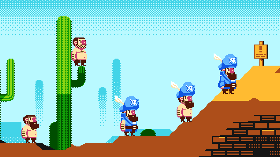 NES Pirate 1.png [ 10.21 KiB | Viewed 2798 times ]
Attachment:
 NES Pirate 2.png [ 10.24 KiB | Viewed 2798 times ]
Espozo wrote:
In all seriousness though, I really think you should stick with the NES's color palette,
You're right, on both counts.
I've converted what I was doing back to NES palettes.
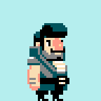
Trying out a few colourways. Grey seems to be a favourite, thoughts welcome.
colourways walk cycle

runcycle WIP

And some weapons

Gonna keep experimenting with his palette until it sticks.
This is absolutely fantastic. You've eschewed some of the NES restrictions like in Shovel Knight, but taken the aesthetics of the system to a whole new level. These bigger sprites give so much more room for personality, and the higher framerate has allowed for some fantastic subpixel animation.
With that being said, there's not much C&C I could provide. The designs are great but some of your weapons look a little messy. The dark AA on the edges of the Mega Anchor won't look very good on most backgrounds.
Also, have you considered posting your work over on
r/pixelart? The people over there would go nuts for it!
I really enjoy the hot pink one.
Pink pirate is hilarious in the same way that
pink Captain Falcon is.
I'm sorry, but I can't help but think of the "buttons" on Captain Falcon's pecks whenever I see a picture of him. (It doesn't help that they're pink here.)
Selectable palettes can be fun.
The main problem with selectable palettes is that you can't have other objects use that palette, unless you also want them to change color. Being able to alter the players color is fine on something like the SNES or the GBA, but not so much here.
Well, it's not an actual NES game, so there's no problem with selectable palettes at all. My game supports two players simultaneously, so each player is a different color. I decided there's no reason to not allow a person playing alone to pick either of the two colors available. It follows that ports of the game for PC or whatever will probably allow a lot more colors to choose from, because it's a stupid thing to restrict when it doesn't need to be restricted. If players want to be authentic they can always only pick the first two colors, but why not allow people who don't actually care to have some fun?
I feel the same way about not strictly using the NES palette. He's already said he's disregarding the sprite limit/other stuff. Will you really keep dogging him on each thing he hasn't specifically said he's not honoring? For all we know, the plan could be what Yoshi's Island does (different Yoshi for every level) or whatever.
But if there can be only one™, my vote goes to teal. (the one on the furthest right in the walk cycles). And actual feedback, I can't get the idea that his arm is not a French baguette in the run cycle wip out of my head.
Kasumi wrote:
I feel the same way about not strictly using the NES palette. He's already said he's disregarding the sprite limit/other stuff. Will you really keep dogging him on each thing he hasn't specifically said he's not honoring? For all we know, the plan could be what Yoshi's Island does (different Yoshi for every level) or whatever.
Espozo wrote:
In all seriousness though, I really think you should stick with the NES's color palette, but you can do whatever you want.
(Where else did I complain about him not using the NES palette anyway? "Keep" usually implies more than once)
and..
This Topic wrote:
NES Pirate
Meaning that there are still restrictions. Otherwise, you could have 8bpp sprites using 24 bit color and still call it an NES sprite.
Sure there are still restrictions. But they were already not NES restrictions when the sprite limit and sprites per scanline limit were disregarded. I think the topic had made its intentions pretty clear, the title is kind of a lack-of-a-better-term thing. I ask again, does he really need to specifically state every thing he's not honoring?
Quote:
Otherwise, you could have 8bpp sprites using 24 bit color and still call it an NES sprite.
People do what you've said all the time. But you know this. Hence Pirates of the Caribbean.
Quote:
"Keep" usually implies more than once
I didn't say, "keep dogging him about the palette" I said "keep dogging on each thing he hasn't specifically said he's not honoring". So the more than once is,
1. Your Pirates of the Caribbean joke
2. Selectable palettes
Edit: Or... does 1 not count because he actually
did specifically say he didn't honor the palette in that? Even if it was once, I think it's a valid question. I'd be happy to rephrase it, but I think you do understand what/why I've asked.
Lets just say you won the argument so we can move on.
DragonDePlatino wrote:
This is absolutely fantastic. You've eschewed some of the NES restrictions like in Shovel Knight, but taken the aesthetics of the system to a whole new level. These bigger sprites give so much more room for personality, and the higher framerate has allowed for some fantastic subpixel animation.
With that being said, there's not much C&C I could provide. The designs are great but some of your weapons look a little messy. The dark AA on the edges of the Mega Anchor won't look very good on most backgrounds.
Also, have you considered posting your work over on
r/pixelart? The people over there would go nuts for it!
I just wanted to say thanks for the feedback, comments like these really help me get enthusiastic to finish off difficult and time consuming parts of the game.
I'll be sure to do a pixelart dump in r/pixelart when theres a bit more to show, thanks for the tip.
Bit more walkcycle:

Weapons:

Booty:

Booty system confirmed:

Neat, looks very busy but nicely spread out and not too predictable. The sprite reminds me of late '80s puzzly arcade titles. Not sure why.
Barracuda or Shark guys?

Both?
thefox wrote:
Both.
Both is good.
hawken wrote:
Booty system confirmed.
If there's one thing I wish would stay dead and gone, it's dropped-item vanishing. But it looks good, including the puffs of smoke they vanish into.
I must say I preferred him having a pegleg.
With both anchor sizes, it would probably be good to have him have to lean into his swings. It looks stiff for him to just be standing there with the anchor extended.
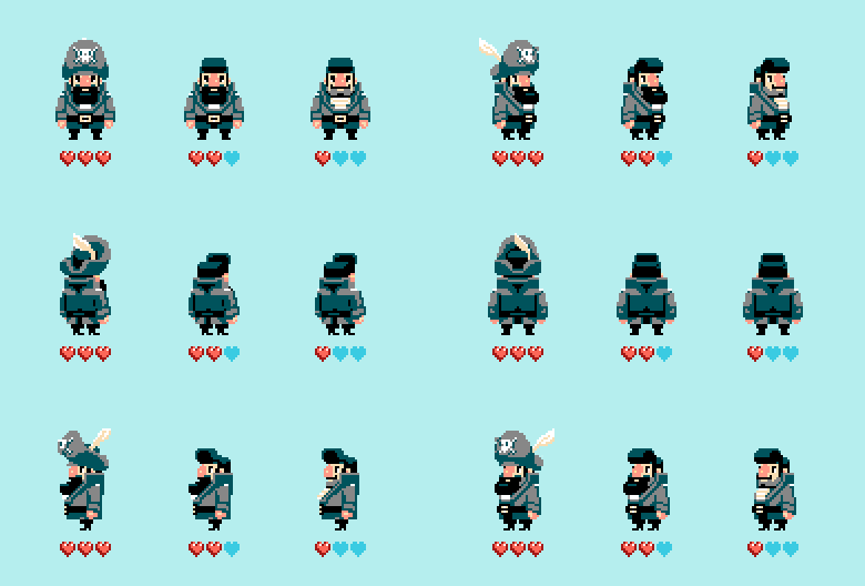
needed some frames from all angles so put into a handy diagram showing how Pete changes as he loses health.

Nice-looking as always.
I'm tempted to suggest something like having the feather only if you've managed not to get hit yet that stage, and thus "have a feather in your cap" figuratively as well as literally.
The fuses on the cannon/bomb look a little...metal-strappy, but this is probably only on super-bright backgrounds like that where the white seems transparent.
That looks really good, especially considering how turntables can be annoying to do.

Hmm...The contrast between the 3/3 heart form and the 2/3 heart form is pretty good, but it's hard to tell the difference between 2/3 and 1/3 at a glance. What if Pete lost a little more hair off the top to contrast the 2/3 and 1/3 forms?

I'd recommend also tearing the jacket to distinguish the most damaged state.
Thanks for the replies and suggestions.
Will probably go for sleevelessness!


I think I'd go jacketless altogether and show off that striped tanktop underneath...
Or if you stick with the hair idea, perhaps full male pattern baldness and have the top come off like a toupée.
Taking damage and losing something makes sense (hat, toupée, armor, jacket, etc.), but taking damage and something changing styles doesn't really (new hair style, new jacket style, etc.)
...and I didn't even notice the beard change until just now looking back over them. I would definitely think about how the change affects the character's silhouette, and maximize that.
Anyway, game looks neat. The blue shadowed palette looks far better than the green one. In the green one, I would definitely change the light grey to a somewhat warmer hue, I think it's too much temperature contrast and not enough value contrast that's causing those to look strange.
Haha, I was going to suggest the weakest sprite be jacketless too.

That'd be a more noticable change since it's a pretty significant region of color changing; I didn't even notice that the two weaker sprites were different until I crossed my eyes and saw that the beard was changed.
The silhouette is a good tip too, but I think the jacket loss would be distinguishable enough, unless you plan on having a lot of segments where the player sprite is literally just a silhouette.
M_Tee wrote:
Or if you stick with the hair idea, perhaps full male pattern baldness and have the top come off like a toupée.
I wasn't into the hair suggestion until now, lets see...


