Why you shouldn't let me get bored

This is an archive of a topic from NESdev BBS, taken in mid-October 2019 before a server upgrade.
View original topic
Why you shouldn't let me get bored
by on (#140769)
Really a quick job without much effort put into it (I was going to add more stuff and make this larger than a screen but got lazy), so whatever. May decide to add more stuff later if I get bored.

Image

Background tiles used: 10 (including blank tile)
Background palettes used: 3 (green, brown, water)

And yes I know the NES resolution is 256×240, not 256×224, but let me make my life easier =P Just waste those two missing rows and move on, they're hidden by overscan anyway.

EDIT: click for scaled up version
Re: Why you shouldn't let me get bored
by on (#140812)
Needs some slopes and loop-de-loops.
Re: Why you shouldn't let me get bored
by on (#140813)
That or logs falling down the waterfall.

But seriously, that looks good for so few tiles.
Re: Why you shouldn't let me get bored
by on (#141157)
Logs belong to the sprite category (and why would you have falling logs under a bridge not far from the floor, anyway?) Anyway, if somebody wants the tile set for that pic (before I forget):
Image

Whatever, tried to take a shot at a single-tile rain:
Image

It... doesn't really look great:
Image

I think it'd be probably better to take the waterfall tile and edit that.
Re: Why you shouldn't let me get bored
by on (#141158)
Sik wrote:
Logs belong to the sprite category (and why would you have falling logs under a bridge not far from the floor, anyway?)

To cross a similar waterfall a few screens over, I guess.
Re: Why you shouldn't let me get bored
by on (#141166)
tepples wrote:
To cross a similar waterfall a few screens over, I guess.

Yeah, this is the first thing I though of when I saw the image, which is naturally followed by this.
Re: Why you shouldn't let me get bored
by on (#143022)
Sik wrote:
Really a quick job without much effort put into it (I was going to add more stuff and make this larger than a screen but got lazy), so whatever. May decide to add more stuff later if I get bored.

Image

Background tiles used: 10 (including blank tile)
Background palettes used: 3 (green, brown, water)

And yes I know the NES resolution is 256×240, not 256×224, but let me make my life easier =P Just waste those two missing rows and move on, they're hidden by overscan anyway.

EDIT: click for scaled up version

Sweet! Now that's what I call transforming the poor NES's 3 colors into wonderful colorful awesome exciting and beautiful art! :D

I have a request. Would you like to take it? viewtopic.php?f=21&t=12497
Re: Why you shouldn't let me get bored
by on (#143087)
8bitMicroGuy wrote:
Sweet! Now that's what I call transforming the poor NES's 3 colors into wonderful colorful awesome exciting and beautiful art! :D

That was the original idea actually, try to make the NES look better than what it is. This is also why there isn't a background - I hadn't settled yet on how it should be done (in fact, if I can come up with a resonable way to get a background with parallax, I will take it). Later I got stuck with trying to keep the tile count low too, though, so I ran out of ideas >.< I'll see if later I can resume this with just the original challenge. I have some idea for a tree actually... (I think it's 5 tiles for the leaves and 2 for the trunk, but I need to try it to make sure)

Also another idea was to change palettes on the fly as you move across the level, so you get to use more colors than usual in a single map. Just make sure only four palettes are visible simultaneously on screen =P

8bitMicroGuy wrote:
I have a request. Would you like to take it? viewtopic.php?f=21&t=12497

Didn't check it yet, but here's a trick you may want to look for: a good way to get good sprites is to have two colors representing the same shade with different levels of lighting (e.g. red and dark red), and use the third color for another shade you may need (e.g. white). Yeah, I guess sprites may not look as colorful, but it will definitely look nicer than anything with outlines.

With backgrounds you get more leeway since you actually have four colors instead of three (albeit one is shared among all palettes, and it also depends if sprites can go under the background).
Re: Why you shouldn't let me get bored
by on (#143102)
Sik wrote:
here's a trick you may want to look for: a good way to get good sprites is to have two colors representing the same shade with different levels of lighting (e.g. red and dark red), and use the third color for another shade you may need (e.g. white).

Another trick to make it look like you have more colors than you actually do is to have 2 colors in a palette have different hues, and the third be a neutral color (e.g. gray) that could be combined with both. This works better for backgrounds, since then you get another color you can combine with both hues.

Blaster Master, for example, does this to draw the ground and the grass using only one palette. It doesn't look particularly amazing in crispy RGB pixels, but in NTSC it looks great! Little samson does something similar in some stages.

The neutral color doesn't have to be gray, and you're not forbidden to combine the stronger colors, the heart of this trick is to be able to construct 2 different color ramps/gradients using a single palette, mixing and matching colors as necessary. Some dithering helps, but checkerboard patterns of 2 different colors does not create a 3rd color that's between the 2.
Re: Why you shouldn't let me get bored
by on (#143506)
*throws hat into the ring*
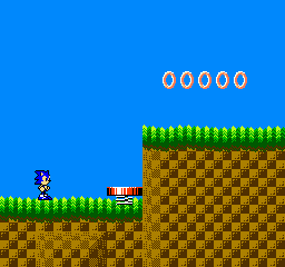
G'DAY!

Image
Re: Why you shouldn't let me get bored
by on (#143521)
Other than Pocket Adventure Sonic (which I don't like even with the proper colors), it looks good! The grass looks particularly nice, but the ground suffered a bit from having its palette include a green that can be merged with the grass.

Personally, since the dark brown and the dark green are somewhat similar, I'd try using the brown to finish the bottom of the grass pretending the color didn't change. It would maybe look strange if you looked directly at the transition, but the overall picture would look better because the ground would have more depth with an extra color for highlights. Since a much bigger area of the screen is covered by ground tiles than ground/grass transitions, the trade would probably be worth it. Several games have this kind of harsh color transitions and it really doesn't look that bad, specially after the video is NTSC'fied.
Re: Why you shouldn't let me get bored
by on (#143526)
You know, I've had these for a while, so what the heck.

Attachment:
Koopas.png
Koopas.png [ 583 Bytes | Viewed 4137 times ]

I was bored and I knew that SMB had a bunch of shared colors in the palettes, so I thought I'd see how it looked if I layered sprites on top of each other, like Mega Man's face in Mega Man. I'm sure there would be plenty of sprite flicker...
Re: Why you shouldn't let me get bored
by on (#143654)
That would make for a neat All Stars hack though.