WAH-HOO

This is an archive of a topic from NESdev BBS, taken in mid-October 2019 before a server upgrade.
View original topic
WAH-HOO
by on (#139300)
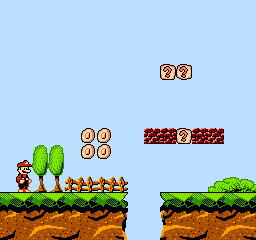
its almost 4am, i got school tomorrow and all i did today was this:
Image
Re: WAH-HOO
by on (#139305)
Almost 4 am? Where do you live? It's 8 pm in Texas 8-) I like the picture though. (Is it going to be a graphics hack of SMB?)
Re: WAH-HOO
by on (#139327)
Espozo wrote:
Almost 4 am? Where do you live? It's 8 pm in Texas 8-) I like the picture though. (Is it going to be a graphics hack of SMB?)

nah, i made it with the idea to be a new game (based possibly on smb3 engine). besides, you havent seen underground yet, you havent seen underwater levels yet - you aint seen nuthn yet.
also, 6 hours later im in school now. FYI i live in Estonia.
Re: WAH-HOO
by on (#139328)
Quote:
Almost 4 am? Where do you live? It's 8 pm in Texas

Well the computation is very easy. Texas is in UTC-6 area, and he has 8 hours of advance on you. Therefore he is in a UTC+2 area. (ok he confirmed this in-between, but this doesn't change the problem).

The background looks really good ! However I do not personally like how this altered mario sprite looks. Too realistic and not enough cartoony for Mario. The coins being not perfectly round is a bit weird.
Re: WAH-HOO
by on (#139330)
Bregalad wrote:
Quote:
Almost 4 am? Where do you live? It's 8 pm in Texas

Well the computation is very easy. Texas is in UTC-6 area, and he has 8 hours of advance on you. Therefore he is in a UTC+2 area. (ok he confirmed this in-between, but this doesn't change the problem).

The background looks really good ! However I do not personally like how this altered mario sprite looks. Too realistic and not enough cartoony for Mario. The coins being not perfectly round is a bit weird.

i couldnt draw mario better :C
Re: WAH-HOO
by on (#139343)
I quite like this kind of Mario, much more than the original.
Re: WAH-HOO
by on (#139350)
So do I. One change I'd recommend is to add a couple more pixels of below the hat.

The only thing that could beat it is if someone made sprites based on the art style of the Super Mario 3 and Super Mario World cartoons.
Re: WAH-HOO
by on (#139351)
I like it. Coins could be more yellow/orange, and look less like fried eggs. Another detail I dislike is the use of red for outlining Mario's pants, and the light colored shoes (it looks like he's barefoot).
Re: WAH-HOO
by on (#139356)
tepples wrote:
So do I. One change I'd recommend is to add a couple more pixels of below the hat.

The only thing that could beat it is if someone made sprites based on the art style of the Super Mario 3 and Super Mario World cartoons.


tokumaru wrote:
I like it. Coins could be more yellow/orange, and look less like fried eggs. Another detail I dislike is the use of red for outlining Mario's pants, and the light colored shoes (it looks like he's barefoot).


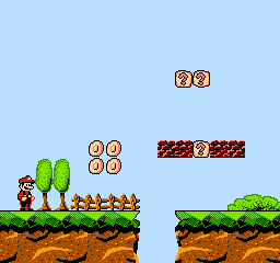
Added more to the hat, a bit more facial hair and black shoes now. classy. but i didnt change the color of the coins because its shared with the ? blocks and i didnt want to use the orange-yellow for it because THAT looks like a fried egg to me.
the red outlining on mario came out of struggle that the pants & edge would be the same color. so it goes unchanged for now.
As for the cartoony mario spriting.... i am not that good of a charachter spriter to be able to make sprites that resemble the cartoon mario accurately. could give it a shot one day though.
Image

also, heres the massive sheet of things for this mockup:

Image
Re: WAH-HOO
by on (#139371)
Have you considered making the shoes red? I think it looks closer to the brown they were supposed to be, and has the advantage of limiting the use of a lighter color for outlining, which IMO looks weird.
Re: WAH-HOO
by on (#139384)
My biggest complaint with Mario's sprite is that he isn't fat enough... or is that Luigi in Mario's clothes? O_O
Re: WAH-HOO
by on (#139386)
Sik wrote:
My biggest complaint with Mario's sprite is that he isn't fat enough... or is that Luigi in Mario's clothes? O_O

i suck at charachters :C
Re: WAH-HOO
by on (#139388)
Eh, just a column more of pixels at the belly to make it more rounded would do the job.
Re: WAH-HOO
by on (#139427)
Sik wrote:
Eh, just a column more of pixels at the belly to make it more rounded would do the job.

went ahead and did "luigi" too.
Image
Re: WAH-HOO
by on (#139446)
Seeing that Luigi isn't just a palette swap, (stomach) you might also want to make his head a little thinner

Edit: I edited yours if you want to use it
Attachment:
Mario and Luigi.png
Mario and Luigi.png [ 729 Bytes | Viewed 5551 times ]
Re: WAH-HOO
by on (#139450)
Espozo wrote:
Seeing that Luigi isn't just a palette swap, (stomach) you might also want to make his head a little thinner

Edit: I edited yours if you want to use it
Attachment:
Mario and Luigi.png

even though i actually did shrink luigis head a little, that looks better