Years ago started a I
thread on a C64 forum with mockups of how C64 versions of various games could have looked if they had been ported to the system.
After playing around with NES Screen Tool for the first time in quite some time while making the
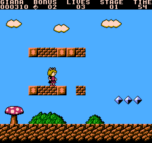
Mini SMB mockup I thought it would be fun to make a mockup of how the most "Nintendo" game of all on the C64 could have looked if it had been ported to the NES - The Great Giana Sisters!
I didn't try to make it look exactly like the C64 version, instead I wanted it to look NES. There were a few things about the C64 version that didn't really translate well to the NES graphicsmode, the metatiles are 3 tiles wide instead of 2 and doesn't always align to 2x2 grid, the screen has higher vertical resolution (240 pixels on the NES, 200 on C64) so there is more space between between blocks. Oh, and Gianas sprite doesn't really look like the C64 sprite at all...
Anyway, here is the picture.

Hopefully othere people will think this is a fun idea and will post their own mockups in this thread!
You did a good job there. I might see what I can do.
Quote:
There were a few things about the C64 version that didn't really translate well to the NES graphicsmode, the metatiles are 3 tiles wide instead of 2
And they'll look pretty much the same, given the platforms' different pixel aspect ratios (3:4 for NTSC C64, 8:7 for NTSC NES). Like Apple II tiles, C64 tiles are 14/2 = 3.5 color burst periods wide. NES tiles are 16/3 = 5.33 periods wide. Thus a 3-tile-wide C64 metatile is worth 63/64 = 1.97 NES tiles.
Quote:
and doesn't always align to 2x2 grid
You can place a block that's not grid aligned so long as it has empty or same-palette tiles on the unaligned sides.
tepples wrote:
And they'll look pretty much the same, given the platforms' different pixel aspect ratios (3:4 for NTSC C64, 8:7 for NTSC NES). Like Apple II tiles, C64 tiles are 14/2 = 3.5 color burst periods wide. NES tiles are 16/3 = 5.33 periods wide. Thus a 3-tile-wide C64 metatile is worth 63/64 = 1.97 NES tiles.
Interesting! I was actually thinking about how wide a "wide" c64 pixel was compared to a normal NES pixel, with the higher horizontal resolution and the border and all. Now I don't have to wonder anymore

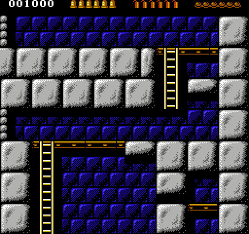
Anyways, I spent some time on another mockup, this time it's Rick Dangerous that got NES:ified by me. I didn't do any sprite at all this time.

That's pretty awesome. I've followed the NES->C64 mockups and the other way round reminds me of Euro NES designers; eg: Dracula, etc. on the NES.
That's pretty cool. At one point I considered making my game dual NES/C64, but the graphics from both machines are like as far apart as they could be, while one is not technically superior to the other, each one can't (easily) reproduce what the other does. The drastic change in resolution doesn't help at all either. So I pretty much gave up that idea.
Even if graphics wouldn't be a problem controller would, the standard controller for a C64 game is the joystick , and you only have 4 directions and 1 button (some have 2 buttons, but they are the same for the software). You could use the keyboard for more buttons, but it doesn't have a D-pad, and requiring the user to use the joystick and keyboard at the same time is ridiculous.
You could probably handle the background by just making two separate tilesets, but that won't help you with sprites (which is where it gets really tricky as sprites have nothing to do with each other between the NES and C64).
As for the controller, from what I've read the two button controllers map themselves to impossible combinations of up/down and left/right. The problem is that this means you can't mix button 1 with up or down, and you can't mix button 2 with left and right. Maybe I'm mixing this up with something else but I recall that setup existing.
Bregalad wrote:
That's pretty cool. At one point I considered making my game dual NES/C64, but the graphics from both machines are like as far apart as they could be, while one is not technically superior to the other, each one can't (easily) reproduce what the other does. The drastic change in resolution doesn't help at all either. So I pretty much gave up that idea.
Even if graphics wouldn't be a problem controller would, the standard controller for a C64 game is the joystick , and you only have 4 directions and 1 button (some have 2 buttons, but they are the same for the software). You could use the keyboard for more buttons, but it doesn't have a D-pad, and requiring the user to use the joystick and keyboard at the same time is ridiculous.
Yes, I have been toying with the idea of porting Driar to the C64 and thought about most of those thing. For Driar I would probably have him always run instead of using up for jumping, but for most games the "up" to jump would be the only "decent" solution. I'm so used to "up for jump" so I don't have a big problem with it, but I know lots of people do.
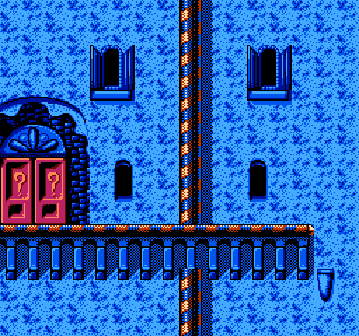
Anyway, another day, another mockup. This time I used the Amiga version of Robocod as my source. This was definitely the mockup that has taken the longest time to make.

Well my game is top-down view and has no jumping, A is for shield and B for attack. If I was porting this to the C64 I'd probably have to remove the ability to shield, which in turns would make significant changes to the gameplay.
You can't shield and move at the same time (otherwise the game would be a pushover

), so pehaps support for those special 2-button joystick could be added. However, I don't know any C64 game that REQUIRES those joystics.
The other option is requiring 2 standard joysticks (for 1 player) and use the second one only for the button, to shield. However, that'd be almost as ridiculous as having to press a keyboard key to shield.
I don't think UP for jumping is a problem with joysticks, in fact it's pretty much a standard. HOWEVER with a controller, that's a no-no. It's a huge difference, with a joystick you just move your wirst up, however with a controller you should move your left thumb up which is much more tiring and harder to do efficiently.
As for sprites, it's without a doubt the worst to port. The best idea is to have monochrome sprites for black (or whathever colour) outline, and use multi-coloured sprite with lower priority for the texture. If a few textured pixels are off it's no major problem, and you even have a 3rd colour to compensate. However, the sprite's size total mismatch between both platform is a major issue.
The background is not much better since your working area is 40x25 tiles instead of 32x30, this implies a lot of changes. In fact I came to the conclusion that moving the status bar to the left or right of the screen (to keep the 32x24 tiles "screen" of my game intact) would be the only solution without re-designing the entiere levels.
Bregalad wrote:
Well my game is top-down view and has no jumping, A is for shield and B for attack. If I was porting this to the C64 I'd probably have to remove the ability to shield, which in turns would make significant changes to the gameplay.
You can't shield and move at the same time (otherwise the game would be a pushover

), so pehaps support for those special 2-button joystick could be added. However, I don't know any C64 game that REQUIRES those joystics.
The other option is requiring 2 standard joysticks (for 1 player) and use the second one only for the button, to shield. However, that'd be almost as ridiculous as having to press a keyboard key to shield.
Yes this is a big problem, I have been toying with the idea of making a Zelda type game for the C64 and have been thinking about controls quite a lot. And since Zelda uses 3 buttons (A, B and Start) this makes it even worse. Golden Axe Warrior managed to get by with two buttons quite decently by only having one action-button and one menu-button but a secondary attack really would have added to the game.
I was thinking about going the Golden Axe Warrior route with two buttons - supporting two button joysticks/joypads and make the spacebar act as the second firebutton for players without a 2 button joystick for the C64 (such as myself). Another solution would be to make some sort of press and hold the button to access the menu solution, this is what
Wonderland does and it actually works quite well.
Bregalad wrote:
I don't think UP for jumping is a problem with joysticks, in fact it's pretty much a standard. HOWEVER with a controller, that's a no-no. It's a huge difference, with a joystick you just move your wirst up, however with a controller you should move your left thumb up which is much more tiring and harder to do efficiently.
I usually use a Sega Master System gamepad with my C64s and Amigas and am very used to playing with them. I can complete Giana Sisters and Turrican II with no problem. Actually for Turrican II on the Amiga it really makes the game easier since they use the second button (or spacebar for people without it).
I would prefer jumping with a button, but since I have been playing this way since the 90s it feels very natural and works well enough.
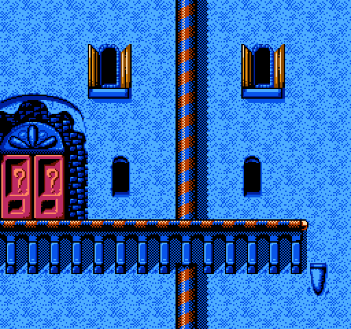
I did some more work on the Robocod mockup, toned down the pattern on the walls a little, and added in the color for the "doors?" on the windows, these would have to be sprites to make this possible on a NES. I also redid the pillars to how I would have done them, doesn't look as close to the original anymore but I think they are more pleasing to the eyes.
There are some other hardly noticable touches here and there.

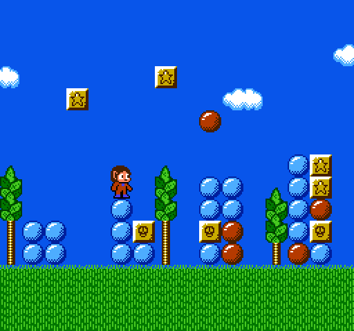
Did a quickie, Alex Kidd in Miracle World on the NES:

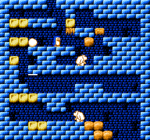
I'm on a roll now, here's Penguin Land, a Master System game I think is very underrated.

Don't really like the player sprite, he gets a little lost in the background, and the spikes coming out of the box doesn't really look good either, the should be a little narrower. Oh well, it's just a mockup.
*edit* I redid the player sprite using two color palettes, did turn out a lot better. */edit*

I loved Penguin Land.
Bregalad wrote:
You can't shield and move at the same time (otherwise the game would be a pushover

)
Auto-shield when not moving or attacking. I think
The Legend of Zelda does this.
Quote:
I don't think UP for jumping is a problem with joysticks, in fact it's pretty much a standard. HOWEVER with a controller, that's a no-no. It's a huge difference, with a joystick you just move your wirst up, however with a controller you should move your left thumb up which is much more tiring and harder to do efficiently.
Yet games like
Street Fighter II and
Super Smash Bros. get away with it.
Is
Penguin Land anything like
Duck Maze?
tepples wrote:
Is Penguin Land anything like Duck Maze?
Heh, I remember trying that on an emulator ages ago and thinking what a blatant Penguin Land ripoff it was!
It's pretty much the same game except Duck Maze plays very badly compared to the Master System version of Penguin Land. It plays more like the original
SG-1000 Doki Doki Penguin Land - which oddly enough got an arcade port which basically ran on SG-1000 hardware.
The
Master System version of Penguin Land is IMO a lot better and plays way smoother. It's actually considered the sequel and not a remake.
Pretty cool stuff here! Please post more mockups!
Macbee wrote:
Pretty cool stuff here! Please post more mockups!
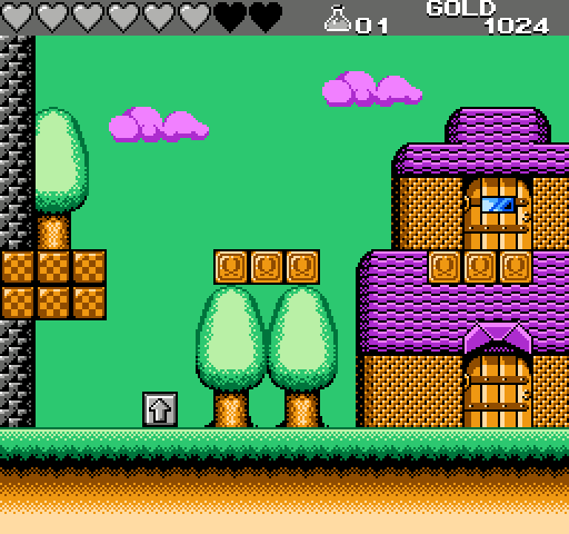
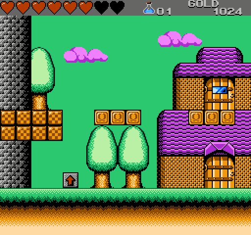
As you command! Continuing on the Master System path, here's Wonderboy III: The Dragon's Trap.

Didn't make any player-sprite this time, and the Statusbar turned monochrome since I had used all the palettes. The window on the upper door would have to have sprites overlayed to be that color, but since there are no other sprites than the player in the village, that seemed feasable.
Pretty cool mockups, jayminer. Wish I had time to contribute to the thread, but for now I'll just keep enjoying your work! =)
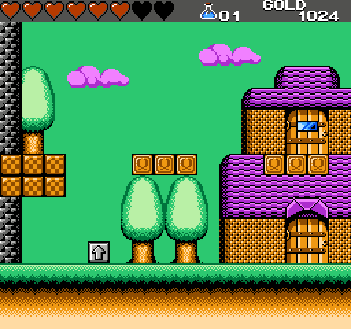
I was thinking, how hard is it to change the palette midscreen on the NES. Is this done by any games? For the Wonderboy III mockup it would be enough to just change two colors in the palette after the statusbar to make a big difference (the dark gray to a slightly lighter gray, and the red to an even lighter gray), and with two more color changes for the sprite palettes the "potion" could be colorized aswell with two sprites - without having to sacrifice an entire palette that could be used for the player and enemies and all that stuff.
Here's how it would look with those features:

jayminer wrote:
I was thinking, how hard is it to change the palette midscreen on the NES.
It is straightforward to change palette midscreen, but as far as we know, these are the constraints-
1- You have to have at least one scanline with rendering disabled
2- Six palette entries can be changed on a scanline without any visible artifacts
3- Up to 18 palette entries can be change on a scanline if you're willing to accept a smear of colors, but that can partially be masked by using the NES's greyscale bit.
This thread goes into much too much detail.
4- Sprite memory will be damaged by disabling and re-enabling rendering. This basically means it can only be used for bottom status bars.
It's
conceivable that there are specific (mid-scanline) times when you could disable and re-enable rendering such that it would not damage sprites (during the time that OAMADDR is 0), but it would produce an irregular edges on the relevant scanline.
There's a small window during HBlank when the PPU is not using PPUADDR (between dots 258 and 320 according to this diagram), so it should be safe to update 2 bytes during this time and then disable only the background rendering, in order to blank the following scaline without corrupting sprites. At the end of this blank scanline, fix the scroll using $2005/6 magic and enable background rendering. Based on this I believe you need 1 blank scanline for every 2 colors you need to change.The above is wrong, sorry. That HBlank window can be used to set the internal PPU address (for scrolling purposes), but you can't write data to the PPU because it's using the data bus to fetch sprite patterns. I guess my NESDEV skills are starting to get a little rusty!

I'm pretty certain you can't write to PPUADDR and PPUDATA to update palette RAM during sprite fetch.
Oh man, I've been waiting for a thread like this to show some NES-conversions. Though some of the games I would use (GBC) would be cheating, since it has specs similar enough to (but also much better than) the NES. I might contribute some time in the future, but these screens are gorgeous.
jayminer wrote:
Here's how it would look with those features:
I know these are just mockups (and they look great!), but in an actual conversion you'd want to also make sure that there's no important information in the very borders of the screen. For example SMB's status bar has 16 pixels of padding on top and 24 pixels on left and right.
lidnariq wrote:
4- Sprite memory will be damaged by disabling and re-enabling rendering. This basically means it can only be used for bottom status bars.
IIRC, it only affects the first four sprites, and only if a sprite is intersecting the point where rendering is switched off.According to my notes from a long-ass time ago, it's only if one if the first 6 sprites intersects where rendering is off.
Also, I'd say you want a 16-pixel margin (or at least no text or anything important) on the top and bottom of the screen; my TV cuts off the bottom row and the top two rows of tiles. I don't remember what happens on the sides.
Relevant wiki pageRule of thumb: 16 on top, 11 on bottom, 8 on sides
I know about the overscan, haven't really thought about it when doing any of my mockups though, but I'm gonna try and think about it for any future ones (because I want them to be as believable as possible, sort of how the game actually might have looked, had it been ported to the NES). Since most of the systems I'm using as inspiration has a lower vertical resolution than the NES, it never should be a problem really.
Does anyone have any idea if the Master System cuts off more or less of the picture than the NES horizontally? I was just thinking because Wonderboy III on the Master System has the hearts all the way to the left on it's statusbar, like I did it in the mockup. Then again, I think it's the leftmost column that get's hidden for scrolling so perhaps there actually is 8 pixels on both sides that are unused but didn't show in the picture I looked at.
I've compiled a
list of other platforms' dot clock rates. Both the SMS VDP and the NES PPU use the TMS9918 dot clock rate, which is 3/2 of the NTSC colorburst rate. This means the width of active picture is the same for both platforms, but the side-to-side positioning may differ slightly for a couple trivial reasons.
lidnariq wrote:
I'm pretty certain you can't write to PPUADDR and PPUDATA to update palette RAM during sprite fetch.
Oh crap, I forgot about sprite pattern fetches! Sorry about that.
Practically all Master System games that scroll horizontally mask the leftmost column (8 pixels) so take that into account. Note that the NES can do exactly the same though, so really just do the same thing and forget about it =P
Also I was under the impression that the leftmost and rightmost two columns (i.e. 16 pixels each) were not safe. Then again, I'm going by Sega docs, but since the NES screen has the same width and resolution I assume it'd be the same.
Sik wrote:
I was under the impression that the leftmost and rightmost two columns (i.e. 16 pixels each) were not safe. Then again, I'm going by Sega docs, but since the NES screen has the same width and resolution I assume it'd be the same.
Nintendo's official background planning sheets likewise assumed a 16-pixel margin at the left and right sides and thus a 224-pixel-wide title safe area. By modern standards (Rec. 601), which specify an active scanline period equal to 280 TMS9918 pixels, this is an 80% title safe area to account for the tolerances of 1970s TVs. By the sixth generation (PS2, GameCube, Xbox), as TVs became manufactured to tighter tolerances, console makers started allowing an 85% title safe area, which in TMS9918 terms would be 238x204 pixels.
jayminer wrote:
What I personally would do is assign the hearts to the same palette as the rooftops for this screen. The hearts would automatically be assigned a color palette that would closest match red, be it pink or orange. Think how Double Dragon's status bar always changes color. I think some other games had the status bars change color.
Alternatively, make the hearts one tile big and make them sprites, with a max of 8 (assuming the game maxes out at 8 hearts). If you can get more than eight hearts, then make a life bar with an indicator with how much life you actually have, similar to Zelda 2 or Pokemon. This might not work that well since not many enemies would share the same palette as the hearts, unless you deliberately design all enemies with a single set of colors like Mr. Gimmick did (or comparable to how Micronics handled their games, since this is a hypothetical port).
OneCrudeDude wrote:
What I personally would do is assign the hearts to the same palette as the rooftops for this screen. The hearts would automatically be assigned a color palette that would closest match red, be it pink or orange. Think how Double Dragon's status bar always changes color. I think some other games had the status bars change color.
Alternatively, make the hearts one tile big and make them sprites, with a max of 8 (assuming the game maxes out at 8 hearts). If you can get more than eight hearts, then make a life bar with an indicator with how much life you actually have, similar to Zelda 2 or Pokemon. This might not work that well since not many enemies would share the same palette as the hearts, unless you deliberately design all enemies with a single set of colors like Mr. Gimmick did (or comparable to how Micronics handled their games, since this is a hypothetical port).
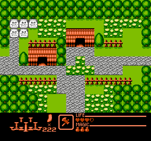
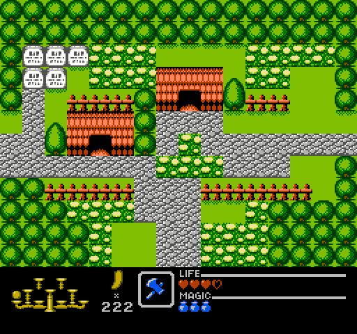
That is an interesting idea. I actually redid the picture adding in red into the "gray" palette I already had, redesigned the springboard (the gray box with an up arrow) and redid the "tower" with one less shade of gray, had to use some more dithering but it doesn't look to bad IMO, but the dithering might not look as good on a real NES (this is probably true for a lot of the dithering I have used in my mockups).
Anyway this is how it looks now, I squeezed everything together a little to still show the house but also show a little more of the tower.
This will probably be the last update to Wonderboy III, I have done an almost complete mockup of Golden Axe Warrior which I will add real soon.

And here is Golden Axe Warrior. For those of you not familiar with the game, it's a rather blatant Zelda ripoff for the Master System, but it's actually a quite good game!
This time I also ran out of colors for the Statusbar... :/

Here's that last Wonderboy mockup run through blargg's nes_ntsc:
Here's a reinterpretation of the DOS classic Jetpack:

(The bent ladders would be animated, as with the conveyers.)
The original game's tiles are 12x12, and the levels were 26x16 tiles. In an NES port, if the levels were 16x13 (like in the picture), they would have only half as many blocks to work with. However, if levels were 2 nametables wide (32x13) the block count would be identical.
One of my goals was to make it look decent for any background color from the first row (ie the darkest).
There's still a few things I'm not quite happy about (eg. the 1-up graphic). Also, if anybody has any suggestions for a better palette for the gold, I'd gladly take it.
jayminer wrote:
And here is Golden Axe Warrior. For those of you not familiar with the game, it's a rather blatant Zelda ripoff for the Master System, but it's actually a quite good game!
This time I also ran out of colors for the Statusbar... :/

Here's an idea; sprite for middle weapon and magic bottles; the protagonist is a bluish color, so his palette could be used here. I'm not sure what the scale thing is supposed to hold in the end, and the one image I seen looks like they're all similar enough in color. Alternatively, magic is turned into a sprite based magic bar with a value mark (IE: 1/4).
lidnariq wrote:
Here's that last Wonderboy mockup run through blargg's nes_ntsc:
Cool, it actually looked better than I thought it would!
RT-55J wrote:
Here's a reinterpretation of the DOS classic Jetpack:
Finally, someone else contributed to this thread, great!

I like your mockup, it looks very NES.
OneCrudeDude wrote:
Here's an idea; sprite for middle weapon and magic bottles; the protagonist is a bluish color, so his palette could be used here. I'm not sure what the scale thing is supposed to hold in the end, and the one image I seen looks like they're all similar enough in color. Alternatively, magic is turned into a sprite based magic bar with a value mark (IE: 1/4).
Well, there are a few problems with using sprites. The player changes color when you get a new armor (same as the rings in Zelda 1) and the magic bar fills up all the way to the edge of the screen. Sure it could be shortened but I think it would be nicer if it would stay the same. The "scale" holds the orbs you get when finishing a castle, it's basically the triforce. On the Master System all orbs are different colors but here they would all have to look the same, no biggie.
Here's an update to Golden Axe Warrior using palette changes, there's two scanlines of black in the beginning of the status bar, and three of the palettes are changed.

Can the NES even do something like your picture shows? Did any NES games even do that? I thought MMC2 would allow you to do something like that.
OneCrudeDude wrote:
Can the NES even do something like your picture shows? Did any NES games even do that? I thought MMC2 would allow you to do something like that.
Well, from what lidnariq wrote earlier in the thread:
lidnariq wrote:
It is straightforward to change palette midscreen, but as far as we know, these are the constraints-
1- You have to have at least one scanline with rendering disabled
2- Six palette entries can be changed on a scanline without any visible artifacts
3- Up to 18 palette entries can be change on a scanline if you're willing to accept a smear of colors, but that can partially be masked by using the NES's greyscale bit.
This thread goes into much too much detail.
4- Sprite memory will be damaged by disabling and re-enabling rendering. This basically means it can only be used for bottom status bars.
It's
conceivable that there are specific (mid-scanline) times when you could disable and re-enable rendering such that it would not damage sprites (during the time that OAMADDR is 0), but it would produce an irregular edges on the relevant scanline.
I have no idea if any games actually did this.
jayminer wrote:
I have no idea if any games actually did this.
In the thread I linked,
Denine wrote:
For example, the following games changes palette for status bar:
-Wizard & Warriors.
-Fantastic Adventurers of Dizzy.
-Dizzy the adventurer.
-Tom and Jerry.
I should probably explicitly mention that the "palette entries" I was referring include the normally unusable slots at $3Fx4, $3Fx8, $3FxC, so writing from $3F0D-$3F12 would be 6 visible colors, but writing from $3F01-$3F06 would only be 5. And writing from $3F01-$3F12 would change 15.
jayminer wrote:
I have no idea if any games actually did this.
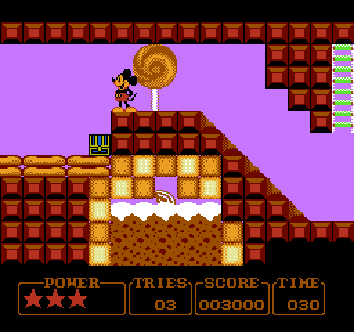
Mickey's Adventure in Numberland changes palette before the status bar on bottom.
Here's a video which clearly shows that the border color is changing (border color is same as the background color):
https://www.youtube.com/watch?v=UITwFE04wh0#t=89sI quickly checked it out in Nintendulator, and what it does is this:
- IRQ trips on scanline 187
- At the end of scanline 188 it changes background color ($3F10 i.e. mirror of $3F00) to black
- At the end of scanline 189 it changes $3F00 and $3F01 to black
- At the end of scanline 190 it sets $3F01, $3F02 and $3F03 to the colors used by the status bar
Another game which does it is Jungle Book:
- IRQ trips on scanline 175
- Changes all 4 palette sets on scanlines 177..180, 3 colors per each scanline
- Uses same palette for all palette sets. I presume it does this so that it doesn't need to upload attributes for the status bar (status bar code in this game is a bit complex due to 8-way scrolling with horizontal mirroring).
I'm sure there are other games that do similar stuff.
EDIT: ninjaed, but whatever
It might not be on par for the thread (this asks for mockups of non-NES games on NES hardware), but this is something I wanted to do. I tried my best to 'dissect' the infamous
Great Gatsby "NES Prototype", and come up with a palette that it might've used as an NES game. I apologize beforehand for the large image.

The game uses some very odd graphics placement, and it seems to be able to lay down a background attribute to a space as small as 8*8. If this were an MMC5 game, it would be feasible, but using a mapper as advanced and expensive as the MMC5 for a game with only four levels is quite a waste. Not to mention, I haven't actually tried making up an NES mockup of the graphics, and the palette seems to be based on an MSPaint estimate of the palette. The game runs at 240p as opposed to 224 for NTSC regions, so the playfield would have to be shrunken down a little. There's also some discrepancies with the colors, most importantly the chandelier; you could probably get away with layering the sprites, but they fall down, and would cause a LOT of flicker when they do.
So what do you think?
A while ago I made a crude mock-up demo of the Adventure game Loom(TM) on the Famicom:

which was based on
this scene.
The ROM can be downloaded from
my blog.
I actually had another test ROM on changing the palette mid-screen for the interface (so that the staff is brown instead of gray).
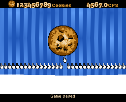
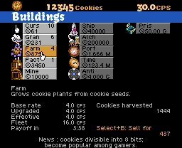
In case you haven't seen it, here's Cookie Clicker.

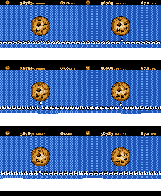
Title screen. The part of the light blue stripes nearest the big cookie is made of sprites. Move the cursor with the controller or the Super NES Mouse. Click the cookie, get a cookie.

Click the cookie more to get more cookies. Once you have a few dozen, you can spend your cookies on things to click the cookie for you. Click the CPS at the top right to go to...

Spend cookies on things that make more cookies. (The colors here are cheated for illustration purposes; the ones not focused will be drawn in grayscale.) Click the CPS again for...

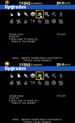
Make your buildings more efficient. Oh, there's a notification in the upper left. Click at the top left to return to the big cookie.

The big cookie after I buy a few cursors. These are animated by modifying four "cursor strip" tiles in CHR RAM.
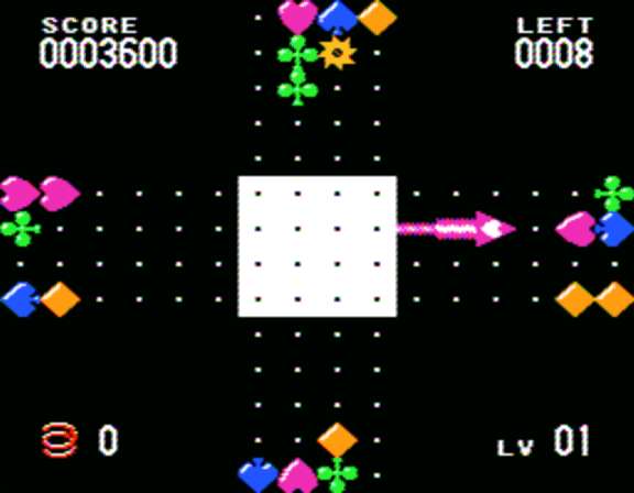
Zoop was ported to every platform in use at the time (PC, Super NES, Genesis, Game Boy, Game Gear, Jaguar, Saturn, and PlayStation), but the NES was already obsolete by that time. This is what Zoop might have looked like on NES:


Demonstration of why 4-player Dance Dance Revolution (as seen in DDR Ultramix) would be impractical, originally for
this post.
Cutting it back to 2 players would be fine though.
There also isn't quite enough room for 4 DDR mats on a NES... although you could use two Track and Field pads for four players, specifying diagonals instead of LDUR.
You could try staggering the judgement/receptors such that none are on the same line (using all 64 sprites to do so). Then the future arrows become "just" split scroll of the background...
I'm back again, this time I tried making a graphical mockup of that Gatsby game.

I even went the extra mile and adjusted the colors to the NES palette, and have marked down the palettes I used. However, my mind started to draw blanks for the other palettes, since the game doesn't exactly follow the NES' limitations to the T. This is what it would actually look like on the NES, since the waiters are three tiles wide and Nick is two + one, so 12 sprites. 4 of them would have to be dropped off for at least a single frame, while another set of four would be dropped off for the very next frame. In a perfect world where flicker does not exist, this is what it would look like.

Wow, so many posts in such a short time!

I'm really happy too see others adding their work to this thread!
Most of these mockups are really interesting, I especially like Cookie Clicker which I think looks great with it's variable width font and all (even though I had seen that one before).
Does anyone have any suggestion for a game I could do a mockup of next? I'm trying to find ones that aren't too "busy" and complicated, and that I think would look nice on the NES, but any suggestions are welcome

OneCrudeDude wrote:
I'm back again, this time I tried making a graphical mockup of that Gatsby game.
I even went the extra mile and adjusted the colors to the NES palette, and have marked down the palettes I used. However, my mind started to draw blanks for the other palettes, since the game doesn't exactly follow the NES' limitations to the T. This is what it would actually look like on the NES, since the waiters are three tiles wide and Nick is two + one, so 12 sprites. 4 of them would have to be dropped off for at least a single frame, while another set of four would be dropped off for the very next frame. In a perfect world where flicker does not exist, this is what it would look like.
Couldn't the waiters be shrunk down to 2 tiles wide? It would perhaps look a little odd but with some clever redesign of the graphics I think it could look good enough. That would remove the flicker.
*edit* I did a
very quick mockup of how I would imagine them looking if they were shrunk down. It's ugly and the proportions are bad but I hope it will get the idea across.

*edit2* Couldn't keep my hands away, did another quick update to the waiter.

An easier way to prevent flicker would be to prevent a whole plethora of enemies being on screen at once; if you play the game, you will see that it likes to throw 5+ enemies in a given time, especially in a row. If you only had two waiters instead of three in a line, there'd be minimal flicker.
I also noticed that I could use color $22 as the main BG color, since the game's graphics seem to imply that. Later I might come up with a different, and hopefully more accurate mockup.
Edit: Here's the alternate version of the mockup I promised a few minutes back. While it looks more accurate, I am not a fan how how the columns have a lot of black, overpowering lines.
Question regarding the NES' NTSC and PAL video output. PAL regions can show 240 vertical pixels, while NTSC regions can show 224. Does that mean the NES automatically cuts off the uppermost and lowermost line of graphics for NTSC, or is it more complicated than that?

I like to think that I'm evil.

jayminer wrote:
Does anyone have any suggestion for a game I could do a mockup of next? I'm trying to find ones that aren't too "busy" and complicated, and that I think would look nice on the NES, but any suggestions are welcome

Either one probably would have been sprite-flickering hell, but I wonder if either Jail Break or Shao-lin's Road (both by Konami) would have looked good on NES.
jayminer wrote:
Does anyone have any suggestion for a game I could do a mockup of next? I'm trying to find ones that aren't too "busy" and complicated, and that I think would look nice on the NES, but any suggestions are welcome

Shovel Knight!
Estlib wrote:
I like to think that I'm evil.
Somari 2! =)
Memblers wrote:
jayminer wrote:
Does anyone have any suggestion for a game I could do a mockup of next? I'm trying to find ones that aren't too "busy" and complicated, and that I think would look nice on the NES, but any suggestions are welcome

Either one probably would have been sprite-flickering hell, but I wonder if either Jail Break or Shao-lin's Road (both by Konami) would have looked good on NES.
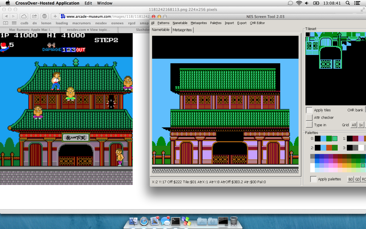
This is what I have come up with so far, not sure if I will do more work on this since it's mostly tedious things like the slopes on the ceilings left to do. But it would be interesting to add some sprites and see how it would look. I just did a screengrab with the picture I looked at showing aswell, for easier comparison.

Memblers wrote:
jayminer wrote:
Does anyone have any suggestion for a game I could do a mockup of next? I'm trying to find ones that aren't too "busy" and complicated, and that I think would look nice on the NES, but any suggestions are welcome

Either one probably would have been sprite-flickering hell, but I wonder if either Jail Break or Shao-lin's Road (both by Konami) would have looked good on NES.
That's ironic you say that because Konami's later NES games didn't give two shits about flicker. Zen Intergalactic Ninja is the worst offender.
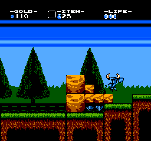
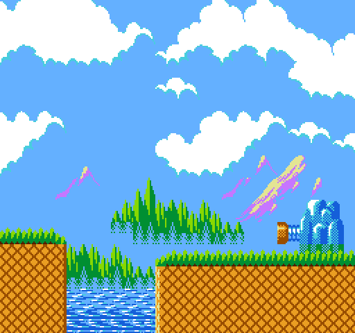
Here's Shovel Knight, this could have been soo much better with some more work, I just did the background very quickly because I wanted some sort of background, and I didn't bother with the clouds at all so the entire background looks kinda bad. Anyway, here it is:

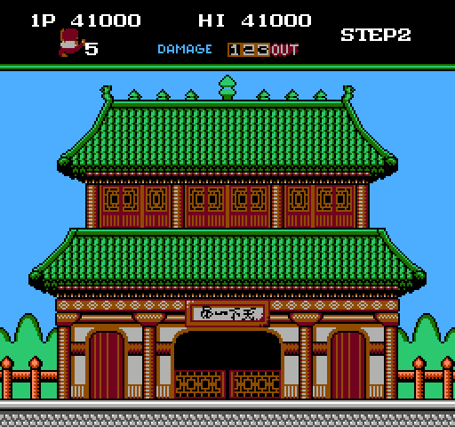
I also finished the background for Shao-lin's Road:

jayminer wrote:
Here's Shovel Knight, this could have been soo much better with some more work, I just did the background very quickly because I wanted some sort of background, and I didn't bother with the clouds at all so the entire background looks kinda bad. Anyway, here it is:
Pretty cool! Congratulations! =D
jayminer wrote:
I also finished the background for Shao-lin's Road:
That's cool, I think yours even looks a little better than the original.
jayminer wrote:
You -could- always overlays sprites on the Knight to make him look closer to the source game. It seems like the Knight was the only thing that was left over from the "let's make it look like an NES game as best as possible" phase of development. It'd be possible to recreate the game on the NES, you'd just need to re-arrange things (or remove them) to work. One of the boss fights has a bunch of random NPCs just sitting there, so maybe they could be removed.
Memblers wrote:
That's cool, I think yours even looks a little better than the original.
Even with it's flaws, I always thought the NES had a nice, vibrant palette.
OneCrudeDude wrote:
You -could- always overlays sprites on the Knight to make him look closer to the source game. It seems like the Knight was the only thing that was left over from the "let's make it look like an NES game as best as possible" phase of development. It'd be possible to recreate the game on the NES, you'd just need to re-arrange things (or remove them) to work. One of the boss fights has a bunch of random NPCs just sitting there, so maybe they could be removed.
Yes, the thing is, the knight-sprite is already 4 sprites wide at it's widest and overlaying even more to get more colors would waste almost all of the NES sprites on just the player, so I decided to try and scale down the sprite instead. I guess a low priority sprite could be used to color in the knights "belt" which would add a little more color, and then let that sprite disappear first if there are too many sprites on that scanline. If I recall correctly that's what they do with the eyes in SMB2.
If someone was to do an actual port of the game to NES hardware, I think everything would have to be shrunk down for better playability, or just live with it all being very flickery.
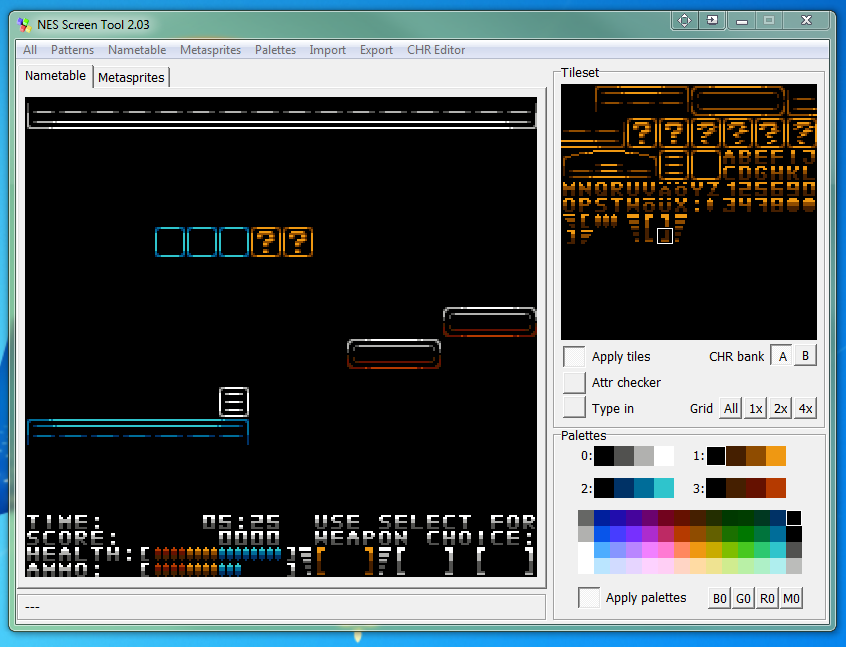
This isnt exactly a mockup of another game, but rather something different... its still a mockup of something though

That looks cool, but there's way too much shading on the text. If there were only a lighter gray, I'd suggest using that, but since there isn't, maybe put a stronger bias towards the lighter shades. Otherwise, it's harder to read than it needs to be.
Like this?
Attachment:
 weaponchoice1.png [ 808 Bytes | Viewed 2259 times ]
That and you need to get important info away from the picture edges so that the TV doesn't
chop them off. Less text in the first place would be a good idea as well; the "TIME:" could be replaced with a clock as I started to do.
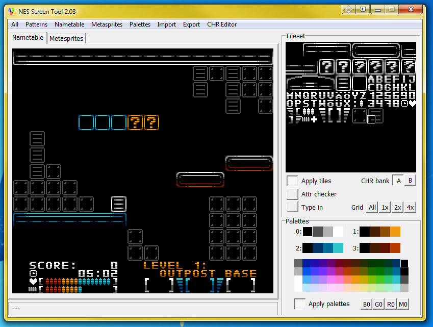
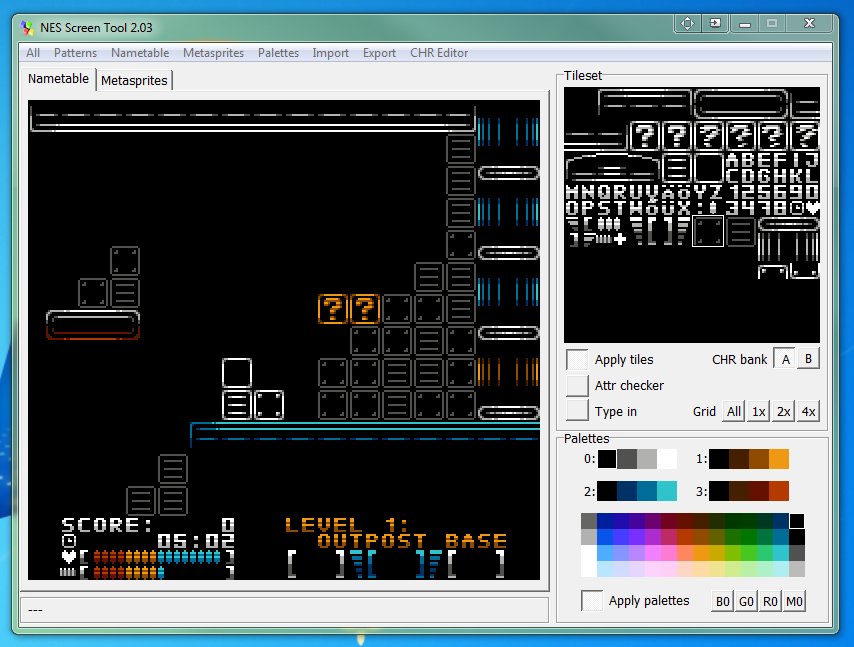
modifications as per suggestions above

edit: added some background detailing
edit2: different shot

@estlib: I really like the colors and style. What is it for?
@jayminer: The entire game would have to be re-designed to work optimally on the NES. Flicker is one of the hard limits of the NES, and there's only so much you can do to work around it. Maybe flicker could just be standard with the port, preferably the 'blink in and out of existence' kind like Recca's, not the 'temporarily not draw a sprite until it is out of the line' like Bubble Bobble's.
OneCrudeDude wrote:
@estlib: I really like the colors and style. What is it for?
Its the representation of a game idea i had a year or more back, but i am unable to make it because i lack the programming know-how needed for something like this. It was supposed to be kinda like the vectorman of NES.
I can see that, it has a very unique style that's not seen in a lot of other NES games. Would black be the most prominent color, or will there be patterns in the background? While the black is overpowering, it also gives it a nice contrast to the other colors.
OneCrudeDude wrote:
I can see that, it has a very unique style that's not seen in a lot of other NES games. Would black be the most prominent color, or will there be patterns in the background? While the black is overpowering, it also gives it a nice contrast to the other colors.
yes, black is meant to be the main color of the game, but there will be background elements aswell, no specific patterns though. in these shots, they are panels & blocks (including their solid actual block counterparts). The game of contrast between colors & black is the entire artistic idea behind the game idea. there does exist a standing sprite of the "NES Vectorman" but its way too big for anything else to exist on the screen (see attachment).
Attachment:
 nestorman.PNG [ 1.17 KiB | Viewed 2184 times ]
Estlib, your screenshot looks very interesting. I would like to play some platformer game with this style =)
VEG wrote:
Estlib, your screenshot looks very interesting. I would like to play some platformer game with this style =)
me too, thats why i thought of it. but it will never be - i cant asm

What if Dragon Quest 5 had been made for the NES instead of the SNES? It could have looked something like this:

That looks amazing! Since you asked before for requests, if you don't mind, I'd like to see how R-Type would look like on the NES. It would be a flickery mess (like the SMS version, which also has the same sprite limitations), but it would probably look better than the bootlegged port,
Magic Dragon.
Actually there are already people hacking Magic Dragon to resemble the original game.
I don't know about the progress of this project, but there are several patches floating around on the net (never tried them).
I did some quick search but could only find the following video clip:
http://www.nicovideo.jp/watch/sm9687000It's on niconico and I'm not sure whether you need an account to view it. Also, the first half of it is still showing the original Magic Dragon. The patched version is shown from 2:00 onwards.
I remember watching a more complete video years ago, probably even on Youtube, but I couldn't find it atm.
That actually looks interesting, though Magic Dragon's awkward movements don't do the sprites justice. In fact, the graphics could be a little better, maybe they could draw inspiration from the other versions (MSX, SMS) of R-Type and hybridize the things that would work the best. Speaking of, doesn't the SMS also share the same sprite limits? 8 per scanline, 64 per screen, and sprites can be either 8*8 or 8*16? I noticed that the SMS R-Type has the rotating turrets spaced further apart and don't appear to flicker that much, while the bootlegged port has the turrets MUCH closer and half of the turrets flicker continually.
OneCrudeDude wrote:
Speaking of, doesn't the SMS also share the same sprite limits? 8 per scanline, 64 per screen, and sprites can be either 8*8 or 8*16?
Yes, but since they have 15 colors you can have nicer graphics without having to stack sprites. Not that you absolutely must stack sprites on the NES, but if you want to approach the colorfulness of the Master System sprites you do.
Here's an update on my Jetpack mockup from earlier:

- Redone door, 1-up, font
- Some new tiles (gold bricks, teleporters, etc.)
- The drop shadows have been, uh, dropped.
I feel that the destructible crates could use some work.
Gilbert wrote:
Actually there are already people hacking Magic Dragon to resemble the original game.
I don't know about the progress of this project, but there are several patches floating around on the net (never tried them).
I did some quick search but could only find the following video clip:
http://www.nicovideo.jp/watch/sm9687000It's on niconico and I'm not sure whether you need an account to view it. Also, the first half of it is still showing the original Magic Dragon. The patched version is shown from 2:00 onwards.
I remember watching a more complete video years ago, probably even on Youtube, but I couldn't find it atm.
For those that don't have an account:
http://nicoviewer.net/sm9687000> Playing in LD mode due to heavy traffic
> Still crisp enough I can distinguish individual pixels without any blurring
(⌐■_■)
Anyway, good graphics o.o (I guess it's not surprising, it's just overwriting CHR-ROM for the most part). That the game never slowed down for starters probably helps too.
EDIT: pffffft the more updated version is the next video in the related list
http://www.nicovideo.jp/watch/sm10132018 (with account)
http://nicoviewer.net/sm10132018 (without account)
Same deal as before (first half is original, second is the hacked version)
tokumaru wrote:
Yes, but since they have 15 colors you can have nicer graphics without having to stack sprites. Not that you absolutely must stack sprites on the NES, but if you want to approach the colorfulness of the Master System sprites you do.
The SMS is a weird system, from what I gathered from it. Perhaps this could warrant a thread, and to make it have more content, we compare it to other contemporary systems such as the 7800, C64, and MSX2.
@Zif: Nico is down at the moment, but the thumbnail looks promising. One thing I don't like about the hack is how... awkward and stiff the motions and animations are. This looks especially worse when you use better graphics. Hopefully they will alter the animations and general fluidity of the game to look better, though perhaps the stiffness is how they managed to make the game not slow down at all.
Estlib wrote:
there does exist a standing sprite of the "NES Vectorman" but its way too big for anything else to exist on the screen (see attachment).
Well, that can be fixed. Don't like how the hand turned out, though.
Estlib wrote:
there does exist a standing sprite of the "NES Vectorman" but its way too big for anything else to exist on the screen (see attachment).
Actually, it looks like you could get away with using several sprites instead of him being a 'solid' block of a character. For example, his feet can be drawn with 4 titles total, and his legs could be overlayed sprites. The graphics would need to be drawn and arranged in a very specific manner to use up as little sprites per scanline as possible. You could get him to be 4 tiles wide if you're lucky, which would be enough for another enemy. Alternatively, the enemies could be background based, since the entire stage is black and could easily hide the fact that they are backgrounds.
OneCrudeDude wrote:
Hopefully they will alter the animations and general fluidity of the game to look better
Unlikely to happen, the latest video is from 2010 =P
Myask wrote:
Estlib wrote:
there does exist a standing sprite of the "NES Vectorman" but its way too big for anything else to exist on the screen (see attachment).
Well, that can be fixed. Don't like how the hand turned out, though.
that is wayy too small. I was thinking if the charachter would take up 24/64 possible onscreen sprites, then there would be enough room for atleast 2 enemies on screen. flickering wont be an issue if the enemies are different in nature and/or occupy surfaces at different height positions.
OneCrudeDude wrote:
Since you asked before for requests, if you don't mind, I'd like to see how R-Type would look like on the NES.
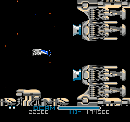
This is what I came up with, and it was sort of a pain. I cheated a bit, the ground is less varied than it is in the arcade version and some things are a bit squeezed down.

The player is four sprites wide and the "helper" thingy (which I didn't draw) is two sprites wide and with the one sprite wide charged beam animation seven sprites would be used on the same scanline only to show the player, so if this were an actual game - the ship would have to be shrunk down and perhaps dropping the charging animation (like on the Master System).
Hmm, then what about NES-ifying the SMS port? The only thing the SMS has over the NES is color depth, so some graphics would have to be simplified so that they can work and not flicker too bad. The SMS game flickers a LOT as it is.
OneCrudeDude wrote:
Hmm, then what about NES-ifying the SMS port? The only thing the SMS has over the NES is color depth, so some graphics would have to be simplified so that they can work and not flicker too bad. The SMS game flickers a LOT as it is.
I was thinking about using the SMS version as a basis for the sprites. But I don't think I will do any more work on R-Type, it was really tedious to do that mockup and I feel it needs a bit more color to really shine which is not really possible on the NES, unfortunately.
Dunno, it looks pretty good to me (dunno if other sections may cause trouble though).

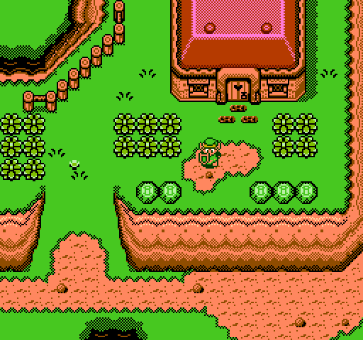
My take on Zelda III. Settled for a quite bright palette in the end. Uses quite a lot of dithering.
That's pretty sweet, jayminer!
Looks great! I'd only tweak the colors a bit so that Link doesn't blend so much with the background... Two of his colors are also present in the main background palette, so he ends up looking like part of it.
tokumaru wrote:
Looks great! I'd only tweak the colors a bit so that Link doesn't blend so much with the background... Two of his colors are also present in the main background palette, so he ends up looking like part of it.
That's a good point, I drew the sprite separately and just cut and pasted it onto the background with a paint program, so I never really thought about it having the same shade of green as the background when I did draw it.
I might update the picture a little later to use slighty different colors for Link.
If you're still accepting suggestions, I'd love to see how Shantae (GBC) would look as a NES mockup.

Macbee wrote:
If you're still accepting suggestions, I'd love to see how Shantae (GBC) would look as a NES mockup.

That's a curious request. As much as I like Shantae, I'm not sure GBC to NES conversions make sense, from an artistic point of view. My point is that there isn't much reimagining involved, it's mostly color reduction. Still, if anyone can come up with an interesting mock-up for Shantae, I'd like to see it.
OneCrudeDude wrote:
Actually, it looks like you could get away with using several sprites instead of him being a 'solid' block of a character.
That's kind of Vectorman's schtick, isn't it?
I looked at Shantae and judging by the pictures I looked at, it would be very hard to make a decent looking NES mockup of it, because of the NES 16x16 attributes.
Not to mention the game takes advantage of sprite layering to the extreme (it's because of that why there's next to nothing going on at any given time, GBC STILL has a sprites per line limitation) and probably has more than 8 palettes in use at a time. I think the GBC could do 50 or so colors at a given time?
I think only Shantae herself uses layering (this gets really obnoxious with enemies that use the yellow/red/black palette).
As for palettes, if I recall correctly the GBC has more palettes than the NES does, so that's a downside too. I don't recall any palette raster effects (i.e. all palette tricks would be screen-wide), but it does rewrite tiles on the fly (e.g. brick parallax in some underground levels), so that has to be taken into account too. Also the palette in the background plane can be set per-tile, right?
Also: the GBC resolution is smaller. This means that a sprite of the same pixel size covers a larger portion of the screen, and Shantae is designed around those sizes (meaning everything would look too small on a NES).
Quote:
GBC STILL has a sprites per line limitation
GBC is 10 sprites per scanline VS NES 8. But as someone else mentioned, take that in relation to the screen size as well (ratio wise, they're bigger sprites than the NES).
I want to join and make some mockups as soon as I have more time.
Meanwhile I'll post some veeeeery old tests I did on Nes Screen Tool using graphics from Sonic 1 and Castle of Illusion (both for Sega Master System):


Sik wrote:
Also: the GBC resolution is smaller. This means that a sprite of the same pixel size covers a larger portion of the screen, and Shantae is designed around those sizes (meaning everything would look too small on a NES).
Actually, she's still rather big, and she looks more at home with the NES' screen display.

She even gives Astyanax a run for his money, and
he's a big guy, for an NES player sprite.
OneCrudeDude wrote:
I think the GBC could do 50 or so colors at a given time?
Sik wrote:
As for palettes, if I recall correctly the GBC has more palettes than the NES does, so that's a downside too. I don't recall any palette raster effects (i.e. all palette tricks would be screen-wide), but it does rewrite tiles on the fly (e.g. brick parallax in some underground levels), so that has to be taken into account too. Also the palette in the background plane can be set per-tile, right?
The GBC has a total of 16 available palettes, 8 for the BG, and 8 for OBJs (sprites). The maximum amount of colors you can display on screen (reasonably at least) was 56 - 4 colors each for the BG, 3 colors each for OBJs - but writing to palette data during HBlanks could technically allow you to display more than 56. Every tile in the BG has an attribute that allows you to choose which of the 8 palettes the tile will use, so yes, they're set per-tile, unlike the DMG.
An NES mockup of Shantae would be challenging to say the least, mostly because of color-reduction as pointed out above. It's probably worth mentioning that this game was praised for its vibrant and detailed art and animation, even as the GBA was gaining traction.
@Macbee - That's some great work

I haven't played Sonic 1 for the SMS in a long time, but you certainly made me do a double take.
Shonumi wrote:
Every tile in the BG has an attribute that allows you to choose which of the 8 palettes the tile will use, so yes, they're set per-tile, unlike the DMG.
I assume you meant "unlike the NES"? (the original GB only had a single palette for all the background, period)
Rogue clone?

Sik wrote:
I assume you meant "unlike the NES"? (the original GB only had a single palette for all the background, period)
No, I meant what I said. The GBC BG tiles could have their palettes set on a per-tile basis, hence GBC BG tiles
are unlike DMG BG tiles, which had a system-wide palette. The GBC has no concept of a single palette that will be used by all BG tiles; the closest you get is Palette #0 being the default in VRAM since everything in the BG Tile Attributes is initially empty.
Shonumi wrote:
the closest you get is Palette #0 being the default in VRAM since everything in the BG Tile Attributes is initially empty.
If the VRAM is uninitialized, then it is most likely not all #0x00.
And there is 2 kind of Game Boy Colour games (retrocompatible with DMG and not retrocompatible), I thought you were mentioning a difference between those 2.
Bregalad wrote:
If the VRAM is uninitialized, then it is most likely not all #0x00.
It has a startup screen though. Doesn't it have to be initialized for that?
The boot rom definitely sets things up, but not all of VRAM is touched iirc. By empty, I did not mean 0x00 specifically, just that the values are meaningless. I was under the impression that VRAM was either filled with garbage data, a constant value like 0xFF but interpreted as 0 anyway, or a combination (garbage data with bits of constant values, all seen as 0). Since the GBC boot ROM does not alter all of VRAM, it should be possible to look at what's happening to uninitialized VRAM, at least in parts. I could whip up a test this weekend if anyone is interested.
EDIT - Actually, the GBC boot ROM appears to zero out some memory locations, perhaps as a convenience to the boot ROM and Nintendo's way of dealing with the garbage data for the game developers' sakes. I'll investigate when I get home. Sorry for causing such a technical tangent in this thread :p
RE-EDIT - Alright, so the GBC boot ROM is actually pretty nice. I gather that, except for the Nintendo logo tiles, it basically clears out VRAM before the game even touches anything. So immediately proceeding bootup, BG Palette #0 will in fact be the closest thing the GBC has to a universal BG palette as I stated before, since all tiles will point to that palette. As soon as the program starts writing to BG Attributes though, that can change.
Shonumi wrote:
@Macbee - That's some great work

I haven't played Sonic 1 for the SMS in a long time, but you certainly made me do a double take.
Thank you very much!

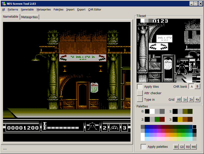
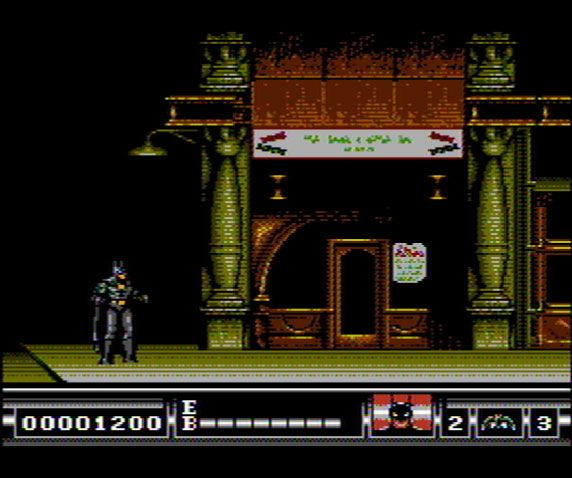
Today I tried to mockup the Mega Drive version of "Batman". I believe it could be a nice NES game.
I used a lot of horizontal dithering since it's proven it can blend colors on PAL televisions. I wish I could see how it looks on PAL.


That's a really impressive mockup!
The "bright" side is that the PAL chroma merging won't have much of an effect on your mockups, because there's little hue change from scanline to scanline. A little bit of color bleeds into the grey highlights.
The down side is that we haven't codified exactly what's going on with the 2C07's weird chroma shift on alternating scanlines, so it's not clear exactly what color the regions of alternating scanlines would look like.
lidnariq wrote:
That's a really impressive mockup!
The "bright" side is that the PAL chroma merging won't have much of an effect on your mockups, because there's little hue change from scanline to scanline. A little bit of color bleeds into the grey highlights.
The down side is that we haven't codified exactly what's going on with the 2C07's weird chroma shift on alternating scanlines, so it's not clear exactly what color the regions of alternating scanlines would look like.
Thanks for the explanation.

Horizontal dithering is not my favorite type (it's very noticeable)- but at least it also doesn't create artifacts on NTSC (which is good).
I'm trying to create different patterns and so far only horizontal dithering doesn't look deformed on AV/NTSC:


Anyway, if someone from Europe wants to try it on an Everdrive here's the link for the mockup ROM:
https://www.mediafire.com/?lz6fbwjvg7f99bf
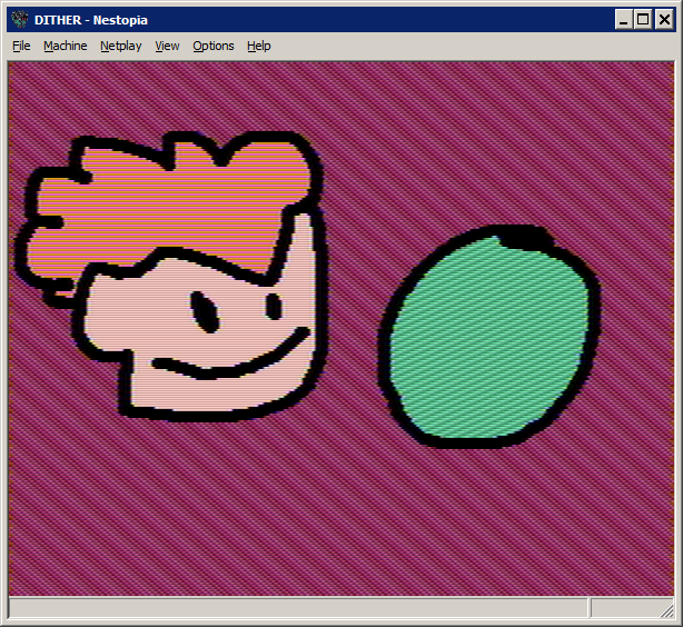
Dithering using "wide" pixels might produce slightly less objectionable artifacts on NTSC.
Code:
. . [][]. . [][]. . [][]
[][]. . [][]. . [][]. .
. . [][]. . [][]. . [][]
[][]. . [][]. . [][]. .
Compare all-horizontal to wide-pixel diagonal
Macbee wrote:
I'm trying to create different patterns and so far only horizontal dithering doesn't look deformed on AV/NTSC:
For whatever it's worth, three 2A03 pixels make two NTSC color periods, and the 2A03 chroma phase shift repeats every 3 scanlines, so if you use a dithering pattern that's a multiple of three pixels wide (and three high), it will compensate as best as possible for that.
surt wrote:
Rogue clone?
Reminds me of Ultima IV a bit.
Going the other extreme of sizing...I'd been thinking NEShack? Just how to fit all the data necessary on the screen.
I allocated a bit more space than I needed on the first pass for the main map, I found. Thanks to this and the permawalls ringing every level (except for some of the Planes) there are enough tiles in one CHR page to just plain draw what you want for the fullmap, not needing to go monochrome and walls-only as I did.
Now, for the actual inset, one can have the ASCII in up to 24 colors, if truly desired-as one can have some color choices on sprites, and others on BG, even the 69 light-radius tiles can be accommodated.
STATUS is where things like "Hungry" or icons therefor would go.
Quote:
if you use a dithering pattern that's a multiple of three pixels wide (and three high)
The 3x4 tile grid for the map is going to look just horrible, isn't it?
Is there a public (windows) build of blargg's nes_ntsc demo anywhere? I was suddenly struck by how odd it is to be filtering other people's mockups.
Anyway, here it is, with "chroma error" and "luma blur" both turned up to maximum
Macbee wrote:
I like this. This is my favorite.
lidnariq wrote:
The down side is that we haven't codified exactly what's going on with the 2C07's weird chroma shift on alternating scanlines, so it's not clear exactly what color the regions of alternating scanlines would look like.
It is interesting that PAL C64 has the same "problem", probably for a slightly different reason though:
http://www.larshaugseth.com/c64/colmix.html
Here's a potentially tricky one. Road Rash on the NES. I don't understand what the hell the game is doing that warrants the allegedly superior Genesis to chug at 20FPS, when the NES has had plenty of similar racing games that consistently hit 60FPS.
Wow, some great posts here since I last posted, that Batman mockup looks really great, gonna try it on my PAL NES and take a picture if I can just find my CF-reader, so I can copy it to my PowerPak.
That rogue-like looks like a game I want to play aswell! Speaking of that and going a little off-topic here, are there any rogue-likes for the NES?
OneCrudeDude wrote:
Here's a potentially tricky one. Road Rash on the NES. I don't understand what the hell the game is doing that warrants the allegedly superior Genesis to chug at 20FPS, when the NES has had plenty of similar racing games that consistently hit 60FPS.
The ground in Road Rash on Genesis is texture mapped in software, unlike NES racing games. It'd take Cosmic Epsilon levels of CHRsturbation to match that.
Here's my take on Shantae.

Once again, there are loads and loads of room for improvements on this one, it was all fairly quickly thrown together just to get a sense of how it could look. All "grass" had to be done using with the "brownish" palette so i opted for a dark green/brownish color instead of black, to get a little sense of the grass being green.
Given the difficulties with Shantae mentioned earlier, I think it is great even for a quickly done starting point. Though it needs more work on the "look", it definitely captures the "feel" quite accurately. I'm not an artist, that's just my gaming gut talking. Great stuff all the same

OneCrudeDude wrote:
Here's a potentially tricky one. Road Rash on the NES. I don't understand what the hell the game is doing that warrants the allegedly superior Genesis to chug at 20FPS, when the NES has had plenty of similar racing games that consistently hit 60FPS.
Road Rash is scaling every sprite in software, that's what's causing the slow down (and it tends to be around 12FPS -
ouch). There's the
Master System port which doesn't scale sprites in real-time, but it has to render the floor in software (it can't do mid-screen vscroll changes) so that's what slows it down there, although it's still faster than its 16-bit counterpart...
You'd still be right to criticize racing games on the console though. Like, why the hell is OutRun at 20FPS? =| Granted, there's a lot more going on there (you'd be surprised at how much the second plane gets abused to render sprites) but still.
tepples wrote:
The ground in Road Rash on Genesis is texture mapped in software, unlike NES racing games. It'd take Cosmic Epsilon levels of CHRsturbation to match that.
Despite that, it STILL looks like an NES game racing floor, and very rarely does the ground have interesting patterns that couldn't be done on the NES. Fucking hell, the SNES could probably handle Road Rash better with a Mode 7 engine. Speaking of Cosmic Epsilon, it was developed by the same company that made Tetra Star, also on the Famicom, right? Why do both games have such below average music? Are the composers just incompetent, or did music have to be compromised to make the games work?
Sik wrote:
Road Rash is scaling every sprite in software, that's what's causing the slow down (and it tends to be around 12FPS - ouch).
Given the game's already low framerate, it might as well be drawing new sprites as opposed to scaling them.
Except because that'd take up much more space in the ROM =P (and the difference is still pretty huge, especially for big objects)
And yes, the floor is nothing spectacular, it's using only one plane from what I gather, so it's literally NES level in that sense.
The Genesis has far more bandwidth to video memory than the NES. On the NTSC NES, you can't realistically get away with more than 160 bytes plus OAM DMA in a single vblank unless you do like Battletoads and extend vblank. The Genesis VDP has not only DMA to VRAM during vblank (the "
blast processing" that it shares with the Super NES) but also a (slower) FIFO queue for the CPU to write to VRAM during draw time.
Yeah but huh, the slow down comes from scaling the sprite graphics in software (i.e. it's entirely the 68000's fault here), the video hardware has absolutely nothing to do with the slow down (unlike in the Master System version, where the rendering of the floor is required to work around a hardware limitation).
Also "blast processing" doesn't refer to the DMA, it just refers to using a higher clock speed for its main CPU <.< (which we all know is completely pointless, though the 68000 is still better overall for completely different reasons)
Actually tepples was referencing the origin of Blast Processing, which was a way a programmer used to describe the DMA. He said you could just 'blast DAC to the processor' or something to that extent. What Sega meant was the fact that the Genesis had a faster CPU that allowed it to do things the SNES couldn't quite do. That said, I fail to see how Sonic proves any technical superiority over the SNES. It doesn't do anything spectacular besides scroll quickly, which I'm certain the SNES could do just as well.
Regarding Shantae, I'm pretty sure she'd share some palettes with some enemies. For example, I'm certain her body use the same palette the generic bad guys use, which is black/yellow/red, but I'm not sure where her skin tone, hair, and eye color comes from. The GBC can display far more colors on screen, but as a wise man once said, if there's a will, there's a way.
Don't forget Shantae can transform and there are many palette effects going on her sprite (e.g. when going into shadows her sprite becomes dark). I would imagine she has unique palettes assigned to her in practice, although I never bothered to actually check.
OneCrudeDude wrote:
That said, I fail to see how Sonic proves any technical superiority over the SNES.
It really doesn't.
Quote:
It doesn't do anything spectacular besides scroll quickly, which I'm certain the SNES could do just as well.
Sure it could. even the NES can scroll as fast as Sonic 1 and 2 did (16 pixels per frame IIRC, I think Sonic 3 allowed for more, but that would hardly happen) without problems. You just have to design the engine around that.
The thing is that normal people don't understand the real meaning of "speed" when it comes to computers, so as long as affects happen at a fast pace on the screen, players will get the impression that the machine is fast.
I think a bigger hurdle would be having a big sprite like Sonic with as many animation frames as he tends to have, plus all of the baddies and their bigness. At least when we're talking about the NES.
Yeah but Blast Processing was against the SNES and it really didn't show (especially not with Sonic 2, which is the game they used for the campaign, despite being the Sonic game with the most slow down, although admittedly 2P mode is basically running two full copies of the game simultaneously). I think the real processing differences didn't show up until late in the lifetime anyway (see: the weird stuff Treasure and Traveller Tales would do).
Actually it showed up earlier, Gradius III, a launch title, suffers from immense slowdown. Most Genesis shooters did not slowdown nearly as bad, but still suffered from it regardless. Thunder Force III and Thunder Spirits comes to mind. Maybe perhaps sports games could also be used against the SNES, but EA flat out hated Nintendo, to this very day.
Regarding Shantae, I wouldn't be surprised if that game uses 'dynamic lighting', which basically means 'if this sprite is going to a dark area, her sprite darkens, if she gets close to a light source, her sprite brightens'. If it does do that, that might be tricky to pull off on the NES with it's limited palettes, unless the only sprite in said area is Shantae herself. The problem would be, if she's next the light but an enemy (which shares one of her palettes) is not, the enemy in the 'dark' will brighten because Shantae's body had to. Otherwise, just use byte shifting to darken the palette. Now about those day-to-night transitions, I don't think the NES would be capable of doing that.
The "dynamic lighting" can be seen in the map with the first stone, for what's is worth.
The day and night transition really shouldn't be an issue since absolutely everything gets affected by it. The only issue would be making the fading look smooth, and that's a minor issue =P
That's the thing, smoothness will be an issue. About the only NES game that does 'day-to-night' transitions would be Chubby Cherub, and it shows the NES' limitations with such a thing. Then again, it was a cheapie licensed title made by TOSE in 1986, if they cared enough they probably would do something better.
I've found that color transitions on the NES look smoother if you change fewer colors each step, instead of the entire palette. As long as *something* changes from one frame to the next, the animation looks continuous. However, most games insist on changing the entire palette at once and not changing anything for several frames until the next complete change, making transitions choppy as hell.
OneCrudeDude wrote:
That's the thing, smoothness will be an issue. About the only NES game that does 'day-to-night' transitions would be Chubby Cherub
Castlevania II:Simon's Quest, though that just fades out to swap palettes, which I presume is not what you're talking about. One of Dragon Quests III and IV (both have day/night) did gradual transitions on the overworld.
Would temporal dithering (swapping colours back and forth between frames) be feasible to increase smoothness of transition? Kind of like sprite flickering for semi-transparency.
surt wrote:
Would temporal dithering (swapping colours back and forth between frames) be feasible to increase smoothness of transition? Kind of like sprite flickering for semi-transparency.
Yeah I thought about that too. Even if it doesn't look that smooth, it might be reusable as a dramatic effect. Hard to say without a demo.
On TVs that interlace 240p to 480i it would appear as stripes.
And on monitors that display 240p natively, such as CRT SDTVs, flashing large areas of the background could be grounds for a seizure trigger lawsuit. Remember the brouhaha about the
Pokémon episode
"Cyber Soldier Porygon" where Pikachu shorted out a missile, causing most of the screen to turn into a strobe light? It sent almost 700 real people to hospitals across Japan.
In fact, a lot of classic games re-released officially under emulation (such as Virtual Console) have screen flashing effects removed or modified because of this reason.
And because of incident, Porygon and it's evolutionary family were never shown again in the anime. But Pikachu, who was the one who shorted the missile out, and Team Rocket, the people who shot the missile, are still being shown.
@Gilbert: One such game was Recca, correct? I recall Convoy no Nazo having a similar effect, but I'm certain not even it's Kuso-ge status would warrant it being re-released on the VC.
That said, I wonder how a mockup of Two Crude Dudes/Crude Buster would look like on the NES. I hope better than Bad Dudes, and I reckon the graffiti would have to be omitted (or heavily simplified).
Video games have routinely carried seizure warnings in the manual for a long time (well before that pokemon episode aired, too). It's part of the standard boilerplate for any GameBoy game, for example. What was different about that Pokemon thing is that it was on a TV show, where there was no such warning or expectation. People with the relevant condition usually know to avoid video games.
surt wrote:
Would temporal dithering (swapping colours back and forth between frames) be feasible to increase smoothness of transition? Kind of like sprite flickering for semi-transparency.
Yes, it works nicely. I'm using this since last year in my own game (another Windows game that tries to simulate 8-bit Nintendo) and I'm very satisfied with this fade + dithering thing.
@OneCrudeDude: I don't know about Recca and that Transformer game, and I don't own any of those modern platforms that offer such emulated games either. I could only tell what I've heard and cannot verify them. From what I heard, two popular games with this treatment are Ninja Ryukenden(the flashing when you die) and Zelda(when Link grabs an item).
rainwarrior wrote:
People with the relevant condition usually know to avoid video games.
Not always. A lot of children remain undiagnosed until they try to play a video game for the first time and have a seizure. Console makers have started to impose restrictions on flashing because they don't want their respective brands to be associated with a child's first seizure.
rainwarrior wrote:
On TVs that interlace 240p to 480i it would appear as stripes.
On those TVs
anything you attempt will look like utter shit anyway =P
tepples wrote:
rainwarrior wrote:
People with the relevant condition usually know to avoid video games.
Not always. A lot of children remain undiagnosed until they try to play a video game for the first time and have a seizure. Console makers have started to impose restrictions on flashing because they don't want their respective brands to be associated with a child's first seizure.
Yeah, but they still aren't exhaustive enough in practice =/ (e.g. strip patterns are known to be a common cause of seizures, yet they pass those tests like nothing was amiss)
Sik wrote:
rainwarrior wrote:
On TVs that interlace 240p to 480i it would appear as stripes.
On those TVs
anything you attempt will look like utter shit anyway =P
I was actually suggesting that the stripes would make a good halftone in that situation, not that it would look bad at all.
Just for information, what tool/programs did you guys use for creating mockups ? I think it can be interesting to make a mockup of games before they are actually coded.
How to be sure it respects the console's limitations without actually programming said console ?
So far all I have is background creators for NES, but still this requires designing an actual tileset and takes time, and is restricted on background-only images.
I did all my mockups with Shiru's NES Screen Tool
Bump.
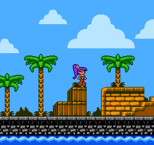
Decided to do a Shantae mockup:

BTW This is intended for MMC5.
Looks pretty good. I would really like to see a Shantae game on the NES. Not a 1:1 port, but an original adventure in the same style.
DevEd wrote:
BTW This is intended for MMC5.
Why has everyone been so averse to the way NES graphics normally work lately?
Every art topic recently has been "hey, I like NES graphics, so here's a scene with a million tiles and 8x8 attributes, because MMC5".
On the other hand, official developers hardly scratched the surface of the MMC5's capabilities, so it would actually be nice to see a homebrew make good use of it.
Before someone mentions it, no, I don't consider Grand Theftendo (or whatever it was renamed to) a good example of MMC5 use, as its simplistic cartoon art doesn't do anything impressive with the colors, and if it weren't for the store signs you wouldn't even notice the MMC5.
tokumaru wrote:
Why has everyone been so averse to the way NES graphics normally work lately?Every art topic recently has been "hey, I like NES graphics, so here's a scene with a million tiles and 8x8 attributes, because MMC5".
Sorry? (Also, the status bar at the top of the screen looks impossible.)
Espozo wrote:
Sorry?
Yes, you did this recently, but there were others. Not that there's anything wrong with using the MMC5, but IMO you have to be making something really amazing to justify using this mapper, and not just be annoyed at 16x16 attributes.
Quote:
(Also, the status bar at the top of the screen looks impossible.)
True, I didn't notice it was overlapping the clouds. You'd need over twice as many sprites as the NES can draw per scanline in order to have a status bar like that.
How would that HUD work? (although I don't see what's wrong with an opaque HUD, since the original did it and it had a smaller viewport, so it's not like it'd be a problem here)
EDIT: missed the last two posts >.>; (although I still would vote for an opaque HUD like in the original)
I actually do think I got everything in 16x16 attributes though. I can always look and find out.
Espozo wrote:
I actually do think I got everything in 16x16 attributes though.
But you did use a million tiles... =)
tokumaru wrote:
Espozo wrote:
I actually do think I got everything in 16x16 attributes though.
But you did use a million tiles... =)
True...

It'd probably look really trashy otherwise though. Literally the last thing I want to worry about on a 2D system is running out of tiles (maybe I shouldn't have picked the SNES...)
tokumaru wrote:
DevEd wrote:
BTW This is intended for MMC5.
Why has everyone been so averse to the way NES graphics normally work lately?
Every art topic recently has been "hey, I like NES graphics, so here's a scene with a million tiles and 8x8 attributes, because MMC5".
Because
Shantae is a Game Boy Color game, and Game Boy Color attributes are the size of MMC5 attributes.
Well, than in my case, wouldn't it be all right for me to use 8x8 attributes? I don't really think of the MMC5 as "cheating" when isn't it just adding more memory or something for the NES to use? Sorry, I'm really uneducated about this sort of thing.

Perhaps someone should mock up a specification for a CPLD that only provides 8x8 attributes and nothing else.
tepples wrote:
Perhaps someone should mock up a specification for a CPLD that only provides 8x8 attributes and nothing else.
This seems to be the aspect newcomer artists have the most trouble understanding (followed by the fact that color 0 is global to all palettes). That's understandable, that limitation looks pretty arbitrary at first, while the number of tiles, number of colors and number of palettes are easier to understand, since they're all numbers.
Where would you store the extra attribute information?
tokumaru wrote:
(followed by the fact that color 0 is global to all palettes).
Really?

Just thinking about color 0 (even though this is an SNES question) how does the SNES treat color 0 when it comes to transparency? Does it treat it like any other color, or does it ignore it and make the normally transparent thing solid? I noticed on DKC 3 that on the waterfall levels, behind the waterfall is only using 3 colors when it could be using 4. Color 0 is the color not being used.
DevEd wrote:
Bump.
Decided to do a Shantae mockup:

BTW This is intended for MMC5.
This scene by itself (minus the transparent HUD, I'm sorry, I don't know any way to make that work) looks like it would easily fit within "vanilla" NES limitations, including attribute regions and tile count. The mossy bricks would need to be sprites though, which is perfectly fine, Marble Madness uses sprites to compensate for attribute artifacts.
Also, don't mind all the purists, use MMC5 if you want, it's not cheating and it has everything you'd want in a mapper, plus the graphical enhancements. At this point, the only reason for using a "lesser" mapper (or no mapper) is if you want the challenge.
Espozo wrote:
Just thinking about color 0 (even though this is an SNES question) how does the SNES treat color 0 when it comes to transparency? Does it treat it like any other color, or does it ignore it and make the normally transparent thing solid? I noticed on DKC 3 that on the waterfall levels, behind the waterfall is only using 3 colors when it could be using 4. Color 0 is the color not being used.
Color 0 is always transparent, no exception. The only way you can use color 0 is as the background color, i.e. what shows up where every layer is transparent (and in the border area too). This is true for the NES too, and the Master System, and the Mega Drive... (amusingly, this is
not true for the Game Boy Color for some reason, which uses the color 0 from the corresponding nametable tile instead).
tokumaru wrote:
Where would you store the extra attribute information?
Same place
Gauntlet,
Rad Racer II, and
Napoleon Senki store their extra nametable data: on a RAM in the cartridge.
Drag wrote:
At this point, the only reason for using a "lesser" mapper (or no mapper) is if you want the challenge.
I imagine that in a mockup thread, known ways of bending hardware limits (such as MMC5 ExGrafix) are fair game because copyright takes away the need to optimize your mockup for actually being able to reproduce it. But it becomes important if you want to reuse the overall art style of your mockup (especially its way of conforming to hardware limits) in an original game that you plan to sell on cartridge.
Quote:
Perhaps someone should mock up a specification for a CPLD that only provides 8x8 attributes and nothing else.
Well I belive you can simulate 16x8 attributes with MMC3 (or another similar complexity mapper) by:
1) using horizontal mirroring
2) using only even rows of tiles (leaving the odd rows "blank")
3) Compressing them by increasing the scroll by 16 lines every 8 lines so that it looks normal on the screen
It sounds like a status bar won't be possible with this configuration, but bi-dimentional scrolling is possible.
However, personally I don't think 16x16 attributes are
such a big deal, and I agree with tokumaru that, while it's not a bad idea to use MMC5, if you use it then it should be justified and impressive.
That screenshot does not seems like it would not be possible using normal NES limitations, except the status bar which overlay with background, which is completely impossible because of the 8 sprites per line limitation.
Drag wrote:
Also, don't mind all the purists, use MMC5 if you want, it's not cheating and it has everything you'd want in a mapper, plus the graphical enhancements.
Normally I'd agree with you, but the MMC5 in particular is still fairly obscure. AFAIK, a lot of what we know about it is speculation, seems it hasn't been completely reverse engineered yet (people know WHAT it does, but not exactly HOW it does it). It also hasn't been fully cloned or implemented on flashcarts, and there are few donor carts around (and many of the games are fairly expensive), meaning most people can't even test their software properly, let alone manufacture a number of copies for distribution. At the current state, 99.9% of players will only be able to run MMC5 games in emulators.
Quote:
At this point, the only reason for using a "lesser" mapper (or no mapper) is if you want the challenge.
What challenge is that? If you're trying to port a 16-bit game to the NES, then yeah, doing it on NROM will be much harder than on the MMC5, but for most NES projects people come up with, the MMC5 is absolute overkill. And it's not like setting up the MMC5 and using ExGraphics is piece of cake either, with all the options and modes, and only 1 screen worth of extended attributes regardless of the NT mirroring, stored in a memory that can only be accessed during rendering... does that sound simple to you? How about an artist wanting to code his first NES ROM?
Bregalad wrote:
That screenshot does not seems like it would not be possible using normal NES limitations
That's exactly my point: If you look closely, there are a few details here and there that need 8x8 attributes (the leaves in the palmtrees near the trunk and the mossy bricks are the only ones I can spot), but they're hardly noticeable, and could probably be reworked to fit the regular attribute grid, meaning that the MMC5 features are hardly being used.
tepples wrote:
Perhaps someone should mock up a specification for a CPLD that only provides 8x8 attributes and nothing else.
The simplest way to get 8x8 attributes that I can think of is: given a game with CHR-RAM, you could define the first four pages (for whatever bank size you use) of that CHR-RAM to contain the attribute table... But that level of complexity is down in "16R4" level, not "XC95xx" level, so there's a lot of room for something more clever.
tokumaru wrote:
the MMC5 in particular is still fairly obscure. AFAIK, a lot of what we know about it is speculation, seems it hasn't been completely reverse engineered yet (people know WHAT it does, but not exactly HOW it does it). It also hasn't been fully cloned or implemented on flashcarts, and there are few donor carts around (and many of the games are fairly expensive), meaning most people can't even test their software properly, let alone manufacture a number of copies for distribution. At the current state, 99.9% of players will only be able to run MMC5 games in emulators.
There haven't been many MMC5 games commercially, so at this point, we wouldn't need exact 1:1 hardware duplication of how the functions are implemented, just as long as the functions are present and consistent. That'll get us through any new homebrews. As for the lack of RE, we
can fix that, it's just that nobody feels like doing it right now, and I don't blame them.
tokumaru wrote:
for most NES projects people come up with, the MMC5 is absolute overkill.
If the MMC5 makes it easier to code your game, then why not use it? Don't forget that it does more than just fancy graphics.
tokumaru wrote:
And it's not like setting up the MMC5 and using ExGraphics is piece of cake either, with all the options and modes, and only 1 screen worth of extended attributes regardless of the NT mirroring, stored in a memory that can only be accessed during rendering... does that sound simple to you?
It's simpler than you think.
Castlevania 3 switches into You could switch into one-screen mirroring when
it uses you use the extended graphics mode, and the MMC5 has the facility available for detecting the end of vblank so you can start updating the extended nametable memory, and that's only if you don't want to switch extended graphics off, update the memory in vblank as though it were normal ram, and switch it back on.
Quote:
How about an artist wanting to code his first NES ROM?
That's going to be hard regardless of any of this.

tokumaru wrote:
Bregalad wrote:
That screenshot does not seems like it would not be possible using normal NES limitations
That's exactly my point: If you look closely, there are a few details here and there that need 8x8 attributes (the leaves in the palmtrees near the trunk and the mossy bricks are the only ones I can spot), but they're hardly noticeable, and could probably be reworked to fit the regular attribute grid, meaning that the MMC5 features are hardly being used.
Don't forget that you can have 256 unique 8x16 sprites with the MMC5, and GBC-compatible amounts of cart-RAM with the MMC5. Plus, there could easily be screens elsewhere in the game that would have more significant benefits from the extended graphics than the screen presented here.
Quote:
Castlevania 3 switches into one-screen mirroring when it uses the extended graphics mode
Huh? It does not. Or if it does you'll have to tell us where exactly. The game uses few of the MMC5's graphical possibilities, because it originally was made for a VRC mapper, which doesn't have any extended graphics.
MMC5's extended attributes have become to video mockups what the VRC6 already is to audio. Only a few games used them, mostly only in Japan, and they give the NES a different class of abilities than it normally has. Lots of people love it, because it lets them feel like they're still making "NES" stuff, but it's easier to work with and you can make pretty things, and a lot us wouldn't use it, mostly because it's not at all characteristic of what the NES can normally do.
The MMC5 extended attributes capabilities end up feeling pretty closely aligned with the Sega Master System's capabilities, actually. Personally, I do find it a little strange people so often want to "max out" the NES in this trivial way, when there's similar platforms that have that kind of capability in their typical form. (PC-Engine might be another alternative.)
The other thing that's maybe worth thinking about is that the MMC5 doesn't cost anything to someone who only works with emulators. You don't have to work for it, you don't have to pay for it, you don't have to offer any merits of your own to get this extended capability, you can just take it. In the actual NES era, it was a hefty additional cost per cartridge, not a decision made lightly, and of course, Nintendo first had to actually realize it was possible and build the chip that could do it. Even though Nintendo built the chip, they never saw fit to use it for any of their own games, interestingly enough, and it wasn't because they didn't want those capabilities. MMC5 had a very real cost, and that's why it was so rarely used.
I understand wanting to use it. NES + MMC5 is a retro platform that (marginally) existed in the real thing, and maybe some people enjoy it more when they don't have to work with the attribute limit, or they like having 3 extra channels of sound, or whatever. If you look at it by itself, ignore rarity, history, etc. and just look at what it can do, it's a fun platform to work with, I guess? Not the one I'd choose, but maybe you like it.
I'm just curious, where does the term "ExGraphics" come from?
rainwarrior wrote:
MMC5's extended attributes have become to video mockups what the VRC6 already is to audio.
well put.
rainwarrior wrote:
I'm just curious, where does the term "ExGraphics" come from?
I don't know... I think it's because of the
Extended RAM, which could optionally be used to enhance the
Graphics. I don't know if this term is official (probably not), and I can't even guarantee it was actually used by other people... I could very well have "invented" it in this thread...

I made that with NES Screen Tool, which doesn't support MMC5 attribute tables. I photoshopped in the 8x8 attributes, Shantae, and the HUD later. Here's how it looked before I added the 8x8 attributes:

BTWI made the Shantae sprite with NES Screen Tool as well.
Link to image due to lack of a spoiler tag
God, I *LOVE* the VRC6 sound. I love how the 2 square channels are like the original ones, but way better because there is 7 duty cycles instead of 3. And the saw wave is a perfect addition to this already great set of PSG. It's the best sound extention by far, I prefectly see why so many remixers uses it. Just a small difference (in hardware), more than twice the possibilities you originally have.
If one were to make a "VRC6" version of a song, and would only use the extra channels for reverb in 3 seconds of a 1 minute song, you'd ask yourself "why use VRC6 then ?". It's exactly what toku and I are trying to say.
rainwarrior wrote:
The other thing that's maybe worth thinking about is that the MMC5 doesn't cost anything to someone who only works with emulators. You don't have to work for it, you don't have to pay for it, you don't have to offer any merits of your own to get this extended capability, you can just take it. In the actual NES era, it was a hefty additional cost per cartridge, not a decision made lightly, and of course, Nintendo first had to actually realize it was possible and build the chip that could do it. Even though Nintendo built the chip, they never saw fit to use it for any of their own games, interestingly enough, and it wasn't because they didn't want those capabilities. MMC5 had a very real cost, and that's why it was so rarely used.
I understand wanting to use it. NES + MMC5 is a retro platform that (marginally) existed in the real thing, and maybe some people enjoy it more when they don't have to work with the attribute limit, or they like having 3 extra channels of sound, or whatever. If you look at it by itself, ignore rarity, history, etc. and just look at what it can do, it's a fun platform to work with, I guess? Not the one I'd choose, but maybe you like it.
We all agree on this. The problem is when it's used just to get rid of a limitation that affects 2% of the resulting work, instead of being used as a way to do something super cool that could not be done without it.
The second screenshot does not look any different from the first, to be honest, there's like no difference at all.
Quote:
I'm just curious, where does the term "ExGraphics" come from?
I guess it comes from
here. At least that's the first doccumentation of MMC5 I can think of.
Bregalad wrote:
If one were to make a "VRC6" version of a song, and would only use the extra channels for reverb in 3 seconds of a 1 minute song, you'd ask yourself "why use VRC6 then ?". It's exactly what toku and I are trying to say.
...
The problem is when it's used just to get rid of a limitation that affects 2% of the resulting work, instead of being used as a way to do something super cool that could not be done without it.
It's funny that you say that, though, because every single real-world use of the MMC5 drastically underuses it.
Bregalad wrote:
Quote:
Castlevania 3 switches into one-screen mirroring when it uses the extended graphics mode
Huh? It does not. Or if it does you'll have to tell us where exactly. The game uses few of the MMC5's graphical possibilities, because it originally was made for a VRC mapper, which doesn't have any extended graphics.
It's the third screen; the one where you're walking up the staircases. The extended graphics are used for the stained glass windows in the BG, and the game switches into single-screen mirroring for this.
And I'm sorry, but I just don't agree with what most of you are saying. There's value in "vanilla" NES capabilities, but that's no reason to stigmatize anyone using expansions, no matter how annoyed you are with their overuse or misuse. Kinda like how I was with warbly arpeggios in chiptunes, once you see examples of them being used
effectively, you'll have nothing to say.
Bregalad wrote:
The second screenshot does not look any different from the first, to be honest, there's like no difference at all.
Aside from the green portions of the treetrunks, the top of the box in the upper right corner, and the brown-tipped leaves at the bottom of the potted plant, right? So yes, I need to retract what I said earlier about this being doable on vanilla PPU.
Bregalad wrote:
The second screenshot does not look any different from the first, to be honest, there's like no difference at all.
Except the trees look horribly off... (should seriously consider having a brown shade in the green palette)
Drag wrote:
Aside from the green portions of the treetrunks, the top of the box in the upper right corner, and the brown-tipped leaves at the bottom of the potted plant, right? So yes, I need to retract what I said earlier about this being doable on vanilla PPU.
Obviously, as is, it can't be done on a vanilla PPU. But if all you're doing is copying all the shapes straight out of the GBC version and just adjusting the colors, that's not much of a conversion, is it?
You can certainly achieve very SIMILAR results on a vanilla PPU, if you take the time to make a few adjustments: redraw the bottommost leaves of the palmtree, spacing them away from the trunk a bit, redraw the bushes so they cover the bottom of the trunk or draw bushes only on one side of the trunk, only place potted plants aligned to the 16x16 grid (with enough clearance for the green leaves), only put bushes on top of floors that are aligned to the 16x16 grid, and get rid of the mossy bricks or make them larger or use sprites for them.
These kinds of changes are expected, you have to adjust grphics and maps when porting a game. The key to success it to try as hard as possible to make something at least as good as the original. Different doesn't necessarily mean worse.
Here's a quick edit with the graphics reworked to fit the normal attribute grid:
Attachment:
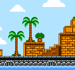 shantae-nes.png [ 3.54 KiB | Viewed 3214 times ]
EDIT: Oops, forgot the mossy bricks... well, you get the point!

The mossy bricks are best removed anyway, the trees were the real problem. (also did you literally just remove the bottom of the tree leaves?)
Sik wrote:
(also did you literally just remove the bottom of the tree leaves?)
Not really, I pushed them 4 pixels away from the trunk and tried to make them flow normally, but looking at it again I can see that the bottom ended up looking pretty flat. Well, it was just a quick edit anyway, I'm sure the leaves can be reworked to flow better.
Since people brought it up, I feel like the default 2A03 is grossly underrated, instead opting for bells and whistles like VRC6 or N163. Primarily it's because the NES' ancient graphical capabilities will often clash horribly with the futuristic sound coming from the same machine. In a way it's understandable, since the triangle wave is a bit of a bottleneck when it comes to audio, where very few composers could actually make it sound substantial. Composers often took different approaches to dealing with the triangle's nature, such as using it as a lead instrument and using a square for bass, or using DPCM samples for basslines. All too often did I come across "NES remixes" of non NES songs, only to be greeted by expanded audio. Damn you YouTube Famitracker composers, I wanted to hear the triangle wave or super low-fi DPCM.
And speaking of graphics, very very VERY few NES games actually resembled anything colorful, much less like anything posted in this thread. The newer the game, the greater the chances that the developers opted to use backgrounds that consist of different shades of the same color. Mario 3 and ESPECIALLY Kirby's Adventure look ridiculously monochromatic, though they can look nice in certain situations. TMNT2 famously has levels that are almost predominantly gray, and Kirby does have some levels where the entire screen is, no joke, entirely orange. Once the SNES came out, developers just stopped caring about graphics. I'm assuming this was due to the combined efforts of limited video capabilities, and poor art design.
OneCrudeDude wrote:
In a way it's understandable, since the triangle wave is a bit of a bottleneck when it comes to audio, where very few composers could actually make it sound substantial.
Yeah, although I think the problem is not so much music itself but rather that sound effects have to steal a sound channel for themselves as well when they play - kind of a problem when the only kind of channel that appears multiple times are the square channels (the rest are all one of a kind), and there are only two of them. How do you arrange which channel(s) do you let sound effects to steal?
tl;dr you have to worry about optimizing music to take full advantage of each kind of channel
and somehow also figure out which to treat as the least important so sound effects can use them, while also allowing for a wide range of sound effects (e.g. noise may not be that useful =P). Even if you leave a square channel in this role, it's not as easy as it sounds.
Drag wrote:
It's the third screen; the one where you're walking up the staircases. The extended graphics are used for the stained glass windows in the BG, and the game switches into single-screen mirroring for this.
I just double-checked, it does not. CV3 uses a normal graphics mode during the entiere game, including during the staircase with stained glass at the begining of the game. It uses single-screen mirroring, however, but it's not related to ExGraphics mode, it is just so that the status bar does not get in the way (vertical mirroring could do that as well).
I theorized that that was the reason why so many NES games have dual harmonies; it was just a coincidence it also happened to sound good. If both squares were playing the same tune, if one of them were to be cut out for any reason, there would be a negligible loss in musical quality, as the song is still the same. Likewise, it's very rare to find an NES game where each of the square waves have their own melody. Astyanax is one such game, and as such, most sound effects are handled through the noise channel. Astyanax also has some light sounding noise percussion, so you can't really tell whether it's gone or not. Some games, like Silver Surfer, have crazy music, but when you play the game, the sound effects will greatly cripple the music, leading me to believe that the music and sound were developed at different times.
Sik wrote:
I think the problem is not so much music itself but rather that sound effects have to steal a sound channel for themselves as well when they play - kind of a problem when the only kind of channel that appears multiple times are the square channels (the rest are all one of a kind), and there are only two of them. How do you arrange which channel(s) do you let sound effects to steal?
In my music engine, I put the melody on square 2. Sound effects steal only square 1 unless I'm playing two square effects at once. If I try to play a third, it kills the one with the least data left, so long as the sound effect I'm starting has more data. And for each frame, it compares the volume of the note on that channel to the volume of the sound effect on the same channel, which lets a loud note override the quiet tail end of a sound effect.
Bregalad wrote:
Drag wrote:
It's the third screen; the one where you're walking up the staircases. The extended graphics are used for the stained glass windows in the BG, and the game switches into single-screen mirroring for this.
I just double-checked, it does not. CV3 uses a normal graphics mode during the entiere game, including during the staircase with stained glass at the begining of the game. It uses single-screen mirroring, however, but it's not related to ExGraphics mode, it is just so that the status bar does not get in the way (vertical mirroring could do that as well).
My mistake, it turns out fceuxdsp lied to me when it showed me glitched stained glass in the nametable viewer. Post corrected, but my point still stands; even if
CV3 doesn't,
you could switch into single-screen mirroring when you activate the extended graphics mode, therefore, the size of the extended attribute table would match the size of your nametable, and I still see no reason why you couldn't switch exgfx off, update exgfx, and switch exgfx back on if you wanted to update exgfx in vblank rather than during rendering.
Therefore, I'm still not convinced that MMC5 exgfx is any harder to use than the PPU alone.
Drag wrote:
even if CV3 doesn't, you could switch into single-screen mirroring when you activate the extended graphics mode
That would be a pain in the ass, if the mirroring interfered with the scrolling system. I'd much rather not change the mirroring and just wrap ExRAM updates around.
Quote:
I still see no reason why you couldn't switch exgfx off, update exgfx, and switch exgfx back on if you wanted to update exgfx in vblank rather than during rendering.
Quote:
Has enough testing been done to confirm that this works?
Quote:
I'm still not convinced that MMC5 exgfx is any harder to use than the PPU alone.
To an experienced coder maybe not, but beginners already get confused enough with pattern, name and attribute tables, so yeah, I think they'd find it harder.
tokumaru wrote:
Drag wrote:
even if CV3 doesn't, you could switch into single-screen mirroring when you activate the extended graphics mode
That would be a pain in the ass, if the mirroring interfered with the scrolling system. I'd much rather not change the mirroring and just wrap ExRAM updates around.
A large number of games use single-screen mirroring, or simulate single-screen mirroring through duplicate writes (unnecessary on the MMC5 since it legitimately supports single-screen mirroring), to achieve 8-way scrolling, with or without status bar. If your main in-game view uses single-screen mirroring, then your tilemap is 1:1 with the exgfx memory. How is that a pain in the ass?
Quote:
Quote:
I still see no reason why you couldn't switch exgfx off, update exgfx, and switch exgfx back on if you wanted to update exgfx in vblank rather than during rendering.
Has enough testing been done to confirm that this works?
To my knowledge, no. Our current documentation states that exgfx ram access is limited
only when exgfx is enabled. Put it in "plain ram" mode and you should hypothetically be able to access it in vblank.
Quote:
beginners already get confused enough with pattern, name and attribute tables, so yeah, I think they'd find it harder.
The MMC5's exgfx is actually
more straightforward than the PPU's regular attribute tables, given that you have 1 byte per tile, and you don't have to access it through $2006/2007. Think about what you have to do to update one 16x16 attribute region on the vanilla PPU, and
then tell me the MMC5 is harder.
Does it matter if it's more difficult to program for or not? These mockups aren't being made for real games anyway. It's obviously doable, what more do you need?
Drag wrote:
How is that a pain in the ass?
Switching back and forth between mirroring modes while using the same scrolling engine would be a pain in the ass, that's what I meant. It would make more sense to just use 1 screen mirroring all the way. Or using whatever other mirroring type you wanted and accepting that the ExRAM wraps around sooner, it's switching back and forth that's a bad idea. Not for different engines in the game (i.e. cutscenes vs. gameplay), of course.
Quote:
To my knowledge, no. Our current documentation states that exgfx ram access is limited only when exgfx is enabled. Put it in "plain ram" mode and you should hypothetically be able to access it in vblank.
In theory, yes, but would you risk doing that without testing on hardware first to be sure it works? The lack of proper reverse engineering and testing of this mapper is a very good reason to use it with caution, or to avoid it entirely if you can't carry out proper tests.
Quote:
The MMC5's exgfx is actually more straightforward than the PPU's regular attribute tables, given that you have 1 byte per tile, and you don't have to access it through $2006/2007.
IMO, having to access part of the tilemap in one place (name table) and the rest in another (ExRAM) is not intuitive at all, specially considering that the update logic will be very different without the PPU's auto incrementing feature, and that maybe you have to update each part at different times (if you indeed can only update ExRAM during rendering - hopefully you're right and it's possible to change modes for writing during VBlank).
Quote:
Think about what you have to do to update one 16x16 attribute region on the vanilla PPU, and then tell me the MMC5 is harder.
It can be quite simple if you have 32x32-pixel metatiles and don't scroll vertically, but I agree that attribute tables can be frustrating at times, specially for beginners.
I really don't want to fight over this. I think the MMC5 is a wonderful mapper, it's amazing how Nintendo managed to cram all those features in the chip and upgrade the capabilities of the system so much, and it's sad that it was so underused. I just don't want to see people using it lightly, like it was the most common and supported mapper ever, for petty reasons like a few misaligned background elements. If you really want to use the MMC5, be my guest, but please, design your graphics around it to properly make use of the enhancements, and PLEASE, PLEASE test your software on a real MMC5, because this mapper has not been dissected enough to be taken for granted.
Sorry about the arguing, it just bothers me when people hate on expansions just because they're expansions is all, and I agree that it's a waste to use a giant hulking mapper just for one tiny part of your game (especially because, like you said, it's not very well understood), but if the 8x8 attribute regions make it easier to plan layouts and make the graphics look nice, I'd say that's enough to make it worthwhile and not a waste.
Quote:
If you really want to use the MMC5, be my guest, but please, design your graphics around it to properly make use of the enhancements, and PLEASE, PLEASE test your software on a real MMC5, because this mapper has not been dissected enough to be taken for granted.
Actually that's the very reason I stopped developing anything for MMC5 long ago : I didn't feel the heart to destroy any MMC5 cart just to test my shitty programs

As a newbe to NES development the MMC5 sounded like the coolest thing, but I've grown up and though that it wasn't that great if I couldn't use all it's capabilities. I like the challenge to do as much as possible with as little as possible.
Quote:
Post corrected, but my point still stands; even if CV3 doesn't, you could switch into single-screen mirroring when you activate the extended graphics mode, therefore, the size of the extended attribute table would match the size of your nametable
We all agree on this then. Any newcommer to NES will have to learn about frame and VBlank
anyways, this is unavoidable, so MMC5 does not make this any more complex than it already is. On the other hand it's top-notch easy to use scanline counter makes it much easier to deal with frame time and VBlank, so I think MMC5 can be easier to handle for a newcomer.
I belive the scheme of having "ExGraphics + NTA" for playfield and "NTB with normal attribute table" for status bar is a perfectly sensible way to use the MMC5's ExGraphics mode. Another way would be to use NTA and NTB for normal scrolling and extended name table for status bar. Just Breed have no status bar, so it does not need any of these schemes, still, the reason it uses vertical mirroring is obscure to me. It's probably simply because the developers couldn't get rid of this
tradition.
