It's been a while, hasn't it?
Anyway, here's a mockup I did:
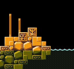
Looks good. I wonder how the dithered colors would look with NTSC artifacts, but so far it certainly looks better than Somari!
tokumaru wrote:
Looks good. I wonder how the dithered colors would look with NTSC artifacts, but so far it certainly looks better than Somari!
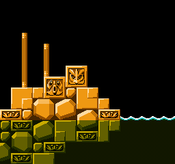
According to Blargg's NTSC filter it will look like this:
Not too bad on the stones, but the water looks pretty weird with those diagonal stripes...
tokumaru wrote:
Not too bad on the stones, but the water looks pretty weird with those diagonal stripes...
I think it'd look weird without the see-thru effect since it matches the background in the stones. A wavy line with nothing above or below would look weirder. Very nice graphics!
EDIT: But, the different-colored background immediately underneath the wave-crests is somewhat strange to look at. Unless of course it is floating organic debris?
This might be a good place to use a one-framed alternating dither pattern. Similar techniques were used for the shields in the 16-bit Sonic games, and for the water in the 8-bit games.
And sometimes a coarser dither pattern looks less artifacty.
Left: checkerboard; right: checkerboard stretched horizontally by 2, as in Videomation
Top: RGB; bottom: composite
Since most Genesis games didn't have a proper transparency effect (especially since those illusions would be broken thanks to RGB displays), is it possible to utilize some Genesis tricks and make them work on the NES? Granted it has a larger screen and can display more colors, but maybe the general idea might work?
The only trick I can think of is where artists dithered with vertical bars rather than a checkerboard pattern. The genesis also had a 320x240 resolution mode which used a faster pixel clock to create the increased horizontal resolution, which means that for each period of the colorburst wave, there's more pixels. So basically, the pixels blurred together better than they would on the NES.
I dunno, it'd still be worth a shot to try different patterns, but I think we did this before.
LocalH wrote:
This might be a good place to use a one-framed alternating dither pattern. Similar techniques were used for the shields in the 16-bit Sonic games, and for the water in the 8-bit games.
Something like this?
(Please excuse the flickering, but GIF frame delays can only be specified in milliseconds instead of FPS)
Drag wrote:
The only trick I can think of is where artists dithered with vertical bars rather than a checkerboard pattern. The genesis also had a 320x240 resolution mode which used a faster pixel clock to create the increased horizontal resolution, which means that for each period of the colorburst wave, there's more pixels. So basically, the pixels blurred together better than they would on the NES.
It's not just the pixel clock, the Genesis composite output also exhibits color mixing in H28 mode (256x224) such that that distinctive dithering still functions. Not sure of the low level reason for that, probably realted to the timing relative to colorburst. I know the H28 pixel clock is damn close to the NES/SNES (I've used the same aspect ratio for Genesis graphics as one would use for NES graphics, and PAR is a function of the pixel clock, since the pixel clock determines the width of a pixel).
DevEd: Yeah, that's what I was talking about. I'm not sure if I'd apply it to non-water tiles unless you're going for a translucent effect for them too (like if an object gets behind the wall).
The 256px mode of TMS9918-derived NTSC VDPs, such as those in the ColecoVision, CreatiVision, MSX, Master System, and Genesis, has a 342-pixel scanline. (NES and Super NES PPU is 341, and standard NTSC is 341.25.) This means the phase of the dot clock relative to colorburst does not change from line to line, causing vertically oriented color mixing. Nor does this phase change from frame to frame.
Genesis color mixing is more distinctive in 320px mode because its dot clock is 15/8 of colorburst. This means the two layers contribute almost equally to each subcarrier period, and the vertical pattern loops roughly once every metatile.
Didn't Battletoads make use of a timing glitch that allowed for 3-frame phase cancelation instead?
If the program leaves rendering turned off just before the start of the first line of picture, the pattern is different. Battletoads turns rendering on late to increase usable video memory bandwidth on NTSC. I do the same in my
rgb121 demo to keep the phase pattern from destructively interfering with dithering. But it does create a bit more of a moving texture overlaying the picture, as infiniteneslives pointed out: "The 'motion' is difficult to ignore".
How about 2-pixel wide flickering dithered pattern with 3 frame phase cancellation.
These 2-pixel wide patterns are also full of artifacts.
It's used on California Raisins and (IMHO) it's as unpleasant as regular, 1-pixel wide, dither patterns.
Any kind of uniform dithering across large plain areas looks weird on the NES when output in NTSC. You always get some sort of pattern, and unless that pattern looks like a plausible texture for the surface in question, it won't look good. I usually try to limit the dithering in my NES pixel work to small and/or noisy areas, so that these phantom patterns aren't so obvious.
tokumaru wrote:
Any kind of uniform dithering across large plain areas looks weird on the NES when output in NTSC. You always get some sort of pattern, and unless that pattern looks like a plausible texture for the surface in question, it won't look good. I usually try to limit the dithering in my NES pixel work to small and/or noisy areas, so that these phantom patterns aren't so obvious.
I had problems with all sorts of patterns - except the ones made from horizontal lines.
They are artifact-free and according to another topic (
http://forums.nesdev.com/viewtopic.php?f=21&t=11018) they even blend colors on PAL TVs - which is pretty cool.
I wish I had an Everdrive to test how tolerable these horizontal lines look on 60 Hz televisions...

Scanline-dithering would be tolerable only if the two colors are similar enough to each other. Due to how YIQ/YUV works, choosing two colors from the same luminance row would yield tolerable results, but you have the problem of being unable to mix with gray, since the available grays are not the same luminance as the colors themselves, so desaturating a color would be harder.
On NTSC at least, $00 (dark gray) is very, very close in luminance to $11-$1C (medium colors), as is $10 (light gray) to $21-$2C (light colors).
Wouldn't it be possible to use color emphasis bits below a certain scanline for a water/transparency effect? Kinda wondered why more games didn't' use those, especially after MMC3 carts could change things based on scanline.
RushJet1 wrote:
Wouldn't it be possible to use color emphasis bits below a certain scanline for a water/transparency effect? Kinda wondered why more games didn't' use those, especially after MMC3 carts could change things based on scanline.
Noah's Ark (E) did that.
[Huge spiel about about emphasis bits and clone incompatibility here]
Do clones have problems with the color emphasis bits? I know that some of Nintendo's own PPUs do, but didn't know about the clones.
BTW, Noah's Ark sets the monochrome bit along with blue emphasis for the water. It looks bluer that way, but also brighter than you'd expect from water.
tokumaru wrote:
Do clones have problems with the color emphasis bits?
Some clones switch the duty cycles for pulse waves, giving notes the wrong timbre. Some clones switch the phases for tint bits, giving screens the wrong tint.
Is that the same reason why Felix the Cat is really dark when played on clone hardware? I always did find that game to look a bit odd for an NES game.
OneCrudeDude wrote:
Is that the same reason why Felix the Cat is really dark when played on clone hardware? I always did find that game to look a bit odd for an NES game.
It looks "odd"/"dark" even on authentic NES hardware, because it turns on all of the tint bits which makes every color darker. Many other games did this also, e.g. Magician, James Bond Jr. and Jungle Book. Probably because its authors preferred the slightly darker palette.
Wasn't there a list of games that made interesting use of the emphasis bits? They always seemed like an under utilized feature.
Edit:
http://wiki.nesdev.com/w/index.php/Colo ... asis_gamesHow boring, most of them use it to make the screen
look shitty darker.
Darker and 100% unplayable on RGB PPUs. I'm surprised, it looks like everyone's cooled off from this debate.

tokumaru wrote:
Do clones have problems with the color emphasis bits?
tepples wrote:
Some clones switch the phases for tint bits, giving screens the wrong tint.
OneCrudeDude wrote:
Is that the same reason why Felix the Cat is really dark when played on clone hardware?
thefox wrote:
It looks "odd"/"dark" even on authentic NES hardware, because it turns on all of the tint bits which makes every color darker.
When 1 or 2 of the tint bits are enabled, only some hues are darkened. This gives the screen a certain color tint depending on which bits are enabled. When the red tint bit is enabled, the Dendy incorrectly tints the screen green. This is the kind of problem tepples was referring to.
When all 3 tint bits are enabled, all colors are darkened. However, it appears some clone systems darken the colors more strongly than the original NES. And the darkening amount may vary from system to system? See the references below.
So it's not exactly the same as what tepples was referring to, but it's related: They're both caused by differences in the tint bits implemention between original and clone systems.
References from thread
Incorrect tint on Dendy:
- In the original post, Drag mentions Lion King uses the red tint bit, but in the Dendy Chronicles YouTube series, the host says Lion King has a green tint problem. Drag also says, "Apparently, [...] the amount of tinting depends on the console; for some it's barely noticable, on others it's extremely obnoxious."
- ccovell: "Famiclone systems have long been known to have overly-strong colour emphasis behaviour compared to the regular NES/Fami PPU. This means games like Bubble Bobble (FDS), Felix the Cat, Magician, etc. are sometimes a bit unclear and harder to play on clones."
- Shiru: "Felix the Cat suffered a lot on the Famiclones indeed, the brightness was much lower than in other games."
I recall there being a discussion that games that always leave all three bits turned on was because developers thought they had to do it. No idea what's the source from that, but it'd make sense at least.
And yeah, tint bits are specially nasty on the RGB PPU, since they work in a completely different way there (instead of dimming the other components, they saturate the ones set, and setting all three will effectively turn the screen white). Now, the RGB PPU gets the palette horribly wrong for starters anyway, so maybe it's not worth the effort considering support for it...
Famicom Titler and Famicom TV use the RGB PPU. A couple Famicom games, such as Just Breed, come with a warning on a package that they're not compatible with Famicom Titler or Famicom TV.

