Gradient sky background

This is an archive of a topic from NESdev BBS, taken in mid-October 2019 before a server upgrade.
View original topic
Gradient sky background
by on (#124164)
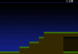
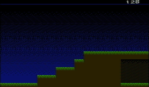
The NES doesn't have HDMI. It doesn't even have HDMA. Nor does it have a lot of intermediate color shadess like those needed for a night sky background. So I needed to make a gradient sky background a different way. I made 1/8, 1/4, 3/8, and 1/2 density repeating tiles and checked them in blargg's snes_ntsc to make sure the diagonal stripes aren't as obvious as they are in, say, the title screen of Dr. Mario. Then I made transitions between the stripes, placing pixels carefully to make the artifacts blend into the RF noise. Finally I flipped the tiles horizontally and vertically and inverted them to make the bottom half of the transition.

Attachment:
File comment: Sky background, including an 8-pixel-wide repeating pattern
fdmockup_gradient.png
fdmockup_gradient.png [ 690 Bytes | Viewed 7013 times ]

Attachment:
File comment: Sky background on a TV, as simulated with snes_ntsc (please zoom)
fdmockup_gradient.jpg
fdmockup_gradient.jpg [ 33.44 KiB | Viewed 7013 times ]


Feel free to use this 8x128 pixel gradient pattern in your games. The pattern might need to be modified for ColecoVision, MSX, SMS, and Genesis games because of their VDPs' vertical color artifact pattern. Is there a preview program like snes_ntsc that takes a 256px or 320px image and renders it for these platforms?
Re: Gradient sky background
by on (#124167)
tepples wrote:
The pattern might need to be modified for ColecoVision, MSX, SMS, and Genesis games because of their VDPs' vertical color artifact pattern. Is there a preview program like snes_ntsc that takes a 256px or 320px image and renders it for these platforms?

The sms_ntsc library's demo should accept a .bmp file. I believe it covers Coleco, MSX, and SMS. Genesis has a slightly different pixel clock in its native modes.
Re: Gradient sky background
by on (#124169)
Too noisy IMO. When you use heavy dithering like this for foreground objects it looks OK, but it doesn't work as well with skies, 'cause they aren't supposed to have any texture. This picture looks particularly weird, considering that the dirt, which is supposed to have some texture, is completely flat.

Considering all the limitations of the NES, horizontal stripes are the best for sky gradients IMO. It might not be very realistic, but it's a pleasant stylized look, unlike heavy dithering that ends up looking like noise.

EDIT: I couldn't find any examples of skies, but look at the gradients in the title screens of Seirei Densetsu Lickle and Darkwing Duck, or the enemy introduction screens in Mega Man 4. There are probably many more examples. There's a homebrew game on the MSX with a sky like this: The Cure. I think it looks infinitely more pleasant than the alternative.
Re: Gradient sky background
by on (#124171)
blargg wrote:
The sms_ntsc library's demo should accept a .bmp file.

And the makefile I made for snes_ntsc worked with pretty much no change. Thanks.

How exactly does the pixel clock in the 32-tile mode of the Genesis differ? I thought it was 3 pixels per 2 NTSC subcarrier cycles, just like CV/MSX/SMS. I know the 40-tile mode differs, as that's supposed to be 15 pixels per 8 cycles.

tokumaru wrote:
the dirt, which is supposed to have some texture, is completely flat.

There's another problem: the intended art style is such that something solid and not potentially visible to the player's character is solid. (Compare screenshots of Pinobee for GBA, where anything solid is completely black.) I guess I could add texture to the left and right edges of dirt.

tokumaru wrote:
Considering all the limitations of the NES, horizontal stripes are the best for sky gradients IMO.

Like this?
Re: Gradient sky background
by on (#124173)
tokumaru wrote:
Too noisy IMO. When you use heavy dithering like this for foreground objects it looks OK, but it doesn't work as well with skies, 'cause they aren't supposed to have any texture.

This reminds me that scrolling would look "twinkly" since it's lots of lone pixels on black. The intro level on Castlevania is a good example of this.

tepples wrote:
How exactly does the pixel clock in the 32-tile mode of the Genesis differ? I thought it was 3 pixels per 2 NTSC subcarrier cycles, just like CV/MSX/SMS. I know the 40-tile mode differs, as that's supposed to be 15 pixels per 8 cycles.

I'm not familiar with the tile modes. It's probably the 40-tile mode that differs, which is what most Genesis games use from what I can tell. Some notes:
53.6931 MHz master oscillator
6.7116375 MHz pixel rate (master/8)
14.31818 MHz color carrier quadrant rate
2.133336313 color carrier quadrants per pixel
Re: Gradient sky background
by on (#124175)
Well personally I like to use single or 2 line dithering, followed by larger area of constant colour. It's "best of both", you get the solidity of constant colours, but the smoothness of dithering in the transitions.
Re: Gradient sky background
by on (#124178)
tepples wrote:
There's another problem: the intended art style is such that something solid and not potentially visible to the player's character is solid. (Compare screenshots of Pinobee for GBA, where anything solid is completely black.)

I see. Well, this style really clashes with the sky. One more reason to approach the sky gradient differently, I guess.

Quote:
I guess I could add texture to the left and right edges of dirt.

That would probably add more depth to the whole thing.

Quote:
Like this?

Without any in-between colors it will be hard to pull off a convincing gradient, but yeah, I do think this is slightly better than what you had before. The actual pattern could probably be tweaked a bit. I'd probably widen the middle section, where both colors are distributed equally, and try avoid the bevel effect that appears to have formed around it. I could try drawing a different pattern, but I only have a touchpad to work with right now and I really can't draw with it.
Re: Gradient sky background
by on (#124222)
Even if you took the first gradient example and made the bottom 2/3 of the sky solid, it would make it less distracting. Complex dithering patterns can be hard on the eyes. I like to keep it simple, keeping colors mostly solid with light dithering between them. Perhaps the example would also look better dithering the two darkest blues instead of black and dark blue? I could certainly be wrong about this.

The 2nd example is also a little distracting. The way the lines are spaced, it creates the illusion of depth (like looking down a corridor).
Re: Gradient sky background
by on (#124228)
With shading on the left and right sides of platforms, with the smaller gradient (top 40% of play area), horizontal lines:
Attachment:
fdmockup_smallhline.png
fdmockup_smallhline.png [ 697 Bytes | Viewed 6885 times ]

Attachment:
fdmockup_smallhline.jpg
fdmockup_smallhline.jpg [ 18.29 KiB | Viewed 6885 times ]


With shading on the left and right sides of platforms, with the smaller gradient (top 40% of play area), dithered:
Attachment:
fdmockup_smallgradient.png
fdmockup_smallgradient.png [ 781 Bytes | Viewed 6885 times ]

Attachment:
fdmockup_smallgradient.jpg
fdmockup_smallgradient.jpg [ 24.94 KiB | Viewed 6885 times ]
Re: Gradient sky background
by on (#124258)
tepples wrote:
Attachment:
fdmockup_smallgradient.jpg


This looks fantastic compared to the first. Gives the illusion of approaching night-dark, where the sky is still a bit blue by the horizon but deep night is on the way. Maybe add a couple (don't go crazy) stars like a light gray pixel here and there at the *very* top?
Re: Gradient sky background
by on (#124259)
I agree, a good portion of solid blue makes all the difference, it now looks great.
Re: Gradient sky background
by on (#124267)
cpow wrote:
This looks fantastic compared to the first. Gives the illusion of approaching night-dark, where the sky is still a bit blue by the horizon but deep night is on the way.

Thanks.

Quote:
Maybe add a couple (don't go crazy) stars like a light gray pixel here and there at the *very* top?

Yeah, I was thinking of doing something like Star Force: a few behind-background sprites near the top that don't scroll with the background.
Re: Gradient sky background
by on (#124276)
This definitely looks a lot better. I think the gradient looks better this time than the line technique, but you'd have to test it out in the context of the actual game play to be sure which is more appropriate (I'm assuming this is for a game?).
Re: Gradient sky background
by on (#124278)
It's for a 2-way scrolling shoot-em-up. The closest analogy I can come up with is Fantasy Zone or what Balloon Kid/Hello Kitty World or SCAT would be if it didn't autoscroll. Once I get characters designed, I'll post what it looks like with sprites on top.
Re: Gradient sky background
by on (#124438)
Sounds similar to Uridium on the C64 in terms of gameplay. Sounds like a quality game :)
Meet Hepsie
by on (#128776)
Hepsie can fly while under the influence of a strange dust.

(Some of you were probably wondering what it'd look like with sprites on top.)