I felt like doing something proper 2 bit for a change. Pew, pew.

Looks awesome! Reminds me a bit of Guxt
Looks great, the stylized asteroids are awesome.
The astroids are really great, my eyes were drawn to them directly.
Thanks everyone

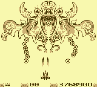
A little update to the asteroids as well as a boss (which is not fully done yet)


The first screen looks great, but I'm not a big fan of the boss. It looks awesome as an isolated bit of pixel art, but as an actual in-game object, it's too busy and doesn't have enough contrast, I feel like it doesn't match the tone set by the rest of the graphics, which are more stylized and well defined.
That is fair critique, tokumaru. Actually gave me some ideas for how I could rework the boss when I got a bit of time.
I think the boss looks really great! It could perhaps have stronger line work to separate it from the background, but as it is, it looks ectoplasmic/transparent which is a neat thing. If you want a firm outline/depth, like on the asteroids, pershaps something in this direction could work (edits on left side only).
Attachment:
 gbmock2-FGedit1.png [ 19.5 KiB | Viewed 3009 times ]
Because Game Boy hardware prior to GBC doesn't have background tile flipping, perfect symmetry is useful only as a ROM-saving compression measure. Also on the original green-screen Game Boy, fine details of moving objects may disappear.
Good points, tepples and FrankenGraphics. Will address when I got time to get back to this.