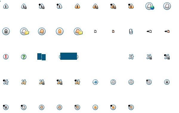
The attachment icon especially looks really bad paired with our black background. It's confusing to figure out what it even is at first. Not only that but the white icons also look very jagged.
http://www.iloveui.comI'm pretty sure we could convince my friend to make some icons for us. He could probably even make us a new logo to go with our new board.
This thread got me working on making the icons properly Alpha Blended.
Here's what I have so far:
Attachment:
File comment: icons with alpha channel
 icons_transparent.png [ 21.46 KiB | Viewed 6206 times ]
It's all one giant image right now, still need to split it into all the little pieces.
The process isn't that hard. Change the image to grayscale, increase brightness and contrast a few times, Magic Wand select the background, Expand selection by 1 pixel.
Then you have your edge alpha values. Pick suitable solid colors for them to blend against.
I've finished the first set of replacement icons. Completely identical to the current icons, except they now have proper alpha transparency.
The animated icons have simply been blended against the forum's current background color, since GIFs don't support alpha (and IE and Chrome don't support APNG).
I also made the attachment icon bright green.
The file extensions are .GIF, but they are actually .PNG files.
edit: this is part one, for /styles/subsilver2/imageset
Yey! You have no idea how much these icons have bothered me through the years. They make the forum look really newbiesh. I hope the PNG ones will work well. Thanks, Dwedit, for having the patience to do this (I never had).
Part 2 finished, these are for /styles/subsilver2/imageset/en
Elapsed time: 35 minutes
edit: And part 3, these are tiny images for /styles/prosilver/theme/images
Elapsed time: 19 minutes
I'll let WhoaMan handle the icon ordeal. I'm very, very worried about putting such icons into place on the system, the main reason being I worry that they'll get nuked/lost if phpBB is upgraded. I'm not familiar enough with the 3.x.x -> 3.x.y upgrade process to know if that could happen. Plus WhoaMan already has experiencing fixing some of the CSS / etc..
EDIT: Ignore me. phpBB "styles" are different than "themes", where you can correlate a style with themes. Wonderfully confusing, and I would expect no less of phpBB. :-) So ignore me.
So what's going on with this?
these have been updated, thank you for working on these

As expected, the transparent PNG icons don't work on IE6. But does anyone really use that anymore? Statcounter says that 0.52% of all internet users still use it, and Wikimedia says that 1.05% of users still use it.
Besides incompatibility with ancient web browsers, the new icons look really nice and smooth.
Dwedit wrote:
PNG icons don't work on IE6.
Nobody should be using IE6. Nobody should be supporting IE6 either.
Anyway, the updated icons look wonderful, especially after using the badly anti-aliased ones for so long. Cheers!

Finally! Everything looks much better now.
EDIT: Although everything is noticeably better, I just realized that the blue outline doesn't go so well with the purple background of the site...

I like it, only thing that is weird to me now is the green paper clips. But I'll survive. Sweet!

3gengames wrote:
only thing that is weird to me now is the green paper clips.
Yup, the green doesn't work too well with this color scheme. Coder colors!
Green paper clips was entirely my idea, I take full responsibility for that. I just wanted something that would immediately stand out and attract attention. Obviously, the old icon made for a white background wouldn't work, and a dark icon wouldn't work against the dark blue-gray background. I also tried adding a white outline to a black paper clip, and that looked horrible.
It kinda matches the logo at the top, even though it is a different shade of green.
The paper clip is the exact same shape as the standard icon, just with an added black outline, and it's now bright green.
If you're really prefer CGA/EGA color #7, I could make it that color as well.
It looks so much better, my eyes are still adjusting to seeing these icons not looking as stupid.
Crazy. I hadn't cleared my cache recently so I was still seeing the old icons. I had no idea what you guys were excited about...
The new ones look great.
Heh, for a while I had a mix of new and old icons, it was pretty weird. But yeah, it looks incredibly better now.
Shift-reload on pages which have old icons to fix that problem.
This has to do with how phpBB does its "caching" of stuff (it has its own internal cache and spits out cache-related HTTP headers to the client as it wishes, rather than just relying on the webserver and file timestamps). Another example of non-KISS software. :-)
Great job, Dwedit.
I think you forgot about the PM icons though.
