The graphics on the forum now are kinda, um.. craptastic.
I'm looking to replace some of the graphics, anyone want to make some for us to use?
Especially this logo:

This stuff also, not very impressive, heheh:


It would be cool to have something original to the site. If anyone's up to it.
Well, you could replace the phpbb logo by a 'nesdev' logo, perhaps another instead of that one placed at main nedev page?
About the others, well... i can't see any problem.
Good idea, the white antialiasing on the borders of everything is kinda ugly.

Is there any specific 'theme' of colors you're looking for?
(retracted; don't bother bstyle)
I dunno about the colors to use, preferably the graphics though would be something unmistakably like "1980's tech". I'll figure something out eventually.
I'll try what Fx3 suggested, using the nesdev logo from the main page. That should look better, for now.
I'm working on a set of forum graphics. I've never worked on a phpBB graphic set before; please don't directory-protect
http://nesdev.com/bbs/template ... er/images/ until I'm done.
EDIT: You mean in this style?
That looks good in my opinion, but it looks like a gameboy screen (ie, the only colors used are selected from a gradient of black - color)
Is there any way to get around that? If not, it's ok.
Edit: To be clearer, it looks kinda like monochrome or something.
Drag wrote:
That looks good in my opinion, but it looks like a gameboy screen (ie, the only colors used are selected from a gradient of black - color)
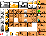
A lot of NES games and Game Boy Color games use dark-medium-light of the same color in their tile images, where all 3 distinct colors in a palette are either black, white, or the same hue.
Currently we've got
- (black, gray, white) for read posts, same as official phpBB icons
- (black, orange, white) for unread posts, same as official phpBB icons
- SMB1 '?' block colors for action buttons
- (red, white) for polls
What kind of color scheme would you suggest? Remember: no more than 3 colors to an icon, and no more than 4 color schemes, unless you want to justify pretending something is a sprite.
EDIT: I can see this in the case of the icons for AIM, ICQ, etc. I've updated the icon sheet with colorized IM service icons.
Ok, the uncolored icons were really the only thing that looked kinda 'off' about it. Now it looks better.
[edit: I need to read posts more carefully... I missed the point about the sprites]
Ok, in this case, I can match the sprite palettes up like this:
yellow, green, red: Since the AIM, ICQ, and Y! icons appear to be solid colors, this palette would be shared among the sprites for each. The black shadow thing could be from under the sprite.
white, grey, black: The paper, and the envelope. On the edit button, the paper sprite could have the pencil part cut out so the pencil is drawn on the bg.
Cyan, white, ?: The MSN logo has that shading on it.
?, ?, ?: Undefined
Seems about right. The thing that was so weird about the mono-colors were that usually when something is disabled (like a button with an icon or something), it has the color removed, and it's just a greyscale representation.
To install the new images, delete the images in the template folder, add the images from
this zipfile, and update the template.
Looks nice, I'll try it out later tonight.
Hmm, lots of them are PNG, might need changes in the bbs code to link them.. I dunno. That'd be a pain if we update to a newer version later.
Will be easier to just convert them to gif's, I'll do that.
It worked, partially. Some of the filenames must be wrong.
It appears you'll need to change the src, width, and height attributes of the <img> tags to match those of the image files (which are mostly in multiples of 16x16 pixels), or just leave them out entirely. Try editing the template before shoehorning the graphics into the template.
Notice that the sticky (pushpin) and announce (pushpin+exclamation) images are of a different size (14x16 instead of 12x16 for the rest of folder_*.png). If phpBB requires all folder_* images to be of the same size, I'll need to add some blank space around the rest.
And it seems your PNG->GIF conversion screwed up the transparency in the images. Try leaving them as PNG and editing the template instead of converting them to GIF.
Ok, yeah my super-quick hack method didn't work, heh. I just used Irfan-view 'save as' to convert, btw.
I'll make a new template, based on the current one. I'll post my progress later.
A new template would be good, since then the SubSilver theme (which is what I currently use) won't have all of its images messed up.
So have there been any problems getting the new graphics in?
I realize me being new here, I may get flamed but seeing how this is a suggestion / discussion forum rather than a forum full of pricks like some of the other forums I was a member of. How about adding a Theme Selector? Like PHPBB ? Just curious. Was this forum orginally from
www.proboards.com ?
Yes, this is a phpBB instance, but a lot of forums lack a theme selector for "branding" reasons, so that the forums together with the rest of the site feel like one site.